This content originally appeared on DEV Community and was authored by Ravi Suresh Mashru
The object-fit property determines how the content of a replaced element is resized to fit inside its container on a web page.
What is a replaced element?
A replaced element is an element whose contents are not affected by CSS in the current document.
An example of a replaced element is the <img> tag. We can specify the position of the image, but we can't actually influence the contents of the image displayed inside the <img> tag using CSS.
Using object-fit with <img>
Let's look at a few examples of how we can use the object-fit property to influence how an image is resized to fit inside its container element (i.e. the img tag).
The behaviour we see is applicable to all other replaced elements as well. Some other examples of replaced elements apart from <img> are: <embed>, <iframe> and <video>. This page on MDN has more information about replaced elements.
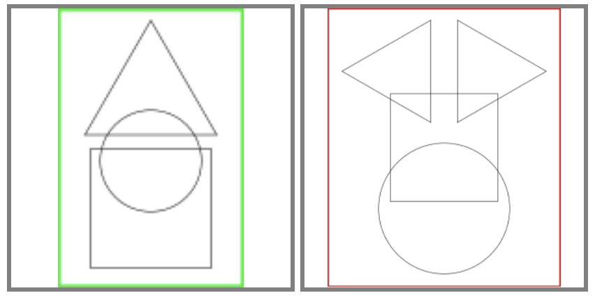
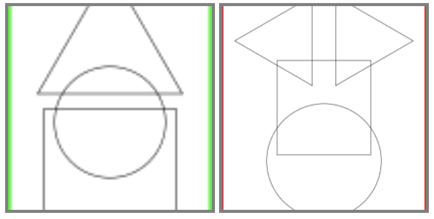
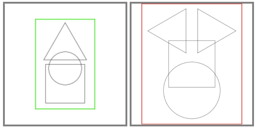
Consider the following two images of dimensions 100x150 and 250x300 respectively:
We will place both images in <img> tags with a width and height of 200px and see how the various object-fit property values affect how the images are resized. I have given the <img> tag a gray border so that its edges are easy to identify.
Note: the object-fit CSS property is used on the <img> tag.
object-fit: fill
This is the default value of the object-fit property. With this value, the image inside an <img> tag will be resized to the size of the container (i.e. the <img> tag).
As you can see, if the aspect ratio of the container and the <img> tag aren't the same, the image will be stretched.
object-fit: contain
With this value, the image will be resized with its aspect ratio maintained so that the entire image fits within the container.
As you can see, if the aspect ratio of the image is different from that of the <img> tag, then there will be a portion of the container that doesn't contain the image.
object-fit: cover
The image is resized with its aspect ratio maintained for this value as well. However, the image will be resized so that it doesn't leave any empty space in the container like with object-fit: contain:
If the aspect ratio of the image is different from that of the container, then there will be parts of the image that are clipped off.
object-fit: none
With this value, the image is not resized at all and maintains its original dimensions. If the image is smaller than the container, the entire image is displayed with its original size. If the image is bigger than the container, it is clipped off.
object-fit: scale-down
This value behaves as if the object-fit property has either the value none or the value contain depending on which one results in a smaller image.
This means that images smaller than the container size remain the same size (like with object-fit: none) and images that are bigger than the container size are resized to fit the container (like with object-fit: contain).
This content originally appeared on DEV Community and was authored by Ravi Suresh Mashru
Ravi Suresh Mashru | Sciencx (2021-06-26T11:14:52+00:00) Understanding the object-fit CSS property. Retrieved from https://www.scien.cx/2021/06/26/understanding-the-object-fit-css-property/
Please log in to upload a file.
There are no updates yet.
Click the Upload button above to add an update.


