This content originally appeared on DEV Community and was authored by José Trindade
Multiple column layouts on large screens that collapse to drawers or popup's on small screens are extremely common on responsive apps. In this tutorial I will show you how to create exactly that.
The full code can be found on github.
Behaviour
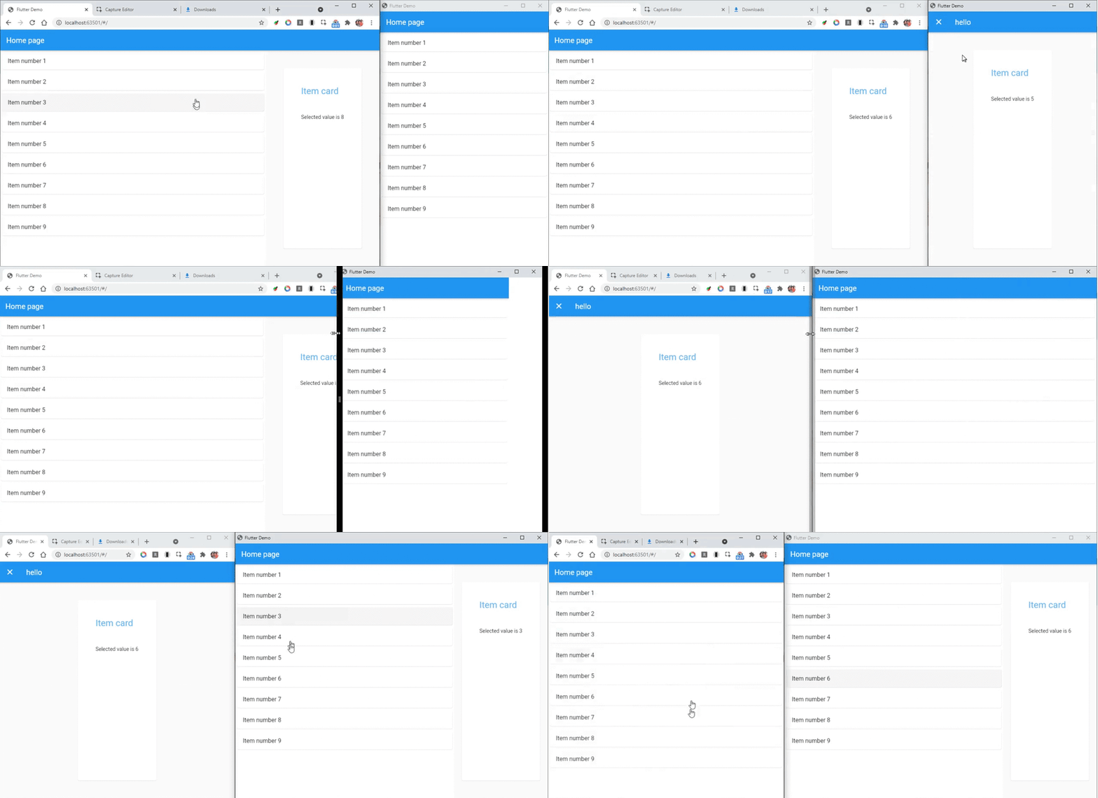
 responsive flutter layout item list demo
Before we start coding let's define exactly what we want to achieve and tackle each part in incremental steps. This will help us focus on the task and keep track of our progress as we go along.
In a nutshell, we want a widget that updates how the children are displayed depending on the screen size of the Window. It should split into two panes when on large screens; on small screens it should show only one pane and open a popup for the second pane as needed:
- Flexible layout
- Two panes for big screens and one for small screens
- Open a popup to show the 2nd pane content on small screens
- When window is resized from big to small open popup if pane2 has content
- Close popup when window resized from small to big
With that out of the way let’s get started.
1. Flexible layout
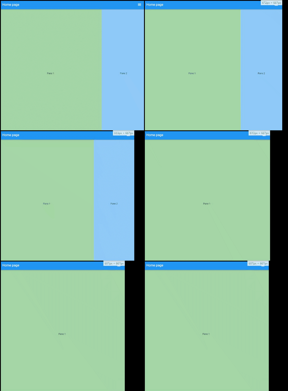
 responsive flutter column layout
The first part is quite easy to do in flutter using a Flex widget, To make it easily reusable we will create a widget that holds and is responsible for the panes behaviour:
class TwoPane extends StatelessWidget {
  final double breakpoint = 800;
  final int paneProportion = 70;

  @override
  Widget build(BuildContext context) {
    if (breakpoint < MediaQuery.of(context).size.width) {
      return Flex(
        direction: Axis.horizontal,
        children: [
          Flexible(
            flex: paneProportion,
            child: Pane1(),
          ),
          Flexible(
            flex: 100 - paneProportion,
            child: Pane2(),
          ),
        ],
      );
    }
    return Flex(
      direction: Axis.horizontal,
      children: [
        Flexible(
          flex: 100,
          child: Pane1(),
        ),
      ],
    );
  }
}
Pane1 and Pane2 are simple Containers with a text child and a background to make it easier to distinguish them.
class Pane1 extends StatelessWidget {
  @override
  Widget build(BuildContext context) {
    return Container(
      color: Colors.green[200],
      child: Center(
        child: Text('Pane 1'),
      ),
    );
  }
}
As per our specification they are enclosed in a Flexible widget. Pane1 has a flex of paneProportion and pane2 the remaining space 100 - paneProportion which, in this case are 70% and 30% respectively.
With this we’ve achieved our first goal. A flexible widget that adjusts the panel’s sizes according to the device screen width. Once the width is smaller than the break point we return only the fist pane. Now, let's add the behaviour for small screens.
Small screens Popup page
 responsive flutter two columns layout that collapses to single column on small screens and vice versa
This is the longest part since there are a few caveats to be mindful of, so bear with me.
Here is the final code that I’ll break down below,:
class TwoPane extends StatefulWidget {
  final Widget pane1;
  final Widget pane2;

  /// keeps track of the pane2 open state
  final bool showPane2;

  /// Called called when pane2Popup
  final void Function() onClosePane2Popup;

  /// the breakpoint for small devices
  final double breakpoint;

  /// pane1 has a flex of `paneProportion`. Default = 70
  ///
  /// pane2 `100 - paneProportion`. Default = 30.
  final int paneProportion;

  const TwoPane({
    Key? key,
    this.showPane2 = false,
    required this.pane1,
    required this.pane2,
    required this.onClosePane2Popup,
    this.breakpoint = 800,
    this.paneProportion = 70,
  }) : super(key: key);

  @override
  _TwoPaneState createState() => _TwoPaneState();
}

class _TwoPaneState extends State<TwoPane> {
  bool _popupNotOpen = true;

  bool get canSplitPanes =>
      widget.breakpoint < MediaQuery.of(context).size.width;

  /// Loads and removes the popup page for pane2 on small screens
  void loadPane2Page(BuildContext context) async {
    if (widget.showPane2 && _popupNotOpen) {
      _popupNotOpen = false;
      SchedulerBinding.instance!.addPostFrameCallback((_) async {
        // sets _popupNotOpen to true after popup is closed
        Navigator.of(context)
            .push<Null>(
          new MaterialPageRoute<Null>(
            builder: (BuildContext context) {
              return new Scaffold(
                appBar: AppBar(title: Text('hello')),
                body: widget.pane2,
              );
            },
            fullscreenDialog: true,
          ),
        )
            .then((_) {
          // less code than wapping in a WillPopScope
          _popupNotOpen = true;
          // preserves value if screen canSplitPanes
          if (!canSplitPanes) widget.onClosePane2Popup();
        });
      });
    }
  }

  /// closes popup wind
  void _closePopup() {
    if (!_popupNotOpen) {
      SchedulerBinding.instance!
          .addPostFrameCallback((_) => Navigator.pop(context));
    }
  }

  @override
  Widget build(BuildContext context) {
    if (canSplitPanes && widget.showPane2) {
      _closePopup();
      return Flex(
        direction: Axis.horizontal,
        children: [
          Flexible(
            flex: widget.paneProportion,
            child: widget.pane1,
          ),
          Flexible(
            flex: 100 - widget.paneProportion,
            child: widget.pane2,
          ),
        ],
      );
    } else {
      loadPane2Page(context);
      return Flex(
        direction: Axis.horizontal,
        children: [
          Flexible(
            flex: 100,
            child: widget.pane1,
          ),
        ],
      );
    }
  }
}
First, to make the component a bit more reusable we pass pane1, pane2 and behaviour properties as parameters:
  final Widget pane1;
  final Widget pane2;
  final bool showPane2;
  final void Function() onClosePane2Popup;
  final double breakpoint;
  final int paneProportion;
Notice the onClosePane2Popup callback. Useful to update values when we close the popup windows on small screens.
Then we added the methods to handle opening and closing the popup window:
-
canSplitPanes: to keep track of the window size and breakpoint -
loadPane2Page: To load the popup page for pane2 on small screens -
_closePopup: to close the popup window
We also added a property _popupNotOpen to track whether the popup is open or not, this is used to prevent reopening the popup window every time we resize the screen. Since _popupNotOpen is a non final field we made the component stateful, which will be necessary when we add animations anyway:
  bool _popupNotOpen = true;

  bool get canSplitPanes =>
      widget.breakpoint < MediaQuery.of(context).size.width;

  /// Loads the popup page for pane2 on small screens
  void loadPane2Page(BuildContext context) async {
    if (widget.showPane2 && _popupNotOpen) {
      _popupNotOpen = false;
      SchedulerBinding.instance!.addPostFrameCallback((_) async {
        ...
        )
            .then((_) {
          // less code than wapping in a WillPopScope
          _popupNotOpen = true;
          // preserves value if screen canSplitPanes
          if (!canSplitPanes) widget.onClosePane2Popup();
        });
      });
    }
  }

  /// closes popup wind
  void _closePopup() {
    if (!_popupNotOpen) {
      SchedulerBinding.instance!
          .addPostFrameCallback((_) => Navigator.pop(context));
    }
  }
On the loadPane2Page after we pop the window, we set _popupNotOpen to true and if (!canSplitPanes) widget.onClosePane2Popup(); ensures that the callback is only run when the user closes the popup window and not when resizing.
Notice that loadPane2Page and _closePopup are wrapped in a SchedulerBinding.instance!.addPostFrameCallback(), this is to ensure that the widgets have been properly rendered before calling another render job.
To test our enhanced component I have created a HomePage widget with a simple state management. We are using a StatefullWidget and ValueNotifiers to update the state and rebuild the components as needed, however, feel free to use your state management of choice.
I’ve also moved Pane1 and Pane2 to the Home page file since they aren't really part of our TwoPane component, they are only passed as children.
Here is what the container page code looks like:
// home_page.dart component

import 'package:flutter/material.dart';
import 'package:two_columns/steps/two_columns1.dart';

class HomePage extends StatefulWidget {
  @override
  _HomePageState createState() => _HomePageState();
}

class _HomePageState extends State<HomePage> {
  ValueNotifier<int?> _selected = ValueNotifier(null);

  void _selectValue(int? val) => _selected.value = val;
  void _clearSelected() => _selected.value = null;

  @override
  Widget build(BuildContext context) {
    return Scaffold(
      appBar: AppBar(title: Text('Home page')),
      body: ValueListenableBuilder(
        builder: (context, _, child) {
          return TwoColumns(
            showPane2: (_selected.value != null) ? true : false,
            onClosePane2Popup: _clearSelected,
            pane1: Pane1(selectValue: _selectValue),
            pane2: Pane2(value: _selected.value),
          );
        },
        valueListenable: _selected,
      ),
    );
  }
}

class Pane1 extends StatelessWidget {
  final void Function(int?) selectValue;
  const Pane1({required this.selectValue});

  @override
  Widget build(BuildContext context) {
    return Container(
      color: Colors.green[200],
      child: Center(
        child: ElevatedButton(
          child: Text('set value'),
          onPressed: () => selectValue(3),
        ),
      ),
    );
  }
}

class Pane2 extends StatelessWidget {
  final int? value;

  const Pane2({Key? key, this.value}) : super(key: key);
  @override
  Widget build(BuildContext context) {
    return Container(
      color: Colors.blue[200],
      child: Center(
        child: Text('Pane2 value is $value'),
      ),
    );
  }
}
A more practical example
While what we've built works, it's not a very realistic use case. A more realistic example would be something like the example below. Basically, the only change is that we are passing a list of items to pane1 and a detail card to pane2
 responsive flutter layout item list demo
You can find the code for the example above and all the steps on github.
Further improvements
I'm thinking of creating a package with this so I want to optimize the code as much as possible. I'll also be adding a few extra perks such as vertical layout, dual screen support, transition animations, etc. I'll update this post as required.
Motivation
While there are loads of widgets to create drawers in Flutter, I couldn't find any that allowed me to easily expand and collapse a dual pane screen, with one pane for details and one for the main content. As such I decided to create one and I’ll be sharing it with you here since it seems useful and I hope to improve and learn from you.
But before that I would like to hear your input on possible ways to improve.
Side note
This is my first post on programming I hope you find it useful. Also I'd really appreciate any criticism and advice, not only in regards to the code but writing in general :).
This content originally appeared on DEV Community and was authored by José Trindade
José Trindade | Sciencx (2021-07-09T20:40:30+00:00) Responsive two columns layout in flutter. Retrieved from https://www.scien.cx/2021/07/09/responsive-two-columns-layout-in-flutter/
Please log in to upload a file.
There are no updates yet.
Click the Upload button above to add an update.
