This content originally appeared on Level Up Coding - Medium and was authored by Ankita Chakraborty
Web Development | CSS | Front End
CSS is Magic, It’s Time You Try 3D
CSS transform is the one of the most versatile and magical properties of CSS. Not only is it the best way to implement smooth animations on your website, but also you can do wonders with CSS 3D transforms.
Like this one ? —
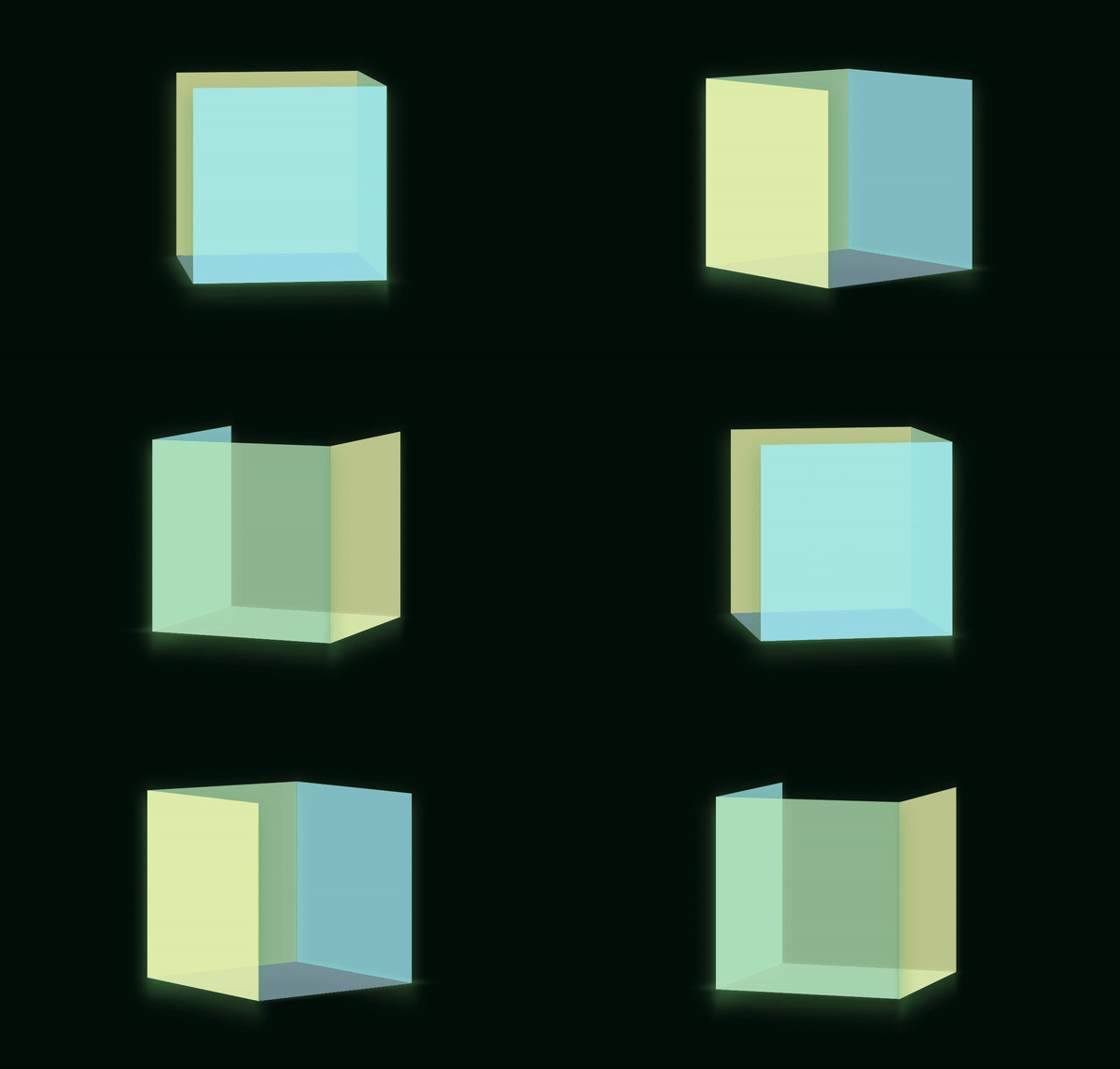
I apologize in advance for the several GIFs coming your way to eat your internet bandwidth, but I hope it’s worth it! ??
But wait, two of the cube’s sides are missing!!!
I did that deliberately so that it would be easier to understand and visualize. I will add a link to the complete code for getting the above result at the end of the article!
First Things First — How does Translate Work?
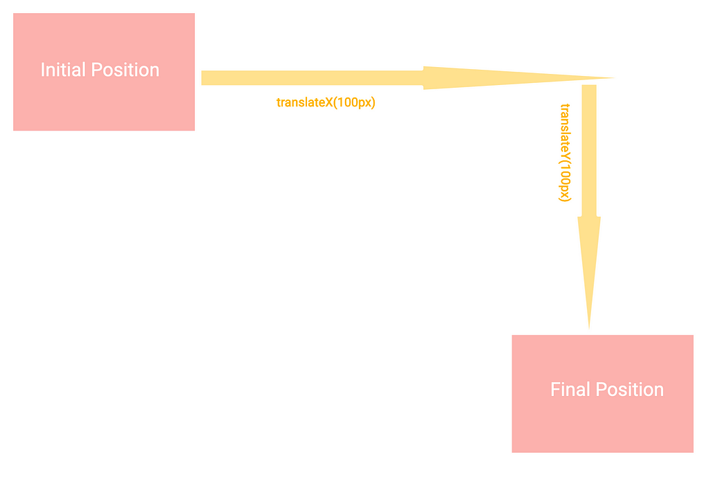
The translate method basically moves an HTML element from its actual position without messing with any other sibling/parent element on the layout tree. To summarize, the translateX method moves the element left and right, whereas the translateY method moves it up and down.
But What the Heck is the Z Axis?
To visualize how translate works along the Z-axis, imagine your div moving towards and away from you instead of top-bottom or left-right in the screen —
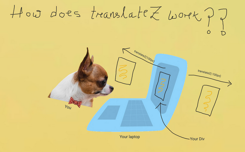
How is that possible? An website is viewed like a page of a book right? How can anything possibly come out of the screen towards you (or, go away from you)?
Your div obviously does not come out in real, it gives you a feeling that it does. Let’s check side by side how altering translate values look along different axes —
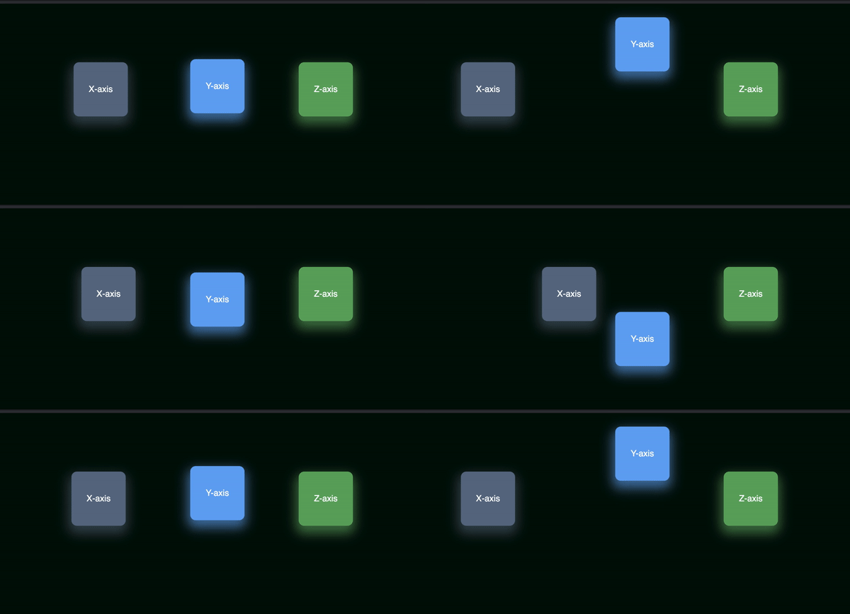
I don’t know about you, but the green box does not look like coming towards or going away from me. ?
How do we solve this? We need to change our perspective a bit. ?
The CSS perspective property
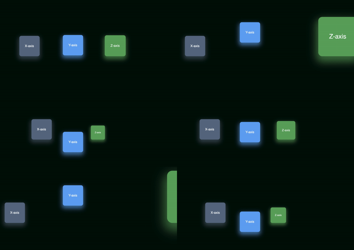
You will not be able to visually detect changes in Z-axis without setting the right perspective value.
The perspective property defines how far the object is away from the user. So, a lower value will result in a more intensive 3D effect than a higher value.
Source — W3 Schools
Let’s add the following CSS to the parent element of the three boxes —
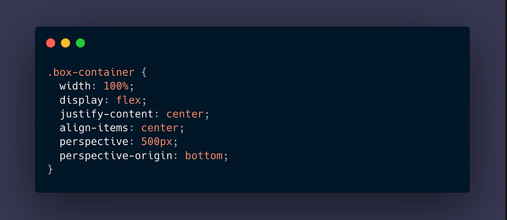
And, voila —
The Rotate Method
As the name suggests, rotate works by rotating the element along one of the three axes, given a degree. However, we will need a little visualization on how rotate works along different axes.


The Cube
Let us finally start with the cube sides! We will have four faces — bottom, front, back and left —
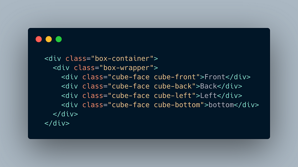
I have added some CSS to the main wrapper of the cube as well.
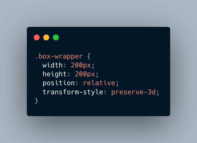
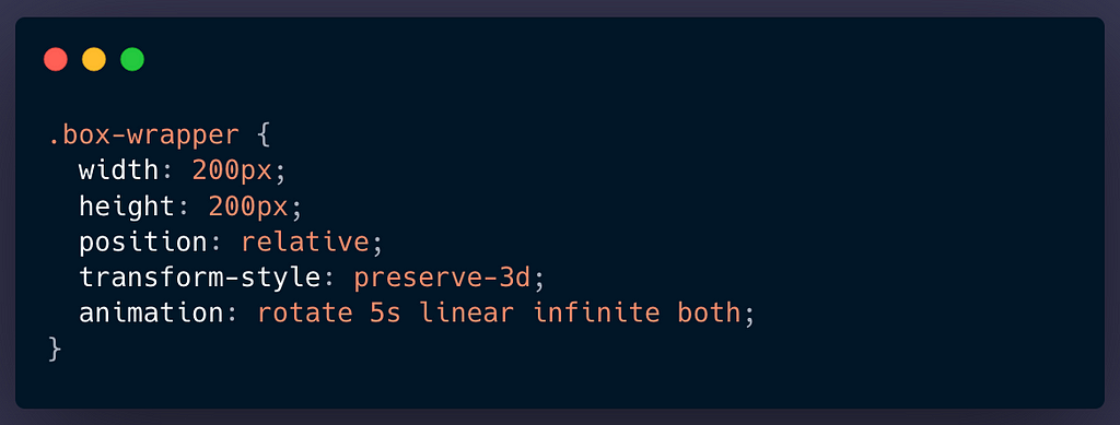
Note that I have added transform-style: preserve-3d; to the container. This is a crucial step for rendering 3D children. The size of each face is 200pxin width and height and we need to keep this value in mind as we will have to add translate values with respect to the dimensions of the sides.
For our cube, each face is going to be an absolute division and I have added text indicating which face it is. I have added opacity: 0.5 for each face so that the overlap is clear —
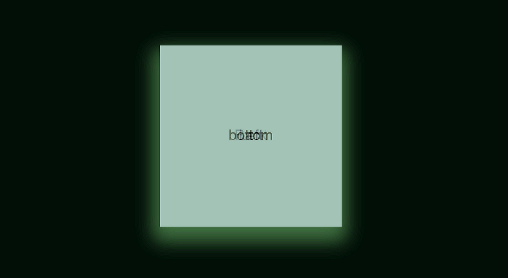
To bring the front face to the front, we add translateZ(100px) to it.
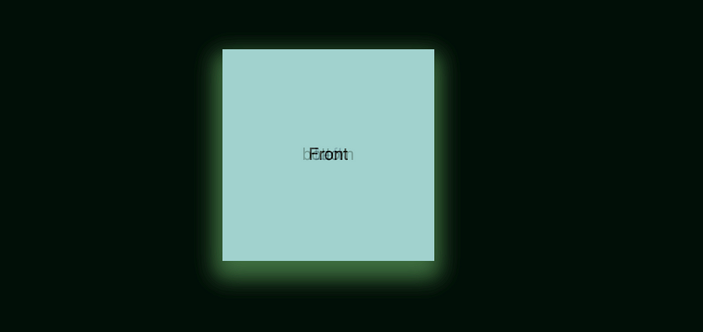
Well, this is how it looks. ?
So how can we make this 3D-ish? Our knowledge of perspective comes handy here.
Adding this CSS to our outer —
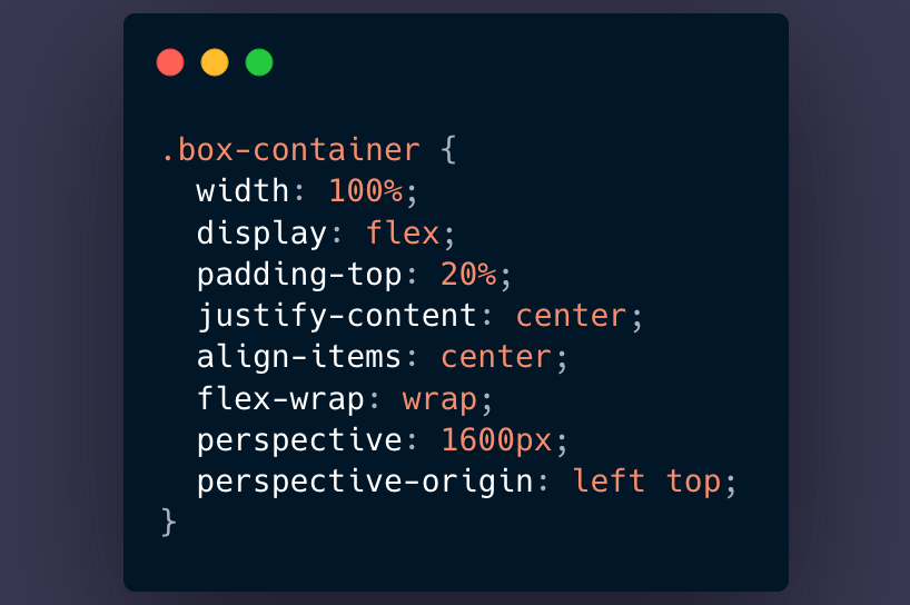
Also, let us make our back-face go backwards. Hence, we will add the opposite of what we added to the front face.
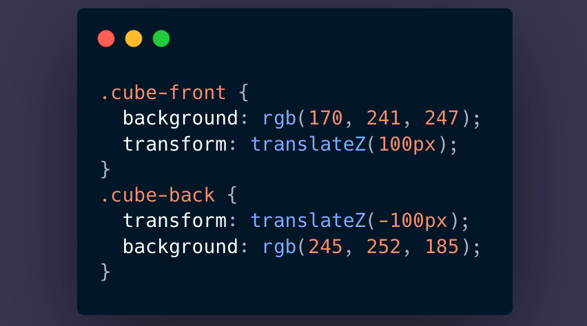
THE RESULT —
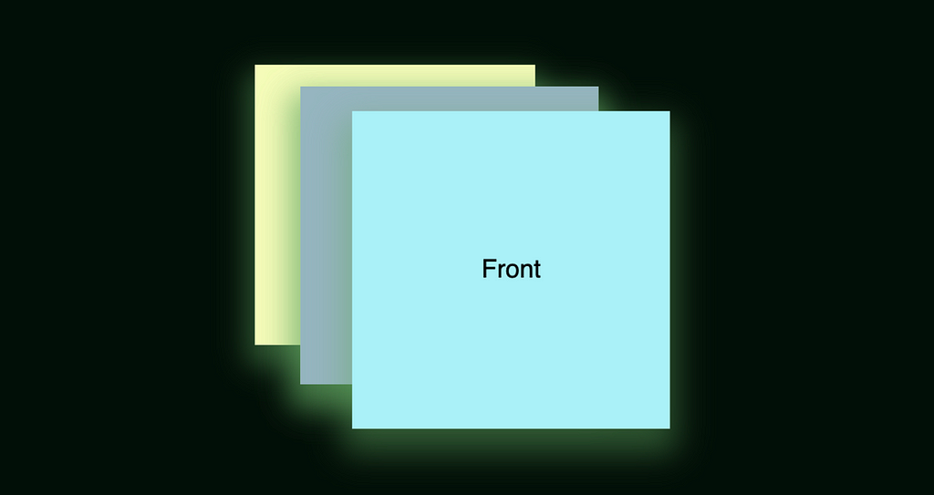
Are you able to visualize the front face coming towards you and the back face (yellow one) going away? If it is still not visual enough, let us try rotating the cube wrapper a bit -
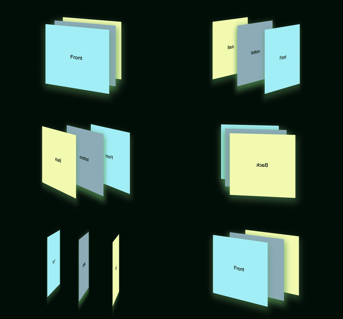
Amazing isn’t it?
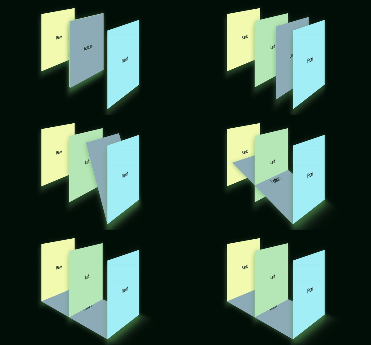
Next up, we need to fix the bottom face ?♀️. To put the bottom face in place, we are going to rotate it by 90-degrees along the X-axis —
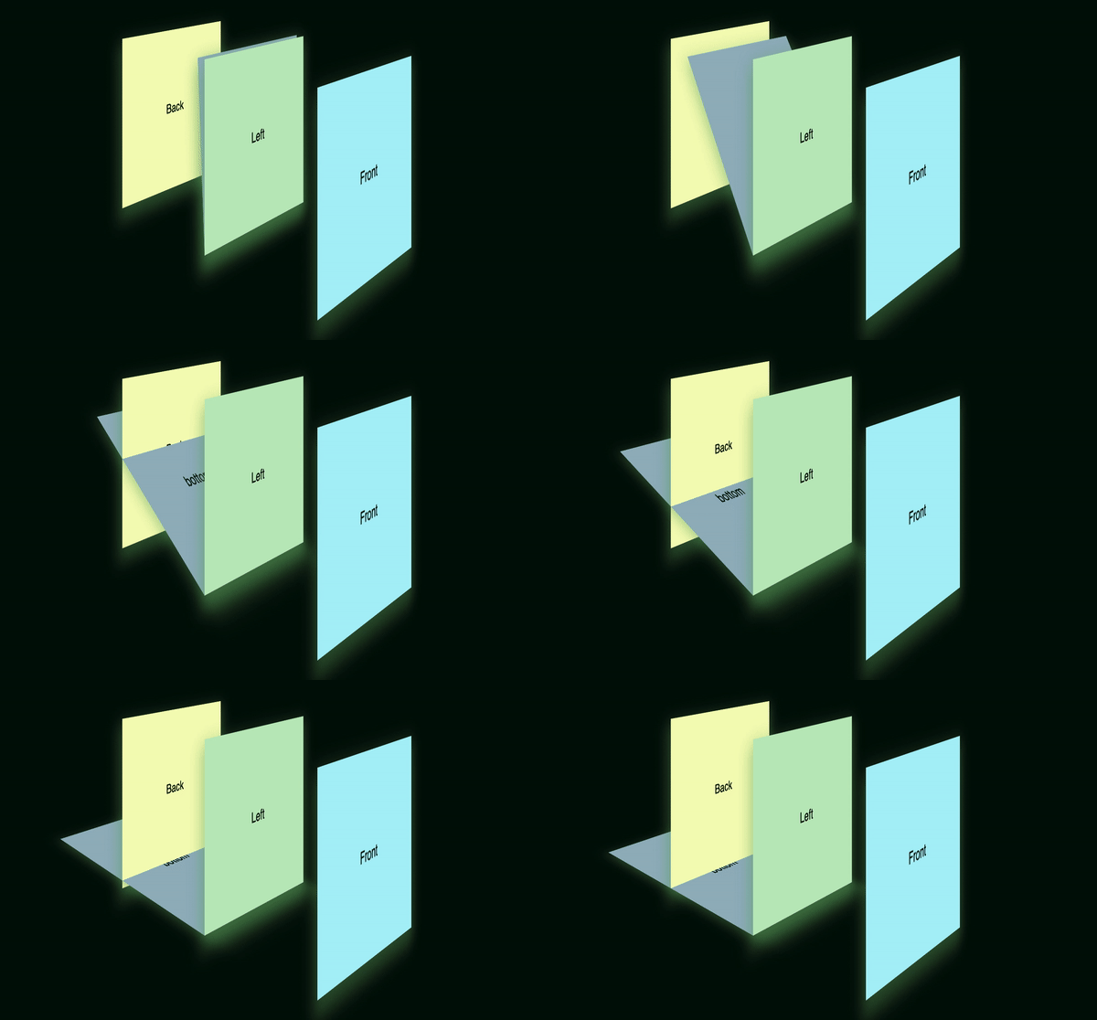
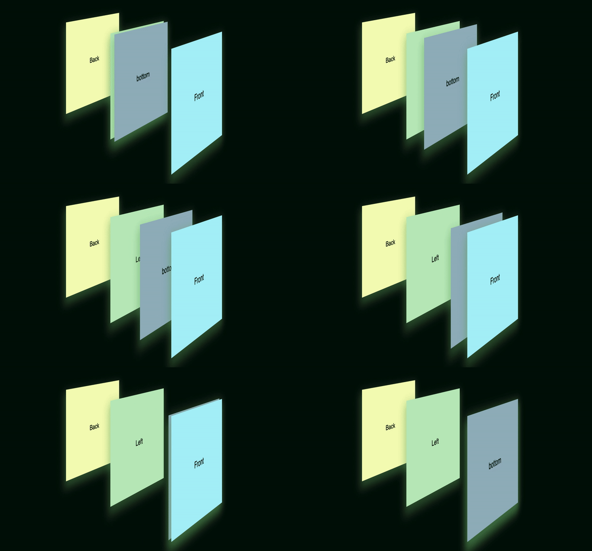
We have to move its position as well so that it sits just between the front and back face of the cube. What we can do is, move the bottom face in line with the front face and then rotate it. Sounds confusing?
Step — 1: Aligning the bottom face with the front face
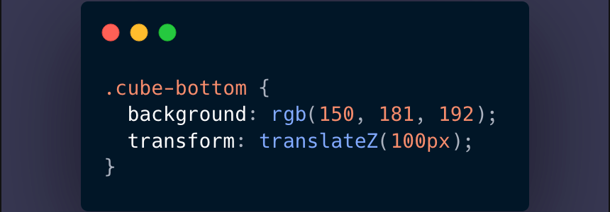
CSS—
Result —
Step — 2: Rotating bottom face by 90 degrees
CSS—

Result —
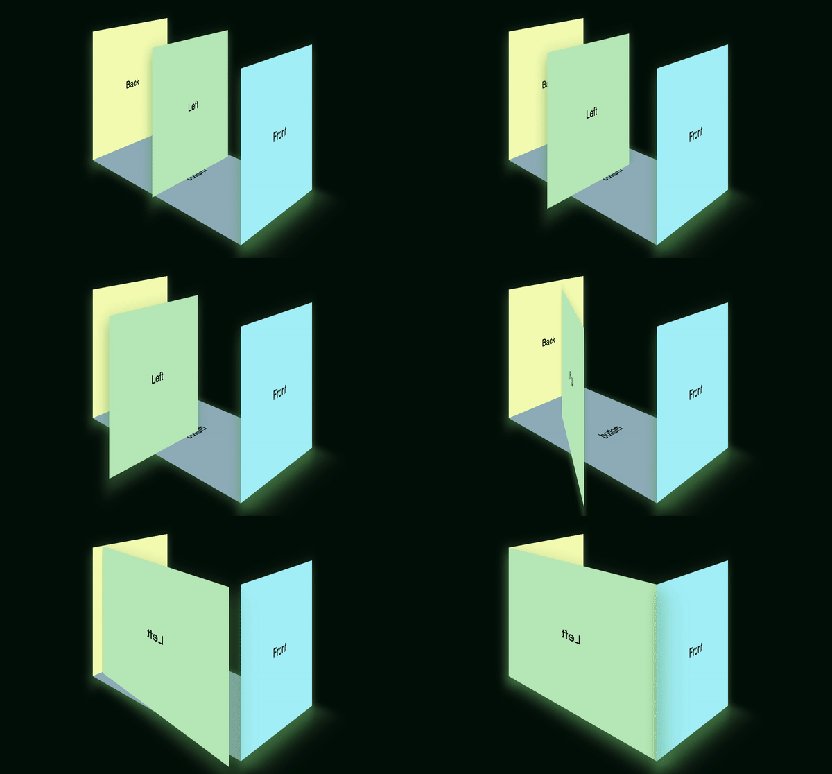
The bottom face is now safe and sound in its place. But the left face is kinda stuck in the middle. ?♀️ First, we need to move it to the side and then rotate it. Let’s move it by -100px on the X axis and then rotate it on the Y axis.
CSS—

Result —
And voila! Our almost cube is almost done. I would suggest you to play around with various values of translate and rotate in every axis and try adding the top and right axis to make a full cube.
Now, last but not the least, lets rotate our cube ?
CSS—
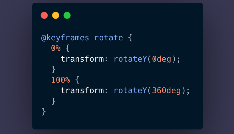
Adding the above animation to our box-wrapper —
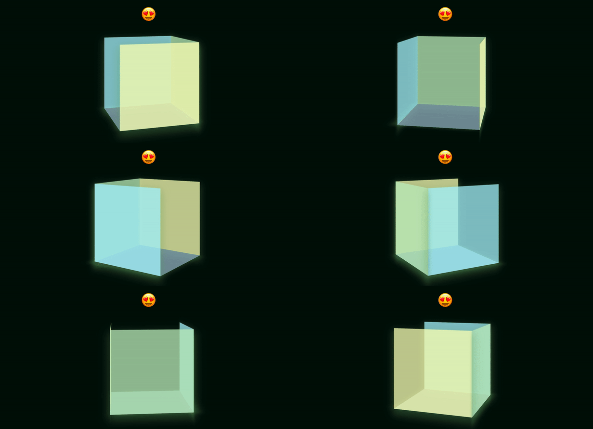
And the result ?? —
Refer to this repository for a working code of the same and play around because CSS 3D is a pool of magic. ?
Please note — I have tweaked the perspective value and added animations to achieve final position of the side to illustrate the changes with more clarity. Also, I had rotated the box-wrapper a little so that the changes are most visible from the right angle.
Thank you so much for reaching the end of the article. Follow me on twitter to be in touch. ?
Cheers!
CSS is magic, its time you try 3D was originally published in Level Up Coding on Medium, where people are continuing the conversation by highlighting and responding to this story.
This content originally appeared on Level Up Coding - Medium and was authored by Ankita Chakraborty
Ankita Chakraborty | Sciencx (2021-07-14T21:50:38+00:00) CSS is magic, its time you try 3D. Retrieved from https://www.scien.cx/2021/07/14/css-is-magic-its-time-you-try-3d/
Please log in to upload a file.
There are no updates yet.
Click the Upload button above to add an update.
