This content originally appeared on
A List Apart: The Full Feed and was authored by The fine folks at A List Apart
I’m not sure when I first heard this quote, but it’s something that has stayed with me over the years. How do you create services for situations you can’t imagine? Or design products that work on devices yet to be invented?
Flash, Photoshop, and responsive design
When I first started designing websites, my go-to software was Photoshop. I created a 960px canvas and set about creating a layout that I would later drop content in. The development phase was about attaining pixel-perfect accuracy using fixed widths, fixed heights, and absolute positioning.
Ethan Marcotte’s talk at An Event Apart and subsequent article “Responsive Web Design” in A List Apart in 2010 changed all this. I was sold on responsive design as soon as I heard about it, but I was also terrified. The pixel-perfect designs full of magic numbers that I had previously prided myself on producing were no longer good enough.
The fear wasn’t helped by my first experience with responsive design. My first project was to take an existing fixed-width website and make it responsive. What I learned the hard way was that you can’t just add responsiveness at the end of a project. To create fluid layouts, you need to plan throughout the design phase.
A new way to design
Designing responsive or fluid sites has always been about removing limitations, producing content that can be viewed on any device. It relies on the use of percentage-based layouts, which I initially achieved with native CSS and utility classes:
.column-span-6 {
  width: 49%;
  float: left;
  margin-right: 0.5%;
  margin-left: 0.5%;
}


.column-span-4 {
  width: 32%;
  float: left;
  margin-right: 0.5%;
  margin-left: 0.5%;
}

.column-span-3 {
  width: 24%;
  float: left;
  margin-right: 0.5%;
  margin-left: 0.5%;
}
Then with Sass so I could take advantage of @includes to re-use repeated blocks of code and move back to more semantic markup:
.logo {
  @include colSpan(6);
}

.search {
  @include colSpan(3);
}

.social-share {
  @include colSpan(3);
}
Media queries
The second ingredient for responsive design is media queries. Without them, content would shrink to fit the available space regardless of whether that content remained readable (The exact opposite problem occurred with the introduction of a mobile-first approach).
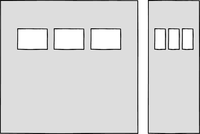
Media queries prevented this by allowing us to add breakpoints where the design could adapt. Like most people, I started out with three breakpoints: one for desktop, one for tablets, and one for mobile. Over the years, I added more and more for phablets, wide screens, and so on.
For years, I happily worked this way and improved both my design and front-end skills in the process. The only problem I encountered was making changes to content, since with our Sass grid system in place, there was no way for the site owners to add content without amending the markup—something a small business owner might struggle with. This is because each row in the grid was defined using a div as a container. Adding content meant creating new row markup, which requires a level of HTML knowledge.
Row markup was a staple of early responsive design, present in all the widely used frameworks like Bootstrap and Skeleton.
<section class="row">
  <div class="column-span-4">1 of 7</div>
  <div class="column-span-4">2 of 7</div>
  <div class="column-span-4">3 of 7</div>
</section>

<section class="row">
  <div class="column-span-4">4 of 7</div>
  <div class="column-span-4">5 of 7</div>
  <div class="column-span-4">6 of 7</div>
</section>

<section class="row">
  <div class="column-span-4">7 of 7</div>
</section>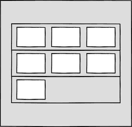
Another problem arose as I moved from a design agency building websites for small- to medium-sized businesses, to larger in-house teams where I worked across a suite of related sites. In those roles I started to work much more with reusable components.
Our reliance on media queries resulted in components that were tied to common viewport sizes. If the goal of component libraries is reuse, then this is a real problem because you can only use these components if the devices you’re designing for correspond to the viewport sizes used in the pattern library—in the process not really hitting that “devices that don’t yet exist” goal.
Then there’s the problem of space. Media queries allow components to adapt based on the viewport size, but what if I put a component into a sidebar, like in the figure below?
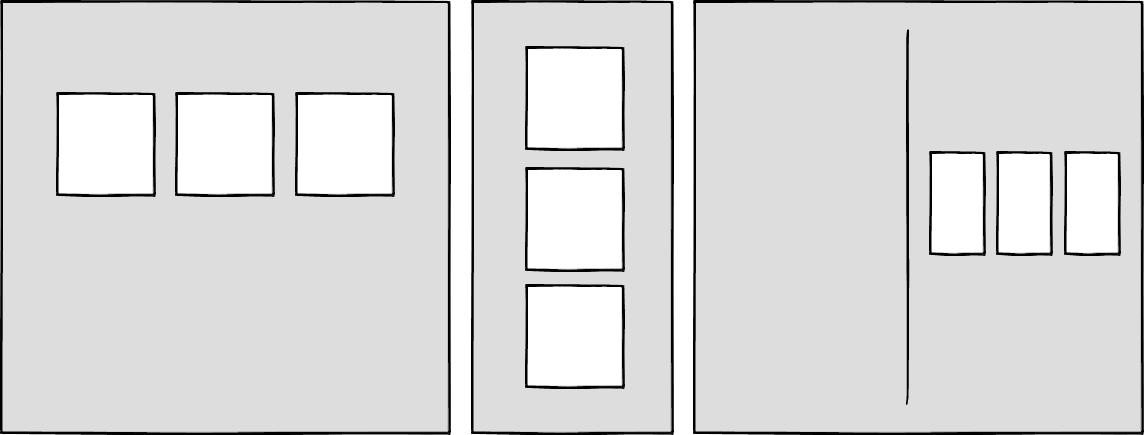
Container queries: our savior or a false dawn?
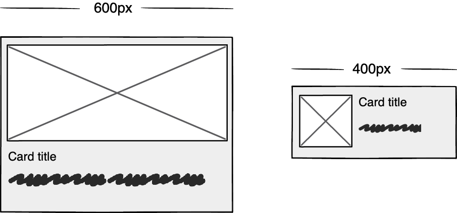
Container queries have long been touted as an improvement upon media queries, but at the time of writing are unsupported in most browsers. There are JavaScript workarounds, but they can create dependency and compatibility issues. The basic theory underlying container queries is that elements should change based on the size of their parent container and not the viewport width, as seen in the following illustrations.
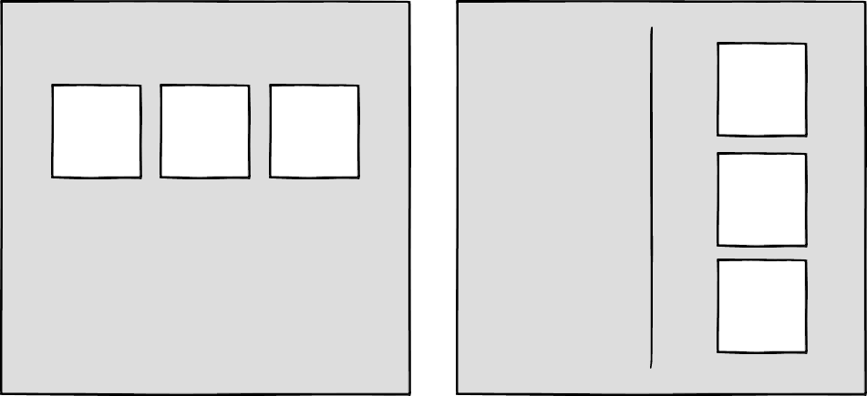
One of the biggest arguments in favor of container queries is that they help us create components or design patterns that are truly reusable because they can be picked up and placed anywhere in a layout. This is an important step in moving toward a form of component-based design that works at any size on any device.
In other words, responsive components to replace responsive layouts.
Container queries will help us move from designing pages that respond to the browser or device size to designing components that can be placed in a sidebar or in the main content, and respond accordingly.
My concern is that we are still using layout to determine when a design needs to adapt. This approach will always be restrictive, as we will still need pre-defined breakpoints. For this reason, my main question with container queries is, How would we decide when to change the CSS used by a component?
A component library removed from context and real content is probably not the best place for that decision.
As the diagrams below illustrate, we can use container queries to create designs for specific container widths, but what if I want to change the design based on the image size or ratio?
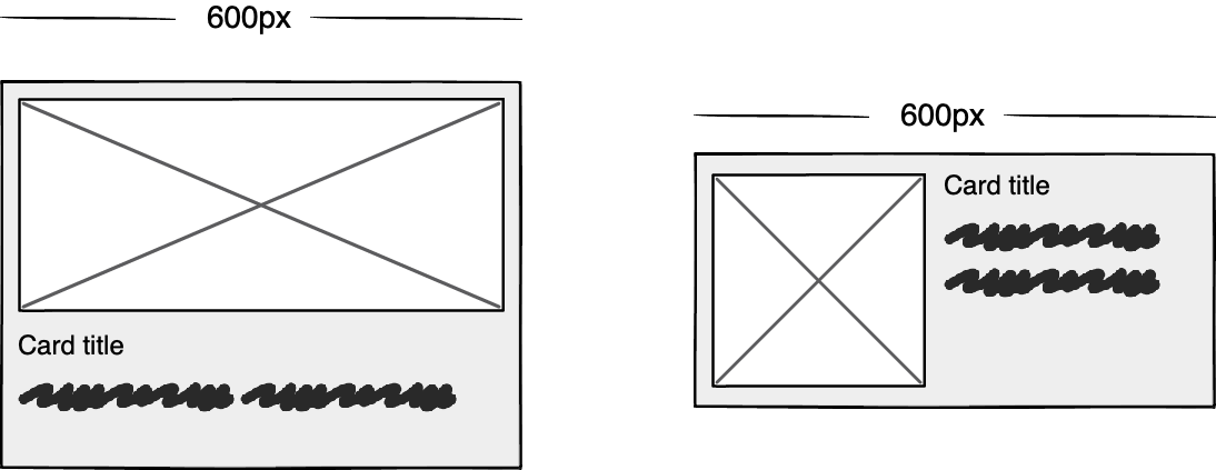
In this example, the dimensions of the container are not what should dictate the design; rather, the image is.
It’s hard to say for sure whether container queries will be a success story until we have solid cross-browser support for them. Responsive component libraries would definitely evolve how we design and would improve the possibilities for reuse and design at scale. But maybe we will always need to adjust these components to suit our content.
CSS is changing
Whilst the container query debate rumbles on, there have been numerous advances in CSS that change the way we think about design. The days of fixed-width elements measured in pixels and floated div elements used to cobble layouts together are long gone, consigned to history along with table layouts. Flexbox and CSS Grid have revolutionized layouts for the web. We can now create elements that wrap onto new rows when they run out of space, not when the device changes.
.wrapper {
  display: grid;
  grid-template-columns: repeat(auto-fit, 450px);
  gap: 10px;
}
The repeat() function paired with auto-fit or auto-fill allows us to specify how much space each column should use while leaving it up to the browser to decide when to spill the columns onto a new line. Similar things can be achieved with Flexbox, as elements can wrap over multiple rows and “flex” to fill available space.
.wrapper {
  display: flex;
  flex-wrap: wrap;
  justify-content: space-between;
}

.child {
  flex-basis: 32%;
  margin-bottom: 20px;
}
The biggest benefit of all this is you don’t need to wrap elements in container rows. Without rows, content isn’t tied to page markup in quite the same way, allowing for removals or additions of content without additional development.
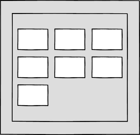
This is a big step forward when it comes to creating designs that allow for evolving content, but the real game changer for flexible designs is CSS Subgrid.
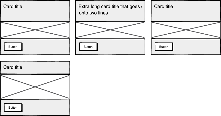
Remember the days of crafting perfectly aligned interfaces, only for the customer to add an unbelievably long header almost as soon as they're given CMS access, like the illustration below?

Subgrid allows elements to respond to adjustments in their own content and in the content of sibling elements, helping us create designs more resilient to change.
.wrapper {
  display: grid;
  grid-template-columns: repeat(auto-fit, minmax(150px, 1fr));
     grid-template-rows: auto 1fr auto;
  gap: 10px;
}

.sub-grid {
  display: grid;
  grid-row: span 3;
  grid-template-rows: subgrid; /* sets rows to parent grid */
}
CSS Grid allows us to separate layout and content, thereby enabling flexible designs. Meanwhile, Subgrid allows us to create designs that can adapt in order to suit morphing content. Subgrid at the time of writing is only supported in Firefox but the above code can be implemented behind an @supports feature query.
Intrinsic layouts
I’d be remiss not to mention intrinsic layouts, the term created by Jen Simmons to describe a mixture of new and old CSS features used to create layouts that respond to available space.
Responsive layouts have flexible columns using percentages. Intrinsic layouts, on the other hand, use the fr unit to create flexible columns that won’t ever shrink so much that they render the content illegible.
fr units is a way to say I want you to distribute the extra space in this way, but...don’t ever make it smaller than the content that’s inside of it.
—Jen Simmons, “Designing Intrinsic Layouts”
Intrinsic layouts can also utilize a mixture of fixed and flexible units, allowing the content to dictate the space it takes up.
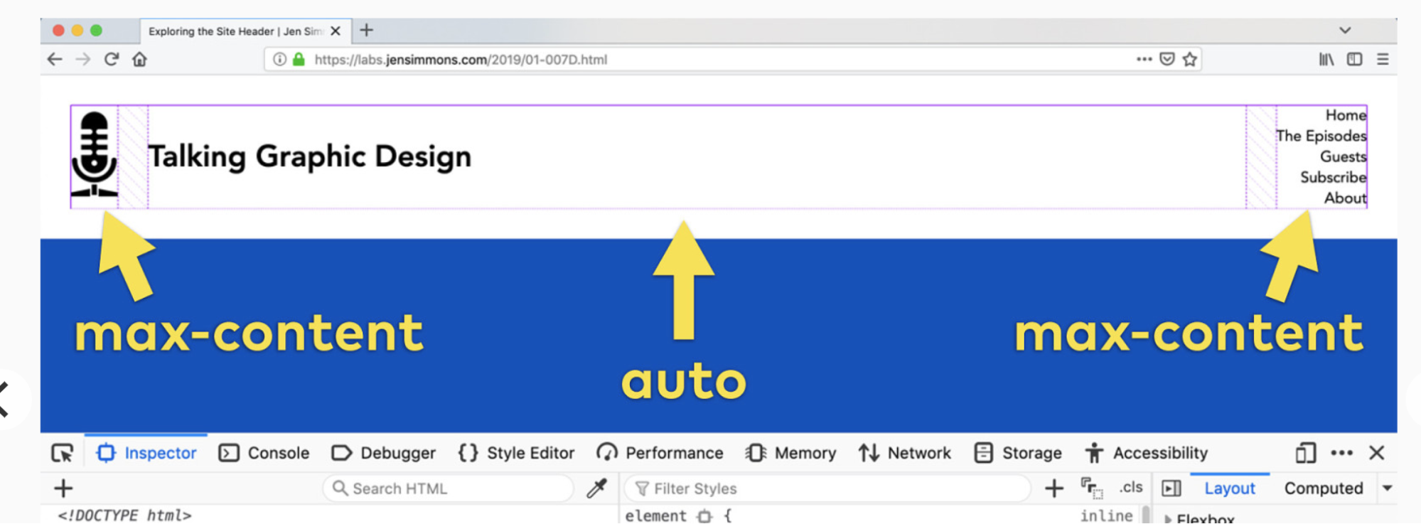
What makes intrinsic design stand out is that it not only creates designs that can withstand future devices but also helps scale design without losing flexibility. Components and patterns can be lifted and reused without the prerequisite of having the same breakpoints or the same amount of content as in the previous implementation.
We can now create designs that adapt to the space they have, the content within them, and the content around them. With an intrinsic approach, we can construct responsive components without depending on container queries.
Another 2010 moment?
This intrinsic approach should in my view be every bit as groundbreaking as responsive web design was ten years ago. For me, it’s another “everything changed” moment.
But it doesn’t seem to be moving quite as fast; I haven’t yet had that same career-changing moment I had with responsive design, despite the widely shared and brilliant talk that brought it to my attention.
One reason for that could be that I now work in a large organization, which is quite different from the design agency role I had in 2010. In my agency days, every new project was a clean slate, a chance to try something new. Nowadays, projects use existing tools and frameworks and are often improvements to existing websites with an existing codebase.
Another could be that I feel more prepared for change now. In 2010 I was new to design in general; the shift was frightening and required a lot of learning. Also, an intrinsic approach isn’t exactly all-new; it’s about using existing skills and existing CSS knowledge in a different way.
You can’t framework your way out of a content problem
Another reason for the slightly slower adoption of intrinsic design could be the lack of quick-fix framework solutions available to kick-start the change.
Responsive grid systems were all over the place ten years ago. With a framework like Bootstrap or Skeleton, you had a responsive design template at your fingertips.
Intrinsic design and frameworks do not go hand in hand quite so well because the benefit of having a selection of units is a hindrance when it comes to creating layout templates. The beauty of intrinsic design is combining different units and experimenting with techniques to get the best for your content.
And then there are design tools. We probably all, at some point in our careers, used Photoshop templates for desktop, tablet, and mobile devices to drop designs in and show how the site would look at all three stages.
How do you do that now, with each component responding to content and layouts flexing as and when they need to? This type of design must happen in the browser, which personally I’m a big fan of.
The debate about “whether designers should code” is another that has rumbled on for years. When designing a digital product, we should, at the very least, design for a best- and worst-case scenario when it comes to content. To do this in a graphics-based software package is far from ideal. In code, we can add longer sentences, more radio buttons, and extra tabs, and watch in real time as the design adapts. Does it still work? Is the design too reliant on the current content?
Personally, I look forward to the day intrinsic design is the standard for design, when a design component can be truly flexible and adapt to both its space and content with no reliance on device or container dimensions.
Content first
Content is not constant. After all, to design for the unknown or unexpected we need to account for content changes like our earlier Subgrid card example that allowed the cards to respond to adjustments to their own content and the content of sibling elements.
Thankfully, there’s more to CSS than layout, and plenty of properties and values can help us put content first. Subgrid and pseudo-elements like ::first-line and ::first-letter help to separate design from markup so we can create designs that allow for changes.
Instead of old markup hacks like this—
<p>
  <span class="first-line">First line of text with different styling</span>...
</p>
—we can target content based on where it appears.
.element::first-line {
  font-size: 1.4em;
}

.element::first-letter {
  color: red;
}
Much bigger additions to CSS include logical properties, which change the way we construct designs using logical dimensions (start and end) instead of physical ones (left and right), something CSS Grid also does with functions like min(), max(), and clamp().
This flexibility allows for directional changes according to content, a common requirement when we need to present content in multiple languages. In the past, this was often achieved with Sass mixins but was often limited to switching from left-to-right to right-to-left orientation.
In the Sass version, directional variables need to be set.
$direction: rtl;
$opposite-direction: ltr;

$start-direction: right;
$end-direction: left;
These variables can be used as values—
body {
  direction: $direction;
  text-align: $start-direction;
}
—or as properties.
margin-#{$end-direction}: 10px;
padding-#{$start-direction}: 10px;
However, now we have native logical properties, removing the reliance on both Sass (or a similar tool) and pre-planning that necessitated using variables throughout a codebase. These properties also start to break apart the tight coupling between a design and strict physical dimensions, creating more flexibility for changes in language and in direction.
margin-block-end: 10px;
padding-block-start: 10px;
There are also native start and end values for properties like text-align, which means we can replace text-align: right with text-align: start.
Like the earlier examples, these properties help to build out designs that aren’t constrained to one language; the design will reflect the content’s needs.

Fixed and fluid
We briefly covered the power of combining fixed widths with fluid widths with intrinsic layouts. The min() and max() functions are a similar concept, allowing you to specify a fixed value with a flexible alternative.
For min() this means setting a fluid minimum value and a maximum fixed value.
.element {
  width: min(50%, 300px);
}
The element in the figure above will be 50% of its container as long as the element’s width doesn’t exceed 300px.
For max() we can set a flexible max value and a minimum fixed value.
.element {
  width: max(50%, 300px);
}
Now the element will be 50% of its container as long as the element’s width is at least 300px. This means we can set limits but allow content to react to the available space.
The clamp() function builds on this by allowing us to set a preferred value with a third parameter. Now we can allow the element to shrink or grow if it needs to without getting to a point where it becomes unusable.
.element {
  width: clamp(300px, 50%, 600px);
}
This time, the element’s width will be 50% (the preferred value) of its container but never less than 300px and never more than 600px.
With these techniques, we have a content-first approach to responsive design. We can separate content from markup, meaning the changes users make will not affect the design. We can start to future-proof designs by planning for unexpected changes in language or direction. And we can increase flexibility by setting desired dimensions alongside flexible alternatives, allowing for more or less content to be displayed correctly.
Situation first
Thanks to what we’ve discussed so far, we can cover device flexibility by changing our approach, designing around content and space instead of catering to devices. But what about that last bit of Jeffrey Zeldman’s quote, “...situations you haven’t imagined”?
It’s a very different thing to design for someone seated at a desktop computer as opposed to someone using a mobile phone and moving through a crowded street in glaring sunshine. Situations and environments are hard to plan for or predict because they change as people react to their own unique challenges and tasks.
This is why choice is so important. One size never fits all, so we need to design for multiple scenarios to create equal experiences for all our users.
Thankfully, there is a lot we can do to provide choice.
Responsible design
“There are parts of the world where mobile data is prohibitively expensive, and where there is little or no broadband infrastructure.”
“I Used the Web for a Day on a 50 MB Budget”
Chris Ashton
One of the biggest assumptions we make is that people interacting with our designs have a good wifi connection and a wide screen monitor. But in the real world, our users may be commuters traveling on trains or other forms of transport using smaller mobile devices that can experience drops in connectivity. There is nothing more frustrating than a web page that won’t load, but there are ways we can help users use less data or deal with sporadic connectivity.
The srcset attribute allows the browser to decide which image to serve. This means we can create smaller ‘cropped’ images to display on mobile devices in turn using less bandwidth and less data.
<img
  src="image-file.jpg"
  srcset="large.jpg 1024w,
             medium.jpg 640w,
             small.jpg 320w"
     alt="Image alt text" />
The preload attribute can also help us to think about how and when media is downloaded. It can be used to tell a browser about any critical assets that need to be downloaded with high priority, improving perceived performance and the user experience.
<link rel="stylesheet" href="style.css"> <!--Standard stylesheet markup-->
<link rel="preload" href="style.css" as="style"> <!--Preload stylesheet markup-->
There’s also native lazy loading, which indicates assets that should only be downloaded when they are needed.
<img src="image.png" loading="lazy" alt="…">With srcset, preload, and lazy loading, we can start to tailor a user’s experience based on the situation they find themselves in. What none of this does, however, is allow the user themselves to decide what they want downloaded, as the decision is usually the browser’s to make.
So how can we put users in control?
The return of media queries
Media queries have always been about much more than device sizes. They allow content to adapt to different situations, with screen size being just one of them.
We’ve long been able to check for media types like print and speech and features such as hover, resolution, and color. These checks allow us to provide options that suit more than one scenario; it’s less about one-size-fits-all and more about serving adaptable content.
As of this writing, the Media Queries Level 5 spec is still under development. It introduces some really exciting queries that in the future will help us design for multiple other unexpected situations.
For example, there’s a light-level feature that allows you to modify styles if a user is in sunlight or darkness. Paired with custom properties, these features allow us to quickly create designs or themes for specific environments.
@media (light-level: normal) {
  --background-color: #fff;
  --text-color: #0b0c0c;
}

@media (light-level: dim) {
  --background-color: #efd226;
  --text-color: #0b0c0c;
}
Another key feature of the Level 5 spec is personalization. Instead of creating designs that are the same for everyone, users can choose what works for them. This is achieved by using features like prefers-reduced-data, prefers-color-scheme, and prefers-reduced-motion, the latter two of which already enjoy broad browser support. These features tap into preferences set via the operating system or browser so people don’t have to spend time making each site they visit more usable.
Media queries like this go beyond choices made by a browser to grant more control to the user.
Expect the unexpected
In the end, the one thing we should always expect is for things to change. Devices in particular change faster than we can keep up, with foldable screens already on the market.
We can’t design the same way we have for this ever-changing landscape, but we can design for content. By putting content first and allowing that content to adapt to whatever space surrounds it, we can create more robust, flexible designs that increase the longevity of our products.
A lot of the CSS discussed here is about moving away from layouts and putting content at the heart of design. From responsive components to fixed and fluid units, there is so much more we can do to take a more intrinsic approach. Even better, we can test these techniques during the design phase by designing in-browser and watching how our designs adapt in real-time.
When it comes to unexpected situations, we need to make sure our products are usable when people need them, whenever and wherever that might be. We can move closer to achieving this by involving users in our design decisions, by creating choice via browsers, and by giving control to our users with user-preference-based media queries.
Good design for the unexpected should allow for change, provide choice, and give control to those we serve: our users themselves.
This content originally appeared on
A List Apart: The Full Feed and was authored by The fine folks at A List Apart
The fine folks at A List Apart | Sciencx (2021-07-15T13:00:00+00:00) Designing for the Unexpected. Retrieved from https://www.scien.cx/2021/07/15/designing-for-the-unexpected-261/
Please log in to upload a file.
There are no updates yet.
Click the Upload button above to add an update.
