This content originally appeared on DEV Community and was authored by Foolish Developer
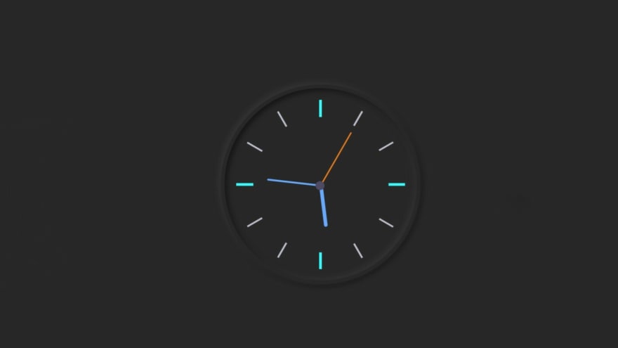
In this article I am going to show you how to make an analog clock using HTML CSS and JavaScript code. I have already designed many types of analog clocks. This watch is made in the shape of a dark neumorphism design. Like a typical analog kite there are three hands to indicate hours minutes and seconds. Here I have used symbols instead of numbers from 1 to 12.
You can watch the live demo to see how this analog clock works. Since I made it with the help of neumorphism design, I have used the same color in the background of the clock and in the background of the page. First of all I made a box with 30 rem width and 30 rem height on a web page. Border-radius 50% has been used to round this box. I have used box-shadow here to implement neumorphism design.
It's very simple and in general I made. Below I show the complete step-by-step how I made it analog clock. First of all you create an HTML and CSS file. Be sure to attach your CSS file to the html file.
Step 1: Create the basic design of the clock
I have made the background of this analog clock using the following HTML and CSS code. I created the structure of this clock using the code <div class = "clock"></div>. First of all I gave the background color of the page (background: # 282828;) in the CSS code.
<div class="clock">

</div>
 html {
  background: #282828;
  text-align: center;
  font-size: 10px;
}

body {
  margin: 0;
  font-size: 2rem;
  display: flex;
  flex: 1;
  min-height: 100vh;
  align-items: center;
}

.clock {
  width: 30rem;
  height: 30rem;
  position: relative;
  padding: 2rem;
  border: 7px solid #282828;
  box-shadow: -4px -4px 10px rgba(67,67,67,0.5),
                inset 4px 4px 10px rgba(0,0,0,0.5),
                inset -4px -4px 10px rgba(67,67,67,0.5),
                4px 4px 10px rgba(0,0,0,0.3);
  border-radius: 50%;
  margin: 50px auto;

}
Step 2: Draw two colorful lines in the clock
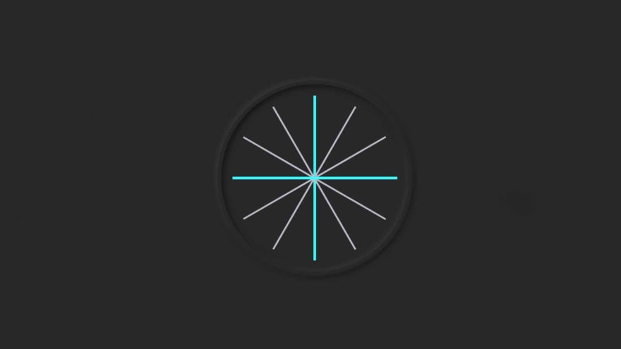
I used the following HTML and CSS codes to make the symbol that I used to indicate the time in this watch. First of all I made two lines using the following codes. I put those two lines at a 90 degree angle to each other. I used background: # 282828 to make the lines brighter.
<div class="outer-clock-face">

</div>
.outer-clock-face {
  position: relative;
  background: #282828;
  overflow: hidden;
  width: 100%;
  height: 100%;
  border-radius: 100%;
}

.outer-clock-face::after {
  -webkit-transform: rotate(90deg);
  -moz-transform: rotate(90deg);
  transform: rotate(90deg)
}

.outer-clock-face::after,
.outer-clock-face::before,
.outer-clock-face .marking{
  content: '';
  position: absolute;
  width: 5px;
  height: 100%;
  background: #1df52f;
  z-index: 0;
  left: 49%;
}
Step 3: Make four more lines
I have made four more lines in this clock using the following HTML and CSS code. Using CSS code, I have angled those lines as needed. I have used white color, you can use any other color.
<div class="marking marking-one"></div>
<div class="marking marking-two"></div>
<div class="marking marking-three"></div>
<div class="marking marking-four"></div>
.outer-clock-face .marking {
  background: #bdbdcb;
  width: 3px;
}

.outer-clock-face .marking.marking-one {
  -webkit-transform: rotate(30deg);
  -moz-transform: rotate(30deg);
  transform: rotate(30deg)
}

.outer-clock-face .marking.marking-two {
  -webkit-transform: rotate(60deg);
  -moz-transform: rotate(60deg);
  transform: rotate(60deg)
}

.outer-clock-face .marking.marking-three {
  -webkit-transform: rotate(120deg);
  -moz-transform: rotate(120deg);
  transform: rotate(120deg)
}

.outer-clock-face .marking.marking-four {
  -webkit-transform: rotate(150deg);
  -moz-transform: rotate(150deg);
  transform: rotate(150deg)
}
Step 4: Draw a circle in the middle of the analog clock
I made a circle in the middle of this clock. This circle is at the junction of pre-drawn lines. The resulting lines have become symbols.
          <div class="inner-clock-face">

          </div>
.inner-clock-face {
  position: absolute;
  top: 10%;
  left: 10%;
  width: 80%;
  height: 80%;
  background: #282828;
  -webkit-border-radius: 100%;
  -moz-border-radius: 100%;
  border-radius: 100%;
  z-index: 1;
}

.inner-clock-face::before {
  content: '';
  position: absolute;
  top: 50%;
  left: 50%;
  width: 16px;
  height: 16px;
  border-radius: 18px;
  margin-left: -9px;
  margin-top: -6px;
  background: #4d4b63;
  z-index: 11;
}
Step 5: Make three hands in the clock
Like a normal analog clock, I have used three hands to indicate hours, minutes and seconds. I created and designed those hands using the HTML and CSS code below.
    <div class="hand hour-hand"></div>
    <div class="hand min-hand"></div>
    <div class="hand second-hand"></div>
.hand {
  width: 50%;
  right: 50%;
  height: 6px;
  background: #61afff;
  position: absolute;
  top: 50%;
  border-radius: 6px;
  transform-origin: 100%;
  transform: rotate(90deg);
  transition-timing-function: cubic-bezier(0.1, 2.7, 0.58, 1);
}

.hand.hour-hand {
  width: 30%;
  z-index: 3;
}

.hand.min-hand {
  height: 3px;
  z-index: 10;
  width: 40%;
}

.hand.second-hand {
  background: #ee791a;
  width: 45%;
  height: 2px;
}
Step 6: Activate the analog clock with JavaScript code
We have done the work of designing this analog watch. Now we will implement this watch with the help of JavaScript. In this case I did not use any plugin or JavaScript library. I have only executed the hands in this watch using JavaScript. Even if you are a beginner, you can understand this design. Below each code I have given a complete explanation of why I used that code.
We are going to grab the reference for the following using querySelector():
➤ .second-hand
➤.min-hand
➤.hour-hand
const secondHand = document.querySelector('.second-hand');
const minsHand = document.querySelector('.min-hand');
const hourHand = document.querySelector('.hour-hand');
 function setDate() {
  const now = new Date();
➤ new Date() creates an instance of the Date class from which we can get all kinds of things like current date, hours, minutes, seconds, etc.
  const seconds = now.getSeconds();
  const secondsDegrees = ((seconds / 60) * 360) + 90;
  secondHand.style.transform = `rotate(${secondsDegrees}deg)`;
➤ I have stored in 'secondsDegrees' how the second hand will rotate.
➤ Then I use rotate(${secondsDegrees}deg) to rotate the hand.
➤ I divided by 60 becose 1 minute is equal to 60 seconds.
➤ I multiplied by 360 because a circle is formed by 360 degrees.
  const mins = now.getMinutes();
  const minsDegrees = ((mins / 60) * 360) + ((seconds/60)*6) + 90;
  minsHand.style.transform = `rotate(${minsDegrees}deg)`;
➤ I have stored in 'minsDegrees' how to turn the hand of the minute.
➤ Then userotate(${minsDegrees}deg) to rotate the hand.
➤ I divided by 60 because 1 hour is equal to 60 minutes.
➤ Added second hand position with minutes. Becase the minute's hand is in the right place depending on the second.
  const hour = now.getHours();
  const hourDegrees = ((hour / 12) * 360) + ((mins/60)*30) + 90;
  hourHand.style.transform = `rotate(${hourDegrees}deg)`;
}
setInterval(setDate, 1000);

setDate();
➤ We need to call this rotate() function every 1 second (1000 milliseconds).
Final Javascript code
const secondHand = document.querySelector('.second-hand');
const minsHand = document.querySelector('.min-hand');
const hourHand = document.querySelector('.hour-hand');

 function setDate() {
  const now = new Date();

  const seconds = now.getSeconds();
  const secondsDegrees = ((seconds / 60) * 360) + 90;
  secondHand.style.transform = `rotate(${secondsDegrees}deg)`;

  const mins = now.getMinutes();
  const minsDegrees = ((mins / 60) * 360) + ((seconds/60)*6) + 90;
  minsHand.style.transform = `rotate(${minsDegrees}deg)`;

  const hour = now.getHours();
  const hourDegrees = ((hour / 12) * 360) + ((mins/60)*30) + 90;
  hourHand.style.transform = `rotate(${hourDegrees}deg)`;
}

setInterval(setDate, 1000);

setDate();
Hopefully from this tutorial you have learned how to make this analog clock. If you have any questions you can ask me by commenting. Of course you can let me know if I did something wrong.
This content originally appeared on DEV Community and was authored by Foolish Developer
Foolish Developer | Sciencx (2021-07-15T15:30:09+00:00) Simple Analog Clock Using Html, CSS & Javascript. Retrieved from https://www.scien.cx/2021/07/15/simple-analog-clock-using-html-css-javascript/
Please log in to upload a file.
There are no updates yet.
Click the Upload button above to add an update.


