This content originally appeared on DEV Community and was authored by Itay Schechner
As a web developer, the #1 topic I've been struggling with is designing. I managed to master HTML\CSS, React.js, Node.js, TypeScript, Java and Spring Boot but something about my websites always felt wrong.
As I began working on my big project called Partydeck, this issue became a real struggle.
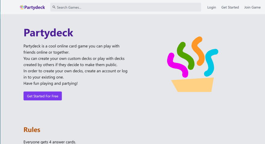
This is the homepage I had designed last March. It looks clean, the theme is clear, and it's easy to understand what the user is expected to do. Yet, something is missing.
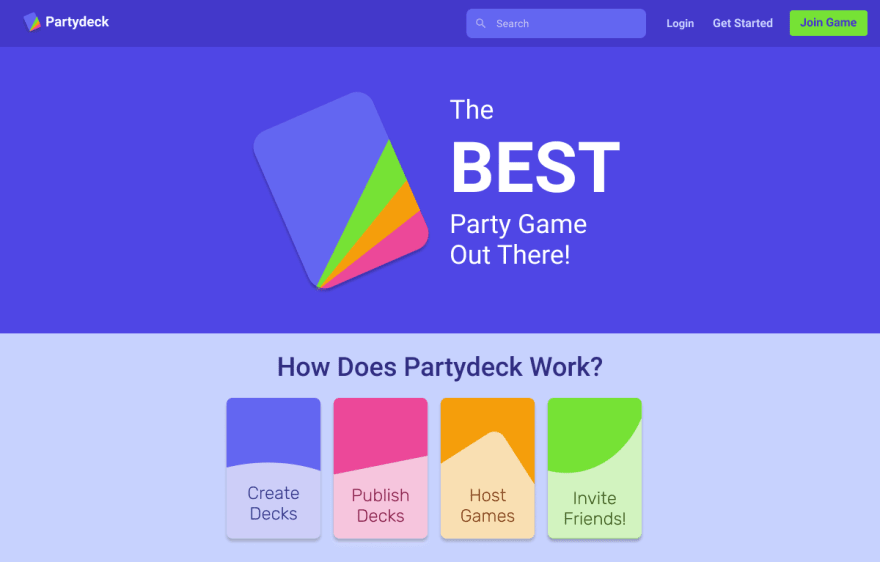
This is the homepage I am currently designing. You can see it is in a whole new level, containing colorful interfaces and is able to keep the user's eyes hooked for a longer time.
What to do?
Here are some of the tips I found the most inspiring and that have helped me the most. Do you have any other good tips? Let me know in the comments!
Use a designing software
The reason this is so important is because it's much more easy to experiment and see what works best when you design your website in an external software before actually programming it.
You don't have to master Photoshop or be the best Adobe user on the planet, just have the minimal understanding of the software of your choice.
My personal preference is Figma, because... it's made of React.js, which I absolutely love.
A great example of the usage of Figma for designing websites can be found in this video:
Get Inspired
If you design a To-Do app, get to Todoist, Any.do or any other website with a purpose close to yours and get inspired by their design.
In my case, my website is similar to Quizlet and Kahoot, so I visited their websites many times to get inspired.
Don't be afraid to use colors
The only website I have ever seen with an almost 100% monochromatic UI is Instagram, and the reason it looks good is because the posts are the ones who keep the user's eyes hooked. Unless you design a social media application, use a color theme.
I don't want you to pick an exact shade, but a color from a pre-made theme such as the Material color theme.
Once you have a color theme, here's what you do:
- What is your primary color? Use it for ~60% of your interface. In my case - the Tailwind.css indigo.
- The secondary color should be similar to the primary, but a bit lighter or darker. You can use different shades of the same color to spice things up.
- What are your accent colors? Picking one is interesting, but in the context of my application I thought I should pick more. Use it in unexpected locations.
A great usage of color themes can be found in the Quizlet website
About Me And My Project
Last October, My friend gave me an excellent app idea. I decided to develop it and gained tond of experience regarding app development, project management and product design. I'm planning on posting a lot about this topic later on.
Check out my project -
Partydeck - A cool online card game
The Partydeck app contains 3 microservices, all connected:
-
The live
server, responsible for creating live games, shufling the cards and generating game codes. Powered by Java and the Spring framework. -
The live
game, the fronendReact.jsapp that connects to the live server. -
The game
panel, a traditional MERN application to store and manage decks.
Want to give it a try?
- Go to the game panel url: https://partydeck-game-panel-iygnk5fpxq-ue.a.run.app
- Sign up and create a game (or choose one from the public library)
- Click 'play' to create a live game
- Invite your friends to play
License
This software has no open-srouce license, which means the default copyright laws apply to it. Under Github's terms of service, you can view and fork the code for this repository for private use.
For more information regarding non-licensed softwares: https://choosealicense.com/no-permission/
This content originally appeared on DEV Community and was authored by Itay Schechner
Itay Schechner | Sciencx (2021-07-19T14:01:57+00:00) How Can a Programmer Design a Website? (That is actually good). Retrieved from https://www.scien.cx/2021/07/19/how-can-a-programmer-design-a-website-that-is-actually-good/
Please log in to upload a file.
There are no updates yet.
Click the Upload button above to add an update.


