This content originally appeared on DEV Community and was authored by Rocky
Flexbox is a powerful, well-supported layout method that was introduced with the latest version of CSS, CSS3. With flexbox, it's easy to center elements on the page and create dynamic user interfaces that shrink and expand automatically.
Life was tough before Flexbox and Grid came, centering a div was so troublesome that it became a meme.
But fear no more, Flexbox and Grid have solved all our problems and things are so much easier now.
In this blog, we'll learn the fundamentals of flexbox and dynamic layouts.
? Use display: flex to Position Two Boxes
Placing the CSS property display: flex on an element allows you to use other flex properties to build a responsive page.
For example:
After applying display: flex property to parent element:
? Use the flex-direction Property
Adding display: flex to an element turns it into a flex container. This makes it possible to align any children of that element into rows or columns.
The flex-direction property specifies the direction of the items within the flex container
You do this by adding the flex-direction property to the parent item and setting it to row or column. Creating a row will align the children horizontally, and creating a column will align the children vertically.
Other options for flex-direction are row-reverse and column-reverse.
Note: The default value for the flex-direction property is row. This is the reason when we used display: flex on the boxes above they were aligned in a row automatically.
After applying row, row-reverse, column and column-reverse in flex-direction
They all are pretty intuitive.
? flex-direction: row
? flex-direction: row-reverse
? flex-direction: column
? flex-direction: column-reverse
? Use the flex-wrap Property to Wrap a Row or Column
If we have a large number of elements in the flex container, it can destroy the width of elements.
CSS flexbox has a feature to split a flex item into multiple rows (or columns). By default, a flex container will fit all flex items together. For example, a row will all be on one line.
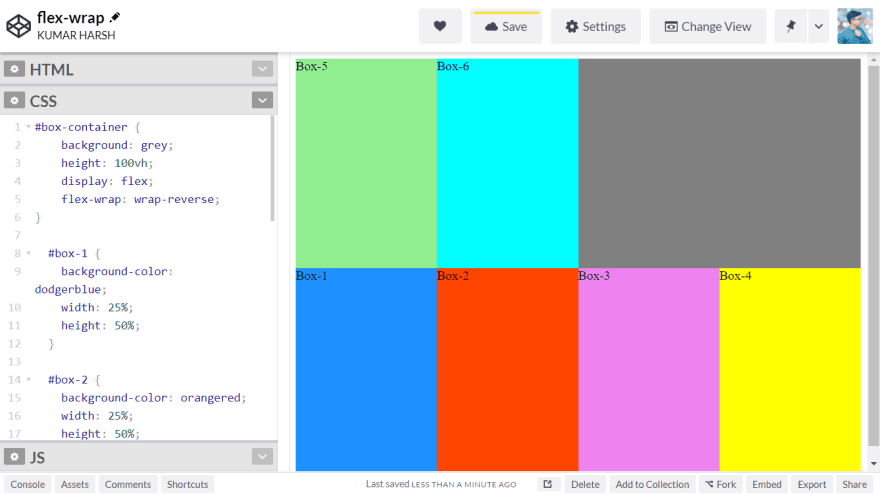
However, using the flex-wrap property tells CSS to wrap items. This means extra items move into a new row or column. It persists the width of elements.
The breakpoint of where the wrapping happens depends on the size of the items and the size of the container.
parent {
flex-wrap: wrap;
}
Vimeo:
CSS has options for the direction of the wrap:
? nowrap:
- this is the default setting and does not wrap items.
? wrap:
- wraps items onto multiple lines from top-to-bottom if they are in rows and left to right if they are in columns.
? wrap-reverse:
- wraps items onto multiple lines from bottom-to-top if they are in rows and right-to-left if they are in columns.
? Main-Axis and Cross-Axis
We can align elements within Flexbox in accordance with these two axes.
To help you better understand:
Time to align flexible items within a flex container
? Justify-content: For horizontal alignment
? Align-content: For vertical alignment
? Align Elements Using the justify-content Property
Sometimes the flex items within a flex container do not fill all the space in the container. It is common to want to tell CSS how to align and space out the flex items a certain way.
Fortunately, the justify-content property has several options to do this. But first, it is important to understand the Main Axis and Cross Axis, which we did in the last section.
Recall that setting a flex container as a row places the flex items side-by-side from left to right. A flex container set as a column places the flex items in a vertical stack from top-to-bottom.
For each, the direction the flex items are arranged is called the main axis. For a row, this is a horizontal line that cuts through each item. And for a column, the main axis is a vertical line through the items.
There are several options for how to space the flex items along the line that is the main axis.
Most commonly used ones are:
? justify-content: center
- aligns all the flex items to the center inside the flex container.
? justify-content: flex-start:
- aligns items to the start of the flex container. For a row, this pushes the items to the left of the container. For a column, this pushes the items to the top of the container. This is the default alignment if no justify-content is specified.
? justify-content: flex-end:
- aligns items to the end of the flex container. For a row, this pushes the items to the right of the container. For a column, this pushes the items to the bottom of the container.
Other options include:
? justify-content: space-between:
- aligns items to the center of the main axis, with extra space placed between the items. The first and last items are pushed to the very edge of the flex container. For example, in a row the first item is against the left side of the container, the last item is against the right side of the container, then the remaining space is distributed evenly among the other items.
? justify-content: space-around:
- similar to space-between but the first and last items are not locked to the edges of the container, the space is distributed around all the items with a half-space on either end of the flex container.
? justify-content: space-evenly:
- Distributes space evenly between the flex items with a full space at either end of the flex container
?? SEE THE CODE:
? Align Elements Using the align-items Property
The align-items property is similar to justify-content. Recall that the justify-content property aligned flex items along the main axis. For rows, the main axis is a horizontal line and for columns, it is a vertical line.
Flex containers also have a cross-axis which is the opposite of the main axis. For rows, the cross axis is vertical and for columns, the cross axis is horizontal.
CSS offers the align-items property to align flex items along the cross-axis. For a row, it tells CSS how to push the items in the entire row up or down within the container. And for a column, how to push all the items left or right within the container.
The different values available for align-items include:
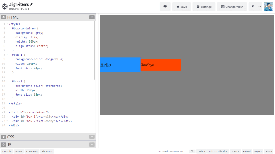
? align-items: center:
- aligns items to the center. For rows, this vertically aligns items (equal space above and below the items). For columns, this horizontally aligns them (equal space to the left and right of the items).
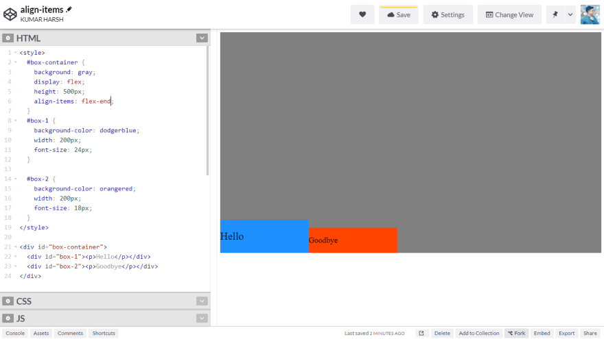
? align-items: flex-end:
- aligns items to the end of the flex container. For rows, this aligns items to the bottom of the container. For columns, this aligns items to the right of the container.
? align-items: flex-start:
- aligns items to the start of the flex container. For rows, this aligns items to the top of the container. For columns, this aligns items to the left of the container.
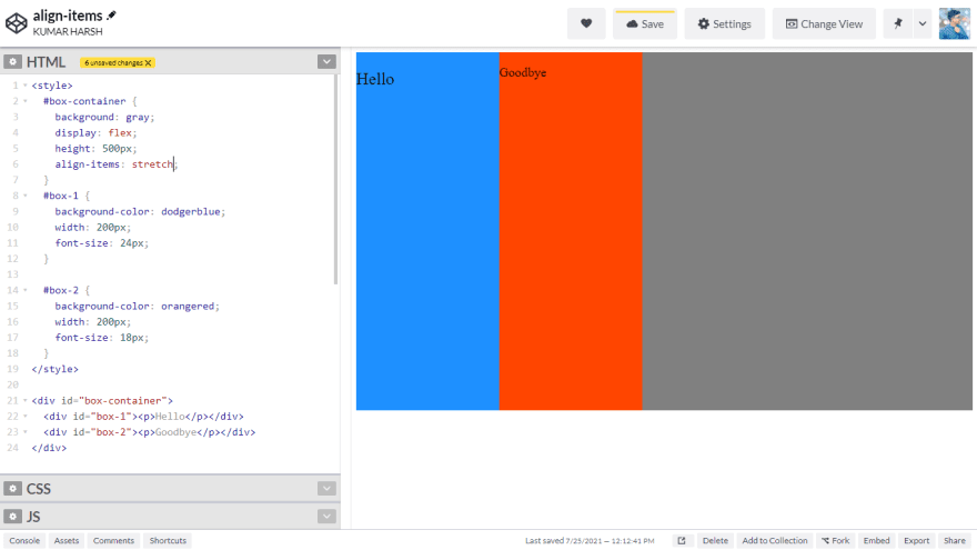
? align-items: stretch:
- stretch the items to fill the flex container. For example, rows items are stretched to fill the flex container top-to-bottom.
This is the default value if no align-items value is specified.
? align-items: baseline:
- aligns items to their baselines. Baseline is a text concept, think of it as the line that the letters sit on.
This content originally appeared on DEV Community and was authored by Rocky
Rocky | Sciencx (2021-07-25T16:47:46+00:00) Complete Introduction to CSS Flexbox ?. Retrieved from https://www.scien.cx/2021/07/25/complete-introduction-to-css-flexbox-%f0%9f%92%aa/
Please log in to upload a file.
There are no updates yet.
Click the Upload button above to add an update.


