This content originally appeared on DEV Community and was authored by Karan Kumar
Let's create a simple customized toggle switch using CSS. Initially when I was trying to create this, I founded it very confusing because many developers have created this button but none of explain it how is this working.
So after struggling a little bit, I've learned how to create this and I want to share with you all.
Prerequisite Knowledge
Basics of HTML, CSS (specially Pseudo Elements)
How it works
As we all know when we assign a label to a input, we can target the input by clicking on label too.
That's what we are going to take advantage of and by this we can convert our label into custom switch which will act same as checkbox.
Let's Start
These are the steps that we are going to follow in order to create this button.
1. Create HTML structure
In this stages we will create the html elements which are input checkbox and a label that is assigned to it but its inner content should be empty.
Reference code is given below.
<!DOCTYPE html>
<html lang="en">

<head>
    <meta charset="UTF-8">
    <meta http-equiv="X-UA-Compatible" content="IE=edge">
    <meta name="viewport" content="width=device-width, initial-scale=1.0">
    <title>Document</title>
    <link rel="stylesheet" href="style.css">
    <script src="script.js" defer></script>
</head>

<body>

<input type="checkbox" name="switch" id="switch">
<label for="switch"></label>

</body>

</html>
2. Hide the input element
Now we will hide the input element as I said earlier we will make the switch with label element so we don't need the checkbox.
input[type="checkbox"] {
  width: 0;
  height: 0;
  visibility: hidden;
}
3. Style the button body
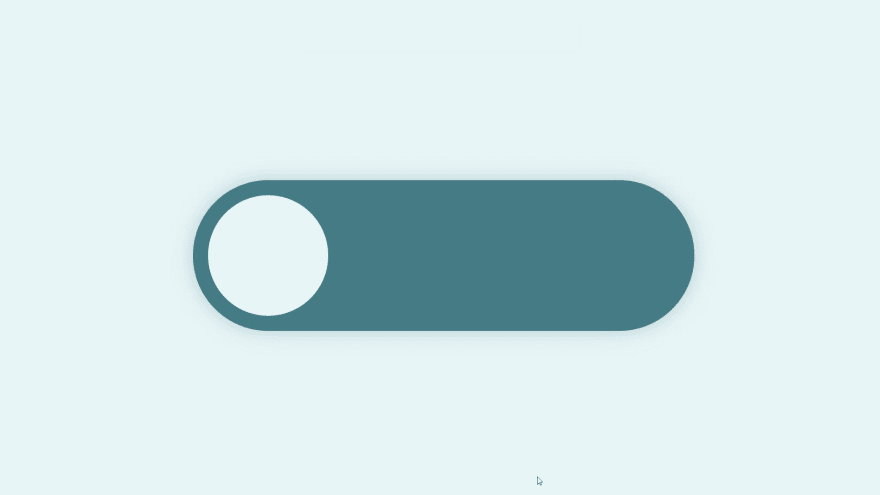
We will create the body of switch or the outer part in which ball will move.
Reference code is given below.
label {
  width: 500px;
  height: 150px;
  background-color: #477a85;
  border-radius: 100px;
  position: relative;
  cursor: pointer;
  transition: 0.5s;
  box-shadow: 0 0 20px #477a8550;
}
4. Create the toggle ball
Now we'll create the toggle ball using pseudo element ::after.
Reference code is given below.
label::after {
  content: "";
  width: 120px;
  height: 120px;
  background-color: #e8f5f7;
  position: absolute;
  border-radius: 70px;
  top: 15px;
  left: 15px;
  transition: 0.5s;
}
At this stage our 80% of work is done, now we just have to add the animation to make our switch work.
5. Adding animation
As we know when we toggle the label, checkbox also get toggled.
- Now we'll add the condition, when checkbox gets checked our ball should be shifted to the right.

  input:checked + label:after {
  left: calc(100% - 10px);
  transform: translateX(-100%);
  }
- To Change the background on button toggle
  input:checked + label {
  background-color: #243d42;
  }
- Now If want a more smooth magnetic effect. When ball get active it its width should increase for a moment.
A element gets active when we click on it.
We can do this by using :active selector.
  label:active:after {
  width: 160px;
  }
Ouput Preview
Try Demo
Find Me On
This content originally appeared on DEV Community and was authored by Karan Kumar
Karan Kumar | Sciencx (2021-07-31T09:43:15+00:00) How to create a custom Toggle Switch using CSS. Retrieved from https://www.scien.cx/2021/07/31/how-to-create-a-custom-toggle-switch-using-css/
Please log in to upload a file.
There are no updates yet.
Click the Upload button above to add an update.


