This content originally appeared on DEV Community and was authored by Modern Web
Hello, welcome. Today we'll see, how we can easily create an awesome wavy button hover effect with pure. We'll see how we can create pure css wavy curve design.
To see demo or you want full coding tutorial video. You can watch the tutorial below.
Video Tutorial
So, without wasting more time let's see how to code this.
Code
First, for this project we have 2 files index.html and style.css. Start by writing basic HTML structure. After that, create a button.
index.html
<button class="btn">
    button
</button
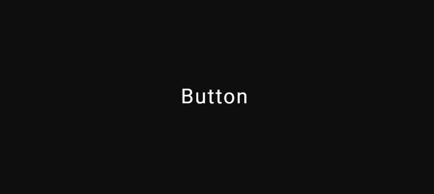
Output
Now, center this button and give dark background to body.
Style.css
*{
    margin: 0;
    padding: 0;
    box-sizing: border-box;
}

body{
    width: 100%;
    height: 100vh;
    display: flex;
    justify-content: center;
    align-items: center;
    background: #0e0e0e;
}
Output
After this style button little bit.
Style.css
.btn{
    position: relative;
    width: 200px;
    height: 60px;
    font-size: 30px;
    text-transform: capitalize;
    font-family: 'roboto', sans-serif;
    letter-spacing: 2px;
    background-color: transparent;
    color: #fff;
    border: none;
    outline: none;
    overflow: hidden;
    cursor: pointer;
}
Make sure you give overflow: hidden;.
Output
Now inside index.html inside our button element, create span element with class wave. Like this.
index.html
<button class="btn">
    <span class="wave"><p>aaaaaaaaaaaaaaaaaaaaaa</p></span>
    button
</button>
You can type anything inside p tag but make sure to type long text.
Give some style to it.
stlye.css
.wave{
    position: absolute;
    background: rgb(255, 46, 46);
    width: 100%;
    height: 80%;
    left: 0;
    bottom: 0%;
}
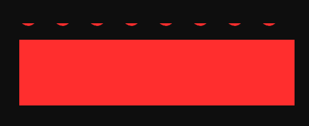
Output
Well, this doesn't look like our effect. To make that effect, Style the p element also.
Style.css
.wave{
    // previous styles.
    transform: rotate(180deg);
}
.wave p{
    font-size: 60px;
    color: transparent;
    text-decoration-style: wavy;
    text-decoration-color: rgb(255, 46, 46);
    text-decoration-line: underline;
}
Output
Now, you can see we have something on top. Change span element's line-height property little bit.
.wave{
     // previous styles.
     line-height: 40px;
}
Output
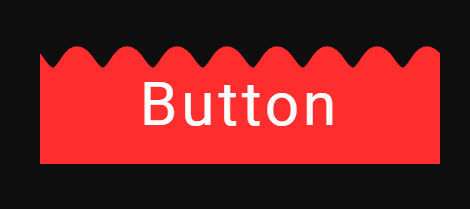
We have wave now.If you didn't notice we created this wavy line with these properties.
    text-decoration-style: wavy;
    text-decoration-color: rgb(255, 46, 46);
    text-decoration-line: underline;
As you can see on the output we have little gap between the wave. So to fix that create another span element with same class.
index.html
<button class="btn">
    <span class="wave"><p>aaaaaaaaaaaaaaaaaaaaaa</p></span>
    <span class="wave"><p>aaaaaaaaaaaaaaaaaaaaaa</p></span>
    button
</button>
And change second wave's line height.
style.css
.wave:nth-child(2){
    line-height: 30px;
}
Output
To make these span elements behind the button. Use z-index. And give transition also.
style.css
.wave{
     // previous styles.
     transition: bottom 1s;
     z-index: -1;
}
Output
Now make that wave animation.
style.css
.wave p{
    // previous styles
    animation: wave 1s linear infinite;
}

@keyframes wave{
    100%{
        margin-left: -50%;
    }
}
Output
Now we are almost done just change wave element's bottom value to -100% and set it to 0 on hover.
style.css
.wave{
    bottom: -100%; // set it negative 100%
}
.btn:hover .wave{
    bottom: 0;
}
Output
We are done.
So, that's it. I hope you understood each and everything. If you have doubt or I missed some thing let me know in the comments.
Articles you may found Useful
If you like, you can subscribe my youtube channel. I create awesome web contents. Subscribe
Thanks For reading.
This content originally appeared on DEV Community and was authored by Modern Web
Modern Web | Sciencx (2021-08-01T10:42:42+00:00) Create Awesome Wavy Button Hover Effect. Pure CSS Wavy Design.. Retrieved from https://www.scien.cx/2021/08/01/create-awesome-wavy-button-hover-effect-pure-css-wavy-design/
Please log in to upload a file.
There are no updates yet.
Click the Upload button above to add an update.


