This content originally appeared on DEV Community and was authored by Bipul Sharma
Part-I
Glossary
- Shallow depth of feild- very small zones of focus.
- Lossy and Lossless images- lossy has loss in quality and file size on compression while lossless has no loss in quality and results in bigger file size on compression.
- transparency/opacity- images that is clear and can take the effect of any images behind it
- Render blocking- JS stopping the DOM rendering.
Image Optimization
Images are the leading cause of the slow web. We have two conflicting needs here: we want to post high quality images online, but also want our websites and apps to be performant, and images are the main reason they are not. So how do we solve this conundrum? The answer is with a multi-pronged approach, ranging from compression to careful selection of image formats, to how we mark up and load images in our applications.
Image performance is all about how much data is contained within an image and how easy it is to compress that data. The more complex the image, the larger the data set necessary to display it and the more difficult it is to compress. Shallow depth of field means better performance. For photography including products, headshots, documentary, and others, a shallower depth of field is preferred.
If you want to squeeze as much performance as possible out of your images, reducing the size of each image by 87% percent, and then upscaling it by 115%, will actually impact the performance of the image as well. It turns out downscaling a photo by 87% percent, Photoshop will take away pixels and simplify the image to scale it down and reduce the complexity of the image and by upscaling it by 115% percent it preserves image quality well enough that humans can't tell the difference. So we get a image of same size but has significantly less complexity.
The image format or file type you choose for your images will have a direct impact on performance. On the web we generally use one of five formats JPEG, PNG, GIF, SVG, and webP.
JPG/JPEG
- Meant for Photos
- Lossy image with adjustable compression
- High compression means large artifacts(distortion)
- Use for Photos when WebP is not an Option
PNG
- Meant for Graphics
- Lossless image format
- Optional transparent alpha layer
- Use for computer generated graphics and transparency
GIF
- Meant for simple lofi gaphics
- Lossy image format
- 256 colors
- Can be animated (but dont use them)
- SVG/Video is always a better option
SVG
- Meant for advance scalable graphics
- Written in Markup, can be included in HTML, CSS
- Very small when optimized
- Use for vector-based computer generated graphics and icons
webP
- Meant for web-based photos
- Upto 34% smaller than JPGs
- Not supported in older browsers(fallback required)
- Used for photos and complex detail images (with fallback)
How to choose what to use?
- For photos, use webP (with JPG fallback)
- For too complex computer graphics use PNG or JPG (whichever is smaller)
- For graphics with transparency use PNG or webP
- For scalable computer graphics, icons and graphs use SVGs
- Aviod animated GIFs at all cost, use videos instead
Mannual Optimizations
- Decide on the maximum visible size the image will have in the layout. No image should ever be displayed wider than a full HD monitor, 1920 pixels. Make sure you also restrict the display width of that image to 1920 pixels, and then center align it. Once you've settled on a width for an image, scale your image to fit that size.
- Experiment with compression in webP, JPG
- Simplify SVGs by removing unnecessary points and lines
- Compare file sizes for JPG, webP and PNG for computer graphics
Automated Optimization
- Imagemin is a good choice. You can use it to build a custom optimization function in Node.js. Or add automated image optimization into your preferred build process. Imagemin CLI provides lossless compression for JPEG, PNGs, and GIFs.
- You can add dedicated lossy compression for each of them using plug-ins: Imagemin-mozjpeg for JPEGs. Imagemin-pngquant for PNGs and Imagemin-webp for webPs.
- Squoosh uses various compression algorithms to optimize images. And it has an experimental CLI you can use to automate that process.
- Sharp is also available for use.
Even a fully optimized image can slow down the performance of your site if it's delivered to the wrong browser at the wrong time. This is the problem Responsive Images Markup is meant to solve.
We have responsive images attributes: srcset and sizes.
Source sets allows you to provide a list of image sources for the browser to choose from and sizes defines a set of media conditions (e.g. screen widths) and indicates what image size would be best to choose, when certain media conditions are true. W indicates total pixel width of each of these images.
For example:

If the viewport of the browser is 800 pixels wide. The browser will pick the 1200 pixel wide image because it is the closest size upwards. If you then choose to scale up the viewport by just scaling up the browser window. The browser will automatically pull down larger versions of the image to fill in the space if it's necessary. But the important thing now is, by carefully planning your image sizes you can now deliver appropriately sized image files to all browsers and all devices.
But, for most of your images, the actual displayed width of the image is determined using CSS and media queries. And you rarely display all your images as full width in the browser. To address this, we have the sizes attribute. Sizes holds a list of media queries and corresponding width to save.
For this image, if the viewport is 1200 pixels or wider, the actual width this image will be displayed at will always be 1200 pixels. The reason why I'm still providing the 1920 pixel image here is to provide a higher resolution image to higher resolution displays. The 100 VW at the end of the size of the attribute says, for all other conditions, meaning screen widths under 1200 pixels, the image is always full width because this is a responsive layout.
This is especially important when you have a design where an image has a max size smaller than the viewport width. Which is almost every single image on the web.
Lazy Loading Images
Loading images, videos, and iframes the user never scrolls to has always been a major performance issue on the web. We're simply wasting data that we shouldn't be wasting. To deal with this issue, developers started adding lazy loading JavaScript libraries that would wait for the user to scroll close to an element before the image was loaded by the browser so that instead of loading all the images on a page, only the images the user would actually get to see inside the viewport were loaded by the browser.
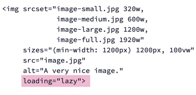
Native lazy loading is activated using the loading attribute on the element in question. Lazy, meaning the asset is loaded only when it's close to the viewport, and eager, meaning the asset is loaded immediately, even if it's nowhere near the viewport. There's also a fallback here called auto, but it's not yet in the specification. Now, this loading attribute is also non-destructive, meaning older browsers who do not understand this attribute will simply ignore it and load all the assets as it would normally do. If you want lazy loading support in older browsers as well, you can use a JavaScript solution like lazysizes, which has an extension plugin called native loading, which serves up the JavaScript solution only to browsers that do not support the loading attribute and the new built in lazy loading feature.
JavaScript Optimization
The code we write is optimized for humans, but if we want the code to be as fast as possible and to be performant, it needs to be rewritten for size and effectiveness, and that makes it unreadable for us humans. We now have tools to do this job for us in the form of code minimizers, packagers, bundlers, and more. At minimum, you'll need a development track where the human readable code is stored and a production track where the highly optimized and compressed machine-readable code is stored.
How and when we compress, bundle, load, modularize, and execute JavaScript is becoming more and more important to improving performance. The same can be said for CSS. Modular and inline CSS, progressive loading, and other performance techniques are now essential to ensure the style of a site or application doesn't slow down its delivery.
The modern web platform supports JavaScript modules, separate JavaScript files that export and import objects functions, and other primitives from each other so bundling all JavaScript into one big file, makes no sense on the modern web.
So from a performance perspective heres what should happpen. On initial, load any critical JavaScript necessary to get the app framework up and running and displaying something above the fold should be loaded. Once that's done and the user has something to look at, any necessary JavaScript modules for functionality should be loaded. And from here on out, the browsers should progressively load JavaScript modules only when they become relevant.
JavaScript functionality should be modularized as much as possible and split into dedicated files.
Several immediate benefits to this approach are:
- React, uses components. JavaScript modules are the exact same thing. Except they run on the web platform itself and you don't need a bundler to make them work.
- Modularization makes ongoing development easier because it provides clear separation of concerns.
- Modularizing, JavaScript and loading modules only when they are needed, brings significant performance benefits on initial load.
- Modularization means updating some feature in a JavaScript app does not require the browser to download the entire app bundle again. It just needs to download the updated module file with its features, which is way smaller.
When and how the browser loads each JavaScript file it encounters has a significant impact on both performance and functionality.
If we add JavaScript to the head of an HTML document, it will always load and execute as soon as the browser encounters it, which is always before the body is rendered out. This will always cause render blocking.
To prevent this blocking JavaScript has been added to the very bottom of the body element, but this too causes render blocking because as soon as the browser encounters a reference to JavaScript, it'll stop doing anything, download the entire script, then execute the script, and then go back to rendering. So basically, entire page will be loaded before the JavaScript is even loaded which just adds to the performance problems.
We have the async and defer keywords which instruct the browser to either load JavaScript files asynchronously while DOM rendering takes place, and then execute them as soon as they're available, or to load the files asynchronously and defer execution until the DOM rendering is done.
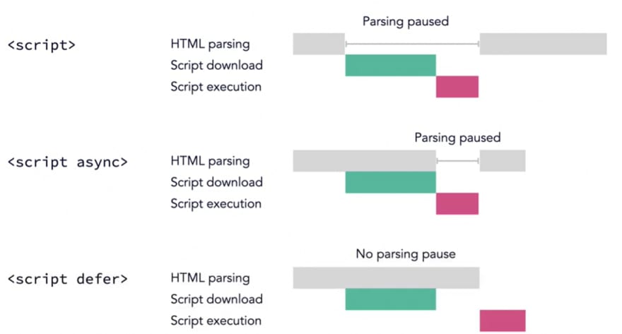
When we add the async tag, the browser will load the JavaScript asynchronously meaning it loads alongside the HTML parsing process. When the script is fully loaded the browser stops the rendering of the HTML until the script is executed and then it continues. Already we're seeing a significant performance enhancement because the parsing isn't paused while the script is being downloaded.
In JavaScript and other programming languages, a synchronous event means one event happens after another, in a chain. Asynchronous means the events happen independently of one another and one event doesn't have to wait for another to complete before it takes place.
In the case of async JavaScript loading the loading is asynchronous, while the execution is synchronous.
Use async anytime you're loading JavaScript and you don't need to wait for the whole DOM to be created first.
Defer is slightly different. We're still loading the script asynchronously when the browser encounters it without render blocking. And then we literally defer the execution of the JavaScript until the HTML parsing is complete.
This is effectively the same as placing the script tag at the end of the body element, except the script is loaded asynchronously, and is therefore much better for performance because we don't render out the entire HTML and then go download the JavaScript. The JavaScript is already downloaded.
Use defer if you need to wait for the whole DOM to be loaded before executing the JavaScript or if the JavaScript can wait.
So here is your performance focused JavaScript loading best practices.
- Call JavaScript by placing the script tag in the head
- Anytime you load JavaScript in the head, always put async on there unless you have a reason to use defer.
- Defer any scripts that need the DOM to be fully built or scripts that you can defer because they don't need to execute right away.
- If and only if, you need to support older browsers and you can't allow the browser to wait for things, load your script in the footer the old way and take the performance hit.
Lazy load JavaScript modules and their associated assets only when they're interacted with and needed using import statements.
For example:
import("/path/to/import-module.js")
.then((module) => {
// do something with the module
});
With this you'll not be chaining the events and getting everything to work conditionally on the user's behavior. So you're saving the user a ton of data and only pushing content to the browser when it's needed.
This whole concept can be used with any JavaScript module including external ESM module.
To rewrite everything and turn it into highly optimized human unreadable code we can use minifiers and uglifiers. All major bundlers, including webpack, rollup, parcel, etc ship with minifiers built in. The two most popular minifiers are uglify-js and terser.
CSS Optimization
The number one measure of perceived performance is how fast something loads in the view port of the browser. For a page to render, all the CSS has to be fully loaded because CSS is a cascade and the rule sets at the bottom of a style sheet may well impact the rules that's higher up. If we serve the browser with a huge style sheet with all the styles for the page, it takes a long time to load that style sheet on this content and the performance suffers. To get around this problem, developers have come up with a clever hack called critical CSS.
First, inline any styles impacting the content above the fold(in the viewport) in the HTML document itself as a style tag in the head. Then lazy load and defer the rest of the CSS, using a clever JavaScript trick, so it only loads when the page is fully loaded.
Critical helps us automate this process so that so you don't have to manually copy and paste code every time you update something.
Critical reads the HTML and CSS figures out what rule sets should be inlined automatically inlines that CSS into the HTML document, separates out the non-critical CSS into a step separate style sheet and then lazy loads on the first and non-critical CSS.
Because this tool is built into the tool chain, it can be set up to take place at every build, so you don't have to keep tabs on what styles are critical. This tool also has a ton of options, so you can fully customize exactly what happens within the critical CSS, index file or the HTML file, the CSS, the view port you're targeting, all this stuff can be configured.
For example:
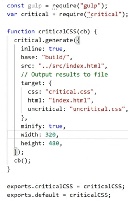
Critical actually spin up a browser and then display the contents in the browser in a defined view port size that we've defined. And then look at what CSS is affecting the content inside that view port and split that out into this critical CSS file. The view port in the example is 320 width, 480 height.
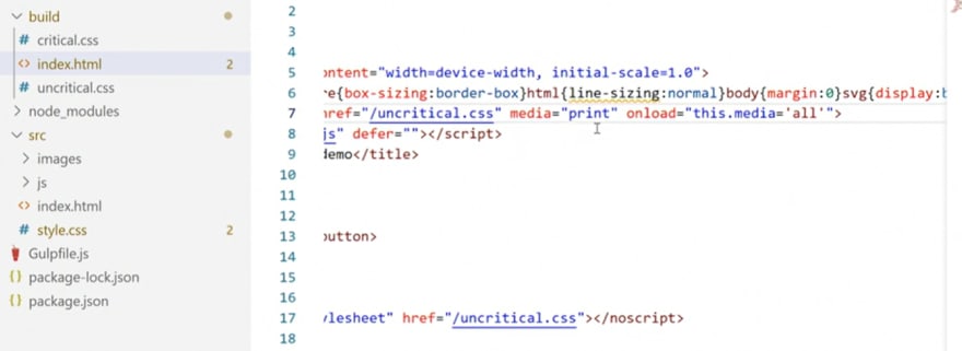
The critical inline CSS that will run before the dom's even built. So this will then define the content that's above the fold.
Then below we have our link elements, but the link element now points at uncritical CSS. And you'll notice the media property is set to print. This is the JavaScript trick.
So what happens now is a regular browser will identify itself as screen. For that reason, this style sheet will not be loaded because it's set to only load for print. Meaning when you're actually printing something. Then, on load, which is an event that is triggered when the page is fully loaded, would change this media to all instead. And at that point, once everything else is done, this extra style sheet will be loaded.
To see how much of your JavaScript and CSS and other code is loaded unnecessarily into the browser, you can use the coverage view in the browser dev tools.
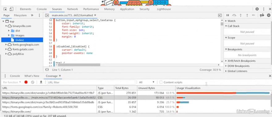
If you see anything marked in red, here, it's a rule that is not currently being used on the page. This is what Critical does, it runs this type of process and then identifies which rules are being used and which rules are not being used, but in the view port, and then it picks and chooses.
If you have one giant style sheet, you need to compare all of these pages and do a bunch of work.
A better solution would be if we could modularize our CSS and split the CSS into smaller components and then load them only if they are needed. And one way we can do that is by deferring loading of CSS until something happens. Now, you already saw an example of that in Critical. You'll remember when we used Critical, the Critical CSS was in lined and then the rest of the styles were put in this uncritical CSS file and deferred.
So, here's a different way of doing the same thing.

Here we set the rel preload and as style attributes into the link element, to tell the browser to preload this style sheet when there's processing available, meaning the loading is delayed to avoid render blocking. Then the on load attribute fires when the CSS is fully loaded and sets the rel attributes to stylesheet so the browser recognizes it and renders it. But this non script element at the bottom is a fall back for browsers that don't have JavaScript, and in that case, they will just immediately load the style sheet.
We could also:

This style sheet will not be loaded by the browser at all until the disabled attribute is removed or set defaults. You can then set up a JavaScript function to change the disabled attribute if, and only if, some event occurs like activating a gallery or triggering a JavaScript or triggering some external function and only then will the browser go to the internet pull down the style sheet, and mount it in the browser.
Lastly,
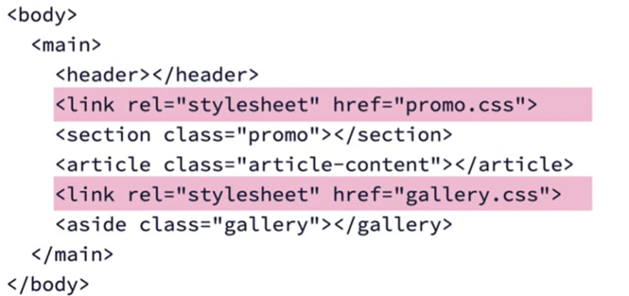
Loading style sheets in body means you can have each component load its own style sheets on the fly. That way the component brings its own styles to the table and you don't have to load any styles you don't need. This makes for much cleaner and more manageable code and it falls in line with modern component-based development practices.
This content originally appeared on DEV Community and was authored by Bipul Sharma
Bipul Sharma | Sciencx (2021-08-03T18:18:13+00:00) Web Performance Optimization- II. Retrieved from https://www.scien.cx/2021/08/03/web-performance-optimization-ii/
Please log in to upload a file.
There are no updates yet.
Click the Upload button above to add an update.
