
This content originally appeared on DEV Community and was authored by npm run dev
1. Tiny bundle size = incredible performance
When in development mode, the size of Tailwind's output is pretty large. This is by design: Every possible class is generated at this stage so you don't need to wait for a build process to finish when you want to use something.
Once Tailwind CSS is put into production mode, however, it will purge any classes which aren't used with a tool called PurgeCSS. This works by searching through your project files for the names of the classes, keeping only those which are used. You can configure which file paths it will search through in your tailwind.config.js in the purge array.
// tailwind.config.js
module.exports = {
  purge: [
    './src/components/**/**/*.jsx',
    './src/layout/**/**/*.jsx',
    './src/pages/**/**/*.jsx',
  ],
  theme: {},
  variants: {},
  plugins: [],
}
It's quite easy to get a very small CSS bundle size without even trying, which really helps in getting your performance score up. You'd be pretty hard pressed to get a bundle size over 10kb, so websites that use Tailwind tend to load very quickly without needing much optimisation on the CSS front - so long as the rest of the site is also optimised.
All you need to do is make sure you always reference classes by their full name, not by building names using JavaScript.
// bad
<div className={ 'bg-' + props.isDark ? 'neutral-dark' : 'neutral-light' }>

// good
<div className={ props.isDark ? 'bg-neutral-dark' : 'bg-neutral-light' }
Also, while this would go mostly unnoticed on faster machines, the simplicity of Tailwind classes, in that they aren't built using complex selectors, means your browser is a little bit faster when parsing and rendering CSS. This helps with performance on slower computers and old phones. As someone whose phone was already slow when I bought it 6 years ago, I'll take any improvement I can get.
2. Prototype and build quickly
With regular SCSS, you need to write custom classes for every single element on your page. While it can offer finer control, writing custom classes takes a decent amount of time: You have to add the class in the HTML, then create it in the CSS, and then write out every property in long format. Then you have to wait for the CSS to build before you can see the result - plus, if you need to make more changes you'll need to rebuild every time, which can take valuable seconds and interrupt your flow.
Tailwind CSS takes out those extra steps and gives you a simple, snappy developer experience when styling elements. You see the element you want to style, add the properties it needs using shorthand, and the changes appear very quickly without having to wait for a CSS bundle. Your attention can stay in one place so you aren't switching around to different files constantly, and the whole process just feels simple.
I can understand that it may take a while to learn all the shorthand. There's some good tools to help with this, chiefly the official docs or @nerdcave's Tailwind cheat sheet. But to be honest, after spending a week or so using it you will have remembered most of the important stuff. There's a couple of weird gotchas, such as not having classes for flex-basis, but there's always reason: In this case, you can just use the width attributes such as w-1/2 in its stead. It just takes a little bit of time, but has the potential to save a whole lot more.
I've used Tailwind in some production sites that had very tight deadlines and I have to say, it definitely took a lot of pressure off when it came to styling up the frontend. If you're on a tight deadline, Tailwind could make life a little easier.
3. It handles CSS variables automatically
Tailwind generates a file called tailwind.config.js. This file contains all your settings for your theme, including colours, widths, spacing (used for padding, margins and similar properties), fonts and so on. Your entire CSS bundle and all the classes you use will be based on this file.
Each property can be assigned a name which will be how you can refer to the classes associated. For example:
// tailwind.config.js

colors: {
  brand: {
    DEFAULT: '#f0000',   // bg-brand
    primary: '#f0000',   // bg-brand-primary
    secondary: '#f0000'  // bg-brand-secondary
}

// other ways to use these colours
.text-brand
.border-brand-secondary
And you can change all these properties any time you like, the names will stay the same unless you change them. So Tailwind will handle all of your CSS variables - it influences the entire look of your site. This is your source of truth - if a brand colour changes, or you need to change the fonts everywhere, tailwind.config.js is where you can do that.
4. Eliminates scope leak
One of the traits people love of BEM and why it's so popular today, is that the naming system classes are built to represent the structure of a component. While making it easy to read and understand, developers also benefit from a side effect of this structure: Since the layout is easy to understand, you can write classes without using CSS selectors.
// this
.block {
  &__element { ... }
  &__element--modifier { ... }
}

// not this
.block {
  & > .element {
    &.modifier { ... }
  }
}
The problem with CSS selectors is they introduce complexity into CSS where components become very dependent on a particular HTML structure. Since generic CSS classes such as .container can repeat a lot, using these names can lead to overlap, where changing one class will affect many other classes. It's one of the main reasons we use BEM, because it makes this structure clear and flattens every class to the top-level scope so nothing depends on anything else. Working without a CSS methodology like this can lead to headaches, and keeping it as simple as possible means more people can understand it more easily.
The way utility-first CSS works is by embracing this idea: Don't have anything depend on anything else. In Tailwind classes are single purpose, generally made up of only one or two CSS properties, and they never depend on each other except for intentional exceptions, such as the group hover feature. You really don't even need to think about scope leak, because unless you add those selectors yourself with custom CSS, the option to nest classes in complex selectors isn't really built in.
// this is all tailwind classes are
.w-1/2 {
  width: 50%;
}
.mx-auto {
  margin-left: auto;
  margin-right: auto;
}
// using hover groups
<div class="group bg-white hover:bg-black">
<h3 class="text-grey group-hover:text-black group-hover:underline">Title</h3>
<p class="text-grey group-hover:text-black"
</div>What I really like about it is that there's no need for vague, overly specific or generally throwaway class names. You don't need to name every text style, every random CSS shape or flourish. Again, you're still free to comment the HTML if you need to, but sometimes there's no need to name every class that only has display: flex.
What if I still need to use selectors?
Of course, there are times when selectors may be the best option, such as for styling WYSIWYG blocks, but generally avoiding selectors can help to maintain an easy to read and understand codebase. Remember you can still use SCSS alongside Tailwind if you prefer. If you do need to use selectors, prefixes can help to keep track of what's custom CSS and what's not. I like to use this method for WYSIWYGs:
// typography.scss

.t-wysiwyg {
   & p {
     font-size: 12px;
   }
   & strong {
     @apply font-bold;
   }
}

.t-wysiwyg--contact { ... }
5. SCSS is still there if you need it
It's good to keep in mind that you don't need to use Tailwind CSS instead of SCSS. There will still be times when you need to create an element that uses :before and :after elements, or when you need a custom keyframe animation. When this happens, you can just use SCSS or any other preprocesser in the exact same way you did before - no need to make a choice between the two.
I prefer to use Tailwind for all the heavy lifting, and for elements that need CSS features I can switch over to SCSS. This allows me to work much faster while still achieving a high level of quality, customisation and detail.
The simplicity of using shorthand classes over long, descriptive class names does feel freeing. There's no denying that BEM or a similar methodology's class names are helpful - you're informed on exactly what a class is meant to do. At least, that's the theory. The issue is that when every element needs to have a unique class name, you end up with some vague, strange, or downright daft classes. It can be difficult to get used to not having classes described, but once you have a good understanding of the syntax it's just like reading regular CSS, and you can always comment your HTML with a description of what the class is.
<-- Contact Section - 2 column, 1 column on mobile -->
<div class="flex flex-row items-center">
  <-- Map -->
  <div class="w-full tablet:w-1/2">
    <img src="map.jpg" />
  </div>
  <-- Content -->
  <div class="w-full tablet:w-1/2">
    <h3></h3>
    <p></p>
    <ul></ul>
  </div>
</div>
6. Works great with JavaScript frameworks
It should be known that Tailwind is not going to be DRY when used in an environment where you'll be copy and pasting HTML, so don't expect things to go well if you're working with plain HTML files. Once you start copy and pasting like this, you no longer have a central source of truth where you can change the way your components look, since the source of truth for your website styling is no longer tied to CSS files.
Modern JavaScript frameworks are where Tailwind's features can really shine. This is because frameworks like Vue or React are based around creating reusable components, in order to minimise the amount of HTML that needs to be written. These components are the building blocks of your application, and can be a simple container or a large component composed of smaller components.
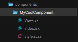
These components are stored in their own custom files which combine HTML and JS, and in Vue you have the option to combine your CSS into a single file as well. This means your sources of truth no longer need to be separated by file type, they can all exist in the same file which handles a single component. This is what's known as component-based development, which JavaScript frameworks embrace with open arms: we've seen styled-components, CSS-in-JS, and now Tailwind, all of which help to contain all the CSS related to a component within that component. They can still be split out into different files, but if you want to make a change to that component you will be going straight to that component's folder instead of three separate locations.
I've written about this concept more in my other post, Learning to love Tailwind.
Conclusion
I'll be the first to admit that Tailwind CSS probably isn't the right choice in every situation. It has some really fantastic features, it's really speedy and it compiles down to ridiculous file sizes, but it requires a totally different mindset and set of tools to take advantage of these features without getting frustrated.
I've noticed a lot of teams, particularly those building headless sites with frontend frameworks, are adopting Tailwind and solutions like it. I think we're still in the early days of this approach and there's a lot to figure out, but the potential is huge. I'm excited to see where it goes in future.
This content originally appeared on DEV Community and was authored by npm run dev
npm run dev | Sciencx (2021-08-05T08:46:50+00:00) 6 reasons to use Tailwind over traditional CSS. Retrieved from https://www.scien.cx/2021/08/05/6-reasons-to-use-tailwind-over-traditional-css/
Please log in to upload a file.
There are no updates yet.
Click the Upload button above to add an update.