This content originally appeared on DEV Community and was authored by menomanabdulla
Today’s world you can’t survive without flex-box as a frontend developer whether you are expert or beginner. Flex-box give you extra superiority for managing your content in final layout, also flex-box has huge market demand for building complex web-layouts.
CSS flexbox will added new weapon in your visual development portfolio. Here I am explained all CSS3 flex-box property in simple way with visual example and copy ready code. So stick till to the end and give your CSS expertise next shape.
Here is live examples, you can check it from here.
Here is github, you can see source-code from here.
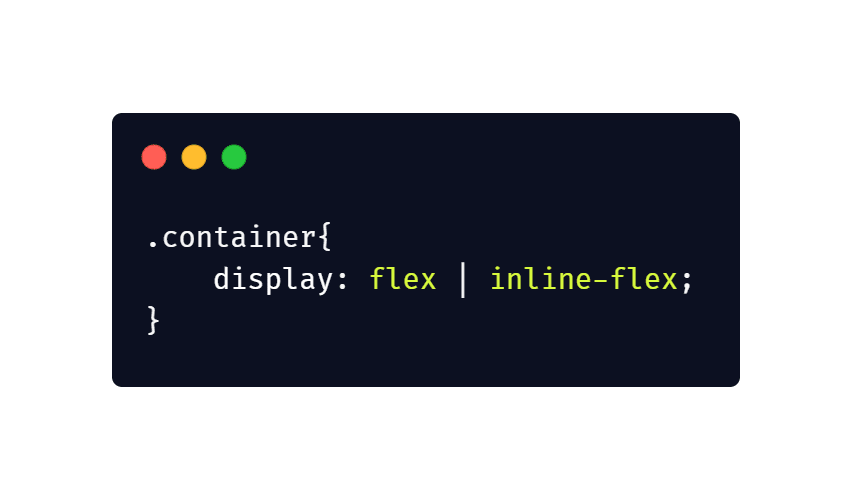
1.Display:
Display is CSS box-model properties, it’s primary properties for next all flex related properties. This defines a flex container, inline or block depending on the giver value. It enables a flex content for all its direct children.
2.Flex Order
Flex item maintain default order as a source order. Order properties can controls order in which they appear in the flex-container.
3.Flex Direction
Flex-direction defines how flex-box items are ordered within a flex-box container. Value example and use case:
row: Same as text direction
row-reverse: Alternative to text direction
column: Same as row but top to bottom
column-reverse: Same as row-reverse but top to bottom
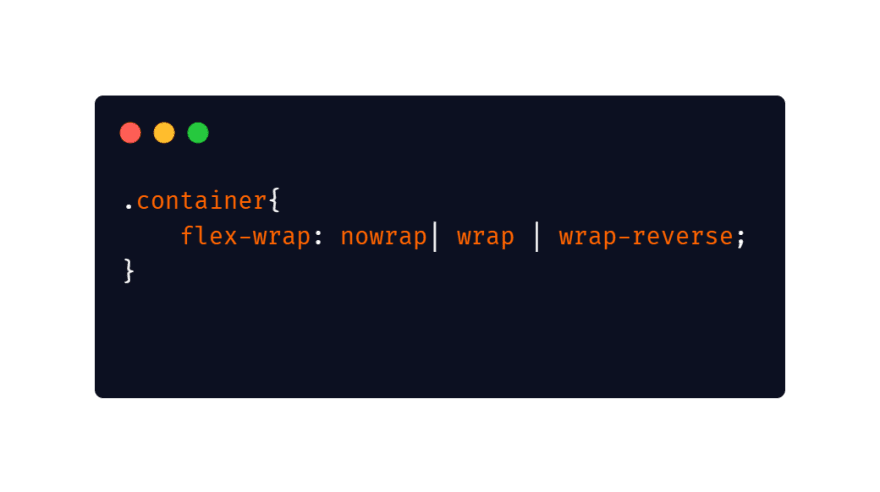
4.Flex Wrap
For Flex-wrap stick by-default inline, flex-wrap is also flexible like others property. You can change that and allow the items to wrap as needed with its property. Value example and use case:
nowrap: all flexf items will be on one line
wrap: flex items will wrap onto multiple lines, fro
wrap-reverse: flex items will wrap into multiple lines, from bottom to top
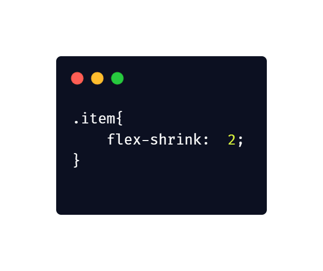
5.Flex Shrink
Flex-shrink is just opposite of flex grow. It only comes into play if the elements must shrink to fit into their container(when the container is just too small).
By-default every item has flex-shrink of 1 which means it will shrink as the box contracts.
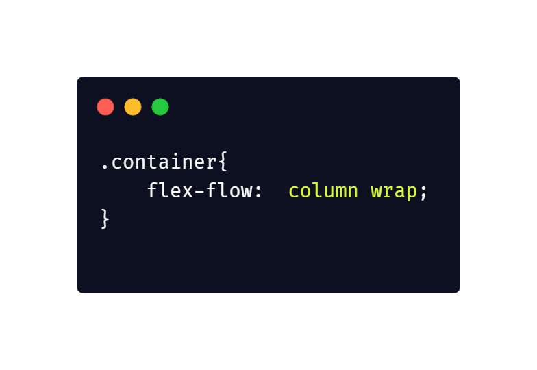
6.Flex Flow
CSS This is short-hand for the flex-direction and flex-wrap properties, simultaneously they define flex containers main and cross axis. The default value is row and nowrap.
7.Flex Basis
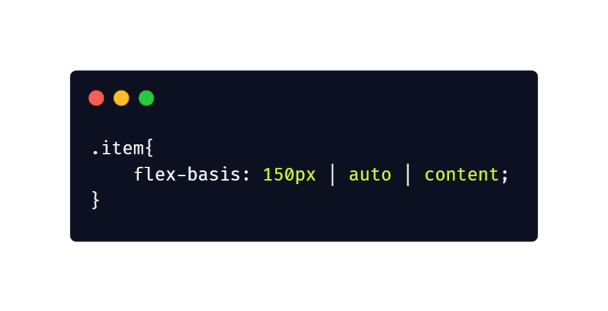
This defines the default size of an element before the remaining space is distributed. It could be a length with unit or keyword like auto, content flex-basis default value is “auto”.
8.Justify Content
This properties define alignment of flex item along with ‘x’ axis or main axis. Justify-content’s default value is “flex-start”.
flex-start: item will appear at the starting of the flex-container along with ‘x’ axis.
flex-end: item will appear at the end of the flex-container along with ‘x’ axis.
space-between: items get space between those mainly left and right side when they appear along with ‘x’ axis.
space-around: items get space combinedly mainly left and right side along with ‘x’ axis.
center: items will align center along with ‘x’ axis.
9.Flex
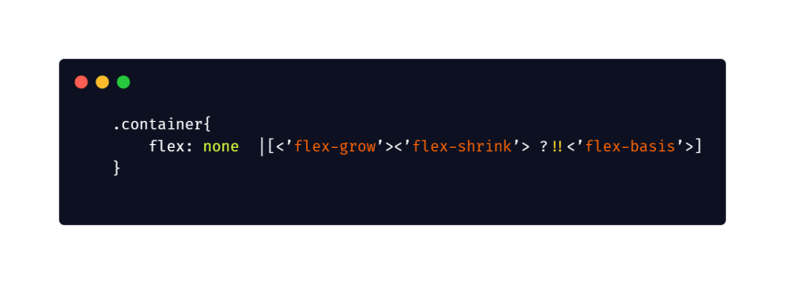
Flex properties determine short-hand of flex-grow, flex-shrink and flex-basis combined. The second and third property are optional. The default is ‘0 1 auto’ but if you set it with a single number value it’s like ‘1 0’;
10.Align Items
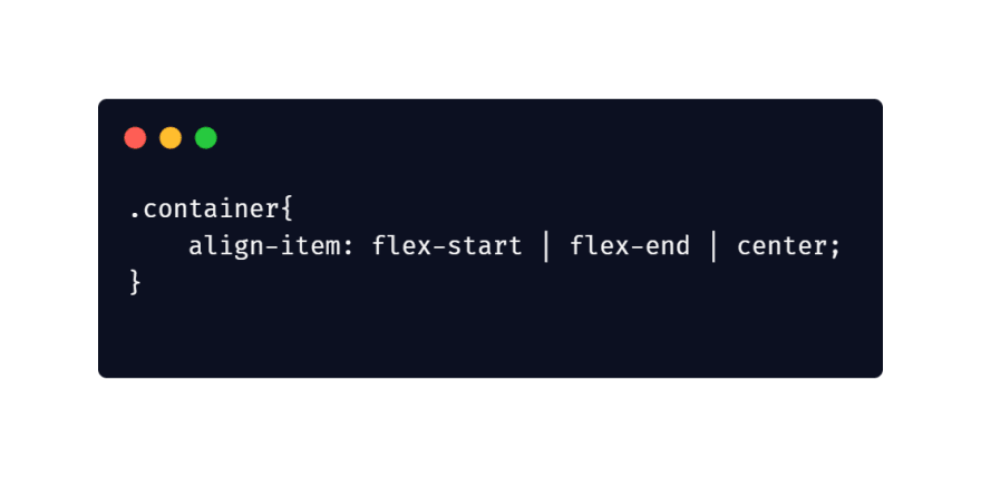
Align-items properties defines the default behavior for how flex items are aligned or laid out along with ‘y’ or cross axis.
flex-start: item will appear at the starting of the flex-container along with ‘y’ axis.
flex-end: item will appear at the end of the flex-container along with ‘y’ axis.
center: item will appear at the center point of the flex-container along with ‘y’ axis.
11.Align Self
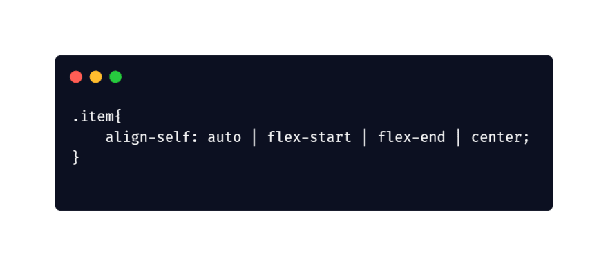
For This allows the default alignment, to be overridden for individual flex items. We can overridden align-items properties only for any individuals.
12.Align Content
This property define flex container’s lines within when there is extra space in the ‘y’ axis, similar to how justify-content aligns individuals items within the man the main-axis.
On this article I tried to cover all CSS3 flex-box properties with example and also include live example with github source code.
I hope you enjoyed it, please let me know your words. If you want to deep drive with CSS3 coding guidelines and front-end web development best practices please check it. Also you can check my 15 Best practices of HTML5 for beginners for give your markup good shape from here. If you find any errors or mistakes then do let me know. Thanks for this journey & Happy Coding.
This content originally appeared on DEV Community and was authored by menomanabdulla
menomanabdulla | Sciencx (2021-08-10T14:18:58+00:00) CSS3 flexbox in simple way for beginners to Advance.. Retrieved from https://www.scien.cx/2021/08/10/css3-flexbox-in-simple-way-for-beginners-to-advance/
Please log in to upload a file.
There are no updates yet.
Click the Upload button above to add an update.

