
This content originally appeared on Level Up Coding - Medium and was authored by osint discovery
Getting the most out of Github
Step-by-step walkthrough to scrape, cluster, and visualize GitHub repositories
Everyone here is familiar with Github. Software engineers and data scientists use Github to find inspirations from open-source projects and gather tips for technical interviews.
Github API provides a convenient way to query repositories based on popularity, programming languages, and contributors. Network graphing tools provide an easy way to cluster and visualize these results.
Scraping Github
Let’s say you are prepping for an upcoming technical interview and would like to see if there are any compiled resources on Github.
With just a few lines of code using the PyGithub library, we can search Github to get repositories tagged to the topic: interview-practice.
Next, we can get more statistics for each repository such as date_of_last_push, number_of_forks, list_of_contributors, and number_of_subscribers. We won’t be using all these fields, but they could be used to filter and sort our data later on.
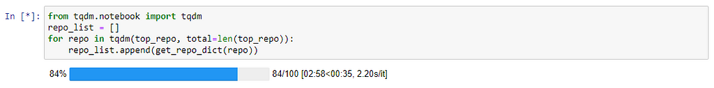
Calling get_subscribers() and get_watchers() to get the list of subscribers and watchers would take several minutes as there may be thousands of them. The tqdm.notebook library would come in handy, to view a dynamic progress bar in Jupyter Notebook.
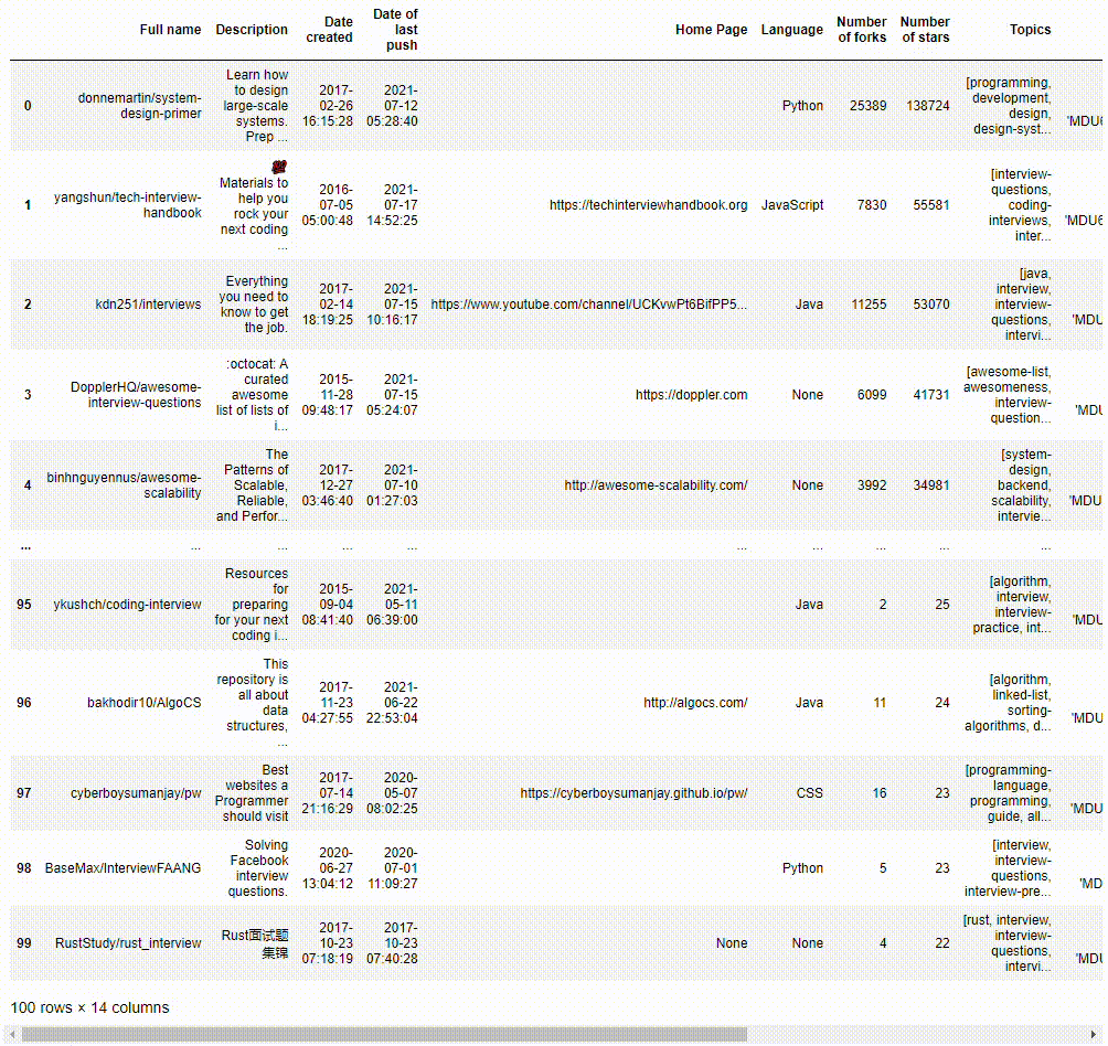
We could save a copy of the queried results as a JSON file and view the data in a Pandas Dataframe.
Transforming data into nodes and edges
Let’s visualize the data in a network graph such that
- Nodes represent repository {r} or topic {t}
- Edges {r} — {t} would link the repository node to the topic node if the repository is tagged with the topic
- Repository {r} node sizes represent the number of stars of the repository
- Topic {t} node sizes represent the number of repositories in the dataset with the topic tag
Data Exploration using PyVis
To visualize a sample of the network graph, we can use PyVis, to generate an interactive plot within Jupyter Notebook. Let’s select those repositories which are tagged with topics related to Leet or Python.
PyVis provides an Options panel to configure various graph layouts and aesthetics. The yellow nodes represent Github topics while the blue nodes represent GitHub repositories.
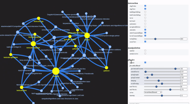
These are the repositories that contain Leetcode solutions for Python, and technical interview tips and resources.
Network Visualization using Gephi
Gephi is a robust tool with several built-in clustering algorithms and many more layout features to perform advanced network analysis.
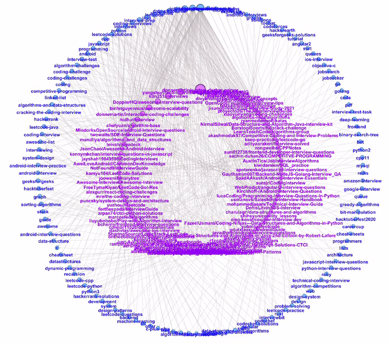
Dual Circle Layout
The Dual Circle Layout is one of the layouts provided by Circular Layout, a Gephi third-party plugin. This layout is extremely useful to show directed links between two node types of different hierarchies.
In our example, we have two node types: repository and topic. We can plot these two node types as two separate circles, the inner circle for repository nodes and the outer circle for topic nodes.
The nodes are sorted anti-clockwise with decreasing size. As we hover through the more popular topics, we can see all the repositories tagged to the topic.
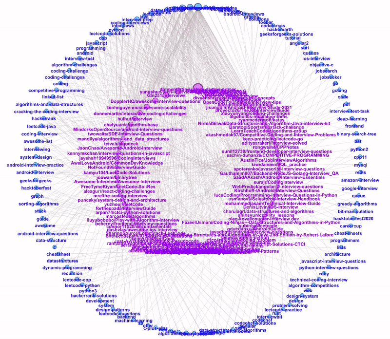
Likewise, when we hover through the repositories, we can see their respective topic tags.
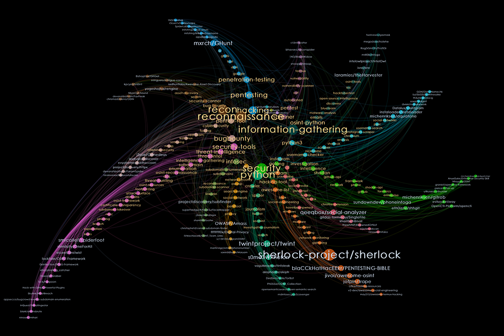
Trawling for Open-source Tools
GitHub serves as a hivemind to scan for open-source tools, especially useful for analysts in the domain of Open-source Intelligence (OSINT)and Infomation Security (INFOSEC).
Better search and classification of these tools will help analysts to stay abreast with the latest techniques in their research. For the later sections, we will look at the Github repositories that were tagged as OSINT or INFOSEC.
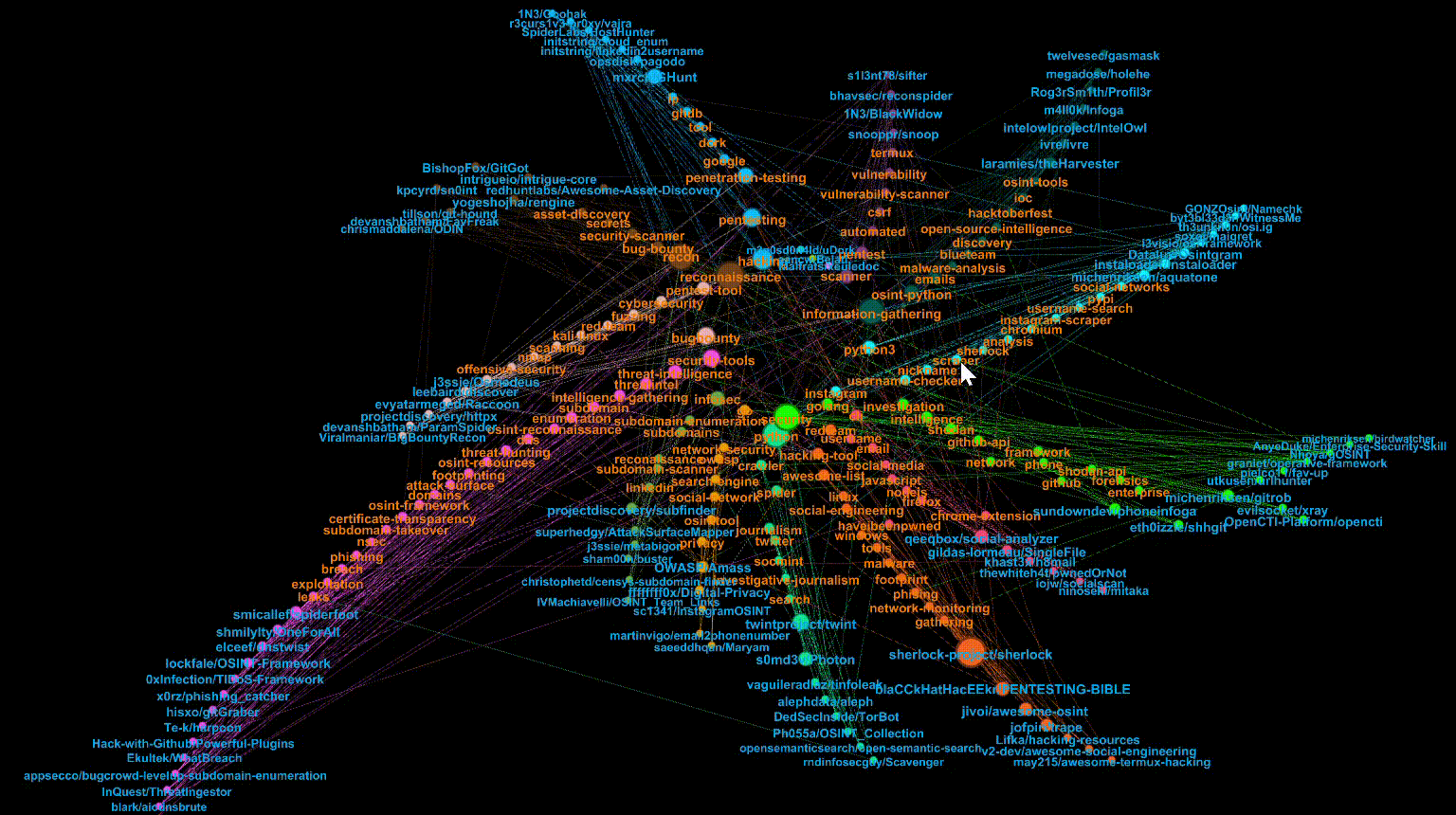
Fruchterman-Reingold layout
The standard Fruchterman-Reingold layout is a force-directed algorithm that treats the edges as springs. This layout would pull highly connected nodes to the centre of the sphere while leaving less connected nodes at the periphery.
Let’s zoom into the centre and hover over popular (i.e. larger node sizes) repositories and topics. Pink nodes represent topics while blue nodes represent repositories.

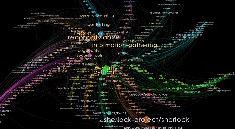
Clustering by Modularity
By running Modularity clustering in the statistics panel, Gephi uses the Louvain method for community detection in a network and this will cluster nodes with similar connections together.
To view the results of this clustering, we proceed to colour the nodes based on the Modularity output and select the Radial Axis Layout. We will obtain a shuriken-shaped network where each blade represents topics (nodes with orange labels) and repositories (nodes with blue labels) belonging to the same cluster.
Interpreting Radial Axis Layout
Let’s look at one of the clusters by choosing the top shuriken blade.
Nodes with orange labels are the dominant topics for the cluster. The topics are sorted by decreasing sizes, as we move away from the centre of the shuriken. We can see that this cluster is related to the topic of Pentesting.
Nodes with blue labels represent the repositories. For this cluster, we get repositories that are tools for Pentesting. As we hover over repositories from the edge of the blade and move closer to the centre, we can see that the repositories at the edge are niche tools with a smaller number of tagged topics, while tools nearer to the centre seem more multi-purposed, with more tagged topics.

Other use cases
Since the Github API provides ways to query a repository’s created_date and date_of_last_push, the visualization could be extended to identify trending open-source projects or recently updated documentation. By making use of the fields for a repository’s contributors, subscribers, and watchers, a more profile-centric analysis could be done to rank accounts.
Tools
[1] Jacques V. (2018), PyGithub Library
[2] West Health Institute (2018), PyVis Library
[3] Bastian M., Heymann S., Jacomy M. (2009). Gephi Software
Visualize GitHub Repos with Python: Trawling Github for Useful Projects and Interview Tips was originally published in Level Up Coding on Medium, where people are continuing the conversation by highlighting and responding to this story.
This content originally appeared on Level Up Coding - Medium and was authored by osint discovery
osint discovery | Sciencx (2021-08-11T01:07:06+00:00) Visualize GitHub Repos with Python: Trawling Github for Useful Projects and Interview Tips. Retrieved from https://www.scien.cx/2021/08/11/visualize-github-repos-with-python-trawling-github-for-useful-projects-and-interview-tips/
Please log in to upload a file.
There are no updates yet.
Click the Upload button above to add an update.