
This content originally appeared on DEV Community and was authored by TechSnack - Technology Tutorials
Responsive Design Doesn't Have To Be Hard
With Flex Box we can easily make our webpage act as a responsive container without media queries!
To start with we are going to quickly create a file with the following HTML inside of it
<div class="viewport flex-parent flex-col">
    <div class="nav flex-parent space-around">
        <div class="box-1"></div>
        <div class="box-2"></div>
        <div class="box-3"></div>
    </div>
    <div class="content flex-parent">
        <div class="sidebar-left"></div>
        <div class="main-area"></div>
        <div class="sidebar-right"></div>
    </div>
    <div class="footer flex-parent space-evenly">
        <div class="box-4"></div>
        <div class="box-5"></div>
        <div class="box-6"></div>
    </div>
</div>
...and this is it for the HTML. That's our entire page!
Now the CSS
At this point the page is blank. We will fix that by styling it right now.
* CSS RESET
The first thing we will do is a basic reset to all of the elements in the document. This will set everything to border-box sizing and remove all margins and padding.
*{
    box-sizing: border-box;
    margin: 0;
    padding: 0;
}
.viewport
We can now create the viewport class. We want this element to take up all available space within the device's screen.
Just to emphasize where the viewport is we will also give it a large black border (this is not necessary when you have inner content or other elements to display)
.viewport{
    min-height: 100vh;
    min-width: 100%;
    border: 5px solid black;
}
Next we can make our viewport class responsive with the following class. .viewport is now a Flex Box container!
.flex-parent{
    display: flex;
}
By default Flex Box containers display vertically but we would like our viewport flex-parent element to display horizontally. We can achieve this with the following flex property.
.flex-col{
    flex-direction: column;
}
That's it for the flex box container.
Now we can begin creating the flex children.
.nav
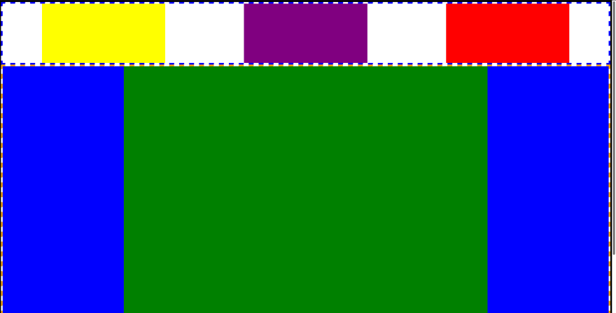
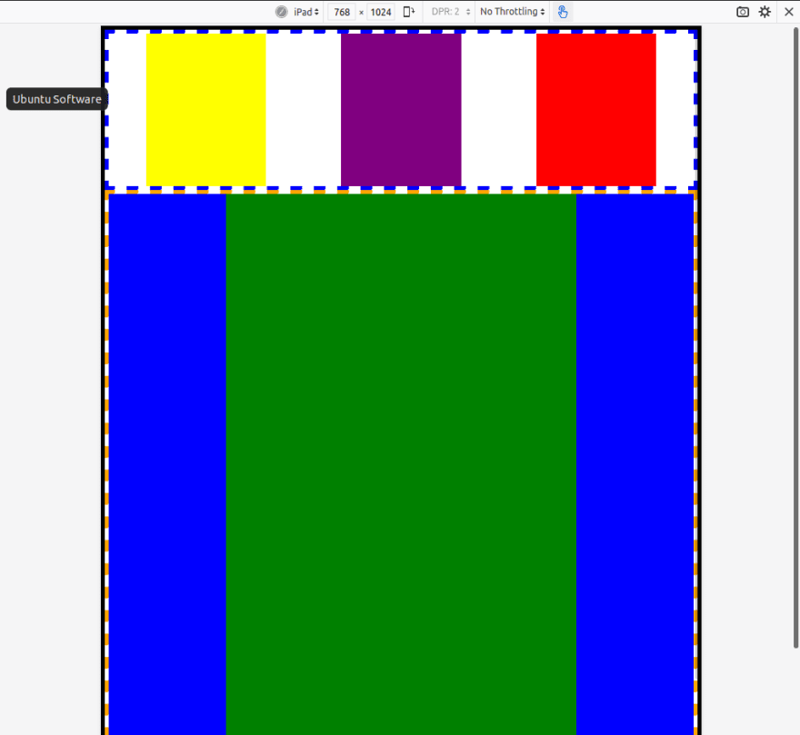
The first child element will be .nav This is our general header area. Let's make the width 100% of the container's width and the height 20vh.
.nav{
    min-width: 100%;
    min-height: 20vh;
    border: 5px dashed blue;
}
Since we want to place elements inside of .nav we will give it the class .flex-parent and we will also demonstrate a key aspect of Flex Box here.
The justify-content flex property
Empty space is crucial. If you have ever attempted to position something with pure CSS without the use of Flex Box or CSS Grids then you know how difficult this is to get right. Luckily, Flex Box has a property called justify-content that can do this for us in various ways.
.space-around
We are going use the following code to place the white space around each element.
.space-around{
    justify-content: space-around;
}
.space-evenly
and while we are here we will make another class for later except using space-evenly which works similarly to space-around with one major difference. With space-evenly the white on the left of the furthest and the right of the furthest right elements will also be part of the spacing distribution!
.space-evenly{
    justify-content: space-evenly;
}
The justify-content property deals with our main axis. Which in this case is the x axis or horizontal axis. this would act differently if this had a class of .flex-col. Go ahead and try it out!
.nav inner elements
Now we can go worry about the elements within .nav
I want to be able to easily change the value of one element without affecting another. For this we will create a different class for each element. This is not entirely necessary but will save stress down the road.
.box-1{
    min-width: 20vw;
    background-color: yellow;
}

.box-2{
    min-width: 20vw;
    background-color: purple;
}

.box-3{
    min-width: 20vw;
    background-color: red;
}
Take a look! The content does not overflow from the page and everything inside of .nav scales with the screen size!
We can now style the rest of our elements!
First we will place .content and .footer onto the page
.content
.content{

    min-width: 100%;

    min-height: 80vh;

    border: 5px dashed orange;

}
.footer
.footer{

    min-width: 100%;

    min-height: 20vh;

    border: 5px solid cyan;

}
.content inner elements
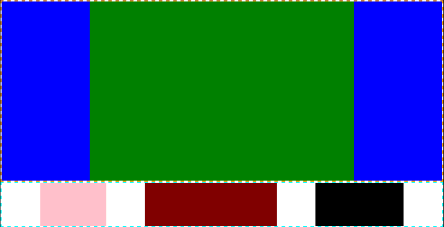
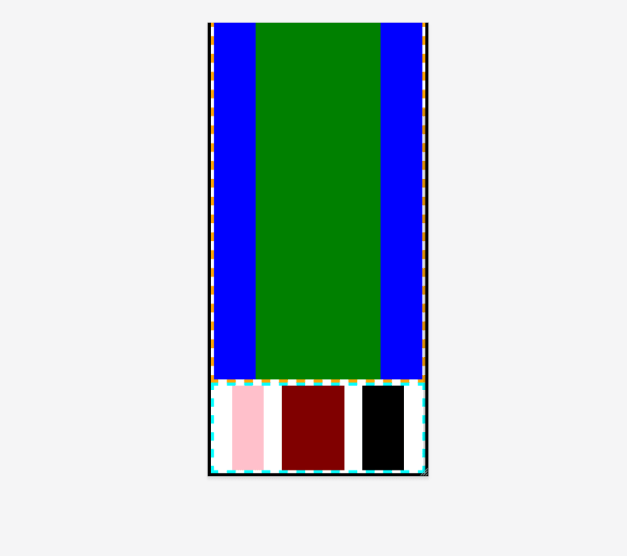
.sidebar-left
.sidebar-left{

    min-width: 20%;

    background: teal;

}
.main-area
.main-area{

    min-width: 60%;

    background: green;

}
.sidebar-right
.sidebar-right{

    min-width: 20%;

    background: blue;

}
.footer inner elements
.box-4{

    min-width: 15%;

    background: pink;

}

.box-5{

    min-width: 30%;

    background: maroon;

}

.box-6{

    min-width: 20%;

    background: black;

}
The Results
Desktop
Tablet
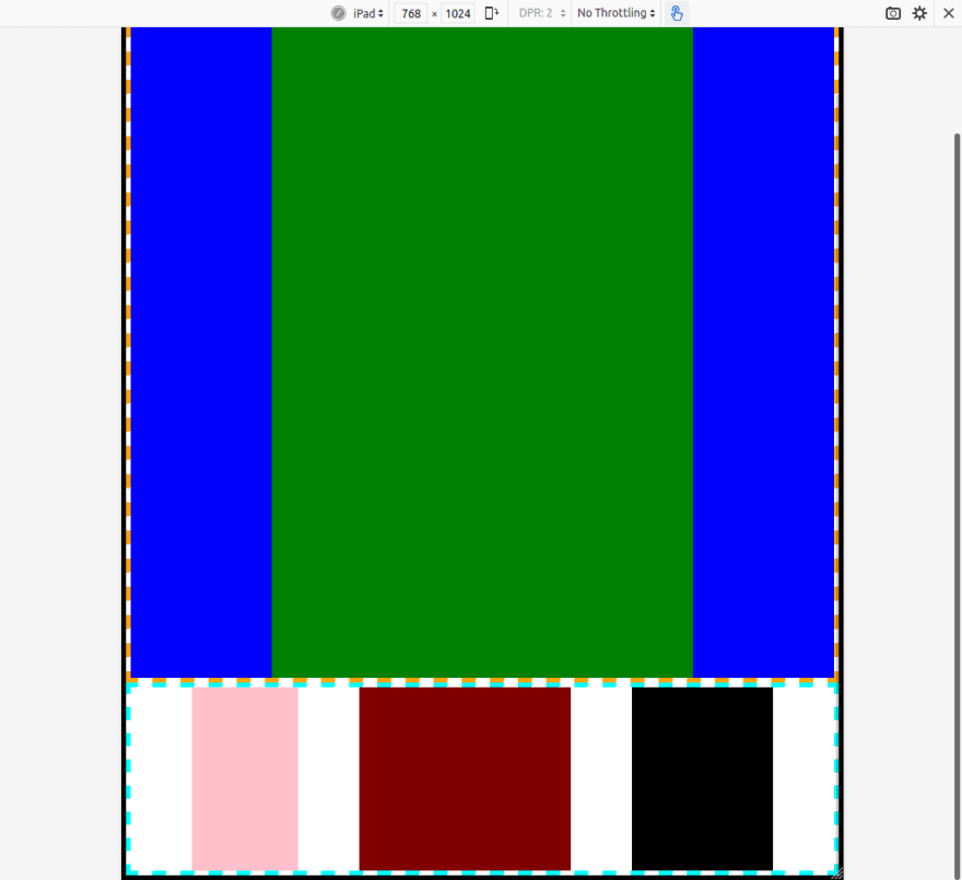
Mobile

Final Thoughts
If you made it this far thank you! I hope you have a better understanding of what Flex Box is and how it can better help us make responsive designs easily without stressing too much.
This was a bonus article today. Stay tuned for an Intro to Version Control later!
This content originally appeared on DEV Community and was authored by TechSnack - Technology Tutorials
TechSnack - Technology Tutorials | Sciencx (2021-08-12T20:57:01+00:00) Pure CSS Flex Box Responsive Design – No Media Queries. Retrieved from https://www.scien.cx/2021/08/12/pure-css-flex-box-responsive-design-no-media-queries/
Please log in to upload a file.
There are no updates yet.
Click the Upload button above to add an update.