
This content originally appeared on DEV Community and was authored by Roden
☢️ Warning !!! ☣️ The site is very heavily loaded, be careful. ☣️
Full Portfolio Demo (!!! 15 SECONDS PRELOAD)
 Kerthin
/
gwentReact-templateSait
Kerthin
/
gwentReact-templateSait
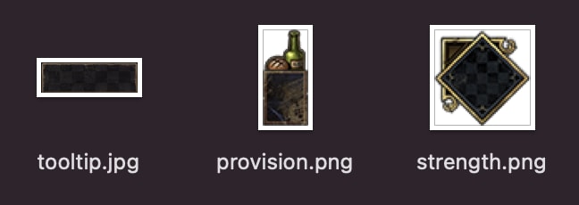
The template represents the appearance of the 'deck Constructor' menu from the Gwent card game.

Description
In this template, you can see a large list of different cards, each of which has its own personal characteristics (provisions, stats, fraction, bonus, name, description, image). Thanks to internal filters, you can manage this list of cards.
- To launch the app
- download the repository;
- log in to the downloaded repository using the command line or terminal;
- enter the command line 'npm run start' or 'serve-s build' and go to the address specified in the terminal.
- Note that the project was made using the CREATE REACT APP.
- Also, the app is very loaded (due to the abundance of media files), so it is not recommended for zapupsku on mobile devices, although the site is adapted to small tablet screens.
-
I would like to note that this is just a test project that does not claim anything. I made it solely out of personal interest.
Use technology.
The following…
Recomend use 0.5x
Introduction
About 2 years ago, I decided to download a card game called Gwent on my iPad. I am a big fan of the Witcher series of games and it was interesting for me to try a separate project from the Witcher universe. Initially, I didn't have high hopes for the game, but after I played the game, I was extremely impressed. In addition to the interesting gameplay, I couldn't help but pay attention to the visual part of the game. It is executed perfectly.
And first of all, it is the way the playing cards are made that attracts attention. In addition to various bronze and gold borders with a beautiful font and icons, the map is surprised by its animated part.


Well, what can I say, and the gameplay itself in the game looks great


By the way, the game used to look like this.

And after all those pleasant emotions that I experienced, I decided to try to implement part of the interface of this game. Namely, the section with the selection of cards for creating a deck.
Concenpt
The site is a collection of cards, each of which belongs to a different faction (there are only 7 of them). Each of the cards has its own special characteristics, such as: provisions, cost, card type, color, name and faction. Based on this data, we need to create appropriate filters that will help us find the necessary maps.
All information about the maps will be stored in our array.
Design
As for the interface, I decided to recreate it close to the original.
Game UI:
As for the cards themselves, I decided to find the sources of all the elements that are used in the styling of cards.
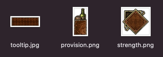
1. Each faction should have its own color style.
Neutral
Monsters
Nilfgaard
Northern
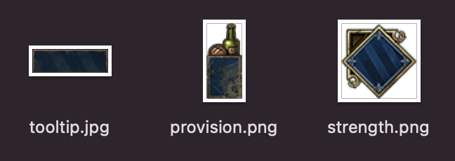
Scoiatael

Skellige
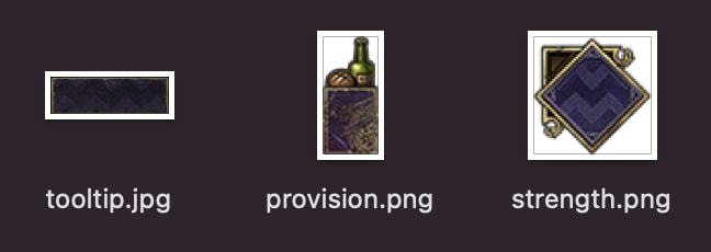
Syndicate
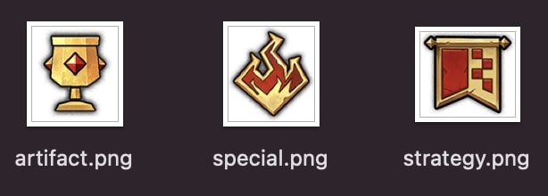
2. You also need to indicate the cost of the card. To do this, we need special icons.
3. We also need to divide the cards into types.
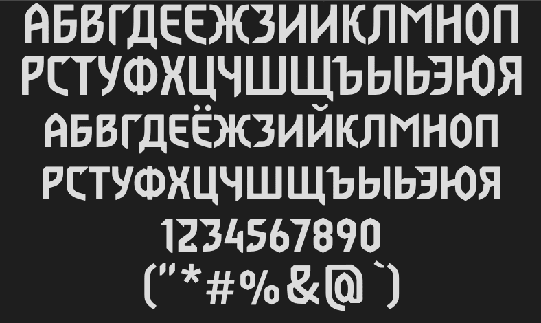
4. Font.
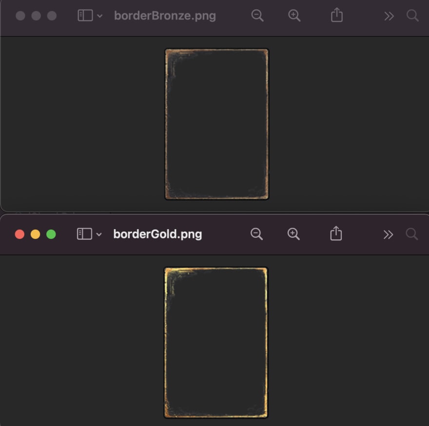
5. And it remains only to choose bronze and gold borders for .
Create Card
To create a correct card, we need to take into account all the data specified in the array. The fraction (specified as a class), border (specified as a class), the path to the video (specified in src), cost (specified as a class), the name of the card and its description.
The videos for the cards themselves are stored in the build/video folder, where they are all divided into sections with provisions.
class Card extends React.Component {
render() {
const product = this.props.product;
var provPath = String(product.prov.match(/\d+/));
var factionClass = product.faction;
var borderClass = product.border;
var videoPath = `img/video/${product.type}/${provPath}/${product.src}`;
var prov = <p className="provisionBg__number">{parseInt(product.prov.match(/\d+/))}</p>;
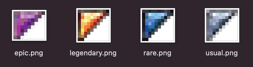
var cost;
if (product.usual) {
cost = 'usual';
} else if (product.rare) {
cost = 'rare';
} else if (product.epic) {
cost = 'epic';
} else {
cost = 'legendary';
}
var strengthType;
var provBlock = <div className="provisionBg">{prov}</div>;
if (product.type === 'special') {
strengthType = <div className="strengthBg__special"></div>;
} else if (product.type === 'artifact') {
strengthType = <div className="strengthBg__artifact"></div>;
} else if (product.type === 'strategy') {
videoPath = `img/video/${product.type}/${product.src}`;
strengthType = <div className="strengthBg__strategy"></div>;
provBlock = null;
} else {
strengthType = <p className="strengthBg__number">{product.strength}</p>;
}
var nameTooltip = <h1 className="tooltip__title">{product.name}</h1>;
return (
<div className={`card _${factionClass} _${borderClass}`}>
<video src={videoPath} poster="img/poster/cursedScroll.mp4" preload="true" autoPlay loop muted></video>
<div className="borderBg"></div>
<div className={`strengthBg _${cost}`}>{strengthType}</div>
{provBlock}
<div className="tooltip">
<div className="tooltip__titleWrap">{nameTooltip}</div>
<div className="tooltip__infoWrap">
<div className="tooltip__info">{product.tooltip}</div>
</div>
</div>
</div>
);
}
}
SCSS
.card {
position: relative;
float: left;
width: 134px;
height: 194px;
margin-left: 30px;
margin-top: 30px;
cursor: pointer;
transition: all .3s;
video {
position: absolute;
width: 100%;
height: 100%;
}
&._bronze .borderBg {
background-image: url('../../../../img/cardElements/border/borderBronze.png');
}
&._gold .borderBg {
background-image: url('../../../../img/cardElements/border/borderGold.png');
}
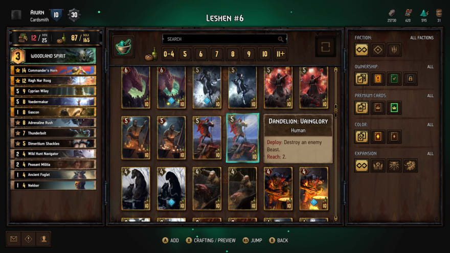
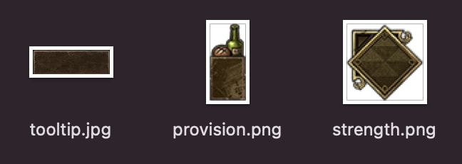
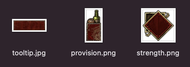
@mixin cardFactionElements($faction) {
&._#{$faction} {
.strengthBg {
background-image: url('../../../../img/cardElements/#{$faction}/strength.png');
}
.provisionBg {
background-image: url('../../../../img/cardElements/#{$faction}/provision.png');
}
.tooltip__titleWrap {
background-image: url('../../../../img/cardElements/#{$faction}/tooltip.jpg');
}
}
}
@include cardFactionElements('neutral');
@include cardFactionElements('monsters');
@include cardFactionElements('nilfgaard');
@include cardFactionElements('northern');
@include cardFactionElements('scoiatael');
@include cardFactionElements('skellige');
@include cardFactionElements('syndicate');
&:hover {
transform: scale(1.1);
z-index: 5;
.tooltip {
display: block;
}
.tooltip {
&:hover {
display: none;
}
}
}
&:last-child {
margin-bottom: 20px;
}
&:nth-child(6n-1),
&:nth-child(6n) {
.tooltip {
left: -177px;
}
}
}
.borderBg {
position: absolute;
width: 100%;
height: 100%;
}
.strengthBg {
position: absolute;
width: 43px;
height: 43px;
@extend %containBg;
&__special,
&__artifact,
&__strategy,
&__number {
@extend %containBg;
}
@mixin cardTypeIcon($type, $mTop, $mLeft, $width, $height) {
&__#{$type} {
margin-top: #{$mTop}px;
margin-left: #{$mLeft}px;
width: #{$width}px;
height: #{$height}px;
background-image: url('../../../../img/cardElements/type/#{$type}.png');
}
}
@include cardTypeIcon('special', '5', '4', '32', '32');
@include cardTypeIcon('artifact', '7', '6', '30', '30');
@include cardTypeIcon('strategy', '8', '8', '25', '25');
&__number {
font-family: Gwent;
font-size: 28px;
color: $paletteStrength;
text-align: center;
line-height: 1.6;
text-shadow: rgb(0, 0, 0) 0px 2px 5px;
}
@mixin cardGemIcon($cost) {
&._#{$cost} {
&:after {
background-image: url('../../../../img/cardElements/gem/#{$cost}.png');
}
}
}
@include cardGemIcon('usual');
@include cardGemIcon('rare');
@include cardGemIcon('epic');
@include cardGemIcon('legendary');
&:after {
content: '';
position: absolute;
top: 7px;
left: 6px;
width: 7px;
height: 7px;
@extend %containBg;
}
}
.provisionBg {
position: absolute;
width: 26px;
height: 54px;
bottom: 4px;
right: 4px;
@extend %containBg;
&__number {
font-family: Gwent;
font-size: 24px;
color: $paletteSandPrimary;
text-align: center;
line-height: 3.3;
text-shadow: rgb(0, 0, 0) 0px 2px 5px;
}
}
Result
{ name: "Draug",
    prov: "pp13",
    type: "unit",
    strength: "7",
    faction: "northern",
    border: "gold",
    legendary: true,
    src: "draug.mp4",
    tooltip: <p>{deploy}: Transform all allied Human units in this row into Kaedweni Revenants, without changing their power.</p>
}

Full View

Tooltip
It remains only to add the description output to each map when hovering.
.tooltip {
    position: absolute;
    top: 2px;
    right: -177px;
    width: 177px;
    display: none;
    transition: all .3s;

    &__titleWrap {
        position: relative;
        padding-top: 3px;
        width: 100%;
        height: 56px;
        background-size: 100%;
        background-repeat: no-repeat;
    }
    &__title {
        margin-top: 10px;
        font-family: Gwent;
        font-size: 17px;
        text-transform: uppercase;
        color: $paletteParagraph;
        text-align: center;
        text-shadow: rgb(0, 0, 0) 0px 2px 5px;
    }

    &__infoWrap {
        background-image: url(../../../../img/cardElements/tooltipInfo/bottom.png), url(../../../../img/cardElements/tooltipInfo/center.jpg);
        background-size: 100%;
        border-bottom-left-radius: 8px;
        border-bottom-right-radius: 8px;
        padding-bottom: 10px;
        background-repeat: no-repeat, repeat-y;
        background-position: center bottom;
    }

    &__info {
        margin-bottom: 6px;
        position: relative;
        word-break: break-word;
        padding: 8px 12px 14px;

        p {
            font-size: 14px;
            color: $paletteTooltioParagraph;
            line-height: 16px;
            font-family: sans-serif;
        }
        span {
            font-weight: 600;
            color: $paletteTooltioKeyword;
        }
    }
}
Result

Since the hint is displayed to the right of the card, it is very important that the hint is displayed on the left of the rightmost cards.
&:nth-child(6n-1),
&:nth-child(6n) {
    .tooltip {
       left: -177px;
    }
}
Filters
The appearance of the filters is made in the form of a side menu with columns of sliding blocks.

function BorderFilterWrap(props) {
    return(
        <label className="sideFilterWrap">
            <input type="checkbox" className="openFilter" />
            <FrontBlock frontFilterIcon={'color'} frontFilterName={'Color'} />
            <div className="popupFilter">
                <RadioButton value={""} radioName={"border"} checked={props.checked} onChange={props.onChange} />
                <RadioButton value={"gold"} radioName={"border"} checked={props.checked} onChange={props.onChange} />
                <RadioButton value={"bronze"} radioName={"border"} checked={props.checked} onChange={props.onChange} />
            </div>
        </label>
    );
}
function CostFilterWrap(props) {
    return(
        <label className="sideFilterWrap">
            <input type="checkbox" className="openFilter" />
            <FrontBlock frontFilterIcon={'cost'} frontFilterName={'Cost'} />
            <div className="popupFilter">
                <CheckboxButton value={"usual"} checked={props.checkedUsual} onChange={props.onChangeUsual} />
                <CheckboxButton value={"rare"} checked={props.checkedRare} onChange={props.onChangeRare} />
                <CheckboxButton value={"epic"} checked={props.checkedEpic} onChange={props.onChangeEpic} />
                <CheckboxButton value={"legendary"} checked={props.checkedLegendary} onChange={props.onChangeLegendary} />
            </div>
        </label>
    );
}
function FactionFilterWrap(props) {
    return(
        <label className="sideFilterWrap">
            <input type="checkbox" className="openFilter" />
            <FrontBlock frontFilterIcon={'faction'} frontFilterName={'Fraction'} />
            <div className="popupFilter">
                <RadioButton value={""} radioName={"faction"} checked={props.checked} onChange={props.onChange} />
                <RadioButton value={"neutral"} radioName={"faction"} checked={props.checked} onChange={props.onChange} />
                <RadioButton value={"monsters"} radioName={"faction"} checked={props.checked} onChange={props.onChange} />
                <RadioButton value={"nilfgaard"} radioName={"faction"} checked={props.checked} onChange={props.onChange} />
                <RadioButton value={"northern"} radioName={"faction"} checked={props.checked} onChange={props.onChange} />
                <RadioButton value={"scoiatael"} radioName={"faction"} checked={props.checked} onChange={props.onChange} />
                <RadioButton value={"skellige"} radioName={"faction"} checked={props.checked} onChange={props.onChange} />
                <RadioButton value={"syndicate"} radioName={"faction"} checked={props.checked} onChange={props.onChange} />
            </div>
        </label>
    );
}
function TypeFilterWrap(props) {
    return(
        <label className="sideFilterWrap">
            <input type="checkbox" className="openFilter" />
            <FrontBlock frontFilterIcon={'type'} frontFilterName={'Type'} />
            <div className="popupFilter">
                <RadioButton value={""} radioName={"type"} checked={props.checked} onChange={props.onChange} />
                <RadioButton value={"unit"} radioName={"type"} checked={props.checked} onChange={props.onChange} />
                <RadioButton value={"special"} radioName={"type"} checked={props.checked} onChange={props.onChange} />
                <RadioButton value={"artifact"} radioName={"type"} checked={props.checked} onChange={props.onChange} />
                <RadioButton value={"strategy"} radioName={"type"} checked={props.checked} onChange={props.onChange} />
            </div>
        </label>
    );
}
SCSS
@import "../../../../variables/StyleVariables/StyleVariables.scss";

.sideFilterWrap {
    position: relative;
    display: block;
    margin-bottom: 15px;
    width: 95%;
}
.openFilter {
    display: none;

    &:checked {
        + .frontBlock {
            .frontBlock__toogle {
                transform: rotate(180deg);
            }
        }
    }
    &:checked {
        + .frontBlock {
            + .popupFilter {
                max-height: 1000px;
            }
        }
    }
}

.popupFilter {
    position: relative;
    display: block;
    width: 100%;
    max-height: 0;
    background-color: $palettePopup;
    overflow: hidden;
    transition: max-height .5s;
}

.filterBlock__buttonBg {
    @mixin sideFilterIcon($family, $nameIcon, $extension) {
        &._#{$nameIcon} {
            background-image: url('../../../../img/icons/#{$family}/#{$nameIcon}.#{$extension}');
        }
    }

    @include sideFilterIcon('faction', 'neutral', 'png');
    @include sideFilterIcon('faction', 'monsters', 'png');
    @include sideFilterIcon('faction', 'nilfgaard', 'png');
    @include sideFilterIcon('faction', 'northern', 'png');
    @include sideFilterIcon('faction', 'scoiatael', 'png');
    @include sideFilterIcon('faction', 'skellige', 'png');
    @include sideFilterIcon('faction', 'syndicate', 'png');
}
Working Filter

Provision Filter
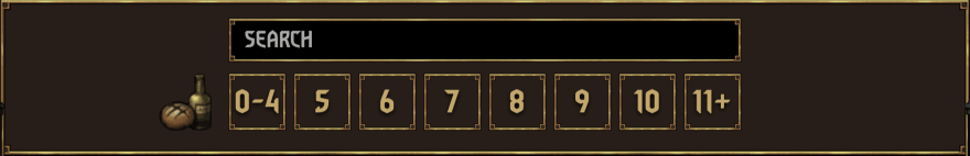
Now we need to make a filter based on the provisions of the card.
Provisions is the number indicated at the bottom of the card, it indicates the amount of free space needed to put it in the deck.

function ProvisionFilter(props) {
    return(
        <div className="filterBlock__provWrap clearfix">
            <RadioButtonProv value={'p4'} radioName={"provision"} checked={props.checked} onChange={props.onChange} number={'0-4'} />
            <RadioButtonProv value={"p5"} radioName={"provision"} checked={props.checked} onChange={props.onChange} number={'5'} />
            <RadioButtonProv value={"p6"} radioName={"provision"} checked={props.checked} onChange={props.onChange} number={'6'} />
            <RadioButtonProv value={"p7"} radioName={"provision"} checked={props.checked} onChange={props.onChange} number={'7'} />
            <RadioButtonProv value={"p8"} radioName={"provision"} checked={props.checked} onChange={props.onChange} number={'8'} />
            <RadioButtonProv value={"p9"} radioName={"provision"} checked={props.checked} onChange={props.onChange} number={'9'} />
            <RadioButtonProv value={"p10"} radioName={"provision"} checked={props.checked} onChange={props.onChange} number={'10'} />
            <RadioButtonProv value={'pp1'} radioName={"provision"} checked={props.checked} onChange={props.onChange} number={'11+'} />
        </div>
    );
}
Result

Text Filter
Well, the last thing left for us is to search by the name of the card.
function TextFilter(props) {
    return(
        <div className="filterBlock__textFilterWrap">
            <input
                    type="text"
                    placeholder="SEARCH"
                    value={props.value}
                    onChange={props.onChange}
                    className="filterBlock__textFilter"
                />
        </div>
    );
}

Responsive
Resize Browser Window

Tablet

The End
Well, that's it. Thank you for your time. I want to note right away that I created this project 2 years ago. This is one of my first projects that I did with React. So take this article as a story about how I tried to copy the interface of the game and nothing more.
I can advise you to subscribe to my Twitter, I also post my works there.
Goodbye

This content originally appeared on DEV Community and was authored by Roden
Roden | Sciencx (2021-08-13T19:02:19+00:00) Create Card Game UI/UX ? Gwent: Witcher + Demo ? (React ⚛️). Retrieved from https://www.scien.cx/2021/08/13/create-card-game-ui-ux-%f0%9f%90%ba-gwent-witcher-demo-%f0%9f%8d%bf-react-%e2%9a%9b%ef%b8%8f/
Please log in to upload a file.
There are no updates yet.
Click the Upload button above to add an update.