This content originally appeared on DEV Community and was authored by Risa Fujii
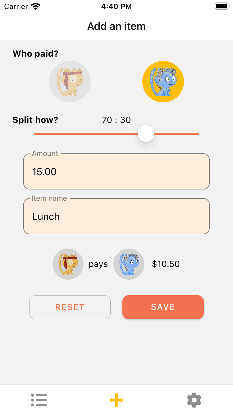
I recently released an iOS/Android app called Warikani. It's an intuitive, simple-to-use expense tracker for couples, built on React Native. Creating the app involved a lot of non-programming tasks, from designing the UI to writing the app store descriptions.
In this post, I will talk about 4 challenges related to design that I faced along the way, and tools that I found essential in solving them.
Disclaimer: I am not discounting the work of designers. If you are a professional designer, or you can ask one to design your app, that is undoubtedly better. This is an article for developers who want to/have to design everything themselves.
Table of Contents
- 1. How should I decide the color scheme for my app?
- 2. How do I design the app UI?
- 3. How do I make app icons for each size?
- 4. How do I create tasteful App Store screenshots?
1. How should I decide the color scheme for my app?
Solution: Use Eva Design System's deep learning color generator
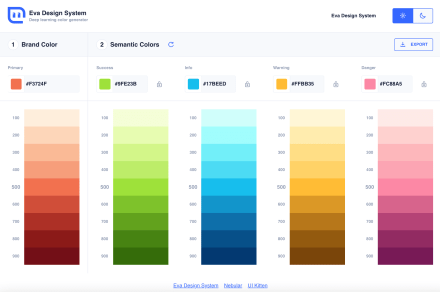
I had a primary theme color that I wanted to use, but I didn't know what colors would go well with it. Eva Design System's color generator is great because it recommends colors for each situation (like success or error) that would go well with your main color. If you don't like their suggestions, you can also hit regenerate until you see a color scheme that you like.
Another perk is that it supports multiple export methods, including JPEG and JSON.
Try it here: https://colors.eva.design
2. How do I design the app UI?
Solution: Learn the fundamentals of UI design from YouTube. Also, consider using a component library.
If you're an engineer with no professional design experience (like me), you would probably benefit from learning the fundamentals of UI design. I recommend these videos by the Youtube channel DesignCourse:
- The 2019 UI Design Crash Course for Beginners
- The 2020 UI Design Fundamentals Crash Course (INTERACTIVE)
Some of the topics covered in these videos may seem obvious (e.g. use enough color contrast, provide adequate whitespace). But it was useful to understand why you should or shouldn't do something.
Another piece of advice is to consider using a UI component library. Initially, I was creating most of my components like buttons and text inputs by styling the base React Native components. I didn't want to use a component library, because:
- It's one more dependency that you have to manage
- It adds a layer of complexity and makes it harder to fine-tune your components
- What if the library stops being maintained?
I was also concerned that using a library would make my app look "generic", for lack of a better term. But after a while, I changed my mind. I wanted to incorporate the look of Material Design text inputs in my app - specifically, how they change color and display a label when focused.
So I installed react-native-paper, which is a Material Design component library, and replaced some of my components. It's a subtle change, but the screen feels more polished overall.
| Before | After |
|---|---|
 |
 |
As for the concern that the app could look more generic somehow, I don't think it's worth worrying about most of the time. After all, users prefer UI that looks familiar (Jakob's Law).
3. How do I make app icons for each size?
Solution: Use an online app icon generator
I didn't know this until I became an app developer, but you have to provide your app icon in 10+ different sizes. This would be extremely tedious to do by hand, but thankfully, there are online app icon generators where you can drop an image and they will resize it for you. I can't remember the exact service I used, but just google "online app icon generator".
4. How do I create tasteful App Store screenshots?
Solution: Bite the bullet, learn a bit of Figma. There are some helpful templates out there.
(Okay, I won't pretend like my screenshots are perfect - there's still room for improvement. Advice from designers is welcome.)
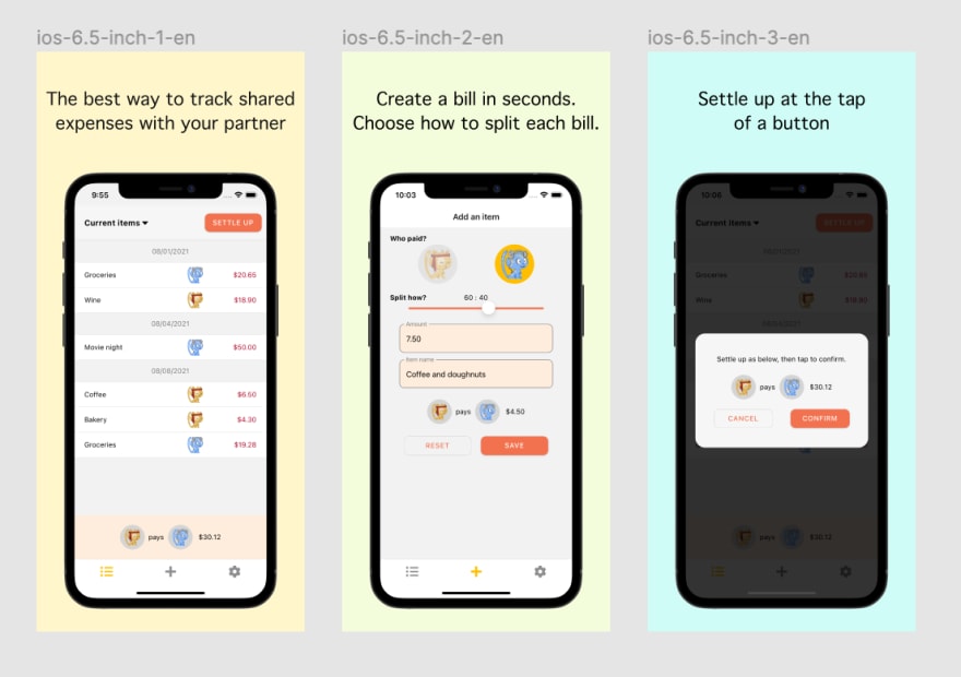
When you submit your app on the App Store or Google Play Store, you're required to upload screenshots in specific sizes. The easiest solution is to take screenshots on your device emulator, and upload them as-is... but that's not exactly eye-catching. You'll notice that the screenshots for well-known apps aren't plain screenshots taken from the emulator (examples).
I initially tried to improve my screenshots by using a tool like this one. It's straightforward - drop in an image, select a background color, and write some text. But I couldn't find a template that allowed for enough customization and provided all the dimensions I needed. I eventually ended up creating the files on Figma.
While doing so, I found these drag-and-drop tools that let you wrap the device screenshots in device frames to be useful:
- For Android screenshots, use the official device art generator: https://developer.android.com/distribute/marketing-tools/device-art-generator
- For iOS screenshots, use community-provided Figma templates like this one: https://www.figma.com/community/file/882254519102673494
Good luck to the indie app developers out there, and let me know about any helpful tools that you found. Thanks for reading!
P.S. Have a partner? Use Warikani!
This content originally appeared on DEV Community and was authored by Risa Fujii
Risa Fujii | Sciencx (2021-08-22T08:57:12+00:00) 4 Design Challenges as an Indie App Developer and Helpful Tools: Color Schemes, App Screenshots, etc.. Retrieved from https://www.scien.cx/2021/08/22/4-design-challenges-as-an-indie-app-developer-and-helpful-tools-color-schemes-app-screenshots-etc/
Please log in to upload a file.
There are no updates yet.
Click the Upload button above to add an update.


