
This content originally appeared on DEV Community and was authored by Modern Web
Hello, Today we'll see how to instagram UI clone using HTML, css. No library. Our clone looks very similar to instagram and has post element. With status, and recommendation section.
To see demo or you want coding tutorial. You can watch the tutorial below.
Video Tutorial
I appreciate if you can support me by subscribing my youtube channel.
So, without wasting more time let's see how to code this.
Code
So to start, we have two files, index.html and style.css. And an image folder contains all icons and post images. You can download image folder from here.
So let's start writing code. Let's make navbar first.
Navbar
Start with writing basic HTML structure. And link style.css. After that make navbar like this.
<nav class="navbar">
    <div class="nav-wrapper">
        <img src="img/logo.PNG" class="brand-img" alt="">
        <input type="text" class="search-box" placeholder="search">
        <div class="nav-items">
            <img src="img/home.PNG" class="icon" alt="">
            <img src="img/messenger.PNG" class="icon" alt="">
            <img src="img/add.PNG" class="icon" alt="">
            <img src="img/explore.PNG" class="icon" alt="">
            <img src="img/like.PNG" class="icon" alt="">
            <div class="icon user-profile"></div>
        </div>
    </div>
</nav>
Add styles to it.
@import url('https://fonts.googleapis.com/css2?family=Roboto:wght@300;400;500;700;900&display=swap');

*{
    margin: 0;
    padding: 0;
    box-sizing: border-box;
}

*:focus{
    outline: none;
}

body{
    width: 100%;
    background: #fafafa;
    position: relative;
    font-family: 'roboto', sans-serif;
}

.navbar{
    position: fixed;
    top: 0;
    left: 0;
    width: 100%;
    height: 50px;
    background: #fff;
    border-bottom: 1px solid #dfdfdf;
    display: flex;
    justify-content: center;
    padding: 5px 0;
}

.nav-wrapper{
    width: 70%;
    max-width: 1000px;
    height: 100%;
    display: flex;
    justify-content: space-between;
    align-items: center;
}

.brand-img{
    height: 100%;
    margin-top: 5px;
}

.search-box{
    position: absolute;
    left: 50%;
    transform: translateX(-50%);
    width: 200px;
    height: 25px;
    background: #fafafa;
    border: 1px solid #dfdfdf;
    border-radius: 2px;
    color: rgba(0, 0, 0, 0.5);
    text-align: center;
    text-transform: capitalize;
}

.search-box::placeholder{
    color: rgba(0, 0, 0, 0.5);
}

.nav-items{
    height: 22px;
    position: relative;
}

.icon{
    height: 100%;
    cursor: pointer;
    margin: 0 10px;
    display: inline-block;
}

.user-profile{
    width: 22px;
    border-radius: 50%;
    background-image: url(img/profile-pic.png);
    background-size: cover;
}
Output

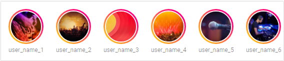
Now let's make status section. For that code HTML structure like this.
<section class="main">
    <div class="wrapper">
        <div class="left-col">
            <div class="status-wrapper">
                <div class="status-card">
                    <div class="profile-pic"><img src="img/cover 1.png" alt=""></div>
                    <p class="username">user_name_1</p>
                </div>
                <div class="status-card">
                    <div class="profile-pic"><img src="img/cover 2.png" alt=""></div>
                    <p class="username">user_name_2</p>
                </div>
                <div class="status-card">
                    <div class="profile-pic"><img src="img/cover 3.png" alt=""></div>
                    <p class="username">user_name_3</p>
                </div>
                // +5 more status card elements.
        </div>
    </div>
</section>
.main{
    width: 100%;
    padding: 40px 0;
    display: flex;
    justify-content: center;
    margin-top: 50px;
}

.wrapper{
    width: 70%;
    max-width: 1000px;
    display: grid;
    grid-template-columns: 60% 40%;
    grid-gap: 30px;
}

.left-col{
    display: flex;
    flex-direction: column;
}

.status-wrapper{
    width: 100%;
    height: 120px;
    background: #fff;
    border: 1px solid #dfdfdf;
    border-radius: 2px;
    padding: 10px;
    padding-right: 0;
    display: flex;
    align-items: center;
    overflow: hidden;
    overflow-x: auto;
}

.status-wrapper::-webkit-scrollbar{
    display: none;
}

.status-card{
    flex: 0 0 auto;
    width: 80px;
    max-width: 80px;
    display: flex;
    flex-direction: column;
    align-items: center;
    margin-right: 15px;
}

.profile-pic{
    width: 70px;
    height: 70px;
    border-radius: 50%;
    overflow: hidden;
    padding: 3px;
    background: linear-gradient(45deg, rgb(255, 230, 0), rgb(255, 0, 128) 80%);
}

.profile-pic img{
    width: 100%;
    height: 100%;
    object-fit: cover;
    border-radius: 50%;
    border: 2px solid #fff;
}

.username{
    width: 100%;
    overflow: hidden;
    text-align: center;
    font-size: 12px;
    margin-top:5px;
    color: rgba(0, 0, 0, 0.5)
}
Output
Now make posts inside left-col element.
section class="main">
    <div class="wrapper">
        <div class="left-col">
            // status wrappers

            <div class="post">
                <div class="info">
                    <div class="user">
                        <div class="profile-pic"><img src="img/cover 1.png" alt=""></div>
                        <p class="username">modern_web_channel</p>
                    </div>
                    <img src="img/option.PNG" class="options" alt="">
                </div>
                <img src="img/cover 1.png" class="post-image" alt="">
                <div class="post-content">
                    <div class="reaction-wrapper">
                        <img src="img/like.PNG" class="icon" alt="">
                        <img src="img/comment.PNG" class="icon" alt="">
                        <img src="img/send.PNG" class="icon" alt="">
                        <img src="img/save.PNG" class="save icon" alt="">
                    </div>
                    <p class="likes">1,012 likes</p>
                    <p class="description"><span>username </span> Lorem ipsum dolor sit amet consectetur, adipisicing elit. Pariatur tenetur veritatis placeat, molestiae impedit aut provident eum quo natus molestias?</p>
                    <p class="post-time">2 minutes ago</p>
                </div>
                <div class="comment-wrapper">
                    <img src="img/smile.PNG" class="icon" alt="">
                    <input type="text" class="comment-box" placeholder="Add a comment">
                    <button class="comment-btn">post</button>
                </div>
            </div>
            <div class="post">
                <div class="info">
                    <div class="user">
                        <div class="profile-pic"><img src="img/cover 2.png" alt=""></div>
                        <p class="username">modern_web_channel</p>
                    </div>
                    <img src="img/option.PNG" class="options" alt="">
                </div>
                <img src="img/cover 2.png" class="post-image" alt="">
                <div class="post-content">
                    <div class="reaction-wrapper">
                        <img src="img/like.PNG" class="icon" alt="">
                        <img src="img/comment.PNG" class="icon" alt="">
                        <img src="img/send.PNG" class="icon" alt="">
                        <img src="img/save.PNG" class="save icon" alt="">
                    </div>
                    <p class="likes">1,012 likes</p>
                    <p class="description"><span>username </span> Lorem ipsum dolor sit amet consectetur, adipisicing elit. Pariatur tenetur veritatis placeat, molestiae impedit aut provident eum quo natus molestias?</p>
                    <p class="post-time">2 minutes ago</p>
                </div>
                <div class="comment-wrapper">
                    <img src="img/smile.PNG" class="icon" alt="">
                    <input type="text" class="comment-box" placeholder="Add a comment">
                    <button class="comment-btn">post</button>
                </div>
            </div>
            // +5 more post elements
        </div>
    </div>
</section>
.post{
    width: 100%;
    height: auto;
    background: #fff;
    border: 1px solid #dfdfdf;
    margin-top: 40px;
}

.info{
    width: 100%;
    height: 60px;
    display: flex;
    justify-content: space-between;
    align-items: center;
    padding: 0 20px;
}

.info .username{
    width: auto;
    font-weight: bold;
    color: #000;
    font-size: 14px;
    margin-left: 10px;
}

.info .options{
    height: 10px;
    cursor: pointer;
}

.info .user{
    display: flex;
    align-items: center;
}

.info .profile-pic{
    height: 40px;
    width: 40px;
    padding: 0;
    background: none;
}

.info .profile-pic img{
    border: none;
}

.post-image{
    width: 100%;
    height: 500px;
    object-fit: cover;
}

.post-content{
    width: 100%;
    padding: 20px;
}

.likes{
    font-weight: bold;
}

.description{
    margin: 10px 0;
    font-size: 14px;
    line-height: 20px;
}

.description span{
    font-weight: bold;
    margin-right: 10px;
}

.post-time{
    color: rgba(0, 0, 0, 0.5);
    font-size: 12px;
}

.comment-wrapper{
    width: 100%;
    height: 50px;
    border-radius: 1px solid #dfdfdf;
    display: flex;
    justify-content: space-between;
    align-items: center;
}

.comment-wrapper .icon{
    height: 30px;
}

.comment-box{
    width: 80%;
    height: 100%;
    border: none;
    outline: none;
    font-size: 14px;
}

.comment-btn,
.action-btn{
    width: 70px;
    height: 100%;
    background: none;
    border: none;
    outline: none;
    text-transform: capitalize;
    font-size: 16px;
    color: rgb(0, 162, 255);
    opacity: 0.5;
}

.reaction-wrapper{
    width: 100%;
    height: 50px;
    display: flex;
    margin-top: -20px;
    align-items: center;
}

.reaction-wrapper .icon{
    height: 25px;
    margin: 0;
    margin-right: 20px;
}

.reaction-wrapper .icon.save{
    margin-left: auto;
}
You can see
action-btnon the style. Don't worry we'll make that next.
Output

Now last last thing we want to make recommendations.
<section class="main">
    <div class="wrapper">
        // left col element
        <div class="right-col">
            <div class="profile-card">
                <div class="profile-pic">
                    <img src="img/profile-pic.png" alt="">
                </div>
                <div>
                    <p class="username">modern_web_channel</p>
                    <p class="sub-text">kunaal kumar</p>
                </div>
                <button class="action-btn">switch</button>
            </div>
            <p class="suggestion-text">Suggestions for you</p>
            <div class="profile-card">
                <div class="profile-pic">
                    <img src="img/cover 9.png" alt="">
                </div>
                <div>
                    <p class="username">modern_web_channel</p>
                    <p class="sub-text">followed bu user</p>
                </div>
                <button class="action-btn">follow</button>
            </div>
            <div class="profile-card">
                <div class="profile-pic">
                    <img src="img/cover 10.png" alt="">
                </div>
                <div>
                    <p class="username">modern_web_channel</p>
                    <p class="sub-text">followed bu user</p>
                </div>
                <button class="action-btn">follow</button>
            </div>
            <div class="profile-card">
                <div class="profile-pic">
                    <img src="img/cover 11.png" alt="">
                </div>
                <div>
                    <p class="username">modern_web_channel</p>
                    <p class="sub-text">followed bu user</p>
                </div>
                <button class="action-btn">follow</button>
            </div>
            <div class="profile-card">
                <div class="profile-pic">
                    <img src="img/cover 12.png" alt="">
                </div>
                <div>
                    <p class="username">modern_web_channel</p>
                    <p class="sub-text">followed bu user</p>
                </div>
                <button class="action-btn">follow</button>
            </div>
            <div class="profile-card">
                <div class="profile-pic">
                    <img src="img/cover 13.png" alt="">
                </div>
                <div>
                    <p class="username">modern_web_channel</p>
                    <p class="sub-text">followed bu user</p>
                </div>
                <button class="action-btn">follow</button>
            </div>
        </div>
    </div>
</section>
.right-col{
    padding: 20px;
}

.profile-card{
    width: fit-content;
    display: flex;
    justify-content: center;
    align-items: center;
    margin-bottom: 10px;
}

.profile-card .profile-pic{
    flex: 0 0 auto;
    padding: 0;
    background: none;
    width: 40px;
    height: 40px;
    margin-right: 10px;
}

.profile-card:first-child .profile-pic{
    width: 70px;
    height: 70px;
}

.profile-card .profile-pic img{
    border: none;
}

.profile-card .username{
    font-weight: 500;
    font-size: 14px;
    color: #000;
}

.sub-text{
    color: rgba(0, 0, 0, 0.5);
    font-size:12px;
    font-weight: 500;
    margin-top: 5px;
}

.action-btn{
    opacity: 1;
    font-weight: 700;
    font-size: 12px;
}

.suggestion-text{
    font-size: 14px;
    color: rgba(0, 0, 0, 0.5);
    font-weight: 700;
    margin: 20px 0;
}

@media (max-width: 1100px){
    .right-col, .search-box{
        display: none;
    }
    .nav-wrapper,
    .wrapper{
        width: 90%;
    }
    .wrapper{
        display: block;
    }
}

@media (max-width: 500px){
    .nav-items .icon{
        margin: 0 5px;
    }
    .post-image{
        height: 300px;
    }
}
Final Output

So that's it. I hope you understood each and everything. If you have doubt or I missed something let me know in the comments.
Tutorials you may find Useful
- Best CSS Effect
- Music Player App
- Disney+ Clone
- Youtube API - Youtube Clone
- TMDB - Netflix Clone
- Responsive Portfolio with contact form
- Fully working Blogging website with backend
I really appreciate if you can subscribe my youtube channel. I create awesome web contents.

Thanks For reading.
This content originally appeared on DEV Community and was authored by Modern Web
Modern Web | Sciencx (2021-08-23T14:04:51+00:00) How to make instagram clone using HTML, CSS. Fully responsive.. Retrieved from https://www.scien.cx/2021/08/23/how-to-make-instagram-clone-using-html-css-fully-responsive/
Please log in to upload a file.
There are no updates yet.
Click the Upload button above to add an update.