This content originally appeared on DEV Community and was authored by Chetan Atrawalkar?CA.
? Today, I’m going to share a responsive sidebar navigation with a step-by-step implementation guide. This sidebar navigation menu comes with an animated hamburger button to toggle the menu drawer.
Generally, a hamburger menu requires a small function of JavaScript to toggle the menu drawer. But, it can also functionalize using HTML and pure CSS.
HTML for Responsive Sidebar Navigation
- The HTML consists of three parts, navigation menu, a toggle button and a dummy content that contains navigation links.
- The All div and section are wrapped into main div with class name
.container.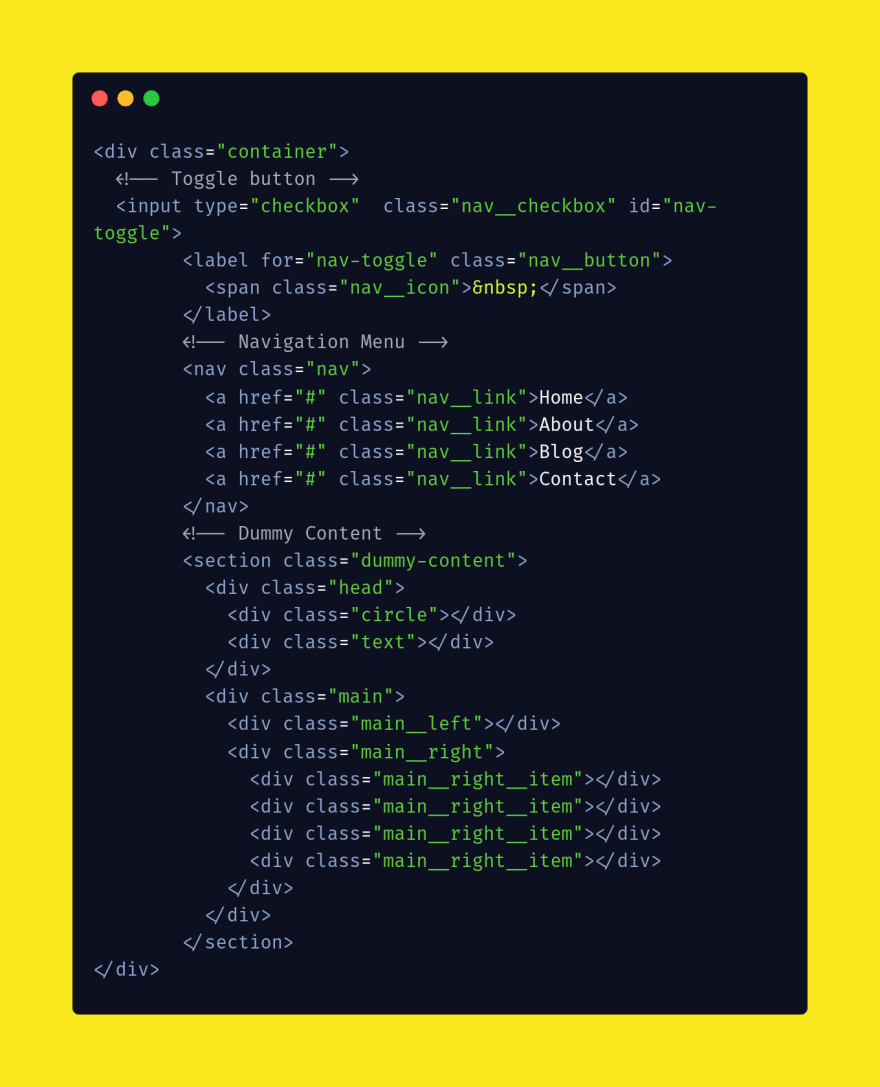
The CSS Styles
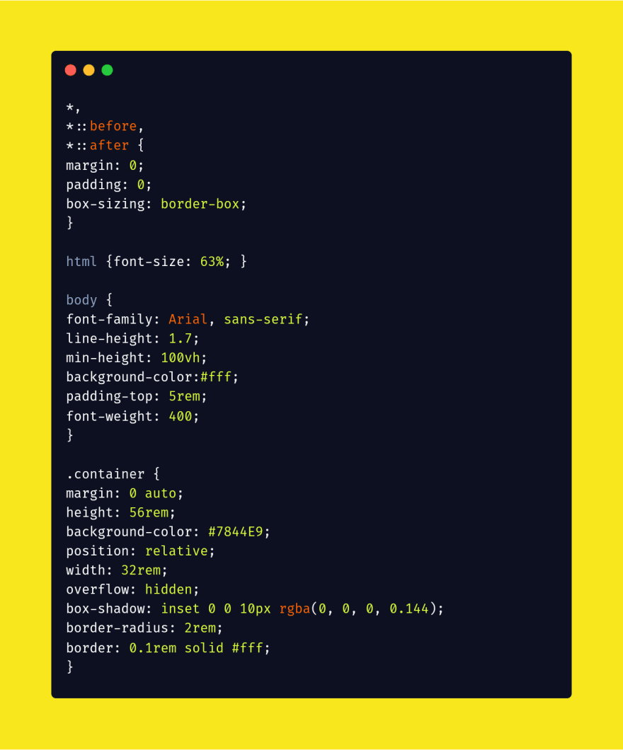
- As the above HTML, first of all, we’ll define some styles for the body and main container.
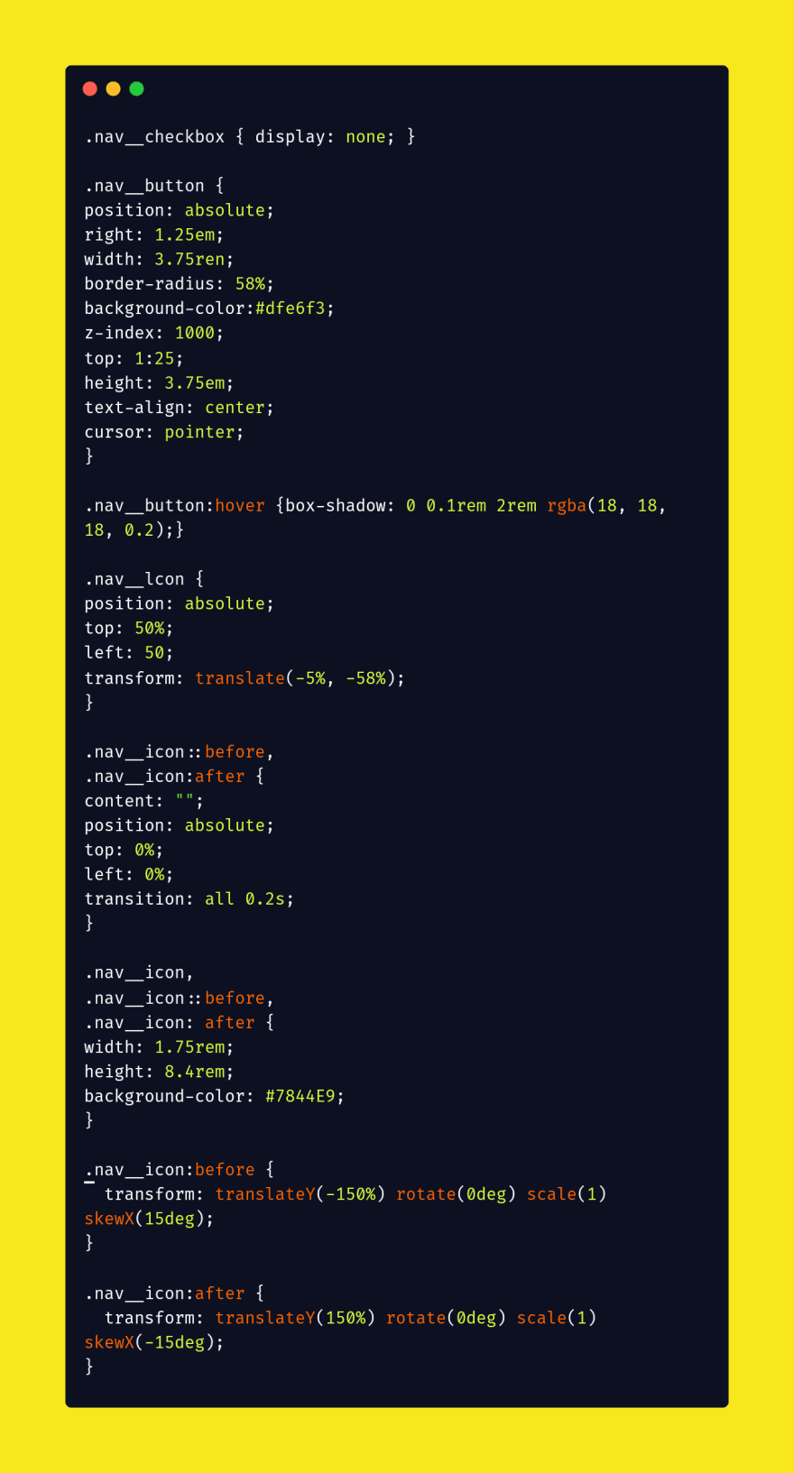
- After that styles nav using CSS position absolute property, if you want to make it static just remove position attribute. If you want to change its thickness, update the height value.
- Similarly, you are also able to change its background color according to your own theme.
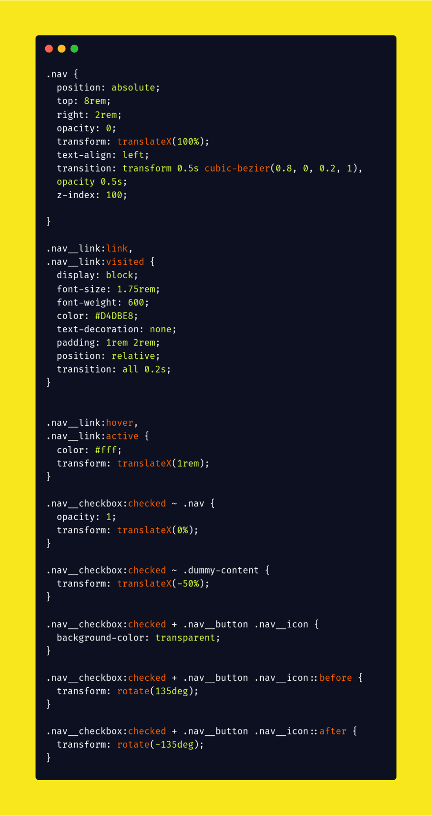
- Add the following CSS code for the dummy content and it's menu.
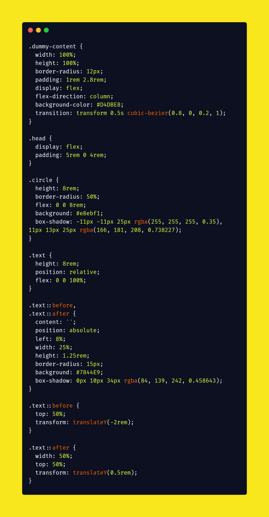
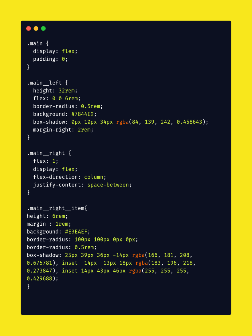
Final Result:-
If you need source code please follow me on instagram @codev_land
That’s all! Let me know by comment below if you have successfully implemented this sidebar navigation menu into your project.
Keep Claim And Just Code It ?
This content originally appeared on DEV Community and was authored by Chetan Atrawalkar?CA.
Chetan Atrawalkar?CA. | Sciencx (2021-08-24T05:52:14+00:00) ? CSS Responsive Sidebar Navigation.. Retrieved from https://www.scien.cx/2021/08/24/%f0%9f%94%b5-css-responsive-sidebar-navigation/
Please log in to upload a file.
There are no updates yet.
Click the Upload button above to add an update.

