This content originally appeared on 1stWebDesigner and was authored by Christina Truong
This article was originally posted at https://medium.com/@christinatruong/the-text-shadow-css-property-d1064bb1b27d and was kindly shared by Christina Truong. Check out more of her work at https://christinatruong.com.
When adding CSS styles to text on an HTML page, it’s usually best to keep it subtle, to make sure that the content on your page is easy to read. But sometimes you may want to make a small block of text stand out a little more than the rest. In this post, I’ll go over how to use the text-shadow CSS property to add a drop shadow to your text.
UNLIMITED DOWNLOADS: 500,000+ WordPress & Design Assets
Sign up for Envato Elements and get unlimited downloads starting at only $16.50 per month!

Prefer to watch a video? This article is a companion piece to my Decoded by Christina series on YouTube.
There are some basic ways to make your text stand out. You can make it bold, change the color, or use different font-sizes.
Another option is to use the text-shadow property to add a drop shadow. There are four values used with this property. Two are required, the offset-x and offset-y, and two are optional, the blur-radius and color value.
/* offset-x | offset-y | blur-radius | color */
text-shadow: 2px 2px 4px green;
Let’s go over how to define each value.
offset-x and offset-y
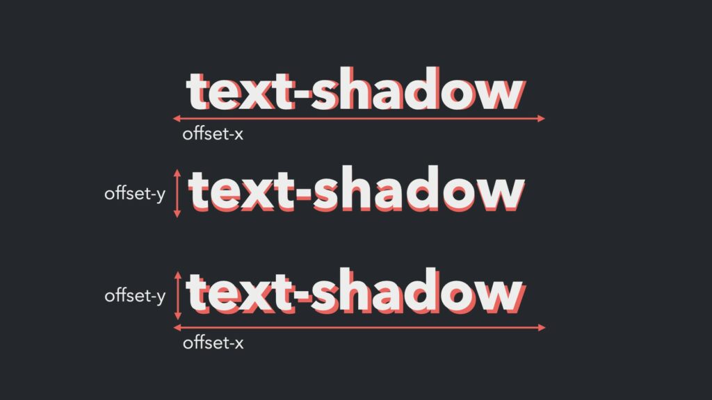
The offset-x value determines how far away, from the element, the shadow will appear on the x-axis, which runs left to right. The second value, the offset-y, determines the distance of the shadow on the y-axis, which runs top to bottom.

These values can be defined with any length data type, which is a number followed by any unit used to represent a distance value (e.g. px, em, rem or a percentage). Also, when using a property with multiple values, each has to be separated by a space.
/* offset-x | offset-y */
text-shadow: 2px 2px;
Since both the offset-x and offset-y values are required, if you add only value, you won’t see any change. But if you only want a shadow on the x-axis, then set the offset-y value to 0 or vice versa.
text-shadow: 2px 0px; /* will only show the shadow on the x-axis */
text-shadow: 0px 2px; /* will only show the shadow on the y-axis */
I used to always get the direction of the x- and y-axis mixed up until I saw an example using Beyoncé’s “Irreplaceable” lyrics as a reminder. In the song, she sings to her ex, “to the left to the left, everything you own in the box to the left.” So, ex (or x) to the left!
blur-radius and color
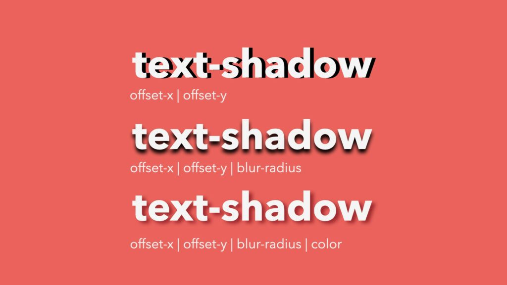
If you only define the offset-x and offset-y values, the shadow will look exactly like a copy of the text.
To create a softer shadow effect, add a third value, the blur-radius. This will blur the edges of the shadow. Any length data type can be used here as well. The larger the value, the bigger and more transparent the blur effect.
The last value is used to change the shadow from the default black colour to any other colour by adding a color value (e.g. keyword, hex code).

Putting it all together
Most of the time, text-shadow effects are used add a subtle drop shadow and not quite like the example below. But for demonstration and testing, using values that create a more prominent style will make it easier to see what each value does.
See the Pen
text-shadow example by Christina Truong (@christinatruong)
on CodePen.light
To make a text-shadow effect a little more subtle, I generally use a dark gray color or something that matches to the background colour, rather than pure black. This will create a softer shadow. (Note that the hex values in the example is using the shorthand notation.)
For the other values, I find that 1–3px is usually enough to give you just a bit of a shadow effect without overwhelming the text. Though there are always exceptions to the rule so I would suggest playing around with different values to get the effect you’re looking for. But in a nutshell, this is how you add a drop shadow to your text.
And that’s it!
This content originally appeared on 1stWebDesigner and was authored by Christina Truong
Christina Truong | Sciencx (2021-09-01T12:44:04+00:00) The text-shadow CSS Property. Retrieved from https://www.scien.cx/2021/09/01/the-text-shadow-css-property/
Please log in to upload a file.
There are no updates yet.
Click the Upload button above to add an update.
