This content originally appeared on DEV Community and was authored by
I'ver just remade my website once more and I'll show you how I made it, what tools I used, a bunch of design tips, and more. You can view the website here
Also, please don't fill out the Hire Me form unless you really want a website. It actually will email me and I don't want my inbox spammed ?.
Design Tips
I've learned lots of things through just simply developing my website and I want to share the knowledge with all of you devs. I'll show you tons of tips and tricks to make your websites look better.
1. Paragraph line spacing
Have you ever looked at a paragraph (<p> tag) in your website and just wondered why it wasn't working out the way you wanted? Here's one reason why.
Take a look at this picture right here:
Doesn't look very convincing, right?
Now take a look at one of them in my website.
Something I've figured out looks better is adding additional line height to your paragraphs. I prefer to keep text size at about 20px and keep a line height of 40px.
Most of you devs should know this already, but I'll show you how anyways.
p{
  font-size: 20px;
  line-height: 40px;
  text-align: justify;
}
2. Use the ­ tag between longer words
Take a look at this absolutely terrible-looking paragraph. When using text-align: justify;, your words just look crazy-spaced, right?
What you can do is put the ­ escaped HTML character between longer words. For example, <h1>Verymuch­longword</h1>.
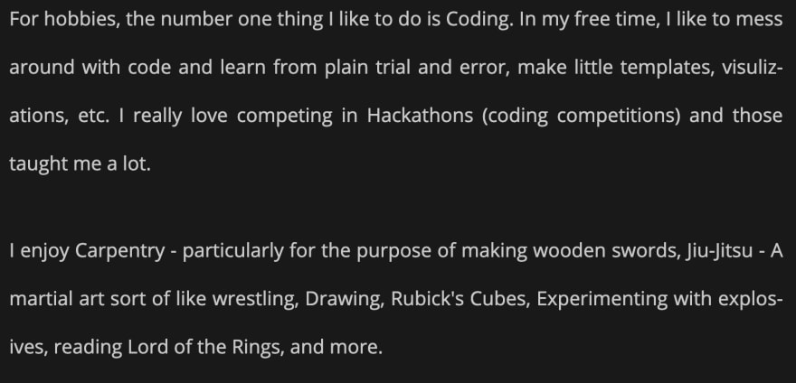
Take a look at this right here:
Do you see how the word "visulizations" is split? (I might've spelled that wrong). The ­ character will do that automatically when the word is getting too "squished up".
I've made some code in javascript that you can use so that all words over eight characters will have that special character inserted into it. It will not do that for <strong> tags, <em> tags, and all other HTML tags within your paragraph.
let paragraphs = docyment.querySelectorAll("p");
paragraphs.forEach(par => {
let cont = par.innerHTML.split(' ');
let res = [];
for (var i in cont) {
if (cont[i].length >= 8 && (!cont[i].includes("<") && !cont[i].includes(">"))) {
let t = cont[i];
res.push(t.slice(0, Math.round(t.length / 2)) + "­" + t.slice(Math.round(t.length / 2), t.length))
} else {
res.push(cont[i]);
}
}
par.innerHTML = res.join` `;
})
3. Curved Seperations
Not sure if you can see that gif down there but go ahead and give it a try. If not, go over to the website.
So honestly I feel like curved seperations give a better feel to how smooth the website is. Curved lines kind of keep the user scrolling. I've found a totally amazing tool to draw those things with.
https://codepen.io/anthonydugois/full/mewdyZ
Users that use a macbook will have a little bit of a harder time using that tool up there than users with a PC honestly. It's hard to explain how to do it, but yeah you'll get used to it. You devs should be able to figure it out.
First, you'll want to draw an svg path like shown below:
Then, simply pop it into an <svg> tag.
<svg viewbox="0 0 800 200">
  <path d="M 0 0 L 0 150 Q 200 150 400 100 Q 600 50 800 100 L 800 0 L 0 0 "/>
</svg>
The path is automatically generated for you in the bottom-right corner. If you want to make your websites look much better, that is something I'd recommend you highly use.
4. Add more content/padding to your website
Sometimes when I go to a website that doesn't have a lot of content in it, I'm kind of "looking" for more. This is a little something I've noticed that is one of the harder elements to pick out.
If you don't have much to say on your site, increase the line-height of text, add additional padding on the y-axis, make everything thicker in the y-direction.
Even if your website has a lot of whitespace/empty space, it looks better like that than a website that is super compacted and isn't something you can scroll through much.
Take a look at the "About" page in my older website:
Now take a look at how things are spaced out in my new one:
The more there is to scroll in a website gives a user an urge to scroll and read more. Also, adding additional design will keep them going. Too much, and they won't want to read it all.
Keep a nice balance and that is what will help others to actually read content on a website.
Thanks for reading this post!
Happy Coding!
This content originally appeared on DEV Community and was authored by
| Sciencx (2021-09-04T20:03:32+00:00) 4 Web Design Tips I used in my brand-new website; The four tips you’ll want to use.. Retrieved from https://www.scien.cx/2021/09/04/4-web-design-tips-i-used-in-my-brand-new-website-the-four-tips-youll-want-to-use/
Please log in to upload a file.
There are no updates yet.
Click the Upload button above to add an update.


