
This content originally appeared on DEV Community and was authored by Code_Jedi
If you have a dataset which is divided into categories of data like: kickstarter projects, flower species or most popular car brands, then it's a good idea to visualize those data categories to see the amount of values within each category.
Here's a dataset of over 300,000 kickstarter projects as well as their categories, goal, No. of backers and much more: https://www.kaggle.com/kemical/kickstarter-projects.
When looking at the dataset, you would notice that every one of those 300,000+ projects are put into different categories such as: Games, Music, Art and Technology.
To make a python script that will display each category as a fraction of a donut plot based on the number of projects belonging to it, first add the necessary libraries and load in the dataset:
import pandas as pd
import matplotlib.pyplot as plt
import seaborn as sns

data = pd.read_csv('ks-projects.csv')

df = pd.DataFrame(data)
Next, to get the number of projects within each category, add this line of code to your script:
category_values = df.pivot_table(columns=['main_category'], aggfunc='size')
Now to display "category_values" in a doughnut graph, add this to the end of your script:
plt.pie(category_values)
my_circle=plt.Circle( (0,0), 0.7, color='white')
p=plt.gcf()
p.gca().add_artist(my_circle)

plt.show()
Now if you run your script, your doughnut plot should look something like this:
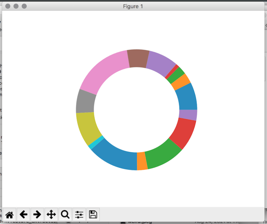
As you can see, it displays the amount of projects within each category as a fraction of the doughnut plot, but it doesn't label the categories.
To label the categories, add these lines of code before your doughnut plot:
category_names = data['main_category']
categories = category_names.unique()
categories.sort()
This will count the number of unique category names within the dataset and sort them in alphabetical order.
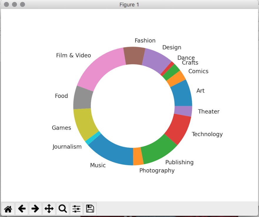
The reason for sorting them in alphabetical order is because the category values we defined earlier are ordered alphabetically( first value is Art: 28153 and last value is Theater: 10913).
Now to display the doughnut plot with its corresponding labels, replace
plt.pie(category_values)
with
plt.pie(category_values, labels=categories)
Full code:
import pandas as pd
import matplotlib.pyplot as plt
import seaborn as sns

data = pd.read_csv('ks-projects.csv')

df = pd.DataFrame(data)
category_values = df.pivot_table(columns=['main_category'], aggfunc='size')

category_names = data['main_category']
categories = category_names.unique()
categories.sort()
plt.pie(category_values, labels=categories)

my_circle=plt.Circle( (0,0), 0.7, color='white')
p=plt.gcf()
p.gca().add_artist(my_circle)
plt.show()
Now if your run your script, you should see a doughnut plot that displays the fraction of projects each category contains, as well as the categories' labels:
This content originally appeared on DEV Community and was authored by Code_Jedi
Code_Jedi | Sciencx (2021-09-04T12:49:20+00:00) How to visualize data categories in python with pandas. Retrieved from https://www.scien.cx/2021/09/04/how-to-visualize-data-categories-in-python-with-pandas/
Please log in to upload a file.
There are no updates yet.
Click the Upload button above to add an update.