This content originally appeared on DEV Community and was authored by Modern Web
Hello, I am kunaal from Modern web. Welcome here, In today's article we'll learn to create an awesome product card which you can proudly put in your portfolio to impress your clients.
This product card is very good to practice you CSS and JS skills. So without wasting more time. Let's start to code.
Video Tutorial
I appreciate if you can support me by subscribing my youtube channel.
Code
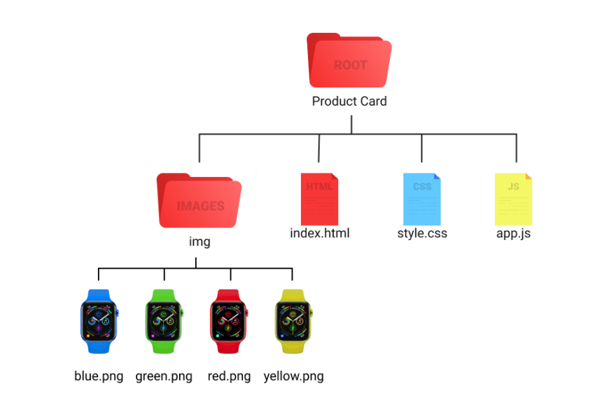
Before we start code, you can check the folder structure.
Let's start with basic HTML structure and link style.css, app.js file to index.html. Once you are done with that. Just make a simple div for card. And style it.
<div class="card">
</div>
*{
    margin: 0;
    padding: 0;
    box-sizing: border-box;
}

body{
    width: 100%;
    height: 100vh;
    display: flex;
    justify-content: center;
    align-items: center;
    background-color: #101010;
}
For this card, we'll also use CSS variables which will make easy for us to change product image and color. So assign some variables.
:root{
    --product-img: url('img/red.png');
    --bg-color: #e5031d;
}
In CSS you can define variable inside any element adding
--at the beginning. And can access it usingvar()
Now of course style card element.
.card{
    width: 300px;
    height: 400px;
    border-radius: 0 20px 0 20px;
    background-color: #1b1b1b;
    box-shadow: 0 15px 10px rgba(0, 0, 0, 0.25);
    display: flex;
    justify-content: center;
    align-items: center;
    position: relative;
    cursor: pointer;
}
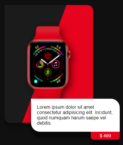
Output
Now according to our design, we have a background below the image which is in kind of diagonal. So, make that.
<div class="bg-container">
    <span class="product-bg"></span>
</div>
Above code and all the following HTML code we have to add inside
cardelement.
.bg-container{
    width: 100%;
    height: 100%;
    position: absolute;
    border-radius: 0 20px 0 20px;
    overflow: hidden;
}

.product-bg{
    position: absolute;
    width: 100%;
    height: 100%;
    background: var(--bg-color);
    clip-path: polygon(70% 0, 100% 0, 100% 100%, 20% 100%);
    transition: 1s;
}
Here I am using clip-path for .product-bg element to make a triangle shape.
Output
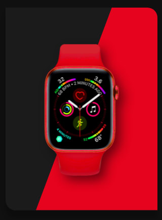
Great! Now make image.
<div class="product-img"></div>
.product-img{
    width: 250px;
    height: 300px;
    background-image: var(--product-img);
    filter: drop-shadow(10px 10px 10px rgba(0,0,0,0.5));
    background-size: 100% 100%;
    transition: margin 1s;
    transition-delay: .7s;
}
Output
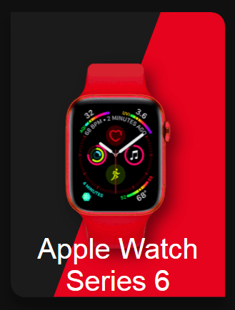
Make product name element.
<span class="product-name">apple watch series 6</span>
.product-name{
    font-size: 40px;
    color: #fff;
    text-transform: capitalize;
    position: absolute;
    padding: 0 20px;
    text-align: center;
    font-family: sans-serif;
    bottom: 0;
}
Output
Now just add opacity:0 to product-name because we don;t want to show until we click on card and make that card active.
.product-name{
    // previous styles
    opacity: 0;
}
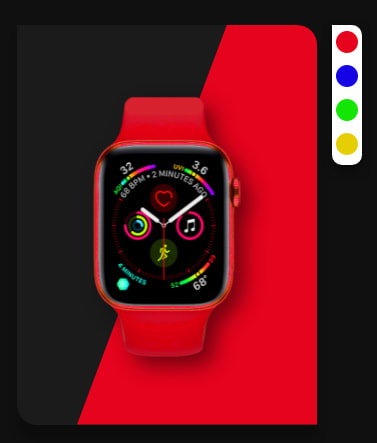
Make color options now.
<div class="colors">
    <div class="red"></div>
    <div class="blue"></div>
    <div class="green"></div>
    <div class="yellow"></div>
</div>
.colors{
    width: 30px;
    height: 140px;
    background: #fff;
    position: absolute;
    right: -15%;
    top: 0;
    display: flex;
    flex-direction: column;
    justify-content: start;
    align-items: center;
    border-radius: 0 10px 10px 10px;
    box-shadow: 0 5px 10px rgba(0, 0, 0, 0.5);
    transition: 1s;
    transition-delay: .7s;
    overflow: hidden;
}

.colors div{
    min-width: 22px;
    min-height: 22px;
    border-radius: 50%;
    background: #000;
    margin: 6px 0;
    cursor: pointer;
}

.colors div:nth-child(1){
    background: #e5031d;
}

.colors div:nth-child(2){
    background: #1503e5;
}

.colors div:nth-child(3){
    background: #15e503;
}

.colors div:nth-child(4){
    background: #e5ce03;
}
Output
And yes, we want to hide this also. For that instead of opacity give its height to 0.
.colors{
    // previous styles
    height: 0;
}
Make card content/ card body now.
<div class="card-body">
    Lorem ipsum dolor sit amet consectetur adipisicing elit. Incidunt, quod numquam harum saepe vel debitis.

    <span class="price">$ 499</span>
</div>
.card-body{
    position: absolute;
    bottom: -30px;
    left: 80%;
    transform: translateX(-50%);
    width: 100%;
    padding: 20px;
    border-radius: 0 30px 0 30px;
    background: #fff;
    font-family: sans-serif;
    box-shadow: 0 20px 10px rgba(0,0,0,0.5);
}

.price{
    position: absolute;
    top: 100%;
    right: 0;
    padding: 5px 30px;
    border-radius: 0 0 10px 10px;
    box-shadow: 0 20px 10px rgba(0, 0, 0, 0.5);
    background: var(--bg-color);
    color: #fff;
    font-size: 15px;
}
Output
Set card-body element's opacity to 0.
.card-body{
    //previous styles
    opacity: 0;
}
Now we are done with styles, we just need to show the elements when card have active class. For that set every element's different styles when card have active class.
.card.active .product-bg{
    clip-path: polygon(0% 0%, 100% 0%, 100% 100%, 0 100%);
}

.card.active .product-img{
    margin-top: -100%;
}

.card.active .product-name{
    transition: 1s;
    transition-delay: .7s;
    opacity: 1;
    bottom: 25%;
}

.card.active .colors{
    height: 140px;
}

.card.active .card-body{
    opacity: 1;
    transition: 1s;
    transition-delay: 1.4s;
}
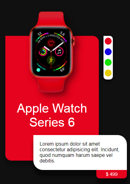
Output
Output when added
activeclass tocardelement insideindex.htmlfile.
Now we have to make active class toggle when we click on card. Open app.js file.
const card = document.querySelector('.card'); // selecting card element

card.addEventListener('click', () => {
    card.classList.add('active');
})
This will add active class to card on click. But how to remove that class. For that add click event to window itself.
window.addEventListener('click', (e) => {
    if(e.target.className == ''){
        card.classList.remove('active');
    }
})
e.target.classNamewill return the elementsclass. So if, user click oncard, user will getcardas a class. Which is of course not equal to empty string.
Our effect is done, But to make it next level, let's make its color and image changable.
const colors = document.querySelectorAll('.colors div'); // select colors div

let hexCodes = ['#e5031d', '#1503e5', '#15e503', '#e5ce03']; // store the watch colors in an array.
Now add click event to each color element. And inside that change the CSS variable value.
colors.forEach((item, i) => {
    item.addEventListener('click', () => {
        const root = document.querySelector(':root');

        root.style.setProperty('--product-img', `url(img/${item.className}.png)`);
        root.style.setProperty('--bg-color', hexCodes[i]);
    })
})
:root was the element in which we defined the CSS variables.
root.style.setProperty() method is used to change the value of CSS variable.
And that's it. Great Job! we are done with our product card. I hope you understood each and everything. If you have doubt or I missed something let me know in the comments.
Articles you may find Useful
I really appreciate if you can subscribe my youtube channel. I create awesome web contents.
My next upcoming tutorials which you might don't want to miss.
- Fully working e-commerce website - Fullstack
- Responsive Personal Portfolio
- Visiting card designer with download feature.
Your donation really motivates me to do more amazing tutorials like this. Support me on patreon, Buy me a coffee, Donate me on paypal
Thanks For reading.
This content originally appeared on DEV Community and was authored by Modern Web
Modern Web | Sciencx (2021-09-05T11:35:59+00:00) How to make a product card using HTML, CSS and JS. With cool UX.. Retrieved from https://www.scien.cx/2021/09/05/how-to-make-a-product-card-using-html-css-and-js-with-cool-ux/
Please log in to upload a file.
There are no updates yet.
Click the Upload button above to add an update.

