This content originally appeared on DEV Community and was authored by Zoltán Szőgyényi
I've been using Tailwind CSS for quite some time and I am in love with how easy it is to set up user interfaces directly from your HTML/React/Vue or other templating files.
One thing that I noticed is that it is quite bothersome when I have to start a new project not having a set of components to work with out of the box.
This is why I started a tutorial series on how to build some of the most commonly used web components with the utility classes from Tailwind CSS.
Last time I talked about how you can build a Tailwind CSS button component including different styles and using SVG icons as well.
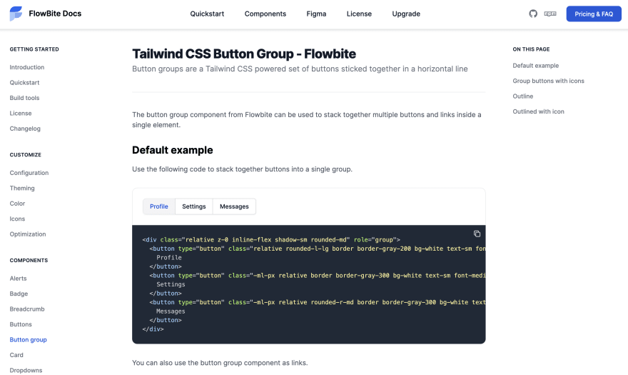
Today I want to talk about how you can create a group of buttons stacked together that you can use for more advanced user interfaces.
Let's get started!
Tailwind CSS button group component
First of all I want to specify the fact that the button component can either be a link using the <a> tag or simply just a <button> element.
We'll start with using the <button> element and create the basic HTML that we'll need for this component.
<div role="group">
  <button type="button">
    Flowbite
  </button>
  <button type="button">
    Tailwind
  </button>
  <button type="button">
    The Practical Dev
  </button>
</div>
Notice that we've added the role="group" attribute to the parent div element?
This helps browsers identify it as a group of components stacked together which in turn helps people with disabilities browse your website more easily.
Next up we should add some styles to the parent div element to stack the buttons together.
<div class="inline-flex shadow-sm rounded-md" role="group">
  <button type="button">
    Flowbite
  </button>
  <button type="button">
    Tailwind
  </button>
  <button type="button">
    The Practical Dev
  </button>
</div>
Now let's apply some styles to the button components.
<div class="inline-flex shadow-sm rounded-md" role="group">
  <button class="rounded-l-lg border border-gray-200 bg-white text-sm font-medium px-4 py-2 text-gray-900" type="button">
    Flowbite
  </button>
  <button class="border-t border-b border-gray-200 bg-white text-sm font-medium px-4 py-2 text-gray-900" type="button">
    Tailwind
  </button>
  <button class="rounded-r-md border border-gray-200 bg-white text-sm font-medium px-4 py-2 text-gray-900" type="button">
    The Practical Dev
  </button>
</div>
Notice that the button in the middle has only a top and border bottom? All of the buttons between the first and last element should only have a border on the Y axis to prevent a wider border between the elements.
Now let's add some hover and focus styles to the buttons as well.
<div class="inline-flex shadow-sm rounded-md" role="group">
  <button type="button" class="rounded-l-lg border border-gray-200 bg-white text-sm font-medium px-4 py-2 text-gray-900 hover:bg-gray-100 hover:text-blue-700 focus:z-10 focus:ring-2 focus:ring-blue-700 focus:text-blue-700">
    Flowbite
  </button>
  <button type="button" class="border-t border-b border-gray-200 bg-white text-sm font-medium px-4 py-2 text-gray-900 hover:bg-gray-100 hover:text-blue-700 focus:z-10 focus:ring-2 focus:ring-blue-700 focus:text-blue-700">
    Tailwind
  </button>
  <button type="button" class="rounded-r-md border border-gray-200 bg-white text-sm font-medium px-4 py-2 text-gray-900 hover:bg-gray-100 hover:text-blue-700 focus:z-10 focus:ring-2 focus:ring-blue-700 focus:text-blue-700">
    The Practical Dev
  </button>
</div>
Awesome! We're done with the first button group component. It should look something like this:
Button group as links
You can also use the button group components as a stack of links.
<div class="inline-flex shadow-sm rounded-md">
  <a href="#" aria-current="page" class="rounded-l-lg border border-gray-200 bg-white text-sm font-medium px-4 py-2  hover:bg-gray-100 text-blue-700 focus:z-10 focus:ring-2 focus:ring-blue-700 focus:text-blue-700">
    Profile
  </a>
  <a href="#" class="border-t border-b border-gray-200 bg-white text-sm font-medium px-4 py-2 text-gray-900 hover:bg-gray-100 hover:text-blue-700 focus:z-10 focus:ring-2 focus:ring-blue-700 focus:text-blue-700">
    Settings
  </a>
  <a href="#" class="rounded-r-md border border-gray-200 bg-white text-sm font-medium px-4 py-2 text-gray-900 hover:bg-gray-100 hover:text-blue-700 focus:z-10 focus:ring-2 focus:ring-blue-700 focus:text-blue-700">
    Messages
  </a>
</div>
Button group with icons
You can also use SVG icons with the button group element.
<div class="inline-flex shadow-sm rounded-md" role="group">
  <button type="button" class="rounded-l-lg border border-gray-200 bg-white text-sm font-medium px-4 py-2 text-gray-900 hover:bg-gray-100 hover:text-blue-700 focus:z-10 focus:ring-2 focus:ring-blue-700 focus:text-blue-700 inline-flex items-center ">
    <svg class="w-4 h-4 mr-2 fill-current" fill="currentColor" viewBox="0 0 20 20" xmlns="http://www.w3.org/2000/svg"><path fill-rule="evenodd" d="M18 10a8 8 0 11-16 0 8 8 0 0116 0zm-6-3a2 2 0 11-4 0 2 2 0 014 0zm-2 4a5 5 0 00-4.546 2.916A5.986 5.986 0 0010 16a5.986 5.986 0 004.546-2.084A5 5 0 0010 11z" clip-rule="evenodd"></path></svg>
    Profile
  </button>
  <button type="button" class="border-t border-b border-gray-200 bg-white text-sm font-medium px-4 py-2 text-gray-900 hover:bg-gray-100 hover:text-blue-700 focus:z-10 focus:ring-2 focus:ring-blue-700 focus:text-blue-700 inline-flex items-center">
    <svg class="w-4 h-4 mr-2 fill-current" fill="currentColor" viewBox="0 0 20 20" xmlns="http://www.w3.org/2000/svg"><path d="M5 4a1 1 0 00-2 0v7.268a2 2 0 000 3.464V16a1 1 0 102 0v-1.268a2 2 0 000-3.464V4zM11 4a1 1 0 10-2 0v1.268a2 2 0 000 3.464V16a1 1 0 102 0V8.732a2 2 0 000-3.464V4zM16 3a1 1 0 011 1v7.268a2 2 0 010 3.464V16a1 1 0 11-2 0v-1.268a2 2 0 010-3.464V4a1 1 0 011-1z"></path></svg>
    Settings
  </button>
  <button type="button" class="rounded-r-md border border-gray-200 bg-white text-sm font-medium px-4 py-2 text-gray-900 hover:bg-gray-100 hover:text-blue-700 focus:z-10 focus:ring-2 focus:ring-blue-700 focus:text-blue-700 inline-flex items-center">
    <svg class="w-4 h-4 mr-2 fill-current" fill="currentColor" viewBox="0 0 20 20" xmlns="http://www.w3.org/2000/svg"><path fill-rule="evenodd" d="M2 9.5A3.5 3.5 0 005.5 13H9v2.586l-1.293-1.293a1 1 0 00-1.414 1.414l3 3a1 1 0 001.414 0l3-3a1 1 0 00-1.414-1.414L11 15.586V13h2.5a4.5 4.5 0 10-.616-8.958 4.002 4.002 0 10-7.753 1.977A3.5 3.5 0 002 9.5zm9 3.5H9V8a1 1 0 012 0v5z" clip-rule="evenodd"></path></svg>
    Downloads
  </button>
</div>
That's all for now! I hope you liked this tutorial.
Flowbite - Tailwind component library
This Tailwind CSS button group component is part of a larger open-source component library called Flowbite.
You can view more components and examples by checking out Flowbite's Tailwind components documentation.
This content originally appeared on DEV Community and was authored by Zoltán Szőgyényi
Zoltán Szőgyényi | Sciencx (2021-10-03T10:44:38+00:00) Building a Tailwind CSS button group component. Retrieved from https://www.scien.cx/2021/10/03/building-a-tailwind-css-button-group-component/
Please log in to upload a file.
There are no updates yet.
Click the Upload button above to add an update.


