This content originally appeared on Jonnie Hallman (@destroytoday) and was authored by Jonnie Hallman (@destroytoday)
Recently, I got a burst of inspiration. I’ve been steadily working on the new Clients section in Cushion, but another part of the app has piqued my interest—scheduling. With the Clients section in a stable state, I thought I’d let it marinate while I receive beta feedback, and pursue scheduling in the meantime.
With Cushion nearing eight years old, and scheduling being one of its oldest features, I wondered what modern scheduling would look like—now eight years later. Despite being so old, I actually think Cushion’s existing scheduling still does a lot of things right—the infinitely scrollable timeline, the colorful visuals, the useful information at-a-glance. The areas that I can really improve, however, revolve around the timeline’s scale and interaction—or lack there of.

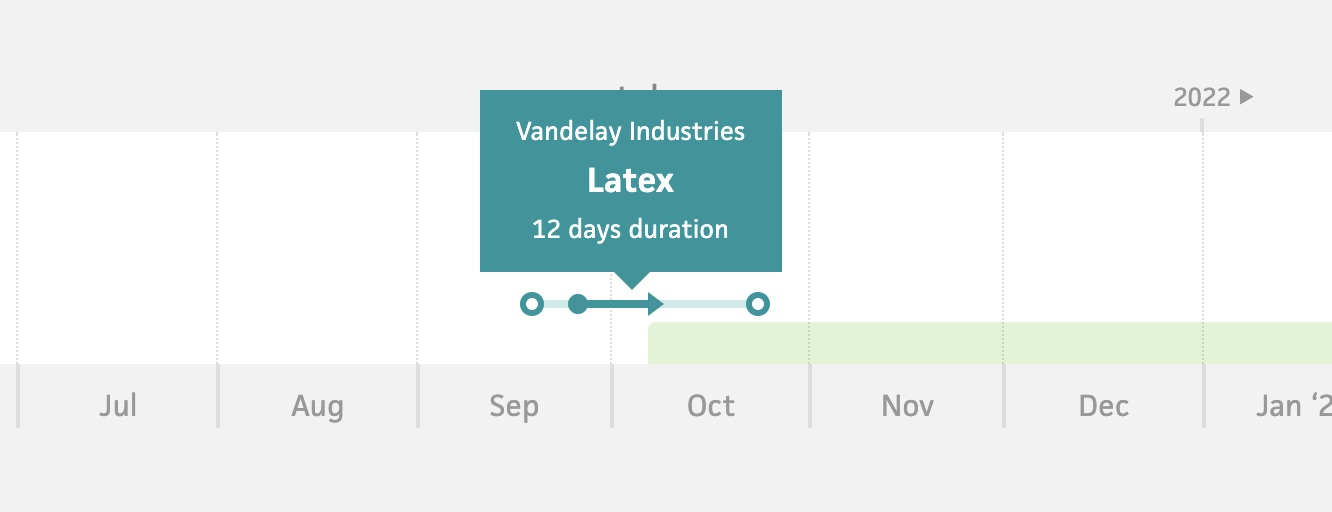
While the schedule timeline is useful at-a-glance, it also shares the page with the list of projects, so the canvas size is tiny (the min-height is ~100px and projects are only a few pixels high). This leaves space for… nothing really, and requires the user to hover a project in order to see its name or client.

I actually remember a user reaching out a few years ago, saying that all the project names should be visible instead of being hidden behind hover. At the time, I didn’t think this was a worthwhile idea since it’s not hard (for me) to hover a project, but now, I think it’s incredibly valid. Nothing should be hidden behind hover in this timeline. A user should be able to take one look at their schedule and be able to digest it without needing to hover. This means a full-window timeline with always-visible labels.
Diving further into the UX, the spots where Cushion’s scheduling really feels eight years old lie mostly in its interactions. The existing schedule is very click-heavy. A user sees this colorful graph-like timeline and immediately thinks they can interact with it, but the most they can do is click into a project. Even to scroll, they need to click left and right arrows—this isn’t intuitive at all. It also slows the user down and lends heavily to one of my biggest gripes with Cushion—a lot of clicking that takes you away from where you were. If I want to move a project to next month, why can’t I do that straight from the timeline? Why do I need to need to click into the project, then click the “Edit” button, then update the dates using input fields, then return to the timeline and see if everything looks right? I should be able to simply click and drag the project in the timeline.
Similarly to moving a project, I should be able to schedule a new project by clicking and dragging. While projects have a bit more complexity than time-tracking entries or workloads, Cushion should be smart enough to make these simple interactions work intuitively. If I click and drag a project in the past, it should know to specify its started and finished dates, and assume that it’s a finished project. Likewise, if I click and drag a project in the future, it should know to only specify its estimated start and estimated finish dates.L
Lastly, for folks who track time, there’s no reason why the schedule shouldn’t use their tracked time to visualize their projects’ actual workload (using time tracking entries) compared to their estimated workload. If a user could see that they were only able to track 20 hours a week for a project estimated for 40 hours a week, they could learn from that and adjust their estimates going forward.
Overall, there’s so much untapped potential in Cushion’s schedule timeline, which is why it has me buzzing. I could honestly see this schedule timeline handle several areas of the app rather than separating them into different views. Rethinking the schedule timeline also has me wondering if I could establish scheduling as the leading feature in Cushion, so the marketing is a bit more focused—instead of scheduling competing with everything else. I definitely plan to provide a lot more details about my ideas and designs for scheduling, but I cut this post short because there’s so much already. From here, I’ll be able to share what I’m actually working on, in small bites, as I work on it.
This content originally appeared on Jonnie Hallman (@destroytoday) and was authored by Jonnie Hallman (@destroytoday)
Jonnie Hallman (@destroytoday) | Sciencx (2021-10-04T12:19:00+00:00) Exploring a modern schedule timeline. Retrieved from https://www.scien.cx/2021/10/04/exploring-a-modern-schedule-timeline-2/
Please log in to upload a file.
There are no updates yet.
Click the Upload button above to add an update.
