This content originally appeared on DEV Community and was authored by Shantanu Jana
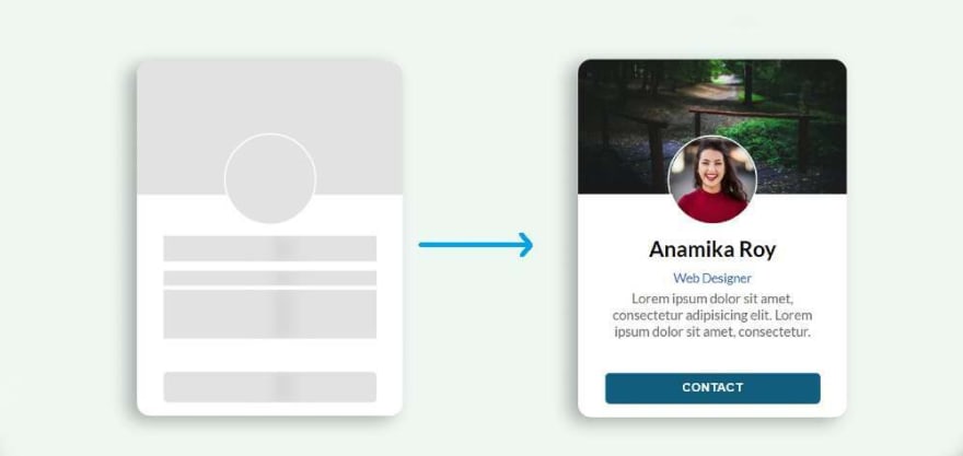
In this article I have shown how Skeleton Screen Loading Animation is created using HTML CSS and JavaScript. I created this animation on a profile card.
You will see various websites where you can see Skeleton Loading Animation before loading any element. Undoubtedly it enhances the quality and beauty of the website a lot. You need to have a basic idea about HTML and CSS to make it.
Skeleton Screen Loading Animation
I have shown this kind of effect before but it was not effective. In this case I have used JavaScript to make it work. This Skeleton Screen Loading Animation will continue for three seconds when you open the web page. After three seconds this effect is off and all the information on the profile card can be seen.
Below I have given a live demo that will help you know how it works.
Now you create an HTML, CSS and JavaScript file. You can use this link to download the source code. If you are a beginner, follow the tutorial below.
Step 1: Design the web page
To create this animation, I first designed the webpage with CSS code. Here I have used light blue as the background color of the web page.
* {
  box-sizing: border-box;
  margin: 0;
  padding: 0;
}

body {
  display: flex;
  align-items: center;
  justify-content: center;
  height: 100vh;
  background: #eff7f2;
  font-family: "Lato", sans-serif;
}
Step 2: Basic structure of Skeleton Loading
Now I have created the basic structure of this Skeleton Loading Animation or Profile Card. I have used the width: 300px and height: 400px of this profile card. A shadow has been used around the card to enhance the beauty.
<div class="user-card skeleton">

</div>
.user-card {
  width: 300px;
  height: 400px;
  box-shadow: -10px 5px 20px rgba(0, 0, 0, 0.3);
  border-radius: 15px;
  overflow: hidden;
  background: white;
  display: flex;
  flex-direction: column;
  align-items: center;
  justify-content: space-between;
  transition: box-shadow 0.2s ease-in;
  cursor: pointer;
}

.user-card:hover {
  box-shadow: -10px 10px 20px rgba(0, 0, 0, 0.4);
}
Step 3: Add profile image and cover image
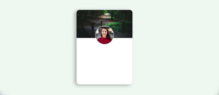
Now I have added profile image and cover image in profile card. I have used the width and height of the profile image 100 px. I used border-radius: 50% to make it completely round. I have added a cover image with height: 150px and width: 100%.
<div class="user-cover">
   <img class="user-avatar" src="img.jpg" alt="user profile image" />
</div>
.user-card .user-cover {
  height: 150px;
  width: 100%;
  position: relative;
  background-image: url(img1.jpg);
  background-position: center;
  background-size: cover;
}

.user-card .user-cover .user-avatar {
  position: absolute;
  width: 100px;
  height: 100px;
  border-radius: 50%;
  left: 0;
  right: 0;
  margin: auto;
  bottom: -35px;
  border: 2px solid #fff;
}
Step 4: Add basic information to the card
Now I have added some basic information in this Skeleton Screen Loading Animation or Profile Card. I used margin-top: 35px to keep all the information from top to bottom.
<div class="user-details">
   <div class="user-name hide-text">Anamika Roy</div>
   <div class="user-email hide-text">Web Designer</div>
   <div class="user-text hide-text">Lorem ipsum ... consectetur. </div>
</div>
.user-card .user-details {
  text-align: center;
  margin-top: 35px;
  margin-bottom: 25px;
  width: 80%;
}

.user-card .user-details .user-name {
  margin-bottom: 10px;
  font-size: 24px;
  font-weight: 600;
}

.user-card .user-details .user-email {
  font-size: 14px;
  color: #0f5fc0;
  font-weight: 500;
}
.user-card .user-details .user-text{
  margin-top: 5px;
  font-size: 15px;
  color: #666;
}
Step 5: Create contact button
Now I have added a contact button in it. I have used the button height: 35px, width 60% and background color blue. I have used font-weight: bold to increase the size of the text.
<button class="contact-user hide-text">CONTACT</button>
.user-card .contact-user {
  margin-bottom: 15px;
  height: 35px;
  width: 80%;
  border: 0;
  color: white;
  font-weight: bold;
  background: #035f7d;
  letter-spacing: 0.5px;
  border-radius: 5px;
  cursor: pointer;
}
Step 5: Add Loading Effect to images
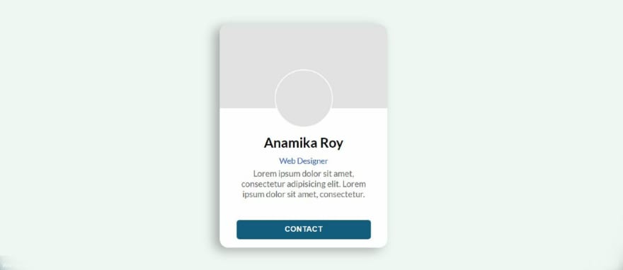
First I added animation between the profile image and the cover image. However, there is no animation in the image, only I have used gray color in the background. The way I designed the profile image and the cover image is the same way I designed it here.
.user-card.skeleton .user-cover {
  background: #e2e2e2;
}

.user-card.skeleton .user-cover .user-avatar {
  display: none;
}

.user-card.skeleton .user-cover::after {
  content: "";
  position: absolute;
  width: 100px;
  height: 100px;
  border-radius: 50%;
  left: 0;
  right: 0;
  margin: auto;
  bottom: -35px;
  border: 2px solid #fff;
  z-index: 10;
  background: #e2e2e2;
}
Step 6: Add Loading Effect to the information
Now I have added animation and color between the text and the button. First I added colors to the buttons and texts, then I added animations using @keyframes.
animation-duration: 2s used to help make this animation work every two seconds. Here animation means a black shadow will continue to travel from left to right every 2 seconds.
.user-card.skeleton .hide-text {
  background: #e2e2e2;
  color: transparent;
  position: relative;
  overflow: hidden;
}

.user-card.skeleton .hide-text::before {
  content: "";
  position: absolute;
  left: 0%;
  top: 0;
  height: 100%;
  width: 50px;
  background: linear-gradient(to right, #e2e2e2 25%, #d5d5d5 50%, #e2e2e2 100%);
  animation-name: gradient-animation;
  animation-duration: 2s;
  animation-iteration-count: infinite;
  filter: blur(5px);
}
Now I have implemented this animation using @keyframes.
@keyframes gradient-animation {
  from {
    left: 0%;
  }
  to {
    left: 100%;
  }
}
Step 7: Turn off Skeleton Loading Effect using JavaScript
Now the most important thing is to turn off the animation using JavaScript. Above we have added Skeleton Screen Loading Animation using css.
This animation will continue indefinitely. So now after some time using JavaScript you have to turn off that animation and instruct to view all the information in the profile card. I set the time to 3000 milliseconds using setTimeout. That means after 3000 milliseconds that gray color animation will be hidden.
If you want to use 4 seconds instead of these 3 seconds then you have to use 4000 instead of 3000 here.
const $el = document.querySelector(".user-card");

// Loading finished
setTimeout(() => {
  $el.classList.remove("skeleton");
  $el
    .querySelectorAll(".hide-text")
    .forEach((el) => el.classList.remove("hide-text"));
}, 3000);
Hope you learned from this tutorial how to create Skeleton Loading Animation using HTML CSS and JavaScript. I have already shared many more such tutorials, you can see those designs.
You can visit my blog for more tutorials like this.
https://www.foolishdeveloper.com/
This content originally appeared on DEV Community and was authored by Shantanu Jana
Shantanu Jana | Sciencx (2021-10-05T16:36:09+00:00) Skeleton Screen Loading Animation using HTML & CSS. Retrieved from https://www.scien.cx/2021/10/05/skeleton-screen-loading-animation-using-html-css/
Please log in to upload a file.
There are no updates yet.
Click the Upload button above to add an update.


