This content originally appeared on DEV Community and was authored by Amrin
Welcome to my "Build 10 CSS Projects in 10 Days" Series This is day 5 and project 5. If you haven't read the other articles in this series please check them out first. I'll list them at the end of this article.
Today I will build Huddle landing page from frontendmentor.
** As always before starting download the starter files **
From here
And open the starter files on your code editor.
Now, let's code.
Part 1: HTML
<body>
  <header>
    <img src="./images/logo.svg" alt="logo">
  </header>

  <main>
    <section class="left">
      <img src="./images/illustration-mockups.svg" alt="illustration-mockups">
    </section>
    <section class="right">
      <h1>Build The Community Your Fans Will Love</h1>
      <p>Huddle re-imagines the way we build communities. You have a voice, but so does your audience.
  Create connections with your users as you engage in genuine discussion. </p>
  <button>Register</button>
    </section>
  </main>
  <footer>
    <i class="fab fa-facebook-f"></i>
    <i class="fab fa-twitter"></i>
    <i class="fab fa-instagram"></i>
  </footer>
</body>
This is just the markup copy and paste it to your code editor. And read through it.
Part 2: CSS
Now we are going to style our project.
@import url('https://fonts.googleapis.com/css2?family=Open+Sans&family=Poppins:wght@400;600&display=swap');

/* global syles */

* {
    box-sizing: border-box;
    margin: 0;
    padding: 0;
}

body {
    font-family: 'Open Sans', sans-serif;
    background: hsl(257, 40%, 49%) url("./images/bg-desktop.svg") no-repeat;
    padding: 50px 60px;
}
Here we imported the fonts that were given in the "style-guide.md" file. From google fonts.
Added some global styles to every element with the global selector.
Then we added the font to the body, and background color, image, and some padding.
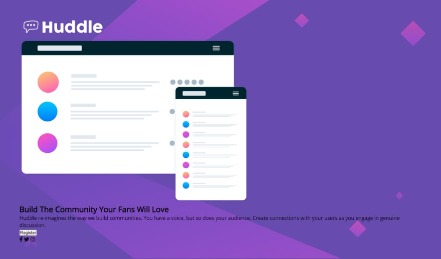
This is it so far.
/* hader */
header img {
    width: 200px;
}

/* main styles */
main {
    display: flex;
    padding-top: 85px;
    justify-content: space-between;
}

.left {
    padding-right: 2.5em;
}

.right {
    color: #fff;
}

h1 {
    font-size: 2.5em;
    font-family: 'Poppins';
    padding-bottom: 20px;
}

p {
    line-height: 1.7;
    opacity: .8;
}

button {
    padding: 15px 60px;
    margin-top: 30px;
    border-radius: 5rem;
    border: 0;
    cursor: pointer;
    color: hsl(257, 40%, 49%);
    font-size: 1em;
    font-weight: 600;
}

button:hover {
    color: #fff;
    background: hsl(300, 69%, 71%);
}
Here we gave the logo 200px width.
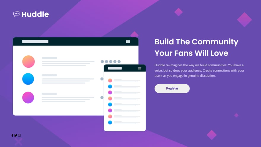
Added display flex to the main section. So, the left and right section stay next to each other.
And styled the texts and button of the right section.
/* footer */

footer {
    text-align: right;
}

.fab {
    border: 2px solid #fff;
    padding: 10px 10px;
    border-radius: 50%;
    margin-left: 20px;
    color: #fff;
}

.fa-facebook-f {
    padding: 10px 13px;
}

.fab:hover {
    color: hsl(300, 69%, 71%);
    border-color: hsl(300, 69%, 71%);
    cursor: pointer;
}
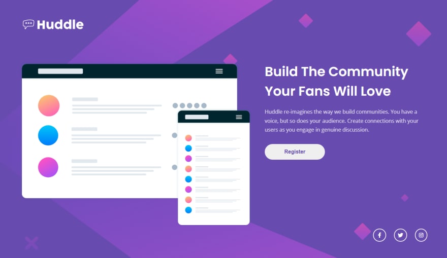
This is the footer section styling. In the footer, we just got 3 social icons.
We aligned them to the right. And added the styles.
Now is the mobile design.
@media screen and (max-width: 1000px) {

    main {
        flex-direction: column;
    }

    .left img {
        width: 100%;
    }

    .right {
        padding-top: 40px;
        text-align: center;
    }

    h1  {
        font-size: 1.8em;
    }

    button {
        padding: 15px 90px;
    }

    footer {
        text-align: center;
        padding-top: 80px;
    }

}
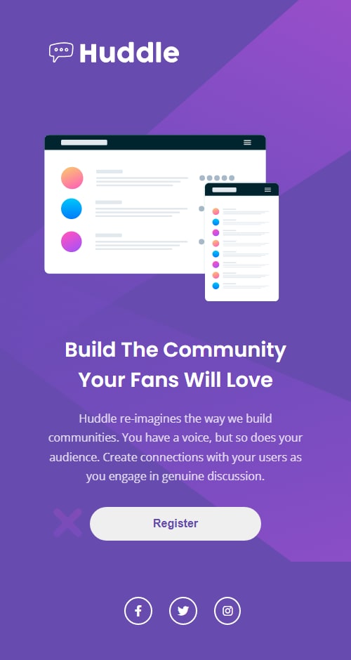
In the mobile design, we just added the flex-direction column to the main. So, the sections stay on top of each other.
And center-aligned the texts and footer.
Previous Article From this series
Conclusion
That's it for today's project.
If you want more articles like this one consider following.
Thanks for reading.
This content originally appeared on DEV Community and was authored by Amrin
Amrin | Sciencx (2021-10-09T17:21:09+00:00) Build 10 CSS Projects in 10 days: Project 5. Retrieved from https://www.scien.cx/2021/10/09/build-10-css-projects-in-10-days-project-5/
Please log in to upload a file.
There are no updates yet.
Click the Upload button above to add an update.


