This content originally appeared on Articles on Smashing Magazine — For Web Designers And Developers and was authored by Steven Frieson
In the past couple of years, it’s no secret that our design tools have exponentially evolved. With many having great component management and prototyping, you may be wondering what big leap could possibly be next?
Let’s look at a typical dilemma:
Let’s say that you’re a designer for the design systems team where you are creating components, variants and spending many hours to document all the use cases and properties that may or may not be changed. You finally finish a large complex component and deliver it to the developers.
How do we know the code is the same UI? Do we really need to audit every single component? How do we bridge this gap between what is designed over what is developed without the overhead of constantly doing reviews?
All of this and you have to help teach people the different ways to use components, proper spacings and design for responsive web, and of course, the component will need to be updated for future use cases.
There are so many touchpoints, people involved. It almost feels like the farther we go into design systems, the more overhead there is for everyone! Now, it appears that a light at the end of the tunnel is glistening, and the next big thing is on its way.
A Hidden Gem In All The ChaosI recently had the opportunity to revisit a tool I haven’t used in quite some time — a tool that is aiming to bridge this gap and minimize all that overhead: UXPin. A new feature called “Merge” has been launched to help break through the chasms of design and development, all while improving the agility and quality our teams expect. This new technology may cause some to rethink how entire design and engineering teams collaborate and work through use cases and building components.
Out With The Old ProcessIf we look at the current process most companies employ today, it can be pretty tedious with some obvious flaws. When we create a new component from scratch, we will design the base level of the component, add variants, write documentation, publish to the library and deliver it to the developers. Listing the process out is long-winded, but luckily it only needs to be done once (we hope):

Now, what happens when we need to update a component? A new use case has come in, or perhaps we decided to change our borders from rounded to razor-sharp? We now need to add the variants to the library, (possibly) update the documentation again, publish and deliver it to our developers. Phew! Let’s hope nothing broke along the way for our designers with all that reorganization of the component.
I almost forgot, we still need to publish the updates to the development library! Let’s hope that they can finish before the product teams go their own way to meet deadlines.
In With The New ProcessSo, you may be wondering, how does UXPin Merge’s technology help with this over-the-top process we all employ today? Well, take a look at the diagram below. You may notice the creation of a component and variants are not needed (in most cases). This new process reduces the amount of fiddling with auto-layout tools, because of our now synergized relationship with developers:

We only need to design the detail level required for documentation and implementation. Simple components such as a button or other atomic-level components may not need to be designed. Why waste your time doing double the work when the development can begin immediately with little overhead? In a way, we’ve come full circle; we are returning to the old ways when static components displayed only a few interactions in the documentation.
Notice that publishing to the library is now at the tail end of the process. That’s because, once the developer finishes with the component, it can now utilize Merge to make it available to designers in UXPin, and of course, all your product developers have it at the same time!
When updating components, it’s essentially the same as a new, except it may even be possible to skip the first step depending on the scenario. For example, let’s say that you want to add an option to add an icon to buttons; this is not something that needs designing, but instead, it needs to be communicated with your new best friends in development.
While this new relationship forms with your developers, the new way to officially launch components to designers may be only upon release by developers. Gone are the days of product designers asking if a component is available to their product developers. If it’s in the library, then it’s available in development and ready for designers to work on right away.
But enough about the process. Let’s take a gander at how UXPin Merge works.
Managing LibrariesThe best part is that libraries can be imported directly from your code repository such as GitHub, Bitbucket, GitLab, (works only for React components), or even from Storybook. Once a library is created, you will have options to name the library.

When importing with Storybook, the process is quite straightforward. Simply grab the library URL, and UXPin will do the rest for you. With React components, using the CLI, you have control over the components that are published by specifying the UXPin library's unique token.
Version Control And TestingOne of the biggest concerns amongst designers and design systems teams is version control. Most concerns can be resolved with this UXPin’s Merge feature. Let’s paint a quick picture:
Today, when we set out to upgrade a component, there is always the fear of breaking a component or layers that may get renamed and cleaned up. A total re-structure of the component could even occur which often leads to anxiety (on the designer’s side) on whether they should upgrade a component or stick with the old one.
When a component is developed, however, as long as the properties are remaining the same, it doesn’t matter how the component layout changes or the actual markup of the component. This, in turn, allows designers to upgrade their components to the latest versions with confidence.
Of course, in the hopefully rare instant that a component gets totally screwed up, just like with any coding project, it can easily be rolled back and republish the old version of the component.
Testing Updates
When testing new components or updates, today it’s not so easy. We obviously can’t edit the existing design library to test as this may accidentally be published, and block any other updates that are ready to go. It’s also very cumbersome to create a component in a new file, test it, and then try to handle the merging back to the current library without breaking layers.
Luckily for us, developers have figured out this issue long ago, and it fits right into UXPin’s Merge technology. When testing new components, it’s already best practice to fork or branch the code, and this new branch may be published into a test environment within UXPin. Your team may test it or you may grant access to a small group of beta testers in your company. Once the component has been tested and tried, the component can be quickly introduced and published to the primary design library without a stitch.
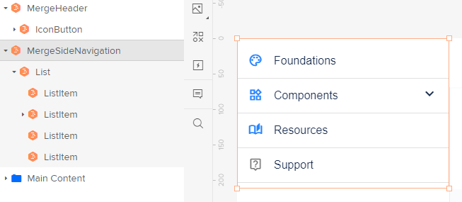
Designing With CodeSo, how do our team members on the ground design, and what does this technology mean for them? Well, I’m glad you asked! From a product designer's perspective — there isn’t much difference. When a designer uses a component from the development library utilizing Merge, they will be marked with an orange hexagon for each component. Anything new will keep behaving exactly the same as the developer's library.

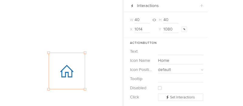
Components from the developers can have restrictions defined, but in a good way. A common issue often is using icons as links rather than wrapping the icon in a button component. If we were to use just an icon from the library, it’s locked and the user may not add interactions:

Alternatively, the icon button below allows for interactions. This allows us to really refine and control what components should be interacted with, and which should not; both from a standards point of view as well as accessibility.

With these types of restrictions, it puts an ease to the Design Systems team that components will have to be used in their proper ways, and if it’s over-ridden it will be obvious from the layer panel that something has been custom made.
Hand-Off
When you are ready to hand off to the developers, the finished prototype can display each component and their configuration to copy and paste to the developer’s tools and quickly build out the project. If your team doesn’t have a component library yet, UXPin comes with a default library or you can easily import some of the public libraries available directly in UXPin.
AccessibilitySpeaking of accessibility, oftentimes it is overlooked or there isn’t enough time to create documentation on all the meta labels, aria tags, and so on. Designers don’t know what tags they need to input and developers don’t want to go through the hassle.
With UXPin, we can expose multiple properties even meta-level data that may never be visible to the interface, such as the ARIA labels. Designers may then enter all the information required (or a copywriter if you are lucky enough to have one on your team), and there will be little to no overhead for the product developers to implement.
Layouts, Templates And GridsJust by reading the title, you know what’s coming, and I’m sure you’re bouncing in your chair right about now — I know I am. Grids, layouts and even page templates can be pulled into the library as a ‘component’ which allows users to bring components into the active area of a page and allow for all the spacing to be handled by the development library.
Common templates (e.g. login screens, completion pages, forms, profile pages, and so on) can all be utilized as a drag-and-drop component as well. Talk about speeding up the process and reducing human error in design!
In ClosingIf you are ready to take the leap, it’s never too late to try out new software and new processes to improve your workflow. After all, we all want to be agile and as adoptive as possible. Let’s build stronger relationships across our teams, reduce our workload and work more efficiently. With tools like UXPin Merge, we get closer to a much more seamless work environment.
This content originally appeared on Articles on Smashing Magazine — For Web Designers And Developers and was authored by Steven Frieson
Steven Frieson | Sciencx (2021-10-12T10:30:00+00:00) Bridging The Gap Between Designers And Developers. Retrieved from https://www.scien.cx/2021/10/12/bridging-the-gap-between-designers-and-developers/
Please log in to upload a file.
There are no updates yet.
Click the Upload button above to add an update.
