This content originally appeared on DEV Community and was authored by Stas Melnikov
The bigger clickable area the better user-friendly interactive elements
When we design interactive elements we have to think about how users will interact with them, in particular, a clickable area.
That is important because users use different kinds of interactions. I often see designers and developers make a clickable area that is equal sizes of the element.
It's nice for users who use a mouse. But that's a big problem for other users. If users have a motor disability click on such an element is a nearly impossible task,
Sometimes I can't hit on such elements when I tap on them using a finger. Also outline around elements has not enough contrast, if I focused on them using a keyboard,
But we can solve these problems easily. Just we should design more largest clickable area that will not conflict with other elements around.
The button role isn't enough for an accessible interface
There is a practice of overriding the button's default role. It's a bad practice already because authors of the ARIA in HTML standard prohibit overriding of default roles in section 2.1.
But in addition, people think if they define role="button" this element becomes accessible. Yes, it's true for screen readers. But that's only one case!
This "button" isn't accessible for a keyboard. Users can't focus on this element using the tab key. Also, this "button" isn't accessible for interaction using the enter or space keys.
So if you want to define role="button" don't do that. Just use the button element.
don't do this
<div role="button">Go</div>

<!-- or -->

<span role="button">Go</span>
you can use it instead
<button>Go</button>
The aria-labelledby simplify navigation for users of screen readers
Any web interface has a lot of sections that help users without vision disabilities orient at the page. We just see headings and understand that is a section and also its sense.
But some users can't see. They use the special quick navigation mode known as "Regions list" in screen readers. In this mode screen readers display all regions on the page. So users can go to any by some taps.
Unfortunately, there is a problem that is section elements aren't displayed in this mode until we associate section heading with a section using the aria-labelledby attribute.
So we have to add the id to the heading and add this as a value to the aria-labelledby attribute that is defined for the section element. As a result, this section will be added to the regions list and users will know about it.
don't do this
<section>
  <h2>About me</h2>
  <p>Lorem ipsum, dolor sit amet consectetur...</p>
</section>
you can use it instead
<section aria-labelledby="about-me">
  <h2 id="about-me">About me</h2>
  <p>Lorem ipsum, dolor sit amet consectetur...</p>
</section>
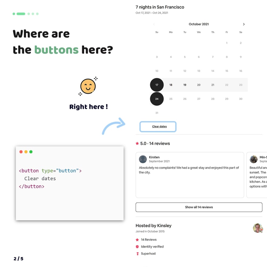
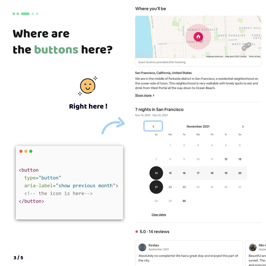
Where are the buttons here?
Unfortunately, designers and developers don't know the importance of using the button element for any elements for which users can click. So why is that important?
Yes, by default click applies on any elements. But not all users use a mouse for interaction with UI. For example, some users want to use tab, enter and space keys for interaction with UI.
If we think about users of screen readers they can't interact with UI if button elements aren't on the page.
So if you want to create an element by which users will click, please, make it is a button.
For inspiration, I collected a few examples where the button element will be helpful. As a result, users will get a more user-friendly web interface.
P.S.
Folks, I love to share my tips with you. I do that with the help of donations from my sponsors since content creating is my full-time job.
For this reason I ask you to join my sponsors if you like what I do

❤ Thank you so much, my sponsors: Ben Rinehart, Sergio Kagiema, Jesse Willard, Tanya Ten, Spiridon Konofaos.
👀 Also I tell stories from my career on Substack. Join my free newsletter, if you're interested in my background
This content originally appeared on DEV Community and was authored by Stas Melnikov
Stas Melnikov | Sciencx (2021-10-18T16:08:38+00:00) The 4 October Frontend tips about a11y and UX. Retrieved from https://www.scien.cx/2021/10/18/the-4-october-frontend-tips-about-a11y-and-ux/
Please log in to upload a file.
There are no updates yet.
Click the Upload button above to add an update.


