This content originally appeared on Telerik Blogs and was authored by Nwose Lotanna Victor
In this post, we learn how to use the Kendo UI Template Wizard to scaffold a new React application, build an Airbnb-like component and deploy it on Netlify.
Prerequisites
This article is suited for all levels of expertise using React.js, including beginners. This article promises to break down concepts as simply as possible.
To be able to follow through this article’s demonstration, you should have:
- Visual Studio Code installed as your integrated development environment
- A GitHub account, which you can set up here if you don’t already have one
- A Netlify account, most preferably linked to your GitHub
- Working knowledge of the React framework file system at a beginner level
- Familiarity with rendering in React (this one is a plus but not a requirement)
What We Will Be Building
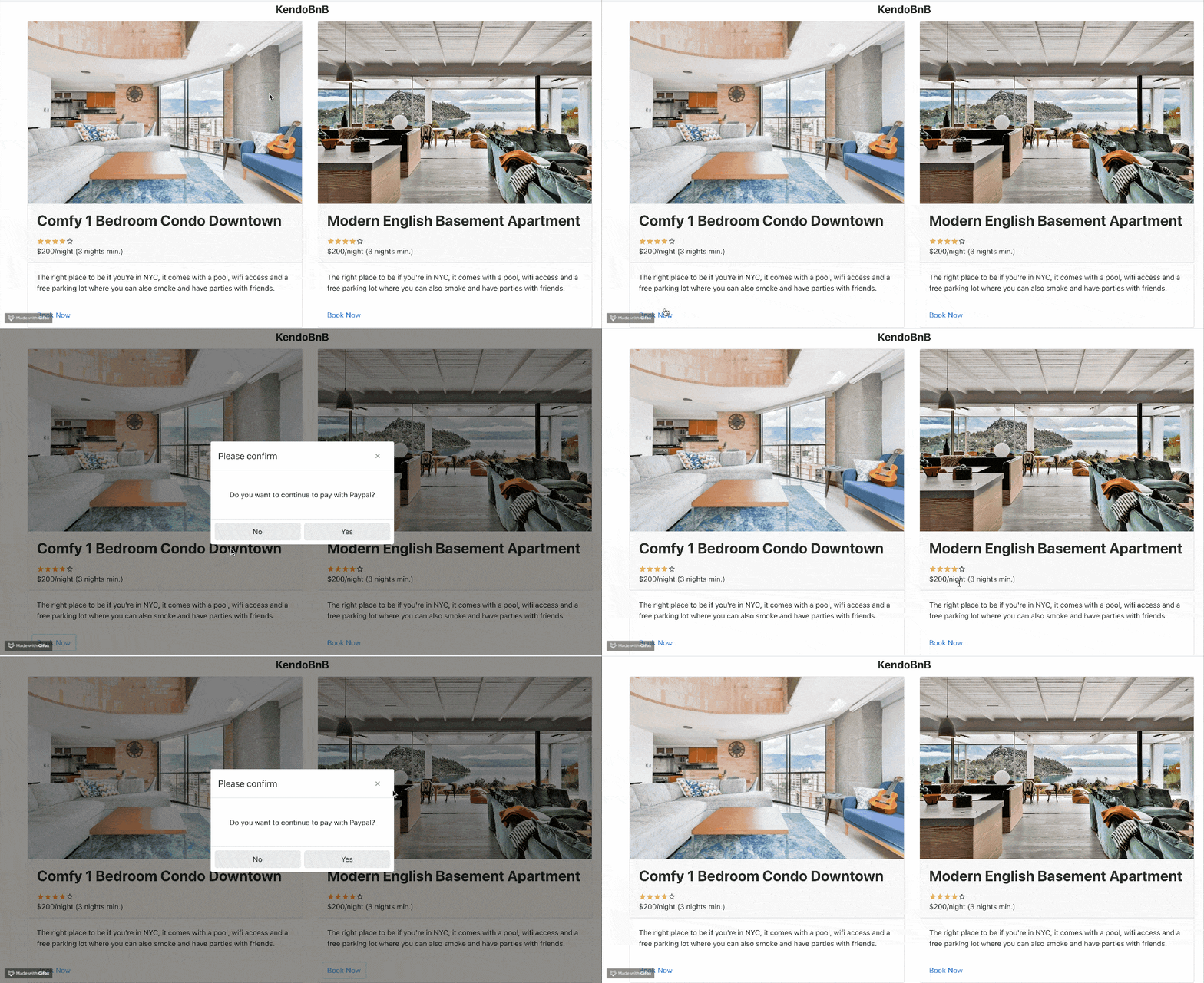
Diving right in, we are going to be building the KendoBnB app component and then publishing it using Netlify.
Getting Started
We will go through the process of setting up the development environment. Open your VS Code application, go to the extensions tab and search for “Kendo UI Template Wizard”.

The Kendo UI team is very passionate about making sure you build accessible web applications that scale easily using the Kendo UI library, and this pushed them to create this super helpful extension to scaffold your app. This is a GUI and totally worth it, especially for beginners.
Note: KendoReact is a commercial UI component library, and as a part of this you will need to provide a license key when you use the components in your React projects. You can snag a license key through a free trial or by owning a commercial license. For more information, you can head over to the KendoReact Licensing page.
Setting Up a New App
Now that you have the template wizard installed in your VS Code, you need to restart the app and then open the Command Palette. Either go to View -> Command Palette, or use shortcut Command + Shift + P for Mac or Ctrl+ Shift + P on a PC. An input box will pop up in your VS Code, and here search for the Kendo UI Template Wizard and click on the launch button.

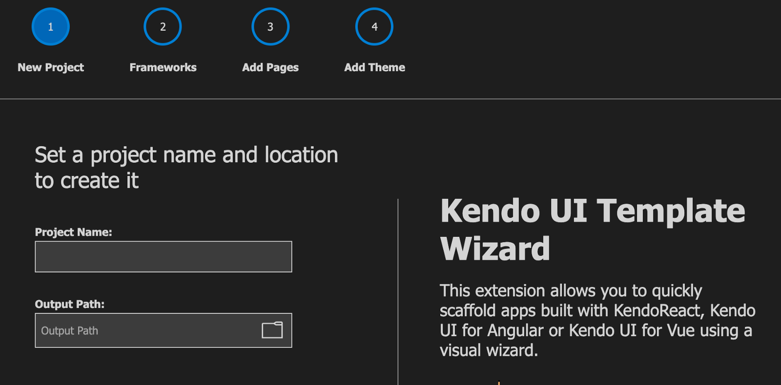
Choose a project name and type it in the box provided, and then choose where exactly on your machine you want it to be located. After doing that, click on the Next button.
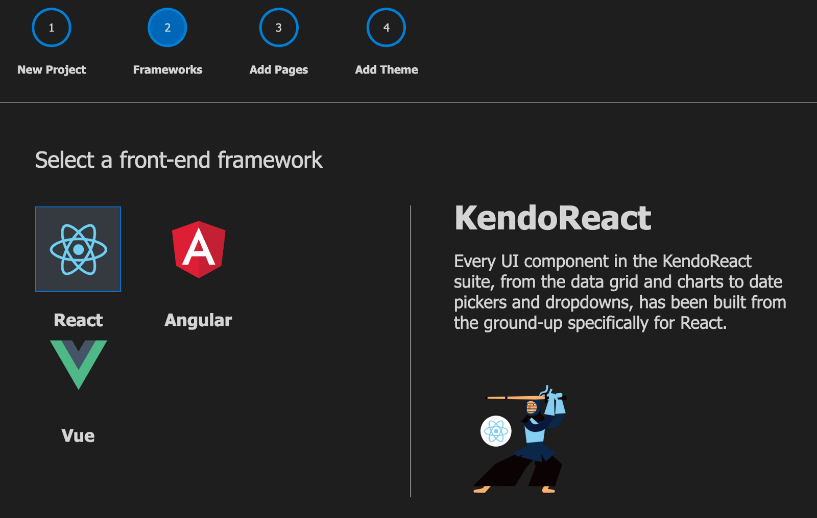
The next step is to choose the framework. For us, we want a React application and so choose React.
Next thing is to select a blank page from the list of grid, form and charts since we will be building the component ourselves, and then click on create.
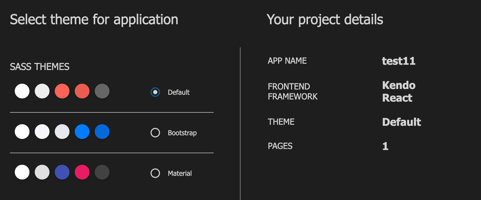
It will take 3 seconds to create, and your new React project is ready!
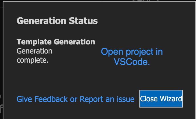
If you click “Open project in VS Code,” you’ll be taken to the project folder. Navigate to the components folder and delete all the components ending with .jsx except the Home.jsx file. We are trying to build a simple component which will not need things like header or footer or blank components.
Your app.js file should look like this after the clean up:
import React, {useState} from 'react';
import './App.scss';
import { BrowserRouter as Router, Route } from "react-router-dom";
import Home from './components/Home';
function App() {
  return (
    <Router>
        <div className="content">
          <h1>KendoBnB</h1>
          <Route exact path="/" component={Home} />
        </div>
    </Router>
  );
}
export default App;
The only route we have specified is the home route. The next thing to do is to open the terminal inside the new project file and run this command to install all necessary dependencies:
npm install
Now we are going to use two important KendoReact UI components to build our KendoBnB component: the React Card component and the React Dialog component.
The KendoReact Card Component
The KendoReact Card component outputs accessible and easy-to-style markup. It is meant to be used as easily as every other component, be it yours or part of a UI component library. The Card has several configurable elements including header, title, subtitle, body, action, footer and image.
The KendoReact Dialog Component
This is the modal element in the KendoReact library so that you can handle pop-up content in the most accessible way in your component. Dialogs communicate specific information and prompt users to take specific actions by interacting with a modal dialog. The KendoReact Dialog component is part of the KendoReact library of UI components. It is distributed through npm under the @progress/kendo-react-dialogs package.
The Home Component
Now to the home component to tie things together. Replace the content of the home.jsx file with the code block below:
import * as React from 'react';
import * as ReactDOM from 'react-dom';
import { Dialog, DialogActionsBar } from '@progress/kendo-react-dialogs';
import { Card, CardHeader, CardTitle, CardBody, CardActions, CardImage, CardSubtitle } from '@progress/kendo-react-layout';
class Home extends React.Component {
    state = {
        visible: false
    };

    toggleDialog = () => {
        this.setState({
            visible: !this.state.visible
        });
    }
    render() {
        return (
          <div style={{ display: 'flex', justifyContent: 'space-evenly' }}>
            {/* Modal code goes here */}
            <div>
            {this.state.visible && <Dialog title={"Please confirm"} onClose={this.toggleDialog}>
              <p style={{ margin: "25px", textAlign: "center" }}>Do you want to continue to pay with Paypal?</p>
              <DialogActionsBar>
                <button className="k-button" onClick={this.toggleDialog}>No</button>
                <button className="k-button" onClick={this.toggleDialog}>Yes</button>
              </DialogActionsBar>
            </Dialog>}
          </div>
             <div style={{width: '45%'}}>
              <Card>
                <CardImage src="https://wander-lush.org/wp-content/uploads/2021/01/Medellin-Airbnb-Penthouse-in-Laureles.jpg" />
                <div>
                  <CardHeader>
                  <h1 CardTitle={true}>Comfy 1 Bedroom Condo Downtown</h1>
                    <div CardSubtitle={true}>
                      <span className="reviews">
                        <span className="k-icon k-i-star" style={{ color: '#ffce2a' }} />
                        <span className="k-icon k-i-star" style={{ color: '#ffce2a' }} />
                        <span className="k-icon k-i-star" style={{ color: '#ffce2a' }} />
                        <span className="k-icon k-i-star" style={{ color: '#ffce2a' }} />
                        <span className="k-icon k-i-star-outline" />
                        <div>$200/night (3 nights min.)</div>
                      </span>
                    </div>
                  </CardHeader>
                  <CardBody>
                    <p>The right place to be if you're in NYC, it comes with a pool, wifi access and a free parking lot where you can also smoke and have parties with friends.
                    </p>
                  </CardBody>
                  <CardActions>
                  <button className="k-button k-primary k-flat" onClick={this.toggleDialog}>Book Now</button>
                  </CardActions>
                </div>
              </Card>
            </div>
            <div style={{width: '45%'}}>
              <Card>
                <CardImage src="https://media.cntraveler.com/photos/5e9907c14ab09800086faf63/master/pass/airbnb-view-37143825.jpg" />
                <div>
                  <CardHeader>
                  <h1 CardTitle={true}>Modern English Basement Apartment</h1>
                    <div CardSubtitle={true}>
                      <span className="reviews">
                        <span className="k-icon k-i-star" style={{ color: '#ffce2a' }} />
                        <span className="k-icon k-i-star" style={{ color: '#ffce2a' }} />
                        <span className="k-icon k-i-star" style={{ color: '#ffce2a' }} />
                        <span className="k-icon k-i-star" style={{ color: '#ffce2a' }} />
                        <span className="k-icon k-i-star-outline" />
                        <div>$200/night (3 nights min.)</div>
                      </span>
                    </div>
                  </CardHeader>
                  <CardBody>
                    <p>The right place to be if you're in NYC, it comes with a pool, wifi access and a free parking lot where you can also smoke and have parties with friends.
                    </p>
                  </CardBody>
                  <CardActions>
                    <button className="k-button k-primary k-flat" onClick={this.toggleDialog}>Book Now</button>
                  </CardActions>
                </div>
              </Card>
            </div>
          </div>
        )
    }
}
export default Home;
You see the two card elements and we initialized state function for the toggle for the dialog element and the card. The App.js file in the root folder should look like this:
import React, {useState} from 'react';
import './App.scss';
import { BrowserRouter as Router, Route } from "react-router-dom";
import Home from './components/Home';
function App() {
  return (
    <Router>
        <div className="content">
          <h2 style={{ display: 'flex', justifyContent: 'space-evenly' }}>KendoBnB</h2>
          <Route exact path="/" component={Home} />
        </div>
    </Router>
  );
}
export default App;
You can see the other routes and their imports have been deleted from this file, so ensure to do so too to avoid errors. If you run the app in the development server:
npm start
You’ll get this:

Deploying the App
Now that you have the app running as you want, to prepare the app for production, run this command:
npm run build
This will minify all the files needed to deploy an app in production. You will notice a new folder called “build” in the project. Open the Netlify app here. Sign into your free account and click on Sites.

You will see a list of sites you have deployed using the platform, or if you are new you won’t see any projects there. Scroll down the list, and you will see a drag-and-drop section.

Drag the build folder into this space and voila! Your app is published.
Conclusion
This has been an introduction to starting a new React app, using KendoReact UI library to build React components and then deploying the app for free using Netlify. Now you can go ahead and build more products with KendoReact and Netlify. Happy hacking!
This content originally appeared on Telerik Blogs and was authored by Nwose Lotanna Victor
Nwose Lotanna Victor | Sciencx (2021-10-20T12:03:02+00:00) Deploy a React App Using KendoReact and Netlify. Retrieved from https://www.scien.cx/2021/10/20/deploy-a-react-app-using-kendoreact-and-netlify/
Please log in to upload a file.
There are no updates yet.
Click the Upload button above to add an update.
