This content originally appeared on
A List Apart: The Full Feed and was authored by The fine folks at A List Apart
Do you find yourself designing screens with only a vague idea of how the things on the screen relate to the things elsewhere in the system? Do you leave stakeholder meetings with unclear directives that often seem to contradict previous conversations? You know a better understanding of user needs would help the team get clear on what you are actually trying to accomplish, but time and budget for research is tight. When it comes to asking for more direct contact with your users, you might feel like poor Oliver Twist, timidly asking, “Please, sir, I want some more.”
Here’s the trick. You need to get stakeholders themselves to identify high-risk assumptions and hidden complexity, so that they become just as motivated as you to get answers from users. Basically, you need to make them think it’s their idea.
In this article, I’ll show you how to collaboratively expose misalignment and gaps in the team’s shared understanding by bringing the team together around two simple questions:
- What are the objects?
- What are the relationships between those objects?
A gauntlet between research and screen design
These two questions align to the first two steps of the ORCA process, which might become your new best friend when it comes to reducing guesswork. Wait, what’s ORCA?! Glad you asked.
ORCA stands for Objects, Relationships, CTAs, and Attributes, and it outlines a process for creating solid object-oriented user experiences. Object-oriented UX is my design philosophy. ORCA is an iterative methodology for synthesizing user research into an elegant structural foundation to support screen and interaction design. OOUX and ORCA have made my work as a UX designer more collaborative, effective, efficient, fun, strategic, and meaningful.
The ORCA process has four iterative rounds and a whopping fifteen steps. In each round we get more clarity on our Os, Rs, Cs, and As.
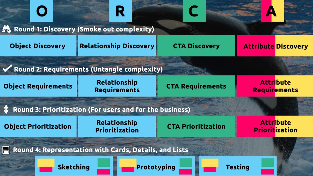
I sometimes say that ORCA is a “garbage in, garbage out” process. To ensure that the testable prototype produced in the final round actually tests well, the process needs to be fed by good research. But if you don’t have a ton of research, the beginning of the ORCA process serves another purpose: it helps you sell the need for research.
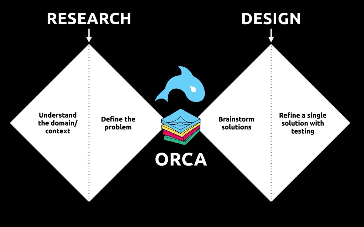
In other words, the ORCA process serves as a gauntlet between research and design. With good research, you can gracefully ride the killer whale from research into design. But without good research, the process effectively spits you back into research and with a cache of specific open questions.
Getting in the same curiosity-boat
What gets us into trouble is not what we don’t know. It’s what we know for sure that just ain’t so.
Mark Twain
The first two steps of the ORCA process—Object Discovery and Relationship Discovery—shine a spotlight on the dark, dusty corners of your team’s misalignments and any inherent complexity that’s been swept under the rug. It begins to expose what this classic comic so beautifully illustrates:
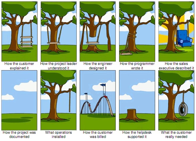
This is one reason why so many UX designers are frustrated in their job and why many projects fail. And this is also why we often can’t sell research: every decision-maker is confident in their own mental picture.
Once we expose hidden fuzzy patches in each picture and the differences between them all, the case for user research makes itself.
But how we do this is important. However much we might want to, we can’t just tell everyone, “YOU ARE WRONG!” Instead, we need to facilitate and guide our team members to self-identify holes in their picture. When stakeholders take ownership of assumptions and gaps in understanding, BAM! Suddenly, UX research is not such a hard sell, and everyone is aboard the same curiosity-boat.
Say your users are doctors. And you have no idea how doctors use the system you are tasked with redesigning.
You might try to sell research by honestly saying: “We need to understand doctors better! What are their pain points? How do they use the current app?” But here’s the problem with that. Those questions are vague, and the answers to them don’t feel acutely actionable.
Instead, you want your stakeholders themselves to ask super-specific questions. This is more like the kind of conversation you need to facilitate. Let’s listen in:
“Wait a sec, how often do doctors share patients? Does a patient in this system have primary and secondary doctors?”
“Can a patient even have more than one primary doctor?”
“Is it a ‘primary doctor’ or just a ‘primary caregiver’… Can’t that role be a nurse practitioner?”
“No, caregivers are something else… That’s the patient’s family contacts, right?”
“So are caregivers in scope for this redesign?”
“Yeah, because if a caregiver is present at an appointment, the doctor needs to note that. Like, tag the caregiver on the note… Or on the appointment?”
Now we are getting somewhere. Do you see how powerful it can be getting stakeholders to debate these questions themselves? The diabolical goal here is to shake their confidence—gently and diplomatically.
When these kinds of questions bubble up collaboratively and come directly from the mouths of your stakeholders and decision-makers, suddenly, designing screens without knowing the answers to these questions seems incredibly risky, even silly.
If we create software without understanding the real-world information environment of our users, we will likely create software that does not align to the real-world information environment of our users. And this will, hands down, result in a more confusing, more complex, and less intuitive software product.
The two questions
But how do we get to these kinds of meaty questions diplomatically, efficiently, collaboratively, and reliably?
We can do this by starting with those two big questions that align to the first two steps of the ORCA process:
- What are the objects?
- What are the relationships between those objects?
In practice, getting to these answers is easier said than done. I’m going to show you how these two simple questions can provide the outline for an Object Definition Workshop. During this workshop, these “seed” questions will blossom into dozens of specific questions and shine a spotlight on the need for more user research.
Prep work: Noun foraging
In the next section, I’ll show you how to run an Object Definition Workshop with your stakeholders (and entire cross-functional team, hopefully). But first, you need to do some prep work.
Basically, look for nouns that are particular to the business or industry of your project, and do it across at least a few sources. I call this noun foraging.
Here are just a few great noun foraging sources:
- the product’s marketing site
- the product’s competitors’ marketing sites (competitive analysis, anyone?)
- the existing product (look at labels!)
- user interview transcripts
- notes from stakeholder interviews or vision docs from stakeholders
Put your detective hat on, my dear Watson. Get resourceful and leverage what you have. If all you have is a marketing website, some screenshots of the existing legacy system, and access to customer service chat logs, then use those.
As you peruse these sources, watch for the nouns that are used over and over again, and start listing them (preferably on blue sticky notes if you’ll be creating an object map later!).
You’ll want to focus on nouns that might represent objects in your system. If you are having trouble determining if a noun might be object-worthy, remember the acronym SIP and test for:
- Structure
- Instances
- Purpose
Think of a library app, for example. Is “book” an object?
Structure: can you think of a few attributes for this potential object? Title, author, publish date… Yep, it has structure. Check!
Instance: what are some examples of this potential “book” object? Can you name a few? The Alchemist, Ready Player One, Everybody Poops… OK, check!
Purpose: why is this object important to the users and business? Well, “book” is what our library client is providing to people and books are why people come to the library… Check, check, check!
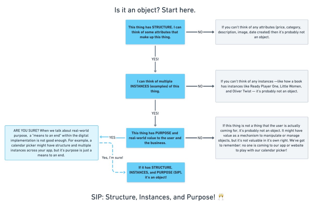
As you are noun foraging, focus on capturing the nouns that have SIP. Avoid capturing components like dropdowns, checkboxes, and calendar pickers—your UX system is not your design system! Components are just the packaging for objects—they are a means to an end. No one is coming to your digital place to play with your dropdown! They are coming for the VALUABLE THINGS and what they can do with them. Those things, or objects, are what we are trying to identify.
Let’s say we work for a startup disrupting the email experience. This is how I’d start my noun foraging.
First I’d look at my own email client, which happens to be Gmail. I’d then look at Outlook and the new HEY email. I’d look at Yahoo, Hotmail…I’d even look at Slack and Basecamp and other so-called “email replacers.” I’d read some articles, reviews, and forum threads where people are complaining about email. While doing all this, I would look for and write down the nouns.
(Before moving on, feel free to go noun foraging for this hypothetical product, too, and then scroll down to see how much our lists match up. Just don’t get lost in your own emails! Come back to me!)
Drumroll, please…
Here are a few nouns I came up with during my noun foraging:
- email message
- thread
- contact
- client
- rule/automation
- email address that is not a contact?
- contact groups
- attachment
- Google doc file / other integrated file
- newsletter? (HEY treats this differently)
- saved responses and templates
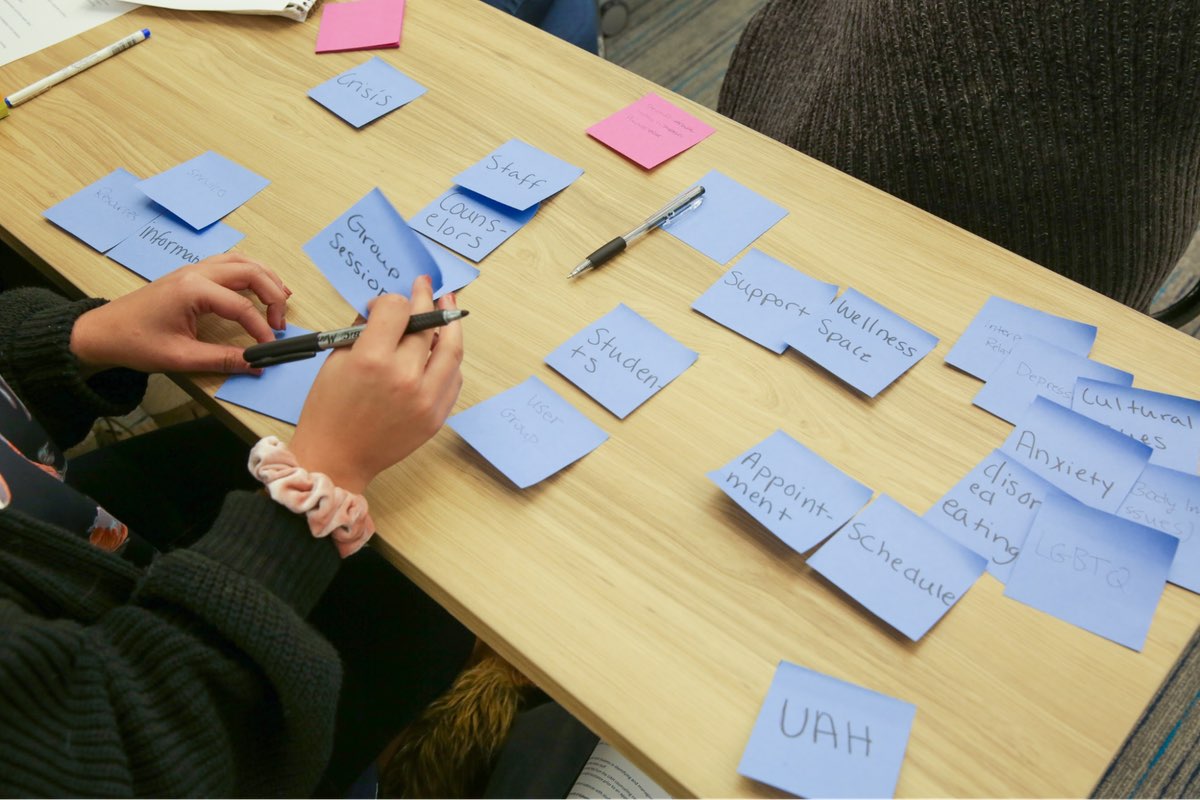
Scan your list of nouns and pick out words that you are completely clueless about. In our email example, it might be client or automation. Do as much homework as you can before your session with stakeholders: google what’s googleable. But other terms might be so specific to the product or domain that you need to have a conversation about them.
Aside: here are some real nouns foraged during my own past project work that I needed my stakeholders to help me understand:
- Record Locator
- Incentive Home
- Augmented Line Item
- Curriculum-Based Measurement Probe
This is really all you need to prepare for the workshop session: a list of nouns that represent potential objects and a short list of nouns that need to be defined further.
Facilitate an Object Definition Workshop
You could actually start your workshop with noun foraging—this activity can be done collaboratively. If you have five people in the room, pick five sources, assign one to every person, and give everyone ten minutes to find the objects within their source. When the time’s up, come together and find the overlap. Affinity mapping is your friend here!
If your team is short on time and might be reluctant to do this kind of grunt work (which is usually the case) do your own noun foraging beforehand, but be prepared to show your work. I love presenting screenshots of documents and screens with all the nouns already highlighted. Bring the artifacts of your process, and start the workshop with a five-minute overview of your noun foraging journey.
HOT TIP: before jumping into the workshop, frame the conversation as a requirements-gathering session to help you better understand the scope and details of the system. You don’t need to let them know that you’re looking for gaps in the team’s understanding so that you can prove the need for more user research—that will be our little secret. Instead, go into the session optimistically, as if your knowledgeable stakeholders and PMs and biz folks already have all the answers.
Then, let the question whack-a-mole commence.
1. What is this thing?
Want to have some real fun? At the beginning of your session, ask stakeholders to privately write definitions for the handful of obscure nouns you might be uncertain about. Then, have everyone show their cards at the same time and see if you get different definitions (you will). This is gold for exposing misalignment and starting great conversations.
As your discussion unfolds, capture any agreed-upon definitions. And when uncertainty emerges, quietly (but visibly) start an “open questions” parking lot. 😉
After definitions solidify, here’s a great follow-up:
2. Do our users know what these things are? What do users call this thing?
Stakeholder 1: They probably call email clients “apps.” But I’m not sure.
Stakeholder 2: Automations are often called “workflows,” I think. Or, maybe users think workflows are something different.
If a more user-friendly term emerges, ask the group if they can agree to use only that term moving forward. This way, the team can better align to the users’ language and mindset.
OK, moving on.
If you have two or more objects that seem to overlap in purpose, ask one of these questions:
3. Are these the same thing? Or are these different? If they are not the same, how are they different?
You: Is a saved response the same as a template?
Stakeholder 1: Yes! Definitely.
Stakeholder 2: I don’t think so… A saved response is text with links and variables, but a template is more about the look and feel, like default fonts, colors, and placeholder images.
Continue to build out your growing glossary of objects. And continue to capture areas of uncertainty in your “open questions” parking lot.
If you successfully determine that two similar things are, in fact, different, here’s your next follow-up question:
4. What’s the relationship between these objects?
You: Are saved responses and templates related in any way?
Stakeholder 3: Yeah, a template can be applied to a saved response.
You, always with the follow-ups: When is the template applied to a saved response? Does that happen when the user is constructing the saved response? Or when they apply the saved response to an email? How does that actually work?
Listen. Capture uncertainty. Once the list of “open questions” grows to a critical mass, pause to start assigning questions to groups or individuals. Some questions might be for the dev team (hopefully at least one developer is in the room with you). One question might be specifically for someone who couldn’t make it to the workshop. And many questions will need to be labeled “user.”
Do you see how we are building up to our UXR sales pitch?
5. Is this object in scope?
Your next question narrows the team’s focus toward what’s most important to your users. You can simply ask, “Are saved responses in scope for our first release?,” but I’ve got a better, more devious strategy.
By now, you should have a list of clearly defined objects. Ask participants to sort these objects from most to least important, either in small breakout groups or individually. Then, like you did with the definitions, have everyone reveal their sort order at once. Surprisingly—or not so surprisingly—it’s not unusual for the VP to rank something like “saved responses” as #2 while everyone else puts it at the bottom of the list. Try not to look too smug as you inevitably expose more misalignment.
I did this for a startup a few years ago. We posted the three groups’ wildly different sort orders on the whiteboard.
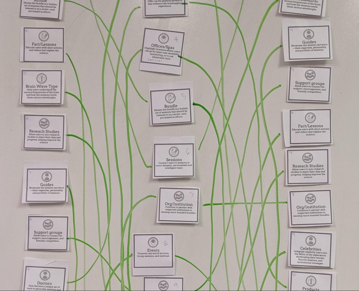
The CEO stood back, looked at it, and said, “This is why we haven’t been able to move forward in two years.”
Admittedly, it’s tragic to hear that, but as a professional, it feels pretty awesome to be the one who facilitated a watershed realization.
Once you have a good idea of in-scope, clearly defined things, this is when you move on to doing more relationship mapping.
6. Create a visual representation of the objects’ relationships
We’ve already done a bit of this while trying to determine if two things are different, but this time, ask the team about every potential relationship. For each object, ask how it relates to all the other objects. In what ways are the objects connected? To visualize all the connections, pull out your trusty boxes-and-arrows technique. Here, we are connecting our objects with verbs. I like to keep my verbs to simple “has a” and “has many” statements.
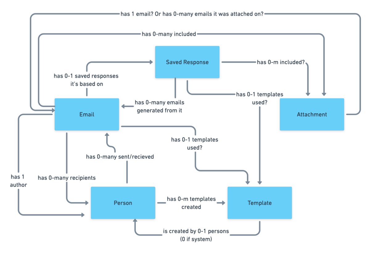
This system modeling activity brings up all sorts of new questions:
- Can a saved response have attachments?
- Can a saved response use a template? If so, if an email uses a saved response with a template, can the user override that template?
- Do users want to see all the emails they sent that included a particular attachment? For example, “show me all the emails I sent with ProfessionalImage.jpg attached. I’ve changed my professional photo and I want to alert everyone to update it.”
Solid answers might emerge directly from the workshop participants. Great! Capture that new shared understanding. But when uncertainty surfaces, continue to add questions to your growing parking lot.
Light the fuse
You’ve positioned the explosives all along the floodgates. Now you simply have to light the fuse and BOOM. Watch the buy-in for user research flooooow.
Before your workshop wraps up, have the group reflect on the list of open questions. Make plans for getting answers internally, then focus on the questions that need to be brought before users.
Here’s your final step. Take those questions you’ve compiled for user research and discuss the level of risk associated with NOT answering them. Ask, “if we design without an answer to this question, if we make up our own answer and we are wrong, how bad might that turn out?”
With this methodology, we are cornering our decision-makers into advocating for user research as they themselves label questions as high-risk. Sorry, not sorry.
Now is your moment of truth. With everyone in the room, ask for a reasonable budget of time and money to conduct 6–8 user interviews focused specifically on these questions.
HOT TIP: if you are new to UX research, please note that you’ll likely need to rephrase the questions that came up during the workshop before you present them to users. Make sure your questions are open-ended and don’t lead the user into any default answers.
Final words: Hold the screen design!
Seriously, if at all possible, do not ever design screens again without first answering these fundamental questions: what are the objects and how do they relate?
I promise you this: if you can secure a shared understanding between the business, design, and development teams before you start designing screens, you will have less heartache and save more time and money, and (it almost feels like a bonus at this point!) users will be more receptive to what you put out into the world.
I sincerely hope this helps you win time and budget to go talk to your users and gain clarity on what you are designing before you start building screens. If you find success using noun foraging and the Object Definition Workshop, there’s more where that came from in the rest of the ORCA process, which will help prevent even more late-in-the-game scope tugs-of-war and strategy pivots.
All the best of luck! Now go sell research!
This content originally appeared on
A List Apart: The Full Feed and was authored by The fine folks at A List Apart
The fine folks at A List Apart | Sciencx (2021-10-21T14:00:00+00:00) How to Sell UX Research with Two Simple Questions. Retrieved from https://www.scien.cx/2021/10/21/how-to-sell-ux-research-with-two-simple-questions-1193/
Please log in to upload a file.
There are no updates yet.
Click the Upload button above to add an update.
