This content originally appeared on Bram.us and was authored by Bramus!

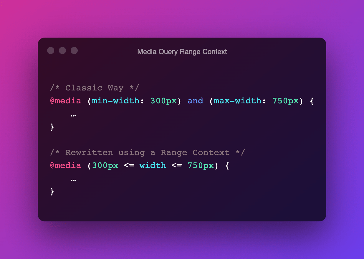
A media feature like width can take its value from a range. When used, we prefix these with min- or max- to express “minimum condition” or “maximum condition” constraints.
@media (min-width: 300px) and (max-width: 750px) {
	…
}
In CSS Media Queries Level 4 these type of Media Features can now be written as a “range context”, which uses ordinary mathematical comparison operators.
@media (300px <= width <= 750px) {
	…
}
The syntax might seem a little bit odd at first, but for me the trick is to read it as “the width sits in between the two values”
Also works with a single value:
/* Old Way */
@media (max-width: 750px) {
	…
}
/* New Way */
@media (width <= 750px) {
	…
}
~
At the time for writing, only Gecko/Firefox supports Range Contexts (ever since Firefox 63). There was some (minor) movement in the Blink/Chromium issue in September, but progress seems to have stalled. No word on WebKit/Safari.
- Gecko/Firefox: Issue #1422225 (RESOLVED FIXED)
- Blink/Chromium: Issue #1034465
- WebKit/Safari: Issue #180234
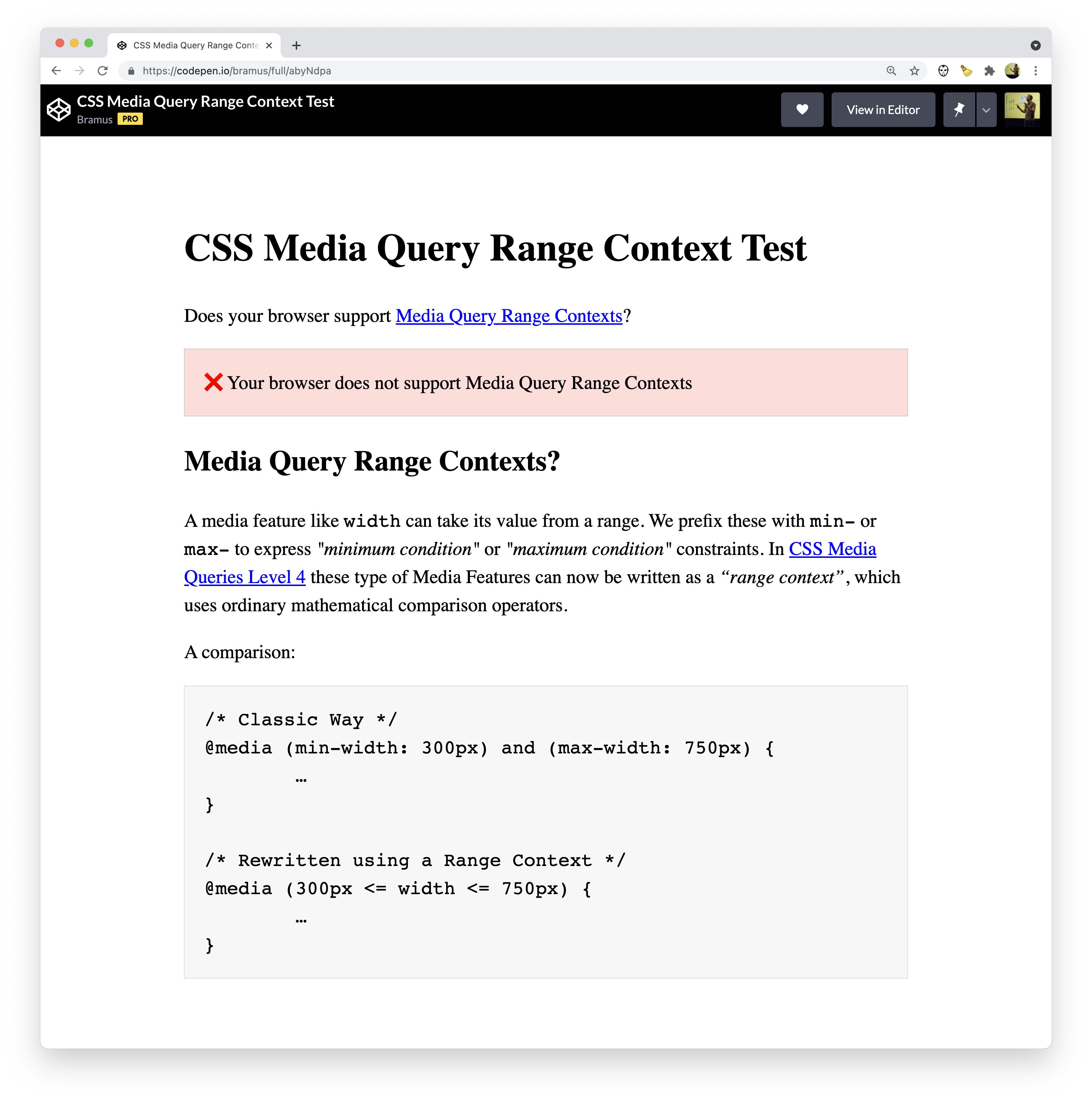
The pen embedded below will indicate if your browser supports Media Query Range Contexts or not:
~
If you’re using PostCSS, you can use the postcss-media-minmax processor to already write Range Contexts:
npm install postcss-media-minmaxvar fs = require('fs')
var postcss = require('postcss')
var minmax = require('postcss-media-minmax')
var css = fs.readFileSync('input.css', 'utf8')
var output = postcss()
.use(minmax())
.process(css)
.css
console.log('\n====>Output CSS:\n', output) ~
🔥 Like what you see? Want to stay in the loop? Here's how:
This content originally appeared on Bram.us and was authored by Bramus!
Bramus! | Sciencx (2021-10-25T22:25:10+00:00) Media Queries Level 4: Media Query Range Contexts. Retrieved from https://www.scien.cx/2021/10/25/media-queries-level-4-media-query-range-contexts/
Please log in to upload a file.
There are no updates yet.
Click the Upload button above to add an update.

