This content originally appeared on Telerik Blogs and was authored by Stoyan Furnadzhiev
We are happy to introduce the new Task Board that was shipped with R3 2021 and help you get to know it a little bit better.
Telerik UI for WinForms R3 2021 brings exciting new features in our suite. Along with the new Filter View and Hierarchy support in PageView’s Navigation View Mode, we’re also happy to introduce the new Task Board.
In this post I’ll walk you through the new Telerik Task Board’s design and features so you can make sure your users’ productivity isn’t “leaking.” Be sure to also check out our R3 21 release blog for a full list of all the other exciting new features and improvements we’ve introduced.
Overview
Task board controls are becoming more and more popular these days. They are essential for creating a seamless process and following the progress of your team’s work. The Telerik Task Board’s powerful features will help you deliver an outstanding task management application. Highly customizable and robust, it will help you easily create every executive’s dream tool. Let’s dive in!
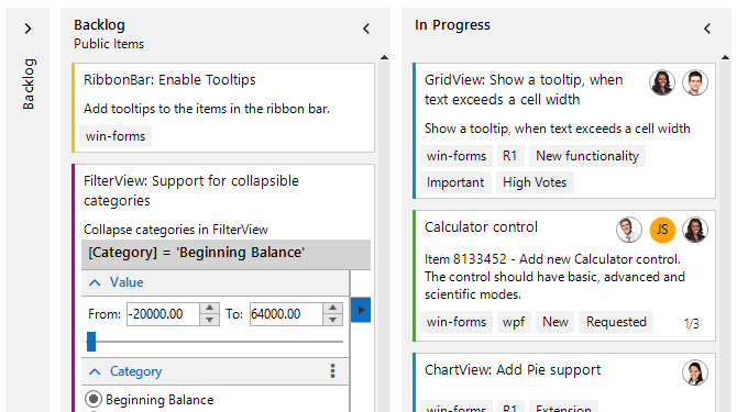
RadTaskBoard offers the ability to create a standard kanban/scrum board. You can define different columns and cards easily. Furthermore, using global properties, you can control the look and feel of the control. The RadTaskBoard supports all our themes as well.
It’s easy to start—just drag and drop the RadTaskBoard from the Toolbox and you are ready to go. Once you’ve dropped the RadTaskBoard onto the designer, you can take a look at the properties and collections exposed in the smart tag.
Global Properties
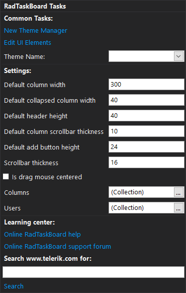
Here you can start by defining your columns. Create several columns in the Columns collection and you’ll immediately see them in the designer.
The default values that are listed in the RadTaskBoard’s smart tag are used to set the according values for all columns in the board. You can also set custom values for each column. In this way you will override the default values. You can always reset the values back to the default ones by calling the appropriate reset method—ResetColumnWidth for example. Doing so will bind the ColumnWidth property of the column back to the DefaultColumnWidth property of the control.
Furthermore, you can define users in the Users collection. Later you can access the users in the collection to assign them to a specific card.
Columns
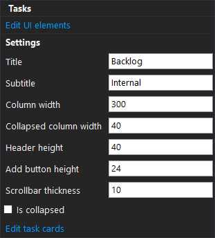 Each column’s smart tag offers the ability to set the Title and Subtitle of the column. Furthermore, as I described earlier, you can set custom values per column for different widths and heights. Keep in mind that setting a value to the ColumnWidth, for example, will break the binding to the global property DefaultColumnWidth. You can also set the initial collapsed state of the column.
With “Edit task cards” you can add cards to the column. This way you can get a feeling of how the cards will look in the Task Board.
Adding Task Cards
You can add task cards during design from the column’s smart tag. But it is generally preferred to let the user define the task cards. So here comes the “+ Add a card” button. When pressed, the button will add a new empty card by default. Alternatively, you can attach to the TaskCardAdding event, where you can show an editor to create and change the added card.
Task Card Features
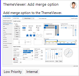 A task card has a lot of features—starting with more standard ones like title and description. You can have an image in the description as well. Assigning users through the Users collection or adding tags that can be customized with different foreground and background colors is straightforward.
The task card also supports defining subtasks. Just add a new SubTask to the SubTasks collection and it will be shown in the lower right corner of the task card. When a subtask is marked as completed, it will be automatically reflected in the card. What is more, you can define the string format for the SubTasks element using the SubTasksStringFormat property of the card.
Another useful feature is the accent of the task card. Within the AccentSettings property there are a set of settings that you can use to adjust the accent color of the card.
Task Card Layout
A single task card consists of nine panels. You can access them through the Panels dictionary with the appropriate enumeration ContentAlignment. Some of them already contain different elements—for example, the title of the card is placed in the top left panel. These panels allow full customization of the task card, depending on your custom workflow.
Other Features
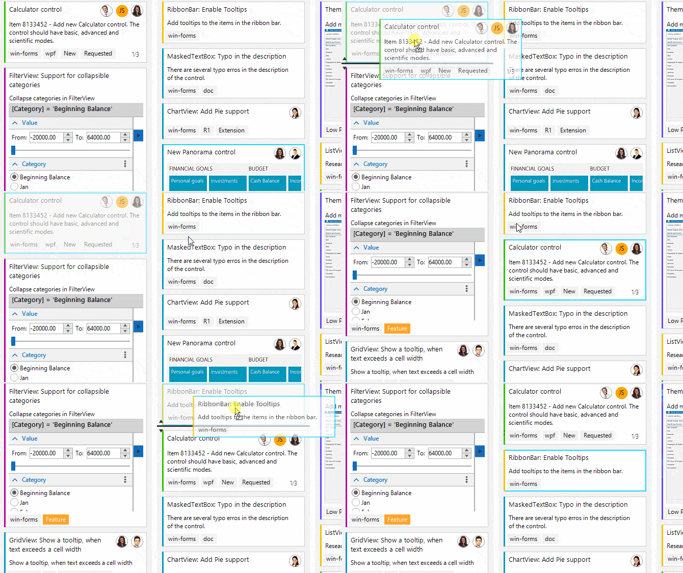
The Task Board Control supports essential features like drag-and-drop of card between columns, automatic scrolling when you reach the end of the board or column, and collapsing columns.
Try It Out!
If you need to develop your own Task Board, just download our free trial and start customizing. Our online documentation contains extra details on how to use the control and its features.
And may the source be with you!
This content originally appeared on Telerik Blogs and was authored by Stoyan Furnadzhiev
Stoyan Furnadzhiev | Sciencx (2021-10-26T12:02:04+00:00) Master Workflow Visualizations With the New Telerik TaskBoard for WinForms. Retrieved from https://www.scien.cx/2021/10/26/master-workflow-visualizations-with-the-new-telerik-taskboard-for-winforms/
Please log in to upload a file.
There are no updates yet.
Click the Upload button above to add an update.
