This content originally appeared on Telerik Blogs and was authored by Carl Bergenhem
In this summary blog post, we cover what the Kendo UI and Telerik UI Web Components teams have been working on over the last couple of weeks. This update brings brand new components to Telerik UI for Blazor and .NET MAUI, Kendo UI for Vue, along with new features and quality of life improvements within Kendo UI for Angular.
The teams behind your favorite Kendo UI or Telerik Web UI component library are always hard at work to deliver new components, features and tools that we know developers will love to use. Usually, we make a set of announcements around each of the big major releases throughout the year with R1, R2 and R3.
Rather than keep everyone waiting for a few months, in today’s blog post I want to take time to highlight some of the features and components that the teams have been working on over the last couple of weeks! This will not cover all web products, just the ones that have recently pushed an update you can take advantage of. So if you don’t see your favorite product listed below, do not worry—there will be more updates to come!
Table of Contents
Telerik REPLs
To kick off this October update, we are excited to share the news about two new interactive browser-based playgrounds—Progress Telerik REPL for ASP.NET Core and Telerik REPL for Blazor. The REPL (Read–Eval–Print Loop) runners require no installation and you can start coding right away. You can write, run and share your code snippets with colleagues, as well as post Q&As in developer forums, social media or email. You also have the possibility to share code snippet straight from your IDE—Visual Studio or Visual Studio Code—directly to a REPL.
The Telerik REPLs integrate seamlessly with Telerik UI for Blazor and UI for ASP.NET Core and let you interact with the UI components for the respective framework without any configuration needed. You can apply different styles with one of the available out of the box themes and swatches.
As this is the initial version of the code runners, we welcome your ideas for features and improvements in the dedicated Telerik REPL Feedback Portal.
Telerik UI for Blazor
Telerik UI for Blazor 2.28 Release
With this October update I’m excited to share that Telerik UI for Blazor just turned 90! Yes, this truly native Blazor UI library now includes 90+ native Blazor components and we’ll spend the next chunk of this blog post covering what’s new in Telerik UI for Blazor 2.28.
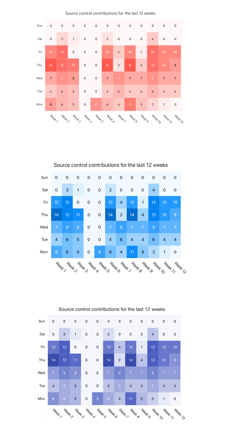
New Blazor Heatmap Chart Component
The new Heatmap Chart UI component will allow you to visualize two-dimensional data in a magnitude of colors. A Heatmap is essentially a grid-structure with cells corresponding to an X-axis and a Y-axis. Every cell’s value decides what color it should be filled in, with a gradation of hues ranging from white to a totally filled-in color and everything in between. Some of the features of the new Heatmap component are:
- Visualizing data values in different shapes
- Using various color scales
- Adding tooltips that allow you to display additional information
- Choosing from a variety of built-in and custom themes and swatches.
New ColorGradient Component
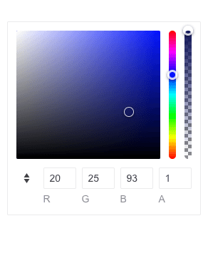
The new Blazor Color Gradient component allows you to pick a color from a gradient in a simple and flexible way. Users can either drag an indication to pick the primary color, revealing its equivalent HEX and RGB values, or enter the values directly into the HEX and RGB inputs. In addition to the extensive configuration options for opacity and different formats, you can also take advantage of the built-in keyboard navigation and accessibility.
New FlatColorPicker Component
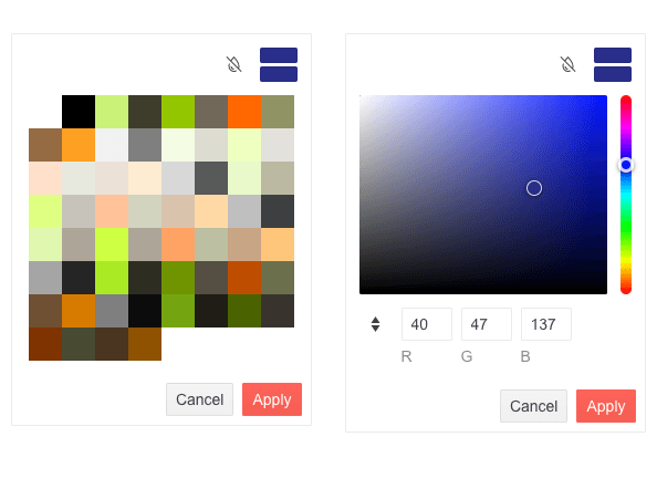
The new Telerik Blazor FlatColorPicker component is a powerful color editing tool that allows you to apply different customizations through its Palette and Gradient views. The component has a header and footer displaying various buttons for switching between views, applying or canceling changes, previewing or reverting, and more. You can easily customize them and render custom content using the available templates.
New ColorPicker Component
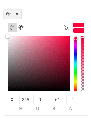
The new Telerik Blazor ColorPicker is a powerful color editing component that renders in a popup and allows you switch between two different views—Palette and Gradient. The Palette view allows you to pick the preferred color from a predefined set of colors, while the Gradient view lets you choose the desired color either by selecting it on the view or by entering it precisely in RGB or HEX format. You can customize the component however you like by showing/hiding its action buttons and modifying its header, footer and split button icon.
New Blazor QR Code Component
The new Telerik UI for Blazor QR Code component is a machine-readable label that carries data for a locator, identifier or tracker, directing users to a website or application when scanned with any smart device. You can customize the component in various ways by rendering your own custom logos and pictures in it. You can further configure its size, width, padding, borders, error correction levels, colors, and overlay settings of the QR Code.
In addition to the customizations, you can also encode several data formats such as URLs, phone numbers, email addresses, contact information and geolocations. The component also supports Swiss QR Code generation.

Data Grid & TreeList Enhancements
Fit Column Width to Content
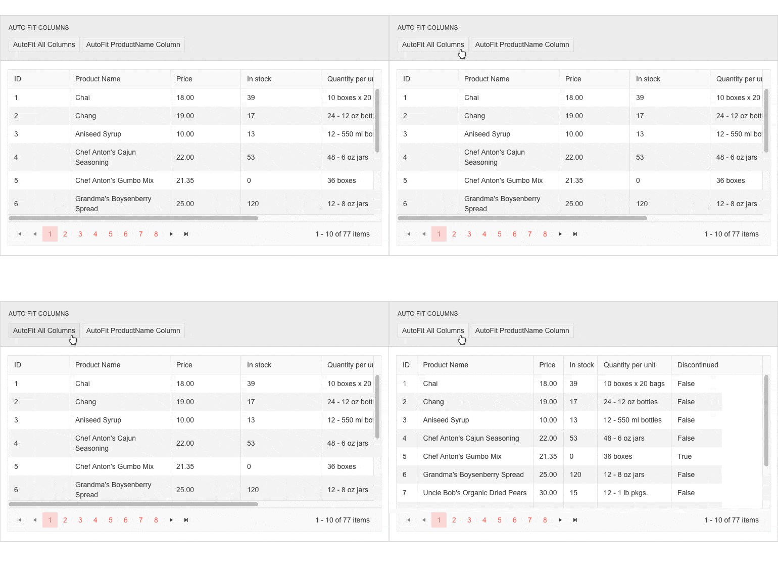
You now have full control over column sizing when rendering data grids and tree lists. With the current release, we exposed three new methods that let you resize column width to fit content, namely:
- AutoFitColumn(string id)—resizes single column, based on id
- AutoFitColumns(IEnumerable ids)—resizes columns, based on id or collection as a parameter
- AutoFitAllColumns()—resizes all data grid columns
Trigger OnEdit, OnUpdate, OnCancel on every cell in Incell EditMode
The InCell EditMode of the Grid and TreeList components now fires CRUD events on every cell as well as firing them per row, which allows you to decide on your own whether you would like to update the model conditionally or for every field.
DateInputs Enhancements
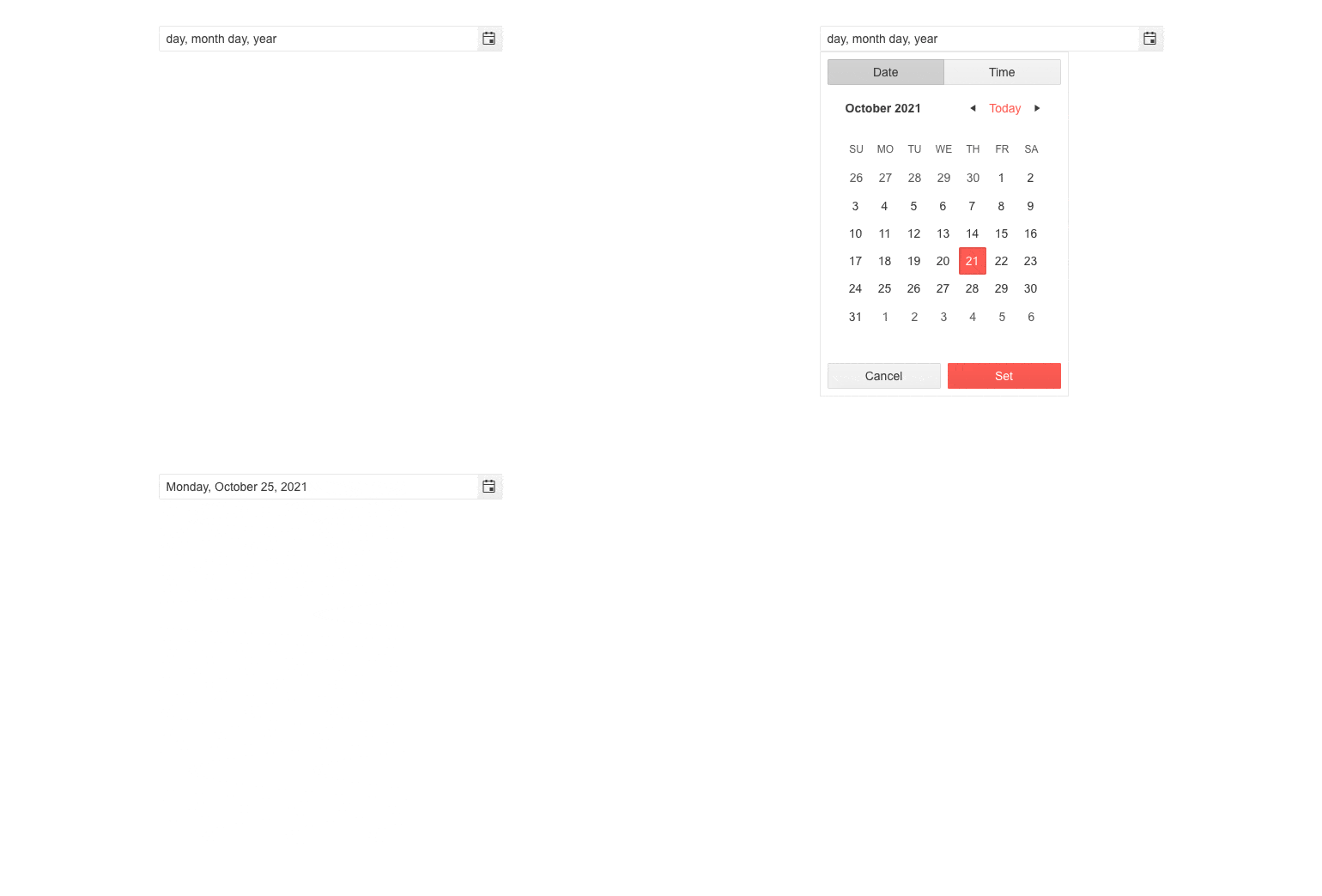
You may now render a text suggestion for each input field and provide descriptions for the format parts for multiple DateInputs components. For example, you can specify whether the month input is prompted as “month” or “MM” choosing between wide, narrow, short and direct display of the format section. The format placeholders are supported for the following components:
Visual Studio Enhancement
Themes & Swatches Configuration
The Create New Project Wizards for Visual Studio now provide the option for theme and swatches configuration. You can now style your project at the time of its creation and configure both the theme and the specific swatches in the wizard with a click of a button.
New Admin Dashboard Template
A brand-new Admin Dashboard project template has been added to the available templates in both Create New Project Wizards for Visual Studio. Using the Admin Dashboard project template, you can easily jump-start a project with the pre-built layout and functionality—rearrange the layout as it fits your needs, and simply plug in your data and bind it to the components—including Grid, Tile Layout, Drawer, Calendar, Form, various Chart types, Card and more.
Compatibility With .NET 6 Release Candidate 2
The 2.28 release of Telerik UI for Blazor is compatible with the newly released .NET 6 Release Candidate 2 and the hybrid apps model via the Microsoft BlazorWebView controls for WPF, WinForms and MAUI. This enables you to embed Blazor functionality and one of the 90+ Telerik Blazor components into existing Windows desktop apps based on .NET 6. Check out a sample repo that showcases hybrid scenarios.
Looking forward to November when we aim to provide official support for .NET 6 shortly after its release by Microsoft.
Telerik UI for .NET MAUI
With this October release, we are excited to announce that all our controls now support .NET MAUI Preview 9. Additionally, we are adding eight new components to our growing Telerik UI for .NET MAUI library!
Pickers

DatePicker and TimePicker components
Some of the new additions to the Telerik UI for .NET MAUI family are DatePicker and TimePicker controls. These pickers are visualized inside a popup and provide a convenient way for your .NET MAUI application users to select a date or time.
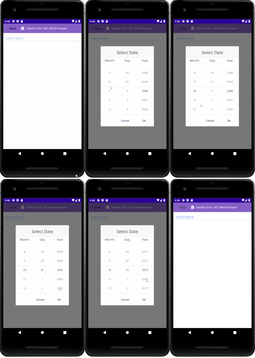
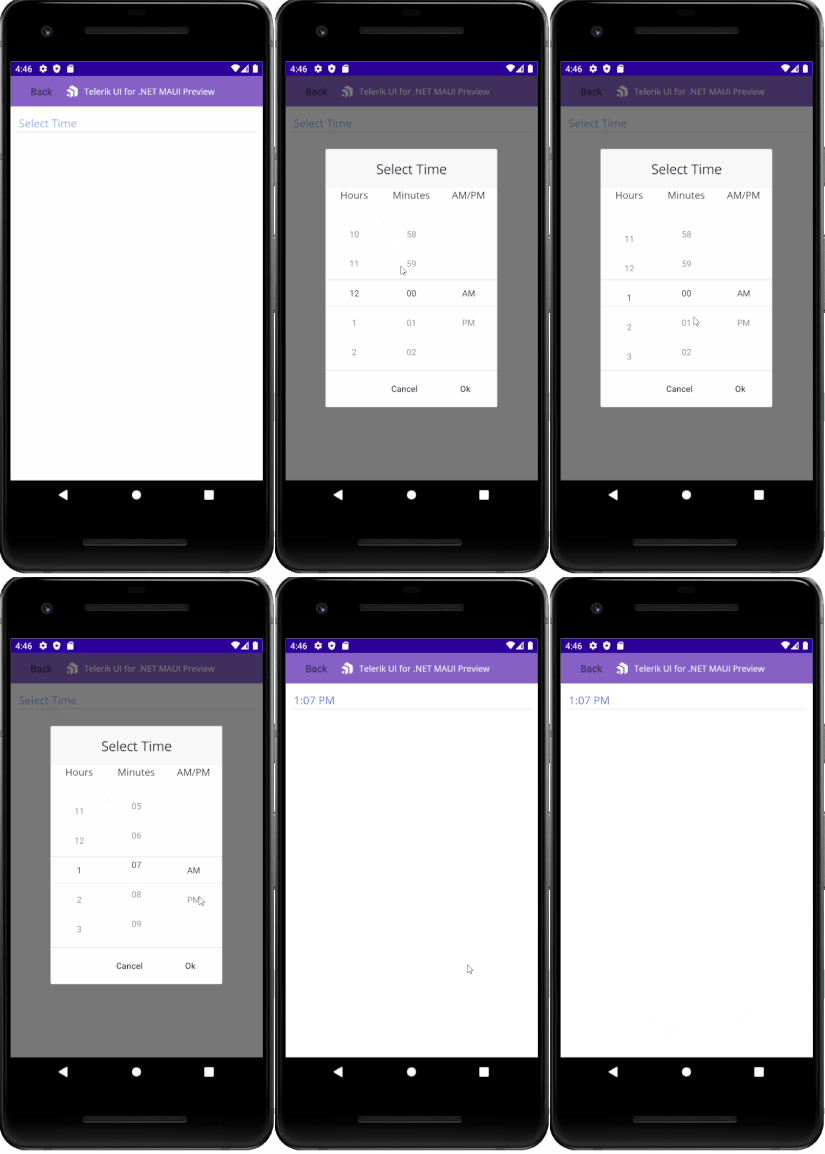
The components can make your life easier by providing some cool features out of the box such as Date Range/Time Range. These properties allow you to define a date or time range when setting minimum and maximum date/time and choose a value in between. The components also provide a flexible styling API and commands support.
ListPicker
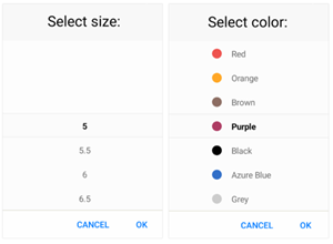
Telerik ListPicker for .NET MAUI is visualized inside a popup and allows you to select an item from a list of items.
The control provides an easy way to loop its items infinitely while scrolling. Also, you can fully customize the dialog appearance, style the list items, and define templates for the items and for the selected one.
TimeSpanPicker
If you want an easy way to select a time duration, then the TimeSpanPicker for .NET MAUI is just for you.
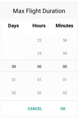
Here are some of the key features of the control:
- Spinner Format: Use either a standard or custom timespan format. Depending on what format is set, the picker visualizes spinner controls with prepopulated values to be picked.
- DisplayString Format: You can choose what text to be displayed when a time interval is selected.
- Templates: TimeSpanPicker provides templates for its header and footer. Also, we have exposed templates for the picker placeholder and display text.
- Time Range: Define a time range by setting minimum and maximum time values, so the user can choose a time in between.
- Time Interval Selection: You can set a current selected time interval to the TimeSpanPicker or set a default highlighted time interval.
- Incremental Time Steps: Change the default time interval values steps for day, hour, minute and second.
TemplatedPicker
If the above pickers do not fit your .NET MAUI application scenario, then the TemplatedPicker comes to save the day! It is a fully customizable control that allows you create a custom picker based on the scenario you want to achieve.
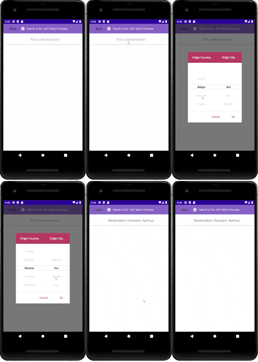
You can place any list of items inside the popup for the user to choose from and show the selected value in a defined format.
MaskedEntry
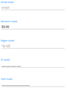
The new MaskedEntry enables users to format and constrain text to a predefined pattern or a pattern they define. The component provides input validation and predefined masks, such as Text, Regex, IP, Email and Numeric.
You can find below all the predefined/supported mask controls/masks as well as some information about each one of them:
- Text—RadTextMaskedEntry is used for handling standard (alphanumeric) user input. Resulting value is String object.
- Email—RadEmailMaskedEntry control is used for handling and validating an email input and returns a String object.
- Numeric—RadNumericMaskedEntry is used for handling numeric user input. The numeric mask is used when you need to display: Decimal, Percent, Fixed point values or culture-aware Currency.
- Regex—RadRegexMaskedEntry is used for handling and validating a standard (alphanumeric) user input against a regular expression. Provides errors if regex is not matched and returns a String value.
- IP—Used for handling and validating an IP address input and returns a string value.
In addition to the built-in toolset of mask controls, it also exposes handy events that allows you to achieve any scenario. For more details, check our product documentation on MaskedEntry.
BusyIndicator
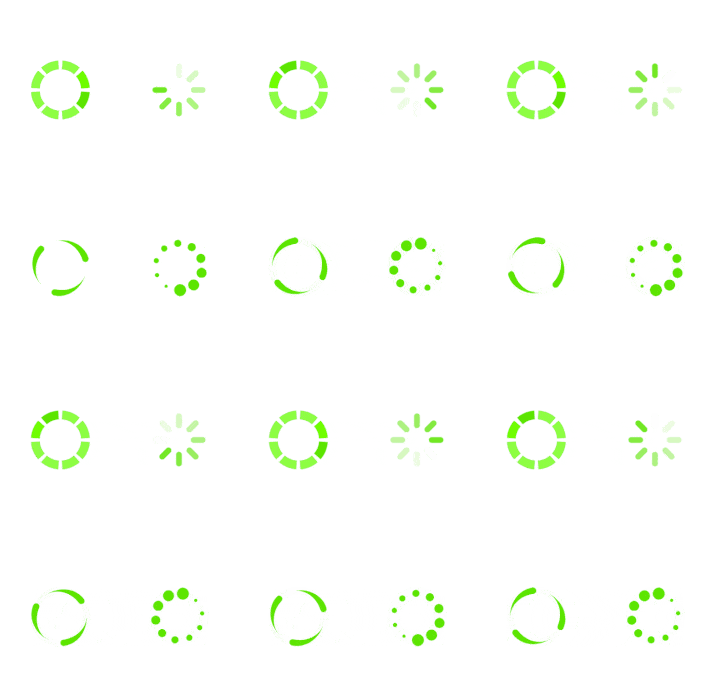
The Telerik BusyIndicator for .NET MAUI allows you to display a notification whenever a long-running process is being handled by the application. This makes the UI more informative and the user experience smoother.
It comes with a set of built-in animations and the support of setting custom content. More information about this can be found in the BusyIndicator section of our help documentation.
Rating
Telerik Rating for .NET MAUI is a UI component that allows users to intuitively select a rating value from a predefined number of items.
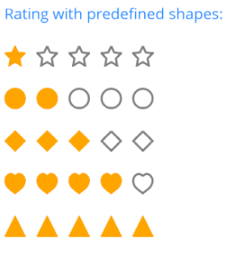
In addition to the predefined rating shapes, other key features of the control are:
- Custom items template support
- Read-only mode
- The ability to customize the shapes
Kendo UI for Angular
Angular Editor Enhancements
Editor Resizing
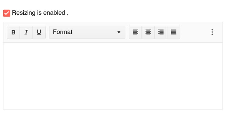
With this latest update, the Kendo UI for Angular Editor received the ability for end users to freely resize the Angular Editor once it has been rendered on a page. This can assist end users with adjusting how big or small they want the Editor to be as they use the component to edit rich text. Through the available configuration options, the available resizing can be restricted to help keep the Editor contained to a certain maximum size, or you can let the resizing capabilities be unlimited and let the user resize to their heart’s content.
Get Selected Text
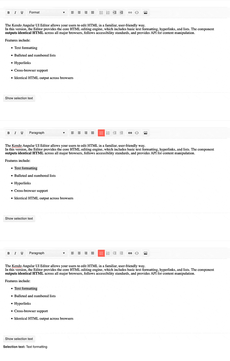
A quality-of-life improvement that was added with this update is for the Angular Editor is the selectionText field that can be used to extract any text that the user has selected. This simplifies scenarios where the selected text of the Editor updates other components, or developers need to pull out selected text for modification or further use elsewhere.
Apply Commands to Words
This specific feature is a quality-of-life improvement that can be enabled or disabled depending on user preferences. Specifically, this new feature tackles how to approach applying commands to words or blocks of text within the Angular Editor depending on the selection.
Before this update, if a user clicked within a single word in the Editor content area but did not select any text, so the cursor was just sitting between two characters, and then used the Bold toolbar button, nothing would happen. The “command” to bold something would only work based on selection.
With this new update, a new configuration allows for this behavior to change. Instead of not bolding the word at all, the current word the cursor is in the middle of will now be bolded. This may seem like a small behavioral change, but it is a feature that many end users of the Editor have requested, so we are very excited to bring this to the masses as of today.
Angular Dialog Updates
Custom CSS Classes & Attributes When Opened via Service
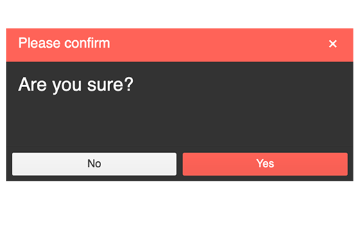
For those Angular developers who rely on the DialogService feature of the Kendo UI for Angular Dialog component, today is a big day. This feature is used when developers need to use an Angular Service in order to dynamically create a Dialog instance. With this update, developers can now apply custom CSS Classes and HTML Attributes through the cssClass and htmlAttributes properties.
RTL Support When Opened via Service
Similar to the above, when using the Kendo UI for Angular Dialog component through the DialogService and Angular Services, developers can also specify that the Angular Dialog should be displayed in a right-to-left fashion. This can be done through the htmlAttributes property where we offer a dir field that can be set to rtl.
Angular Window Enhancements
Custom CSS Classes & Attributes When Opened via Service
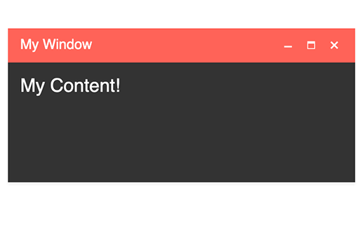
Just like with the Angular Dialog, the Kendo UI for Angular Window component also received the ability to define custom CSS Classes and HTML Attributes when using the WindowService feature to create instances of the Angular Window dynamically.
RTL Support When Opened via Service
The Angular Window also received the ability to render the component and its content in an RTL (right-to-left) mode when using the WindowService approach to displaying Windows. This is also exposed through the htmlAttributes property where RTL can be enabled through setting the dir field appropriately.
Angular PanelBar Updated Design
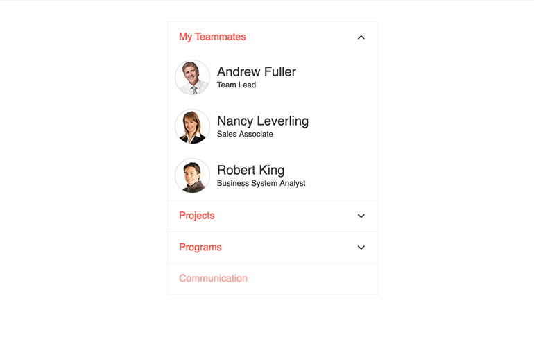
Kendo UI for Angular is just one product out of nine total that share a common rendering. As each of our products grows organically based on customer feedback, there may be some features or tweaks added from one library that affects the others, or we may evolve the look and feel of the component over time. As a part of this, we recently did a quick update of the design for the Angular PanelBar component, unifying the look and feel with the rest of the UI libraries that share themes.
These tweaks come mostly in the form of updated HTML rendering and classes applied under the hood, so there are no big sweeping UI changes that one will spot with the naked eye. The one big difference is the tweaked expand and collapse arrows, which are now a chevron arrow versus a filled-in triangle.
Kendo UI for Vue
New Vue Toolbar Component
The new Kendo UI for Vue Toolbar component builds on the already growing list of native UI components for Vue to provide a graphical element for holding and organizing various button elements. Commonly this is found at the top of our rich text Editor components, but this can also be used as a standalone component.

New Vue SplitButton Component
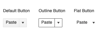
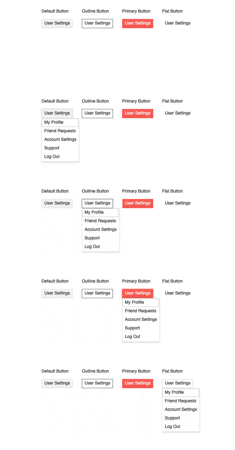
Expanding on the available button types, with this update we have added the Kendo UI for Vue SplitButton component. This button, as the name gives away, is split between a regular button that offers a default behavior when clicked, as well as an arrow that can be clicked to display a dropdown, which will provide a list of additional predefined actions in a list.
New Vue DropDownButton Component
The Kendo UI for Vue DropDownButton component is a button that, when clicked, will display a dropdown list of action items that the user can select from. The Vue Button can use text, icons or a mix of both when defining the look and feel of the button element.
New Vue Menu Component
With this update, we have added the new Kendo UI for Vue Menu component—a multi-level component meant to display hierarchical options within a menu interface. This component is often used as a contextual menu for other Kendo UI for Vue UI components, but can work well on its own for scenarios that call for menu navigation similar to that of desktop applications or menus that appear on elements in the taskbar of major operating systems.

New Vue Filter Component
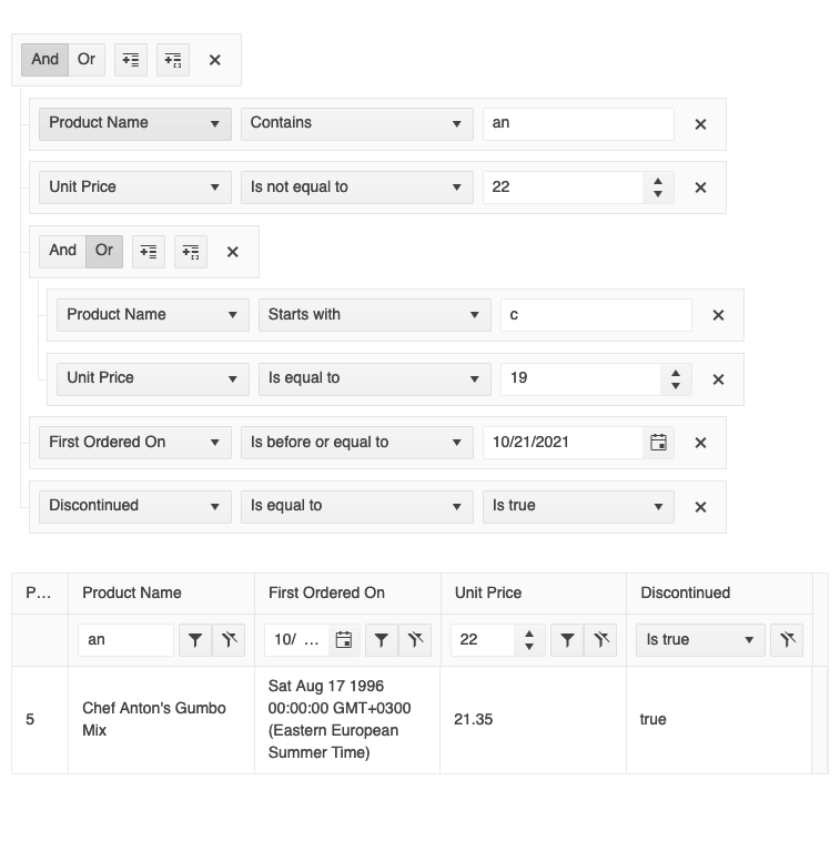
Offering users the ability to filter data can be difficult to achieve from a user experience perspective. Beyond a simple search field, the design can quickly become cumbersome to use and understand. This is where the new Kendo UI for Vue Filter component really shines. This one component allows end users to create complex and detailed filter expressions to filter down underlying data to a very specific set of items. These expressions can be extracted on their own or combined with other Kendo UI for Vue UI components like the Data Grid to deliver a more detailed filter capability to the components.
Label Props for All Inputs and Pickers
An enhancement that we added across all Kendo UI for Vue Input and Picker components is the new label property. This was added to make assigning a Floating Label to each component a little easier by simply configuring the label prop to display the appropriate label. Previously this required a little extra work with wrapping around the applicable component with a FloatingLabel component. Now all that is needed is to pass in a string to a single property and you are good to go.
There’s More To Come
That’s all we had in today’s update, folks, but as I mentioned we are looking to do more of these as we continue our work toward R1 2022. All of our engineering teams are hard at work delivering new features, components and of course bug fixes all throughout this release cycle, so there will be more to share in a few weeks. If a product that you are using actively today is missing here, don’t worry—they will most likely be a part of the next update! If you found this type of update useful, let us know in the comments below. Until next time!
This content originally appeared on Telerik Blogs and was authored by Carl Bergenhem
Carl Bergenhem | Sciencx (2021-10-29T16:02:18+00:00) Kendo UI and Telerik UI Web and .NET MAUI Components October Update. Retrieved from https://www.scien.cx/2021/10/29/kendo-ui-and-telerik-ui-web-and-net-maui-components-october-update/
Please log in to upload a file.
There are no updates yet.
Click the Upload button above to add an update.
