
This content originally appeared on Level Up Coding - Medium and was authored by Michael Markin

While Python is an amazing tool, the vast majority of workplaces (especially in the finance industry) still use Excel to display and report their data. In this article, we will cover how to elegantly integrate pandas DataFrames and graphs with existing Excel files.
- Writing to Excel WITHOUT disturbing other content
- Styling (format font, border, alignment, and much more!)
- Inserting Python graphs as images
1) Writing to Excel WITHOUT disturbing other content
When working with pandas, this is the DataFrame export we are accustomed to seeing:
df.to_excel(filepath)
However, this method of writing to Excel is not suitable for adding to existing reports. It essentially creates a new workbook, which means all original sheets and data will be lost. Be aware of this!
So what can we do instead?
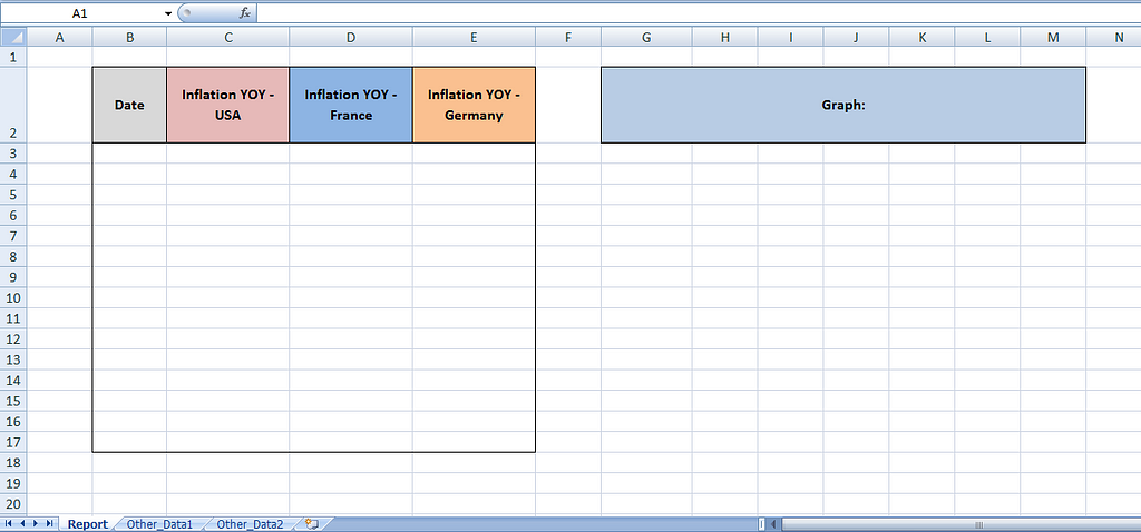
Let’s assume this is our current Excel workbook. It has some headings already set up in the Report tab, as well as other sheets of data. We are going to use Openpyxl to overwrite specific cell ranges within the Report tab without erasing any other content.
Openpyxl is one of the most dynamic and popular Python libraries used for writing and reading Excel files. I will be working with version 3.0.9 of Openpyxl in these examples. It is ideal for Excel 2010, but as you can see it performed just fine with my Excel 2007 as well.
While using Openpyxl, we can read sheets into memory to the pandas Excel writer. This will allow you to work with any pre-existing sheets and save all the original content.
To do this, consider modifying your DataFrame exports to the following code:
The DataFrame in this example contains recent inflation data of a few countries. Notice that we have successfully inserted the data while preserving all other information and sheets in the workbook.

2) Styling (format font, border, alignment, and much more!)
Without any adjustments, DataFrames are always written to Excel in the same boring format: Calibri, font size 11. If you are running a report on a daily or weekly basis, it would be tedious to manually re-format things yourself.
Let’s spice it up by letting Openpyxl styles do the customization. This is code that can be added after you have run df.to_excel(…) and before the writer object is saved.
To recap, I adjusted font settings, background color, border and cell alignment, as well as changed the cell type from a custom DateTime to a simple MM-DD-YY format.
Much more is possible! You can find other styling capabilities in the documentation: https://openpyxl.readthedocs.io/en/stable/styles.html
I decided to only apply formatting to the Date column. Here is what the changes look like in Excel.

3) Inserting Python graphs as images
Oftentimes, we can create much more advanced graphing using Python’s bountiful charting libraries. Let’s say we have a line plot created using the seaborn library and want to insert it into our Excel sheet.
Here’s how to do it using Openpyxl. First, save your chart figure to your local files as a PNG or JPG. Then include this code:
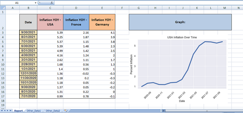
The chart figure has been successfully pasted into the sheet after being anchored to cell G4.
And voilà… the Excel report is now visually appealing and largely automated.
Example Notebook
I hope this helps. Check out the full Juypter Notebook here.
And thanks for reading!
3 Python-to-Excel Actions Every Data Analyst Should Know was originally published in Level Up Coding on Medium, where people are continuing the conversation by highlighting and responding to this story.
This content originally appeared on Level Up Coding - Medium and was authored by Michael Markin
Michael Markin | Sciencx (2021-11-02T02:38:30+00:00) 3 Python-to-Excel Actions Every Data Analyst Should Know. Retrieved from https://www.scien.cx/2021/11/02/3-python-to-excel-actions-every-data-analyst-should-know/
Please log in to upload a file.
There are no updates yet.
Click the Upload button above to add an update.