This content originally appeared on DEV Community and was authored by Zoltán Szőgyényi
I've been using Tailwind CSS quite a lot lately for my web projects, however, one disadvantage that I've encountered compared to other classic OOCSS frameworks such as Bootstrap is the lack of components that you can use right away.
That is why I have started a series of articles here on the DEV community on how to build commonly used components using the utility classes from Tailwind CSS.
Last time I showed you how to build a list group component in Tailwind CSS and today I want to show you how to build a navigation bar.
Let's get started.
Tailwind CSS navbar
First of all we need to build the HTML code before styling it by using a nav tag and inside it a ul for the menu itself.
<nav>
  <div>
    <a href="#">
        <span>FlowBite</span>
    </a>
    <div>
      <ul>
          <li><a href="#">Home</a></li>
          <li><a href="#">About</a></li>
          <li><a href="#">Services</a></li>
          <li><a href="#">Pricing</a></li>
          <li><a href="#">Contact</a></li>
      </ul>
    </div>
  </div>
</nav>
Awesome. Now let's add some styles to the nav and the div wrapper elements.
<nav class="bg-white border-gray-200 px-2">
  <div class="container mx-auto flex flex-wrap items-center justify-between">
    <a href="#">
        <span>FlowBite</span>
    </a>
    <div>
      <ul>
          <li><a href="#">Home</a></li>
          <li><a href="#">About</a></li>
          <li><a href="#">Services</a></li>
          <li><a href="#">Pricing</a></li>
          <li><a href="#">Contact</a></li>
      </ul>
    </div>
  </div>
</nav>
Let's now add some styles to the ul and its elements.
<nav class="bg-white border-gray-200 px-2">
  <div class="container mx-auto flex flex-wrap items-center justify-between">
    <a href="#">
        <span>FlowBite</span>
    </a>
    <div class="hidden md:block w-full md:w-auto" id="mobile-menu">
      <ul class="flex-col md:flex-row flex md:space-x-8 mt-4 md:mt-0 md:text-sm md:font-medium">
        <li>
          <a href="#" class="bg-blue-700 md:bg-transparent text-white block pl-3 pr-4 py-2 md:text-blue-700 md:p-0 rounded" aria-current="page">Home</a>
        </li>
        <li>
          <a href="#" class="text-gray-700 hover:bg-gray-50 border-b border-gray-100 md:hover:bg-transparent md:border-0 block pl-3 pr-4 py-2 md:hover:text-blue-700 md:p-0">About</a>
        </li>
        <li>
          <a href="#" class="text-gray-700 hover:bg-gray-50 border-b border-gray-100 md:hover:bg-transparent md:border-0 block pl-3 pr-4 py-2 md:hover:text-blue-700 md:p-0">Services</a>
        </li>
        <li>
          <a href="#" class="text-gray-700 hover:bg-gray-50 border-b border-gray-100 md:hover:bg-transparent md:border-0 block pl-3 pr-4 py-2 md:hover:text-blue-700 md:p-0">Pricing</a>
        </li>
        <li>
          <a href="#" class="text-gray-700 hover:bg-gray-50 border-b border-gray-100 md:hover:bg-transparent md:border-0 block pl-3 pr-4 py-2 md:hover:text-blue-700 md:p-0">Contact</a>
        </li>
      </ul>
    </div>
  </div>
</nav>
Let's now also add a logo as an SVG element:
<nav class="bg-white border-gray-200 px-2">
  <div class="container mx-auto flex flex-wrap items-center justify-between">
    <a href="#" class="flex">
      <svg class="h-10 mr-3" width="51" height="70" viewBox="0 0 51 70" fill="none" xmlns="http://www.w3.org/2000/svg"><g clip-path="url(#clip0)"><path d="M1 53H27.9022C40.6587 53 51 42.7025 51 30H24.0978C11.3412 30 1 40.2975 1 53Z" fill="#76A9FA"/><path d="M-0.876544 32.1644L-0.876544 66.411C11.9849 66.411 22.4111 55.9847 22.4111 43.1233L22.4111 8.87674C10.1196 8.98051 0.518714 19.5571 -0.876544 32.1644Z" fill="#A4CAFE"/><path d="M50 5H23.0978C10.3413 5 0 15.2975 0 28H26.9022C39.6588 28 50 17.7025 50 5Z" fill="#1C64F2"/></g><defs><clipPath id="clip0"><rect width="51" height="70" fill="white"/></clipPath></defs></svg>
        <span class="self-center text-lg font-semibold whitespace-nowrap">FlowBite</span>
    </a>
    <div class="hidden md:block w-full md:w-auto" id="mobile-menu">
      <ul class="flex-col md:flex-row flex md:space-x-8 mt-4 md:mt-0 md:text-sm md:font-medium">
        <li>
          <a href="#" class="bg-blue-700 md:bg-transparent text-white block pl-3 pr-4 py-2 md:text-blue-700 md:p-0 rounded" aria-current="page">Home</a>
        </li>
        <li>
          <a href="#" class="text-gray-700 hover:bg-gray-50 border-b border-gray-100 md:hover:bg-transparent md:border-0 block pl-3 pr-4 py-2 md:hover:text-blue-700 md:p-0">About</a>
        </li>
        <li>
          <a href="#" class="text-gray-700 hover:bg-gray-50 border-b border-gray-100 md:hover:bg-transparent md:border-0 block pl-3 pr-4 py-2 md:hover:text-blue-700 md:p-0">Services</a>
        </li>
        <li>
          <a href="#" class="text-gray-700 hover:bg-gray-50 border-b border-gray-100 md:hover:bg-transparent md:border-0 block pl-3 pr-4 py-2 md:hover:text-blue-700 md:p-0">Pricing</a>
        </li>
        <li>
          <a href="#" class="text-gray-700 hover:bg-gray-50 border-b border-gray-100 md:hover:bg-transparent md:border-0 block pl-3 pr-4 py-2 md:hover:text-blue-700 md:p-0">Contact</a>
        </li>
      </ul>
    </div>
  </div>
</nav>
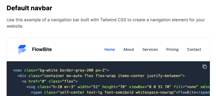
The navbar should look something like this:
Good job! The problem now is that we have to make it work for mobile devices as well which means that we need to show a hamburger menu icon which when click on will toggle the navbar.
Tailwind CSS navbar on mobile devices
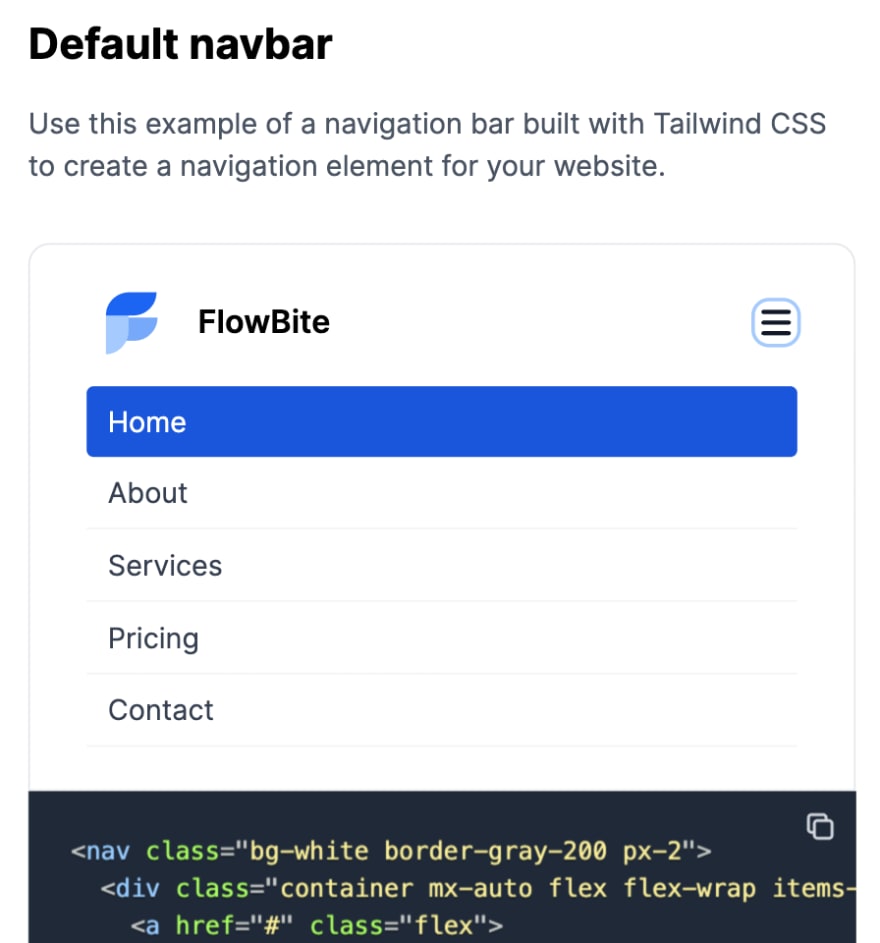
We will make it work on a mobile device and it will look like this:
Please follow the quickstart guide from Flowbite and include the JavaScript so that the following part of this tutorial will work.
You can either install it via NPM and include it locally or just include the CDN directly.
Require via NPM
Make sure that you have Node.js and Tailwind CSS installed.
- Install Flowbite as a dependency using NPM by running the following command:
npm i @themesberg/flowbite
- Require Flowbite as a plugin inside the
tailwind.config.jsfile:
module.exports = {

    plugins: [
        require('@themesberg/flowbite/plugin')
    ]

}
- Include the main JavaScript file to make interactive elements work:
<script src="../path/to/@themesberg/flowbite/dist/flowbite.bundle.js"></script>
If you use Webpack or other bundlers you can also import it like this:
import '@themesberg/flowbite';
Include via CDN
The quickest way to get started working with FlowBite is to simply include the CSS and JavaScript into your project via CDN.
Require the following minified stylesheet inside the head tag:
<link rel="stylesheet" href="https://unpkg.com/@themesberg/flowbite@1.1.1/dist/flowbite.min.css" />
And include the following javascript file before the end of the body element:
<script src="https://unpkg.com/@themesberg/flowbite@1.1.1/dist/flowbite.bundle.js"></script>
After you've included the flowbite.bundle.js inside your project just add the following hamburger toggle button inside the navbar and the toggle should work.
<nav class="bg-white border-gray-200 px-2">
  <div class="container mx-auto flex flex-wrap items-center justify-between">
    <a href="#" class="flex">
      <svg class="h-10 mr-3" width="51" height="70" viewBox="0 0 51 70" fill="none" xmlns="http://www.w3.org/2000/svg"><g clip-path="url(#clip0)"><path d="M1 53H27.9022C40.6587 53 51 42.7025 51 30H24.0978C11.3412 30 1 40.2975 1 53Z" fill="#76A9FA"></path><path d="M-0.876544 32.1644L-0.876544 66.411C11.9849 66.411 22.4111 55.9847 22.4111 43.1233L22.4111 8.87674C10.1196 8.98051 0.518714 19.5571 -0.876544 32.1644Z" fill="#A4CAFE"></path><path d="M50 5H23.0978C10.3413 5 0 15.2975 0 28H26.9022C39.6588 28 50 17.7025 50 5Z" fill="#1C64F2"></path></g><defs><clipPath id="clip0"><rect width="51" height="70" fill="white"></rect></clipPath></defs></svg>
        <span class="self-center text-lg font-semibold whitespace-nowrap">FlowBite</span>
    </a>
    <button data-collapse-toggle="mobile-menu" type="button" class="md:hidden ml-3 text-gray-400 hover:text-gray-900 focus:outline-none focus:ring-2 focus:ring-blue-300 rounded-lg inline-flex items-center justify-center" aria-controls="mobile-menu-2" aria-expanded="false">
      <span class="sr-only">Open main menu</span>
      <svg class="w-6 h-6" fill="currentColor" viewBox="0 0 20 20" xmlns="http://www.w3.org/2000/svg"><path fill-rule="evenodd" d="M3 5a1 1 0 011-1h12a1 1 0 110 2H4a1 1 0 01-1-1zM3 10a1 1 0 011-1h12a1 1 0 110 2H4a1 1 0 01-1-1zM3 15a1 1 0 011-1h12a1 1 0 110 2H4a1 1 0 01-1-1z" clip-rule="evenodd"></path></svg>
      <svg class="hidden w-6 h-6" fill="currentColor" viewBox="0 0 20 20" xmlns="http://www.w3.org/2000/svg"><path fill-rule="evenodd" d="M4.293 4.293a1 1 0 011.414 0L10 8.586l4.293-4.293a1 1 0 111.414 1.414L11.414 10l4.293 4.293a1 1 0 01-1.414 1.414L10 11.414l-4.293 4.293a1 1 0 01-1.414-1.414L8.586 10 4.293 5.707a1 1 0 010-1.414z" clip-rule="evenodd"></path></svg>
    </button>
    <div class="hidden md:block w-full md:w-auto" id="mobile-menu">
      <ul class="flex-col md:flex-row flex md:space-x-8 mt-4 md:mt-0 md:text-sm md:font-medium">
        <li>
          <a href="#" class="bg-blue-700 md:bg-transparent text-white block pl-3 pr-4 py-2 md:text-blue-700 md:p-0 rounded" aria-current="page">Home</a>
        </li>
        <li>
          <a href="#" class="text-gray-700 hover:bg-gray-50 border-b border-gray-100 md:hover:bg-transparent md:border-0 block pl-3 pr-4 py-2 md:hover:text-blue-700 md:p-0">About</a>
        </li>
        <li>
          <a href="#" class="text-gray-700 hover:bg-gray-50 border-b border-gray-100 md:hover:bg-transparent md:border-0 block pl-3 pr-4 py-2 md:hover:text-blue-700 md:p-0">Services</a>
        </li>
        <li>
          <a href="#" class="text-gray-700 hover:bg-gray-50 border-b border-gray-100 md:hover:bg-transparent md:border-0 block pl-3 pr-4 py-2 md:hover:text-blue-700 md:p-0">Pricing</a>
        </li>
        <li>
          <a href="#" class="text-gray-700 hover:bg-gray-50 border-b border-gray-100 md:hover:bg-transparent md:border-0 block pl-3 pr-4 py-2 md:hover:text-blue-700 md:p-0">Contact</a>
        </li>
      </ul>
    </div>
  </div>
</nav>
Here's how it should look on a mobile device:
Great job! You've built a fully responsive Tailwind CSS navbar component. If you want to see more navbar variations built with Tailwind CSS, check out the following Tailwind CSS navbar components from Flowbite.
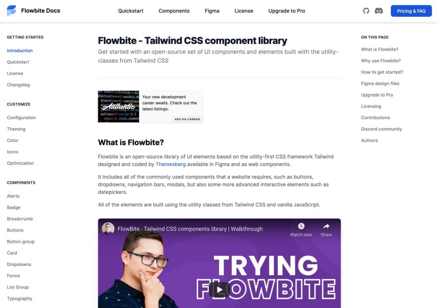
Flowbite - Tailwind CSS component library
This responsive Tailwind CSS navbar is just an example of a larger and open source component library called Flowbite.
The library includes components such as buttons, alerts, navbars, dropdowns, modals, datepickers and many more built exclusively with the utility classes from Tailwind CSS.
This content originally appeared on DEV Community and was authored by Zoltán Szőgyényi
Zoltán Szőgyényi | Sciencx (2021-11-16T11:54:13+00:00) Building a responsive navbar component in Tailwind CSS. Retrieved from https://www.scien.cx/2021/11/16/building-a-responsive-navbar-component-in-tailwind-css/
Please log in to upload a file.
There are no updates yet.
Click the Upload button above to add an update.


