This content originally appeared on DEV Community and was authored by Vic Shóstak
Introduction
Hey-hey, DEV friends! 😉
Lately, I've been reading and refactoring other people's code more and more often. Both incredibly beautiful and… the kind of code I'd like to take apart with you today.
💡 Disclaimer: This article does not claim to be the ultimate truth. The method of code decomposition shown below is just an example, you can always write how you do it in the comments below. Feel free, it will be interesting to read!
Great, let's do it! 👇
📝 Table of contents
How task decomposition helps us
Let's begin by defining what decomposition from Wiki:
[...] Decomposition in computer science, also known as factoring, is breaking a complex problem or system into parts that are easier to conceive, understand, program, and maintain.
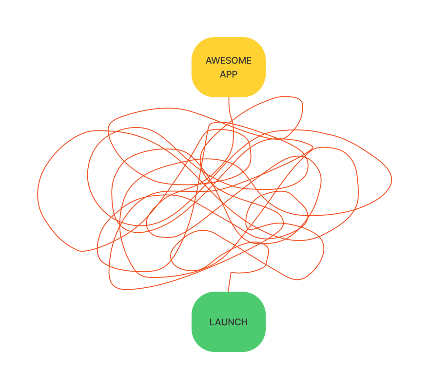
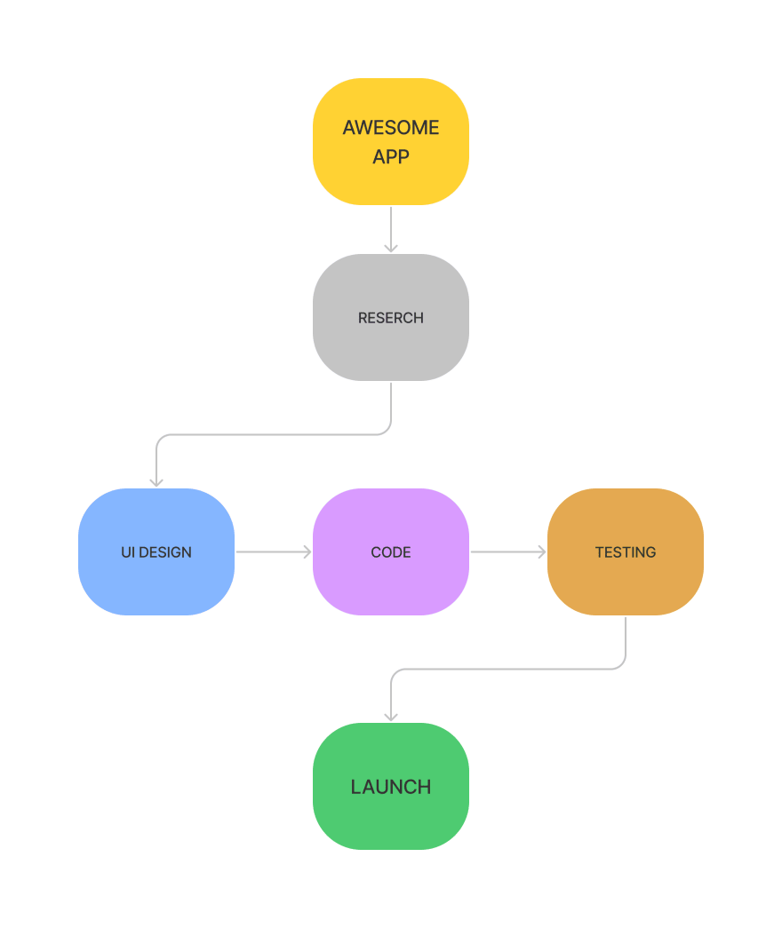
Let's turn to a simple diagram to better understand the principles of tasks decomposition. Take the launch of the “Awesome App” to market as an example.
Without decomposing this task, its diagram would look something like this:
Where do you need to start, and how do you come to launch? Only the desired result without detailing the process itself. Nothing is clear… But if we apply even basic knowledge of decomposition, the diagram will look something like this:
Much better, isn't it? 🤓 We've broken down the process of launching an application into big blocks with clear actions: research, design, writing code, testing, and launching.
Next, we can break these blocks into smaller ones, and so on, until we get to atomic tasks (which can no longer be broken down into smaller ones).
Note about the decomposition in Flutter
I would like to note that the code written on the multiplatform Flutter framework, like no other, requires constant refactoring and decomposition almost from the beginning of the project.
All because the framework has been designed to write code in declarative style, where every element is a separate widget. And when the code becomes a lot (for example, starting from the 5th degree of nesting), it is simply impossible to read it without effort.
That's why you should always have an architectural plan for your application, which you will stick to most of the time. In my opinion, this is both a plus and a minus at the same time. Otherwise, maintaining and further developing the project inevitably turns into a natural pain.
Example of architectural plan
What is an “architectural plan” for writing software? Simple: it is a set of rules that all programmers follow when writing code. If you're familiar with a frontend development (React, Vue, etc.), here's a sample set of rules for writing project code:
- ✅ All components must be stored in the
./src/componentsfolder with easy-to-understand names. - ✅ All helper functions must have a pointer to the action in their name (for example, if the helper get a link to the user's avatar, its name could be
getUserAvatarURL). - ✅ The maximum number of props in a component should not exceed 5.
- ✅ …and many more!
Do you feel like there's no more chaos in your head when you have rules like that? That's the beauty of an architecture plan for software! You just have to follow the accepted rules for a particular project. That's it.
⚡️ Warning: Please don't confuse an architecture plan with a style guide or language/framework best practices! The architecture plan is more like a local checklist for a particular project, than a globally accepted norms and standards.
Problems with code without decomposition
I was recently doing a review of a project that was written in Flutter and found a widget like this:
// ./lib/screens/app.dart

/// Application widget.
class MyApp extends StatelessWidget {
  const MyApp({Key? key}) : super(key: key);

  @override
  Widget build(BuildContext context) {
    return MaterialApp(
      title: 'My App',
      debugShowCheckedModeBanner: false,
      // 👇 start default theme (light)
      theme: theme: ThemeData().copyWith(
        textTheme: GoogleFonts.interTextTheme(
          Theme.of(context).textTheme,
        ).copyWith(
          bodyText2: TextStyle(color: BrandColor.secondary[700]),
          subtitle1: TextStyle(color: BrandColor.secondary[700]),
          headline4: TextStyle(color: BrandColor.primary[500]),
        ),
        scaffoldBackgroundColor: BrandColor.secondary[500],
        primaryColor: BrandColor.primary[500],
        textButtonTheme: TextButtonThemeData(
          style: TextButton.styleFrom(
            primary: BrandColor.primary[500],
          ),
        ),
        elevatedButtonTheme: ElevatedButtonThemeData(
          style: ElevatedButton.styleFrom(
            onPrimary: Colors.white,
            primary: BrandColor.primary[500],
            shape: RoundedRectangleBorder(
              borderRadius: BorderRadius.circular(16.0),
            ),
            padding: const EdgeInsets.symmetric(vertical: 18.0),
          ),
        ),
        outlinedButtonTheme: OutlinedButtonThemeData(
          style: OutlinedButton.styleFrom(
            primary: BrandColor.primary[500],
            side: BorderSide(
              color: BrandColor.primary[500] as Color,
            ),
          ),
        ),
        bottomNavigationBarTheme: BottomNavigationBarThemeData(
          backgroundColor: BrandColor.secondary[300],
          showSelectedLabels: false,
          showUnselectedLabels: false,
          selectedIconTheme: const IconThemeData(size: 26.0),
          unselectedIconTheme: const IconThemeData(size: 26.0),
          selectedItemColor: BrandColor.primary[500],
          unselectedItemColor: BrandColor.primary[300],
        ),
      ),
      // 👇 start dark theme
      darkTheme: ThemeData.dark().copyWith(
        scaffoldBackgroundColor: BrandColor.secondary[700],
        primaryColor: BrandColor.primary[500],
        textTheme: GoogleFonts.interTextTheme(
          Theme.of(context).textTheme,
        ).copyWith(
          bodyText2: TextStyle(color: BrandColor.secondary[500]),
          subtitle1: TextStyle(color: BrandColor.secondary[500]),
          headline4: TextStyle(color: BrandColor.primary[500]),
        ),
        textButtonTheme: TextButtonThemeData(
          style: TextButton.styleFrom(
            primary: BrandColor.primary[500],
          ),
        ),
        elevatedButtonTheme: ElevatedButtonThemeData(
          style: ElevatedButton.styleFrom(
            onPrimary: Colors.white,
            primary: BrandColor.primary[500],
            shape: RoundedRectangleBorder(
              borderRadius: BorderRadius.circular(16.0),
            ),
            padding: const EdgeInsets.symmetric(vertical: 18.0),
          ),
        ),
        outlinedButtonTheme: OutlinedButtonThemeData(
          style: OutlinedButton.styleFrom(
            primary: BrandColor.primary[500],
            side: BorderSide(
              color: BrandColor.primary[500] as Color,
            ),
          ),
        ),
        bottomNavigationBarTheme: BottomNavigationBarThemeData(
          backgroundColor: BrandColor.secondary[900],
          showSelectedLabels: false,
          showUnselectedLabels: false,
          selectedIconTheme: const IconThemeData(size: 26.0),
          unselectedIconTheme: const IconThemeData(size: 26.0),
          selectedItemColor: BrandColor.primary[500],
          unselectedItemColor: BrandColor.primary[300],
        ),
      ),
      themeMode: ThemeMode.system,
      initialRoute: '/',
      routes: <String, WidgetBuilder>{
        '/': (_) => const SplashScreen(),
        '/sign-in': (_) => const SignInScreen(),
        '/main': (_) => const MainScreen(),
        // ...
      },
    );
  }
}
And that's not counting the imports, which take up the first 10 lines! It's already quite difficult to read or make edits to such code.
But this massive code can easily be decomposed! 🚀
How I do it
1️⃣ First, you need to identify the most appropriate elements for it.
One of the most eye-catching parts of the code is the code section defining the application's design themes: the light and dark themes.
2️⃣ Second, let's think about how we're going to do this.
I think it will be enough to put the styles in separate functions (for example, lightThemeData() and darkThemeData()), which will be available in the context of each widget.
3️⃣ Third, for easier access to styles out of context, I will use the extension methods (a built-in Dart language functionality). If you aren't yet familiar with it, I suggest you watch this short video by Filip Hracek:
📌 Note: Furthermore, I usually store the styles in the
./lib/stylesfolder, but you can name it whatever you like.
Sounds like a good plan! Let's rewrite the code. Starting with methods for the class with styles:
// ./lib/styles/themes.dart

/// Theme data for project.
extension BrandThemeData on BuildContext {
  /// Styles for the light theme.
  ThemeData lightThemeData() {
    return ThemeData().copyWith(
      textTheme: GoogleFonts.interTextTheme(Theme.of(this).textTheme).copyWith(
        bodyText2: TextStyle(color: BrandColor.secondary[700]),
        subtitle1: TextStyle(color: BrandColor.secondary[700]),
        headline4: TextStyle(color: BrandColor.primary[500]),
      ),
      scaffoldBackgroundColor: BrandColor.secondary[500],
      primaryColor: BrandColor.primary[500],
      textButtonTheme: TextButtonThemeData(
        style: TextButton.styleFrom(
          primary: BrandColor.primary[500],
        ),
      ),
      elevatedButtonTheme: ElevatedButtonThemeData(
        style: ElevatedButton.styleFrom(
          onPrimary: Colors.white,
          primary: BrandColor.primary[500],
          shape: RoundedRectangleBorder(
            borderRadius: BorderRadius.circular(16.0),
          ),
          padding: const EdgeInsets.symmetric(vertical: 18.0),
        ),
      ),
      outlinedButtonTheme: OutlinedButtonThemeData(
        style: OutlinedButton.styleFrom(
          primary: BrandColor.primary[500],
          side: BorderSide(
            color: BrandColor.primary[500] as Color,
          ),
        ),
      ),
      bottomNavigationBarTheme: BottomNavigationBarThemeData(
        backgroundColor: BrandColor.secondary[300],
        showSelectedLabels: false,
        showUnselectedLabels: false,
        selectedIconTheme: const IconThemeData(size: 26.0),
        unselectedIconTheme: const IconThemeData(size: 26.0),
        selectedItemColor: BrandColor.primary[500],
        unselectedItemColor: BrandColor.primary[300],
      ),
    );
  }

  /// Styles for the dark theme.
  ThemeData darkThemeData() {
    return ThemeData.dark().copyWith(
      scaffoldBackgroundColor: BrandColor.secondary[700],
      primaryColor: BrandColor.primary[500],
      textTheme: GoogleFonts.interTextTheme(Theme.of(this).textTheme).copyWith(
        bodyText2: TextStyle(color: BrandColor.secondary[500]),
        subtitle1: TextStyle(color: BrandColor.secondary[500]),
        headline4: TextStyle(color: BrandColor.primary[500]),
      ),
      textButtonTheme: TextButtonThemeData(
        style: TextButton.styleFrom(
          primary: BrandColor.primary[500],
        ),
      ),
      elevatedButtonTheme: ElevatedButtonThemeData(
        style: ElevatedButton.styleFrom(
          onPrimary: Colors.white,
          primary: BrandColor.primary[500],
          shape: RoundedRectangleBorder(
            borderRadius: BorderRadius.circular(16.0),
          ),
          padding: const EdgeInsets.symmetric(vertical: 18.0),
        ),
      ),
      outlinedButtonTheme: OutlinedButtonThemeData(
        style: OutlinedButton.styleFrom(
          primary: BrandColor.primary[500],
          side: BorderSide(
            color: BrandColor.primary[500] as Color,
          ),
        ),
      ),
      bottomNavigationBarTheme: BottomNavigationBarThemeData(
        backgroundColor: BrandColor.secondary[900],
        showSelectedLabels: false,
        showUnselectedLabels: false,
        selectedIconTheme: const IconThemeData(size: 26.0),
        unselectedIconTheme: const IconThemeData(size: 26.0),
        selectedItemColor: BrandColor.primary[500],
        unselectedItemColor: BrandColor.primary[300],
      ),
    );
  }
}
Yay! Now we can rewrite widget ./lib/screens/app.dart like this:
// ./lib/screens/app.dart

/// Application widget.
class MyApp extends StatelessWidget {
  const MyApp({Key? key}) : super(key: key);

  @override
  Widget build(BuildContext context) {
    return MaterialApp(
      title: 'My App',
      debugShowCheckedModeBanner: false,
      theme: context.lightThemeData(),    // 👈 default theme (light)
      darkTheme: context.darkThemeData(), // 👈 dark theme
      themeMode: ThemeMode.system,
      initialRoute: '/',
      routes: <String, WidgetBuilder>{
        '/': (_) => const SplashScreen(),
        '/sign-in': (_) => const SignInScreen(),
        '/main': (_) => const MainScreen(),
        // ...
      },
    );
  }
}
The app works and looks the same, but the development experience has grown several times over. What a great way to decompose code! 🎉
Photos and videos by
- Filip Hracek & the Flutter team https://flutter.dev
- Vic Shóstak https://shostak.dev
P.S.
If you want more articles like this on this blog, then post a comment below and subscribe to me. Thanks! 😘
And, of course, you can support me by donating at LiberaPay. Each donation will be used to write new articles and develop non-profit open-source projects for the community.
This content originally appeared on DEV Community and was authored by Vic Shóstak
Vic Shóstak | Sciencx (2021-11-22T11:46:00+00:00) 🗂 Decomposing theme elements styles in your Flutter app. Retrieved from https://www.scien.cx/2021/11/22/%f0%9f%97%82-decomposing-theme-elements-styles-in-your-flutter-app/
Please log in to upload a file.
There are no updates yet.
Click the Upload button above to add an update.


