This content originally appeared on Telerik Blogs and was authored by Kathryn Grayson Nanz
Whether your team is just looking to quickly implement an out-of-the-box dark mode, or looking to create a fully custom dark mode theme, KendoReact gives you the tools to customize our components to your heart’s content!
So, you want to add a dark mode to your application using KendoReact? You’re not alone! Dark mode is hugely popular for many reasons. It’s easier on the eyes, saves battery on mobile devices and laptops, looks sleek and can be a great accessibility feature if configured correctly. It’s always nice to be able to offer another feature to your users—and, with as popular as dark mode has become, more and more users are coming to expect it as part of an application’s default offerings!
KendoReact is highly customizable and themeable, including (but not limited to) the option to add dark mode to your app. In fact, there are several different ways to achieve this goal, depending on the level of design customization you’re interested in making to your dark mode implementation. We’ll look at all the options, and you can decide which will be the best fit for your team and application.
KendoReact Theming
Before we dive into the options, let’s talk through how KendoReact defines various terms related to theming and customization:
-
Design themes are an updated set of styles that will alter the look and feel of all components, changing the margin, padding, border radius and other physical elements of the components. KendoReact offers three beautiful themes (Bootstrap, Material and Default) that you can apply to the full library of 100+ components to change the look and feel to best suit your application. Alternatively, you can create your own theme!
-
Swatches are a set of predefined SASS variables that will alter the color palette of the KendoReact themes, changing which colors are designated as primary, secondary, etc. This does not change the structure of the components, but only the colors applied to them. KendoReact offers multiple pre-made swatches for each theme, or you can create your own!
So, to recap, if you’re looking to change how the components structurally look (e.g., “The legacy part of our application uses Bootstrap, and we still want everything we’re building now to look consistent”), then you want a theme. If you’re looking to change the colors of the components (e.g., “When the user clicks this toggle, it should shift the color scheme into dark mode”), then you want swatches.
Method 1: Use Our Pre-Made Dark Mode Swatches
Maybe you don’t have a designer on your team, or you’re not a big fan of playing around with CSS. Or, hey, maybe you’re just busy! No matter the reason, we’ve got your back with the beautiful dark mode swatches already included as part of KendoReact. Between all our available themes, there are 14 possible pre-existing dark mode swatches created by our designers, available for you to pick and choose from!
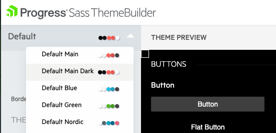
To take advantage of these existing swatches, just head over to the KendoReact Theme Builder, choose your theme, and then use the dropdown next to the theme name on the preview and adjustment page to apply a pre-made swatch. Once you’ve found a swatch you like, click the download button in the top right corner.
You’ll be prompted to enter a name for your new theme and swatch combo, and then the styles you picked will be downloaded in a zip file that includes a .SASS file, a compiled .CSS file and a .JSON file. Choose the file that best suits your method for style management, and then you can just drop that file into your app and see the styles applied—without the need for you to edit a single line of CSS.

Method 2: Adjust or Create a Swatch Using the Theme Builder
The KendoReact Theme Builder is good for more than just downloading pre-made swatches, though. If you looked at one of our swatches and thought, “This would be perfect if that orange was just a little more red,” then good news—the Theme Builder can do that, too!
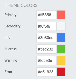
If you have existing design assets that include your brand colors, you can customize a swatch to apply to the KendoReact components, ensuring your app is always 100% on brand. Using the inputs in the left-hand sidebar, you can adjust the colors in the Theme Colors section and see them automatically update on the preview components to the right. This allows you to quickly check whether the all the colors work well together, or see if a color is being used somewhere you might not have anticipated.

You can use this tool to make small tweaks to a pre-existing swatch, or to create something unique! Once you’re happy with your custom dark mode swatch, you can download and apply it just the same as if it were one of our pre-made ones.
Method 3: Use the Figma Kits to Create a Fully Custom Design System
If you’ve got the resources on your team to create and maintain a full design system, then we’ve got the tools to help you apply that design language to your React application! Did you know that we offer Figma Kits that you can use for free (even if you don’t have a license) to fully customize the look and feel of the KendoReact component suite? If your designers want to make changes that go beyond just picking the main colors, the Figma Kits are there to enable them to make as many changes as they like.
Then, you can use the Unite UX UI component styles builder (licensed separately from the UI libraries) to easily adjust and export the styles. Unite UX is a powerful tool that you can leverage to enable your team—no matter the size—to build their own design system quickly and easily.
The design tokens in our Figma Kits are set up to match exactly with the SASS variables used in the KendoReact components, so when you use this tool together with the Unite UX Figma Plugin, you can export files for your full design system that can be dropped directly into your application—and they’ll just work! How often to you get to say that about any kind of engineering project?
Method 4: Edit the SASS Variables by Hand
If you’re the do-it-yourself type, then it’s also a totally valid option for you to edit the SASS variables yourself! This is not our recommended method, mostly just because it’s so much more time-consuming. The tools we’ve created allow you to adjust and preview your styles (either in the Theme Builder or in Unite UX) before exporting a file that we’ve specifically engineered to work perfectly with the styling in each KendoReact component. But, that doesn’t mean you have to do it that way.
If you prefer to get in there and write the code yourself, we’ve provided this list of all our variables for you to edit as you see fit. The linked example here is for the Default theme, but you can find lists for the other three themes as well. You can also find all the available variables for customization of our major components as well—here’s the one for customizing buttons, for example.
Which Method Is Right for Your Team?
Whether your team is just looking to quickly implement an out-of-the-box dark mode, or looking to create a fully custom dark mode theme, KendoReact gives you the tools to customize our components to your heart’s content! After all—it’s your application! It should look exactly how you imagine it. Change up the themes for a totally different look and feel, or just swap out some swatches to create new color palettes—whatever you need and whichever method you choose, know that the KendoReact team is here to support you.
This content originally appeared on Telerik Blogs and was authored by Kathryn Grayson Nanz
Kathryn Grayson Nanz | Sciencx (2021-11-30T14:27:02+00:00) Adding a Dark Mode to Your KendoReact Application. Retrieved from https://www.scien.cx/2021/11/30/adding-a-dark-mode-to-your-kendoreact-application/
Please log in to upload a file.
There are no updates yet.
Click the Upload button above to add an update.
