This content originally appeared on DEV Community and was authored by Kartik Grewal
Release notes come into play when the release cycle is about to conclude and it's time to inform your users about the changes. Changelogs and Release notes help users understand how your product has changed since the last release.
In this article, we will discuss how you can create the release note tools using ReactJS.
Let's get started
Step 1: Installing React
First thing first, let's begin with creating a react project using create-react-app.
npx create-react-app release-notes-app
Step 2: Installing Tailwind
In this project, we'll be using Tailwind - CSS framework, that'll help us in rapidly building the interface for release notes.
Next, by using npm, we install all the tailwind dependencies and set up its configuration file.
All you have to do is follow the simple instructions at tailwind CSS documentation.
Step 3: Creating wrapper component
To create a wrapper component - Create a file called UI.js inside the src/components directory. This file is the wrapper for our Header, Sidebar - which will hold all our versions for users to directly click and jump. And Main will hold our version description.
    const UI = () => {
      return (
        <>
          //Header will come here
          <div className="min-h-screen flex flex-row">
            <div className="flex flex-col bg-gray-100   text-white w-6/12 mobile:hidden">
              <ul className="flex flex-col py-4 sticky top-0  divide-y divide-y divide-gray-400">
                //Sidebar will come here
              </ul>
            </div>
            <div>//Main component should come here</div>
          </div>
        </>
      );
    };

    export default UI;
src/component/UI.js
Step 4: Creating Header component
To create a Header component, create a file named Header.js *inside src/components directory.* It is styled with CSS properties with a basic header.
const Header = () => {
  return (
    <nav className="flex items-center justify-between flex-wrap bg-blue-600  p-6">
      <div className="flex items-center flex-no-shrink text-white mr-6 w-full justify-start">
        <span className="font-semibold text-xl tracking-tight">
          Release Notes
        </span>
      </div>
    </nav>
  );
};

export default Header;
src/components/Header.js
Step 5: Creating Sidebar component
The sidebar component will hold all of the version numbers with hyperlinks so that you can directly click and jump to that version's release notes. Create another file Sidebar.js inside the same components directory.
const Sidebar = () => {
  return (
    <li className={"m-2 ml-4"}>
      <a className={"flex flex-col items-left h-12 cursor-pointer"}>
        <div className="text-sm font-medium text-gray-900">Version 1.0</div>
        <div className="text-sm font-medium text-gray-900">Monday 1/1/21</div>
      </a>
    </li>
  );
};

export default Sidebar;
Step 6: Creating the Main component
The next step is to create the Main component - Create a file called Main.js inside components directory.
This component will display all of the version descriptions with infinite scroll.
const Main = () => {
  return (
    <div className="tab-content tab-space w-5/6 divide-y divide-light-blue-400">
      <div className={"text-gray-900 text-2xl p-2 mt-16 w-40 my-4 ml-8"}>
        Version 1.0
      </div>
      <div className={"block"}>
        <div>
          <section className="flex flex-col  mb-10">
            <div className="w-36 h-auto leading-8 ml-10 text-left font-bold shadow-lg mt-10 mb-3 text-white rounded-md">
              <span className="ml-4">Bug Fixes</span>
            </div>
            <div className="text-left ml-20 mt-4 text-gray-900">
              Bug fix 1
            </div>
          </section>
        </div>
      </div>
    </div>
  );
};

export default Main;
src/component/Main.js
Now that all of our display components are created, let's connect them all to App and check how our frontend looks.
Step 7: Stitching frontend together
Let's import all of our components in UI.js at the respective comments and import UI.js inside our App.js.
import UI from "./components/UI";

function App() {
  return (
    <div className="App" style={{ height: "100vh" }}>
      <UI />
    </div>
  );
}

export default App;
src/components/App.js
Once you run yarn start, It'll probably look like this! I know! It's not perfect (yet!).
It's time to integrate this with a backend! This will fetch our release notes and display them.
Time to get your APIs ready!
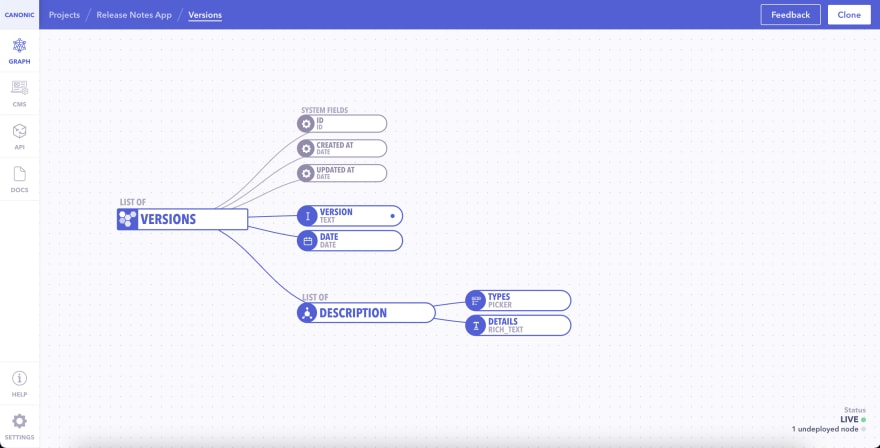
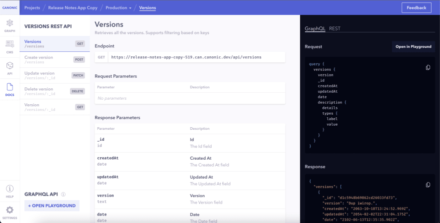
Getting your APIs for release notes comes at real ease. All you have to do is clone a production-ready template on Canonic and you're done. It will provide you with the backend, APIs, and documentation you need for integration, without writing any code.
Step 8: Cloning the project
Head over to Canonic and clone the project by clicking on the top right corner.
Step 9: Deploy and get your APIs
After cloning it should open up your cloned project. We hit deploy on the top right corner if it's already not deployed. That should provide us with a URI and our other sections like docs.
Backend integration with GraphQL
Let's integrate! Now that we have our APIs ready, let's move on by installing GraphQL packages.
Step 10: Install GraphQL packages
To pull our data from the backend, we will need two packages - Apollo Client and GraphQL,
npm i @apollo/client graphql
Step 11: Configure GraphQL to communicate with backend
Configure the Apollo Client in the project directory, inside App.js configure your Apollo client so it would communicate with the backend.
Note to replace the
uriwith the one you'll get from Canonic.
import { ApolloProvider, InMemoryCache, ApolloClient } from "@apollo/client";

import UI from "./components/UI";

//Connecting with the Canonic API
const client = new ApolloClient({
  uri: "https://release-notes-app.can.canonic.dev/graphql",
  cache: new InMemoryCache(),
});

function App() {
  return (
    <ApolloProvider client={client}>
      <div className="App" style={{ height: "100vh" }}>
        <UI />
      </div>
    </ApolloProvider>
  );
}

export default App;
src/App.js
Step 12: Query the data
To query the data, we'll create a directory gql inside the src folder to contain our GraphQL queries. Inside, we will create a file and name it query.js.
This is where we will write the GraphQL query for querying the data.
import { gql } from "@apollo/client";

export const GET_VERSIONS = gql`
  query {
    versions {
      version
      date
      description {
        details
        types {
          label
          value
        }
      }
    }
  }
`;
Step 13: Using query in UI
We then use this query to get the data for changelog and get the versions. Let's modify UI.js to query our backend and pass it onto our components.
import { useQuery } from "@apollo/client";
import { GET_VERSIONS } from "../gql/query";

....

const UI = () => {
  const { data = {}, loading } = useQuery(GET_VERSIONS);
  return (
    <>
      <Header />
      ....
        ....
            <Sidebar versions={data.versions} loading={loading} />
         ....
         ....
         ....
          <Main versions={data.versions} loading={loading} />
        </div>
      </div>
    </>
  );
};

export default UI;
src/components/UI.js
Step 14: Using props in display components
Next, we modify our display components - Sidebar.js and Main.js to iterate over the versions that we received in props and display the actual content.
import { useCallback } from "react";

const Sidebar = ({ versions, loading }) => {
  //This useCallback function taken a string argument of date and converts it into formatted date, e.g Day Month Date Year(Monday 1 Jan 1999)
  const date = useCallback((data) => {
    let dateString;
    dateString = new Date(data);
    return dateString.toDateString();
  }, []);

  const ready = versions && !loading; // This variable checks if data is present is versions and not in loading

  const handleNav = useCallback(
    (version) => window.location.replace(`/#version${version}`),
    []
  ); // This function helps in navigation between versions

  return (
    <>
      {loading && <h1 className="text-gray-900">Loading...</h1>}
      {ready &&
        versions
          .map((data, index) => {
            return (
              <li key={index} className={"m-2 ml-4 pb-4 border-b-2"}>
                <a
                  className={"flex flex-col items-left h-14  cursor-pointer "}
                  onClick={() => handleNav(data.version)} // This onClick function will act as navigation between different section we have
                >
                  <div className="text-gray-900 text-2xl font-bold  ">
                    {data.version} <br />
                  </div>
                  <div className="text-sm font-medium text-gray-500">
                    {date(data.date)}
                  </div>
                </a>
              </li>
            );
          })
          .reverse()}
    </>
  );
};

export default Sidebar;
src/components/Sidebar.js
and we also modify our Main.js component which will display each version's content.
//This component render Description as per the version name.
const Main = ({ versions, loading }) => {
  const setColor = (label) => {
    // We are using this util function to assign a color the label.
    let color = "bg-red-600";
    switch (label) {
      case "Security fixes":
        color = "bg-pink-600";
        break;
      case "Bug fixes":
        color = "bg-yellow-600";
        break;
      case "Changes":
        color = "bg-green-500";
        break;
      case "Known issue":
        color = "bg-blue-600";
        break;
      default:
        color = "";
    }
    return color;
  };

  return (
    <>
      {versions &&
        !loading &&
        versions
          .map((data, index) => {
            return (
              <div
                className="tab-content tab-space w-5/6 divide-y divide-light-blue-400"
                key={index}
              >
                <div
                  className={
                    "text-gray-900 text-2xl p-2 mt-16 w-40 my-4 ml-8 font-bold"
                  }
                >
                  Version {data.version}
                </div>
                <div className={"block"}>
                  <div>
                    {data.description
                      .map((item) => {
                        // The Description in our API is a 'field set' and it two fields, 1. Details and  2. Label
                        const details = item.details; // Here we are accessing the details, details contains all the text.
                        const label = item.types.label; // Here we are accessing picker option's label. There are total 4 labels. 1. Security Fixes 2. Bug fixes, 3. Changes and 4. Know issue
                        return (
                          <section
                            className="flex flex-col  mb-10"
                            id={`version${data.version}`}
                          >
                            <div
                              className={`${setColor(
                                label
                              )} w-36 h-auto leading-8 ml-10 text-left font-bold shadow-lg mt-10 mb-3 text-white rounded-md`}
                            >
                              <span className="ml-4">{label}</span>
                            </div>
                            <div // Here we are using dangerouslySetInnerHTML because we receive the html code from API, we parse it using dangerouslySetInnerHTML
                              className="text-left ml-20 mt-4 text-gray-900"
                              dangerouslySetInnerHTML={{
                                __html: details,
                              }}
                            ></div>
                          </section>
                        );
                      })
                      .reverse()}
                  </div>
                </div>
              </div>
            );
          })
          .reverse()}
    </>
  );
};

export default Main;
Phew! Those were some long snippets. Now let's run the app if not already running and check out what we just built!
Bonus! - Sending release notes to Slack/communities
In addition, we can also attach a slack integration in our backend. This integration will send the release notes directly to slack every time someone adds them.
All you have to do is:
- Using Canonic, open your project and navigate to the API tab from the sidebar. Click on the + icon in the Database Triggers section and name the trigger. At checkout, check 'Create'.
- In the graph, click on + created next to Trigger to create a webhook. Select Message as the input type, Slack as the provider, and trigger URL (enter your trigger URL) and message body as the value.
You can find the final code here
and the live demo here
Conclusion
You can find several online tools that let you publish release notes, but most of them are usually paid. As you scale, you'll realize there are many 'extra' tools like release notes, that you'll need, such as a roadmap, admin panel, etc., and paying for them all may not be feasible.
If you want, you can also duplicate this project from Canonic's sample app and easily get started by customizing it as per your experience. Check it out here.
You can also check out our other guides about SaaS tools. here.
Join us on discord to discuss or share with our community. Write to us for any support requests at support@canonic.dev. Check out our website to know more about Canonic.
This content originally appeared on DEV Community and was authored by Kartik Grewal
Kartik Grewal | Sciencx (2021-12-01T20:26:25+00:00) Publish changelog for your product using React and Tailwind. Retrieved from https://www.scien.cx/2021/12/01/publish-changelog-for-your-product-using-react-and-tailwind/
Please log in to upload a file.
There are no updates yet.
Click the Upload button above to add an update.


