This content originally appeared on Hacker Noon and was authored by Anish De
Introduction
Toasts are very useful for showing users some information. It has a wide variety of uses from displaying success messages for successful actions, showing error messages in case something goes wrong, and much more. Today we are going to build a simple toast with HTML and CSS. We are going to be using some javascript to add some interactivity.
\ We are going to be making a toast that shows up when a button is clicked. It can also be closed, which is hidden away, by clicking a close button.
:::info Codepen - https://codepen.io/anishde12020/pen/JjrYMrW
:::
Basic CSS to make a toast
To make a toast animate in or out, we need to make the toast first. For this example, I am going to add a simple icon and some text in a box and that is going to be our toast.
So, in the markup, let us start by adding a div for out toast -
\
<div class="toast" id="toast"></div>
\ Now, we need to add an icon. I am going to grab a simple information icon from HeroIcons and put in the SVG
\
<div class="toast" id="toast">
  <svg xmlns="http://www.w3.org/2000/svg" fill="none" class="icon" viewBox="0 0 24 24" stroke="currentColor">
    <path stroke-linecap="round" stroke-linejoin="round" stroke-width="2" d="M13 16h-1v-4h-1m1-4h.01M21 12a9 9 0 11-18 0 9 9 0 0118 0z" />
  </svg>
</div>
\ Let us also add a text
\
<div class="toast" id="toast">
  <svg xmlns="http://www.w3.org/2000/svg" fill="none" class="icon" viewBox="0 0 24 24" stroke="currentColor">
    <path stroke-linecap="round" stroke-linejoin="round" stroke-width="2" d="M13 16h-1v-4h-1m1-4h.01M21 12a9 9 0 11-18 0 9 9 0 0118 0z" />
  </svg>
  <p class="text">Some Information</p>
</div>
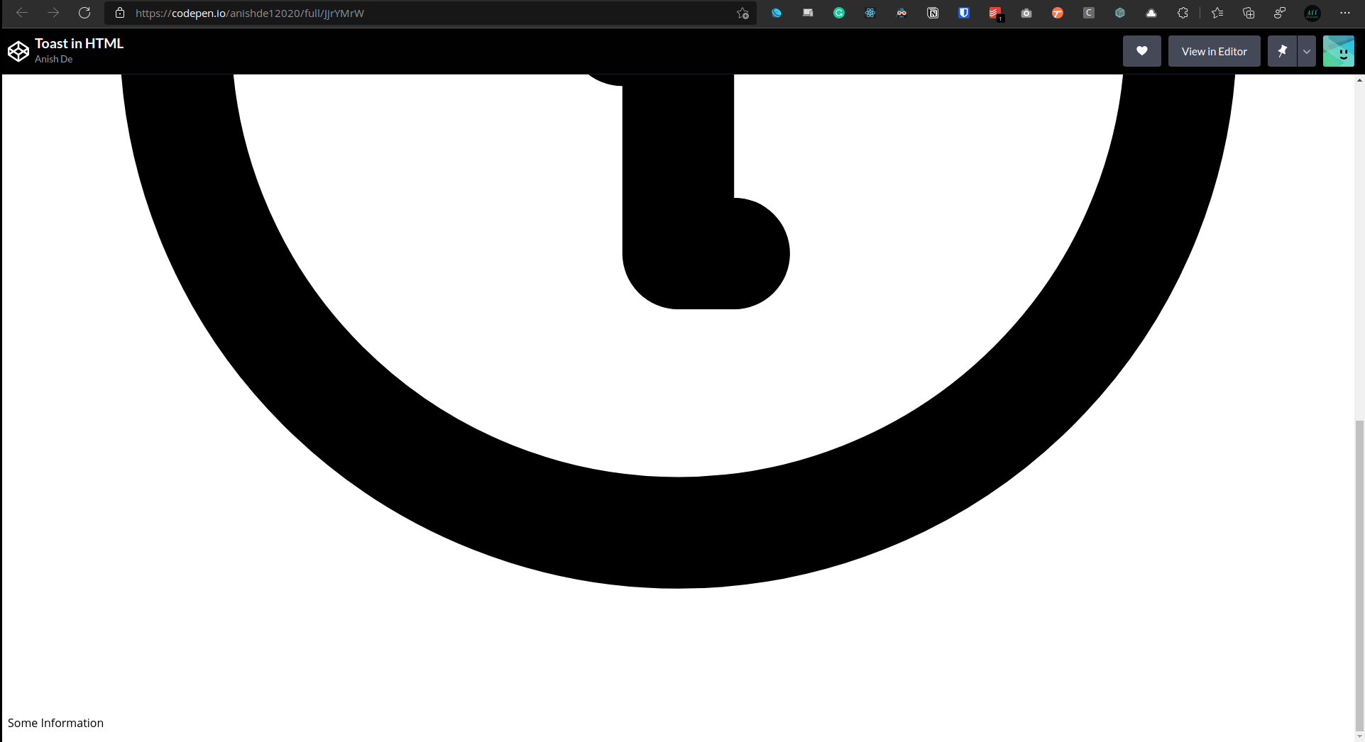
\ This is what our page should look like
\

The icon is so big that it doesn't even fit in the view. Let us fix this design with some CSS and then style it.
First, we are going to style the icon by defining a width and a height -
.icon {
  height: 2rem;
  width: 2rem;
}
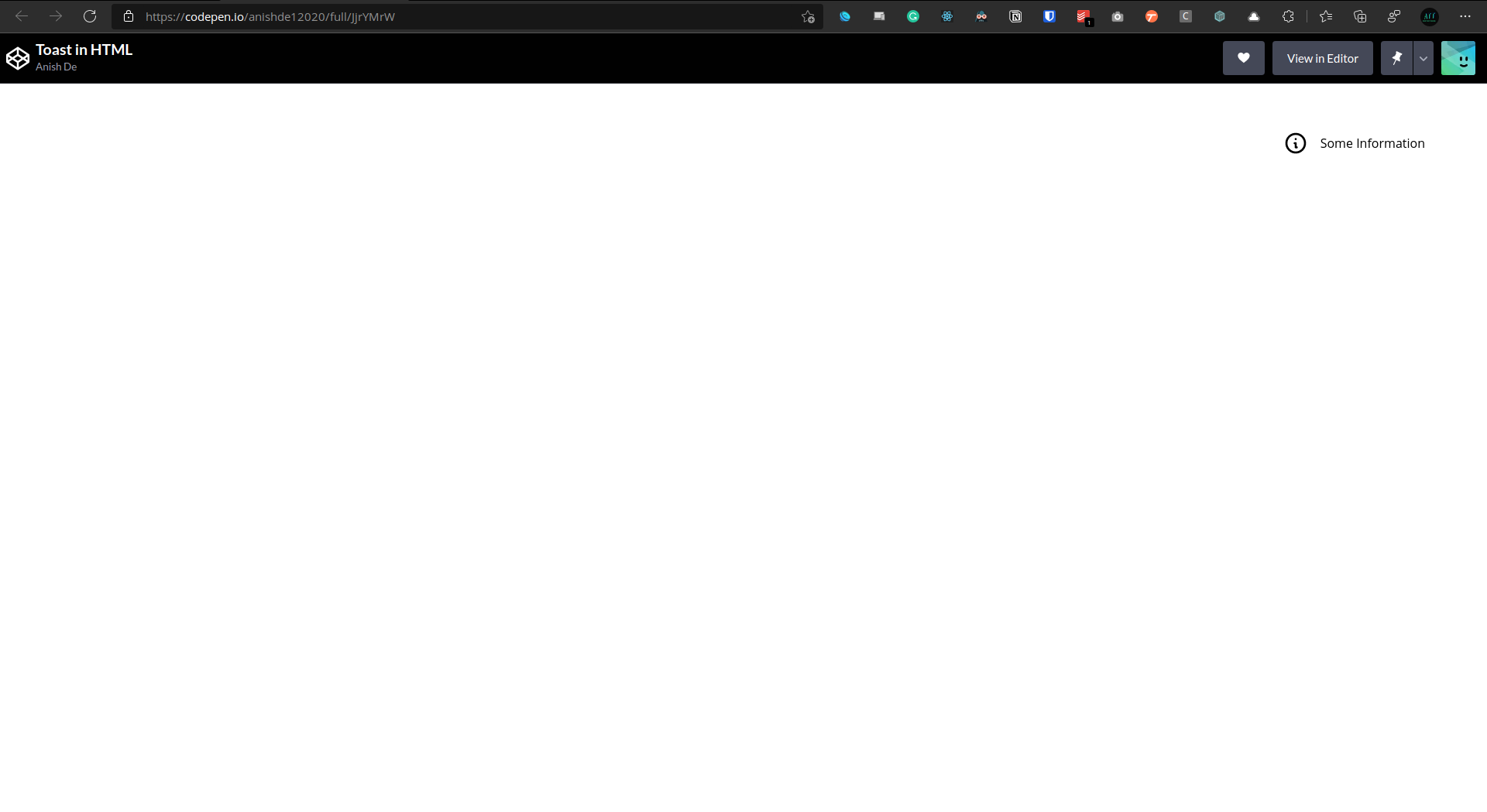
\ Let us now make our toast a flexbox and add some margin on the icon. I am also going to position the toast on the top-right using an absolute position.
\
.icon {
  height: 2rem;
  width: 2rem;
  margin-right: 1rem;
}

.toast {
  display: flex;
  align-items: center;
  position: absolute;
  top: 50px;
  right: 80px;
}

Everything looks good except for the styling. Let us add some colors and other styles:
\
.icon {
  height: 2rem;
  width: 2rem;
  margin-right: 1rem;
  color: white;
}

.text {
  color: white;
}

.toast {
  display: flex;
  align-items: center;
  position: absolute;
  top: 50px;
  right: 80px;
  background-color: black;
  border-radius: 12px;
  padding: 0.5rem 1rem;
  border: 5px solid #029c91;
}
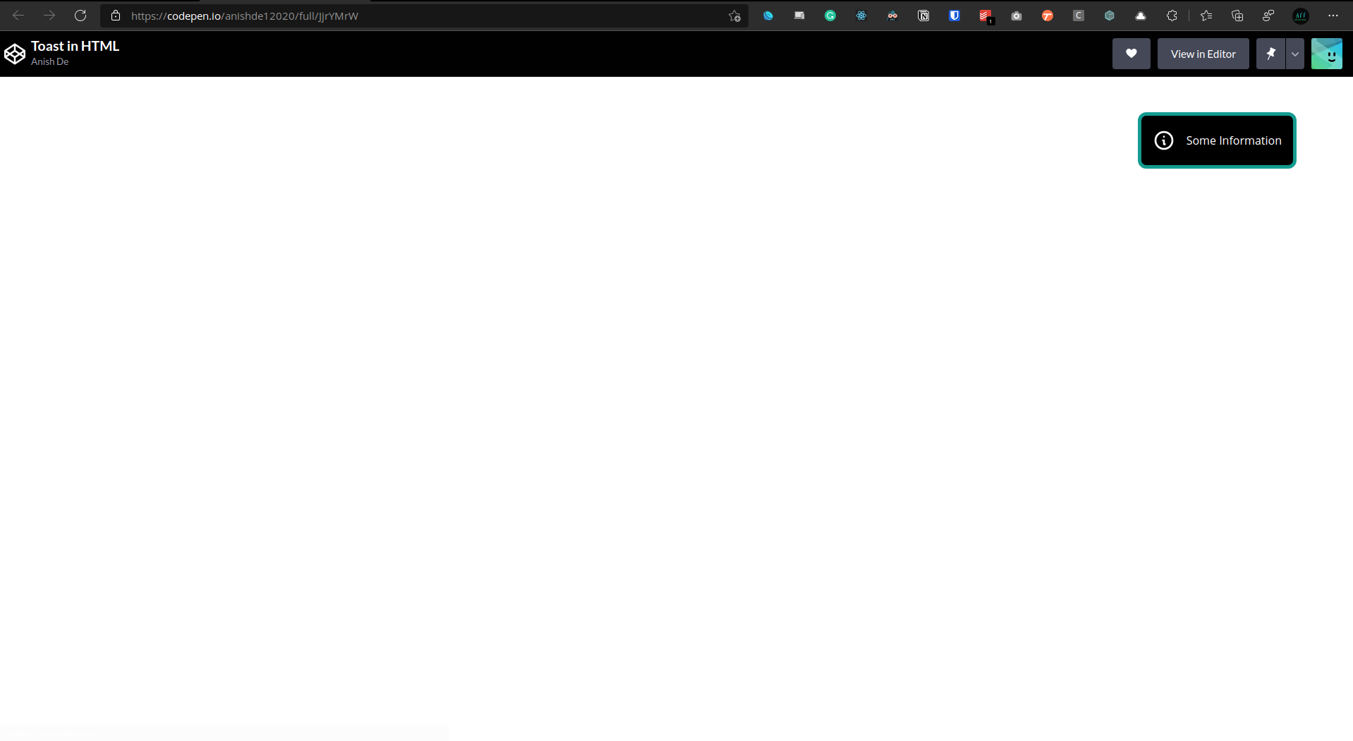
\ We have changed the background color of the toast, added a border to it, added some border-radius, and changed the colors of the icon and the text so that they are visible on the black background.
\ This is what our toast should now look like:
\

\ Let us also add a button that will trigger the animation, that is, show the toast -
<div class="toast" id="toast">
  <svg xmlns="http://www.w3.org/2000/svg" fill="none" class="icon" viewBox="0 0 24 24" stroke="currentColor">
    <path stroke-linecap="round" stroke-linejoin="round" stroke-width="2" d="M13 16h-1v-4h-1m1-4h.01M21 12a9 9 0 11-18 0 9 9 0 0118 0z" />
  </svg>
  <p class="text">Some Information</p>

</div>

<button id="show-toast" class="show-toast">Show Toast</button>
\ Let us also style this button as it looks quite ugly now
\
.show-toast {
  background-color: black;
  color: white;
  border-radius: 8px;
  padding: 8px;
  cursor: pointer;
}
\ Let us also disable any overflow:
\
html,
body {
  overflow: hidden;
}
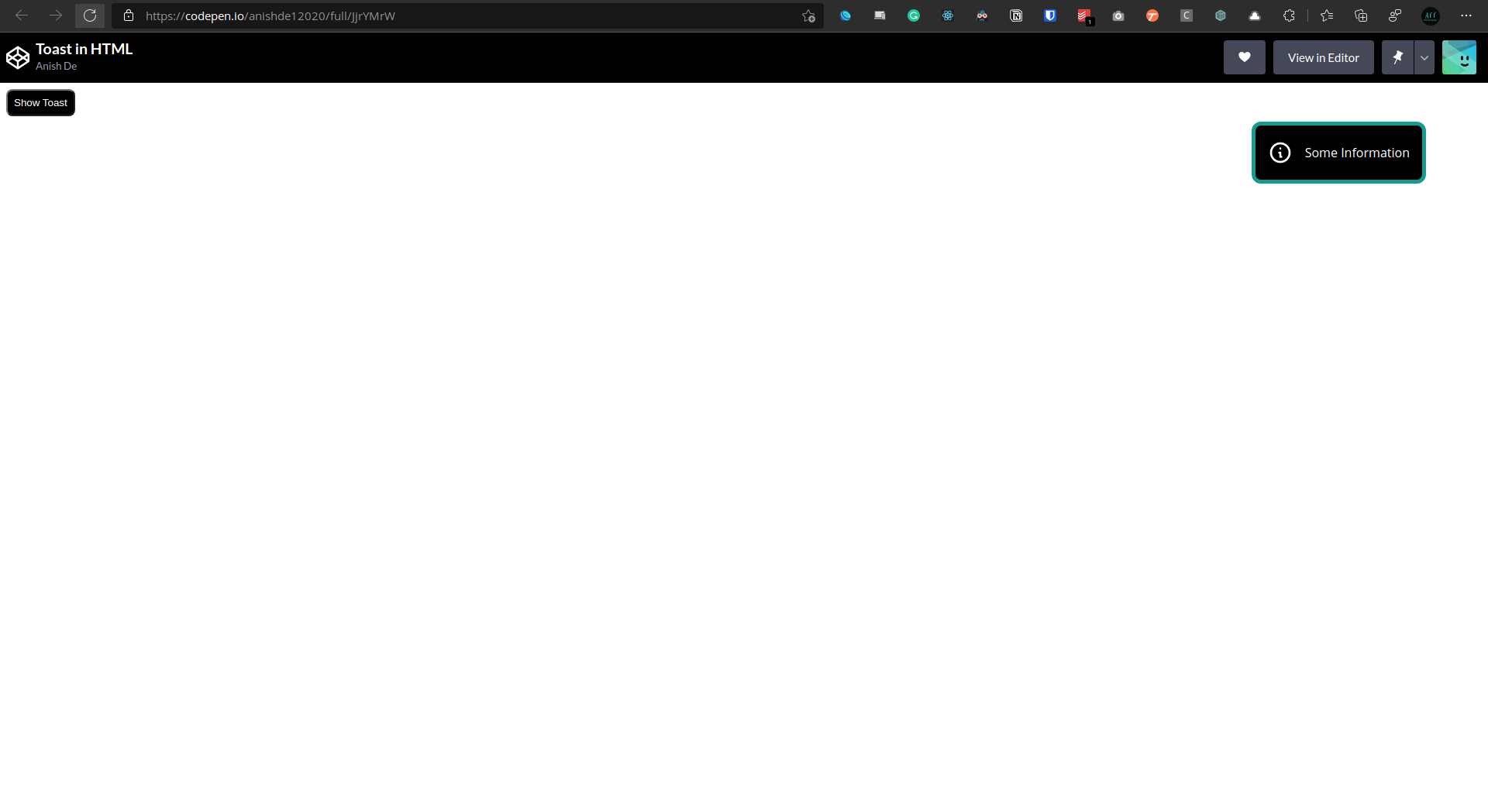
\ This is how everything should look like now:
\

Adding animations
Now that we have the toast and a button to trigger the animations, it is time to add the animations.
\ First of all, we are going to give the toast a starting point by putting it outside the view. So let us edit the CSS for the toast:
\
.toast {
  display: flex;
  align-items: center;
  position: absolute;
  top: 50px;
  right: -500px;
  background-color: black;
  border-radius: 12px;
  padding: 0.5rem 1rem;
  border: 5px solid #029c91;
  opacity: 0%;
}
\
Now let us make a new class called toast-active that will get added to the toast whenever the button is clicked:
\
.toast-active {
  right: 80px;
  opacity: 100%;
}
\ Notice that we are also changing the opacity during the transition. This just makes it look a little better.
\ Now let us write some javascript to add this class to the toast whenever the button is clicked -
let toast = document.getElementById("toast");
document.getElementById("show-toast").addEventListener("click", function () {
  toast.classList.add("toast-active")
});
\
Here, whenever the button is clicked, the toast-active class is being added to the toast. Right now the animation is instant, which doesn't look good. Let us add a transition:
\
.toast {
  display: flex;
  align-items: center;
  position: absolute;
  top: 50px;
  right: -500px;
  background-color: black;
  border-radius: 12px;
  padding: 0.5rem 1rem;
  border: 5px solid #029c91;
  opacity: 0%;
  transition: all 0.25s ease-out;
}
\ Here the transition goes on for a quarter of a second and we have also eased it out so it isn't harsh.
Adding a Close Button to the Toast
We would like to give the user a close button that they can click to close the toast.
First of all, we need to add a button to the toast in our markup:
\
<div class="toast" id="toast">
<svg xmlns="http://www.w3.org/2000/svg" fill="none" class="icon" viewBox="0 0 24 24" stroke="currentColor">
<path stroke-linecap="round" stroke-linejoin="round" stroke-width="2" d="M13 16h-1v-4h-1m1-4h.01M21 12a9 9 0 11-18 0 9 9 0 0118 0z" />
</svg>
<p class="text">Some Information</p>
<button id="close-button" class="close-button">
✕
</button>
</div>
<button id="show-toast" class="show-toast">Show Toast</button>
\ Let us also style it so that it is visible
\
.close-button {
  background-color: black;
  color: white;
  border: none;
  cursor: pointer;
}
\
Now, when this button is clicked, it will just do the reverse of what the show toast button did, that is, remove the toast-active class.
document.getElementById("close-button").addEventListener("click", function () {
  toast.classList.remove("toast-active");
})
\ Now, clicking the cross symbol (close button) in the toast should take it away from the screen with a transition.
Conclusion
If everything has worked out well so far, give yourself a pat on the back because you have just built a toast with nothing but HTML, CSS, and JS!!!
Links
Codepen for this project - https://codepen.io/anishde12020/pen/JjrYMrW
HeroIcons - https://heroicons.com/
My Twitter - https://twitter.com/AnishDe12020
\ First Published here
This content originally appeared on Hacker Noon and was authored by Anish De
Anish De | Sciencx (2021-12-08T20:23:33+00:00) Build Your Own Toast With HTML, CSS and JS. Retrieved from https://www.scien.cx/2021/12/08/build-your-own-toast-with-html-css-and-js/
Please log in to upload a file.
There are no updates yet.
Click the Upload button above to add an update.
