
This content originally appeared on Bits and Pieces - Medium and was authored by Krissanawat Kaewsanmuang
I love modals because they save a lot of time required to load a new tab. In this post, we’re going to learn how to create an awesome reusable modal with React from scratch.

These are the steps for this tutorial:
What we’ll learn
- Create a simple file structure
- Use react toggle state to build a simple modal
- Pass data between components with props
- Warn the user to pass a parameter while using the component
Tip: When using React components, share them with Bit so that they become reusable building blocks your team can easily share, use and sync across your projects. When building with a shared Lego box, you build faster. Try it:
Share reusable code components as a team · Bit
Creating a Modal component structure
So, first let’s add the boilerplate code.
import React from "react";
export default class Modal extends React.Component {
render() {
return <div>Hello Modal</div>;
}
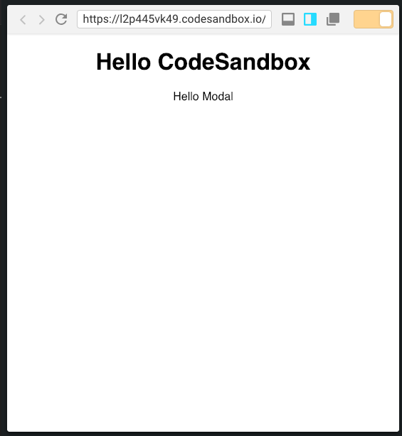
}Then, let’s include the Modal in main App.
import React from "react";
import Modal from "./Component/Modal";
import "./styles.css";
class App extends React.Component {
  render() {
    return (
      <div className="App">
        <h1>Hello CodeSandbox</h1>
        <Modal />
      </div>
    );
  }
}
export default App;
Now inject App component to the entry point.
import React from "react";
import ReactDOM from "react-dom";
import App from "./App";
const rootElement = document.getElementById("root");
ReactDOM.render(<App />, rootElement);
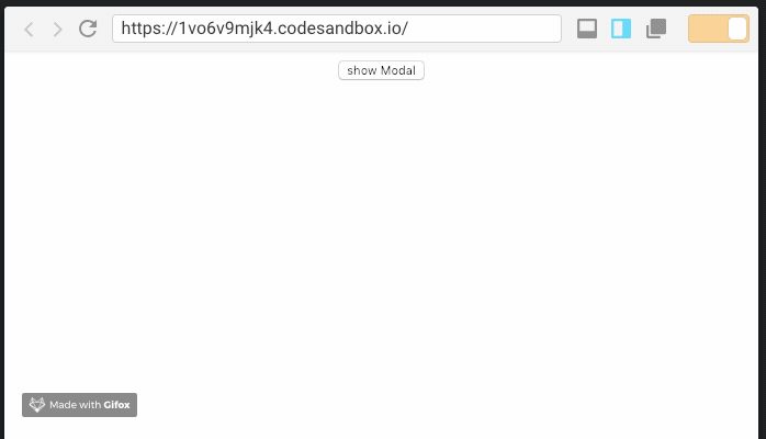
Here’s the output after initial setup.
Toggling the state of a Modal
The mechanism of the modal is to show and hide. This is quite easy to achieve in react because of the built-in toggle state.
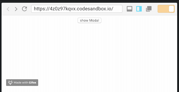
First, create a button to toggle the state.
<button  onClick={e => {
              this.showModal();
         }}
          > show Modal </button>
Now create a showModal function
state = {
    show: false
  };
  showModal = e => {
    this.setState({
      show: true
    });
  };
Now apply this state to Modal component.
<Modal show={this.state.show} />Next, make a conditional render from Modal, condition being the show state.
Don’t forget to return null if show is false, this renders nothing. Render the component when show is true.
export default class Modal extends React.Component {
render() {
if(!this.props.show){
return null;
}
return <div>Hello Modal</div>;
}
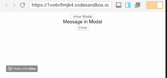
}Let’s click the button- the output should be something like this.
Make the content dynamic
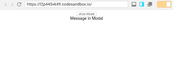
Right now the content in Modal is hard-coded. Let’s make it dynamic by passing a prop.
<Modal show={this.state.show}>Message in Modal</Modal>Replace Message with {this.props.children} in the Modal component.
export default class Modal extends React.Component {
  render() {
    if (!this.props.show) {
      return null;
    }
    return <div>{this.props.children}</div>;
  }
}
This will render whatever is passed to this component, which is just perfect for a dynamic modal.
Close the modal
After opening a modal, it needs to be closed.
Let’s add a new close button.
return (
      <div>
        <div>{this.props.children}</div>
        <div>
          <button
            onClose={e => {
              this.onClose(e);
            }}
          >
            Close
          </button>
        </div>
      </div>
    );
Define the onClose function.
onClose = e => {
    this.props.show = false;
  };
Now set the show state to false, which makes Modal hide.
Wait! It does not work because show state is defined in App component.
So, pass a value back to App component.
onClose = e => {
    this.props.onClose && this.props.onClose(e);
  };
Now pass the whole event object back to App component, then then trigger showModal
<Modal onClose={this.showModal} show={this.state.show}>
          Message in Modal
</Modal>
And toggle the show state:
showModal = e => {
    this.setState({
      show: !this.state.show
    });
  };
The result hides the close button, as expected.
Styling the modal
Right now you don’t see any modal body because, well, it’s not there.
Let’s create modal.css.
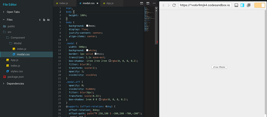
Grab the CSS snippet from Codepen here.
Also include JavaScript to Modal.js and add a class modal in the returning div, and more classes as below.
import React from "react";
import "./modal.css";
export default class Modal extends React.Component {
onClose = e => {
this.props.onClose && this.props.onClose(e);
};
render() {
if (!this.props.show) {
return null;
}
return (
<div class="modal" id="modal">
<h2>Modal Window</h2>
<div class="content">{this.props.children}</div>
<div class="actions">
<button class="toggle-button" onClick={this.onClose}>
close
</button>
</div>
</div>
);
}
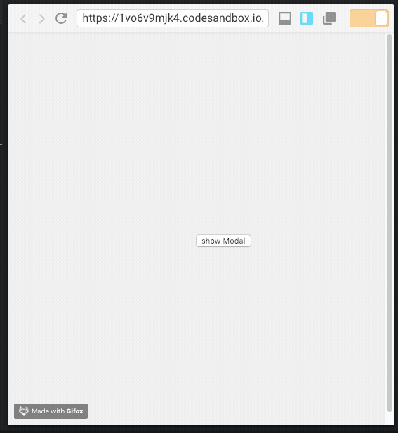
}In the App component, add a class toggle-button to the button.
<div className="App">
        <button
          class="toggle-button"
          id="centered-toggle-button"
          onClick={e => {
            this.showModal(e);
          }}
        >
Now, the result! Isn’t it beautiful? 💅
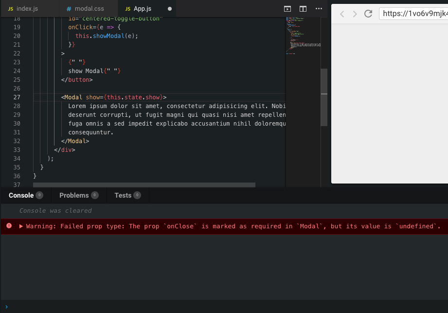
Require onClose
If the component that calls Modal does not pass onClose, the Modal won't close as the show state doesn't have any effect. To fix this, warn the component to pass the onClose.
Import prop-types.
import PropTypes from "prop-types";
Add the following to the bottom of the file, outside the class.
Modal.propTypes = {
  onClose: PropTypes.func.isRequired,
  show: PropTypes.bool.isRequired
};
This results in a warning as below.
Recap
In this tutorial, you learned how to implement a simple modal component that you created using a div and used a toggle state to show and hide the modal. We went through the different steps from creating the file structure to styling our modal. You can find the full code on GitHub here:
Build with independent components for speed and scale
Instead of building monolithic apps, build independent components first and compose them into features and applications. It makes development faster and helps teams build more consistent and scalable applications.
Bit offers a great developer experience for building independent components and composing applications. Many teams start by building their Design Systems or Micro Frontends, through independent components.
Give it a try →
Learn more
- Building a React Component Library — The Right Way
- Microservices are Dead — Long Live Miniservices
- 7 Tools for Faster Frontend Development in 2022
Build a simple Modal Component with React was originally published in Bits and Pieces on Medium, where people are continuing the conversation by highlighting and responding to this story.
This content originally appeared on Bits and Pieces - Medium and was authored by Krissanawat Kaewsanmuang
Krissanawat Kaewsanmuang | Sciencx (2021-12-31T13:20:31+00:00) Build a simple Modal Component with React. Retrieved from https://www.scien.cx/2021/12/31/build-a-simple-modal-component-with-react/
Please log in to upload a file.
There are no updates yet.
Click the Upload button above to add an update.