This content originally appeared on DEV Community and was authored by Mage
TLDR
Data exploration and analysis is a time-consuming process. We’ll continue to explore the Telco Customer Churn dataset to get a brief overview of data by using the descriptive statistical analysis method.
Outline
- Recap
- Before we begin
- Exploratory Data Analysis
- Descriptive statistical analysis
- Conclusion
Recap
In part 2 of the series, Guide to Churn Prediction, we explored the Telco Customer Churn dataset to identify dependent and independent features, find missing values, and understand their mechanisms.
Before we begin
Let’s understand the 2 common terms that we often hear when dealing with data.
Population data
Data collected from the entire population is known as population data. The population is dynamic (it changes continuously), so it’s practically impossible to gather population data.
Sample data
Data collected from a subset or a specific group of population is known as sample data.
Note: The Telco Customer Churn dataset, which we are using in this series, is sample data.
Step 4: Exploratory Data Analysis (EDA) contd..
To explore and analyze data, we’ll perform EDA in 3 different methods shown below:
- Descriptive statistical analysis: The process of using statistical techniques (like mean) to summarize the sample data. This analysis gives us a brief overview of the sample data.
- Descriptive graphical analysis: The process of analyzing the data with the aid of graphs. This analysis provides us with in-depth knowledge of the sample data.
- Inferential statistical analysis: The process of making inferences about the population data using statistical methods (like hypothesis testing, etc.). In a nutshell, this analysis helps us make assumptions about population data. Assumptions are made based on insights gained while performing descriptive and graphical analysis on features of the sample data.
Now, let’s go through the descriptive statistical analysis method in detail.
 Source: Giphy
Descriptive statistical analysis, also known as descriptive statistics or summary statistics, describes and summarizes the sample data. It gives us information about the measures of central tendency (mean, median, mode/frequency) and measures of dispersion (standard deviation, range) of the sample data.
Let’s use descriptive statistical analysis to answer the following questions:
- What are the summary statistics of the numerical features?
- What are the summary statistics of categorical features?
Let’s start with importing the necessary libraries and loading the cleaned dataset. Check out the link to part 1 to see how we cleaned the dataset.
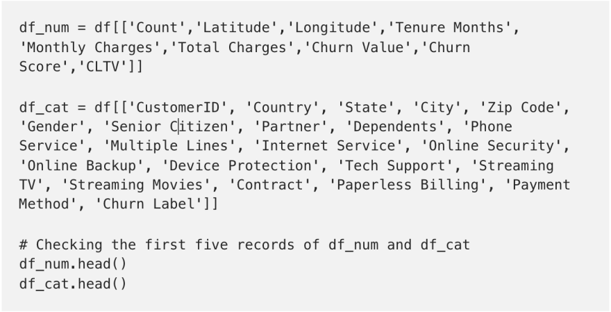
Create 2 datasets, df_num and df_cat, with df_num containing only numerical features and df_cat containing only categorical features. It’s much easier to do descriptive and graphical analysis when the features are separated.
Let's start by checking the data types of features using the dtypes function.
Based on the data types, separate the features and create 2 new datasets as shown in the code below.

 Numerical Features
Let’s use the describe() function to display the summary statistics of the features. This function displays the count, mean, median, standard deviation, 25%, 50%, 75%, min, and max values of each feature in the dataset.
- count displays the number of non-null records/rows. This value will be the same as the number of records/rows in the dataset if there are no null values.
- mean displays the average value of the data.
- std (standard deviation) value tells us approximately how far each data point/record is from the mean.
- min and max displays the minimum and maximum values, respectively.
- 25%, 50% (median), 75%, and 100% displays the values at that percentile. For example, 25% displays the value at the 25th percentile.
- 68% of data lies in (mean — std and mean+std) range.
- 95% of data lies in (mean — 2*std and mean+2*std) range.
- 99.7% of data lies in (mean — 3*std and mean+3*std) range.
- If the mean is equal to the median, then the distribution is normal.
- If the median is greater than the mean, then the distribution of the data is right-skewed.
- If the median is less than the mean, then the distribution of the data is left-skewed.

 Summary statistics of numerical features
For example, let’s understand the summary statistics of the “Total Charges” column.
- The count of non-null records is 7032, which is not the same as the number of records in the dataset. So, this indicates that there are null values in the “Total Charges” column.
- On average, a customer paid approximately $2,283 at the end of the quarter.
- The maximum amount paid by a customer at the end of a quarter is approximately $8,684.
- At the end of the quarter, 50% of the customers paid approximately $1,397 or less than that.
- The mean value (2,283.3) is greater than the median value (1,397.47), so the distribution of the data is right-skewed.
Now, let’s see what interesting insights we can gain from the table.
- More than 25% of the customers stopped using their services by the end of the quarter.
- On average, a customer has been with the company for 32 months and paid around $2,283 in total.
- Customers who have been using their services for more than 55 months are more likely to cancel their services by the end of the quarter.
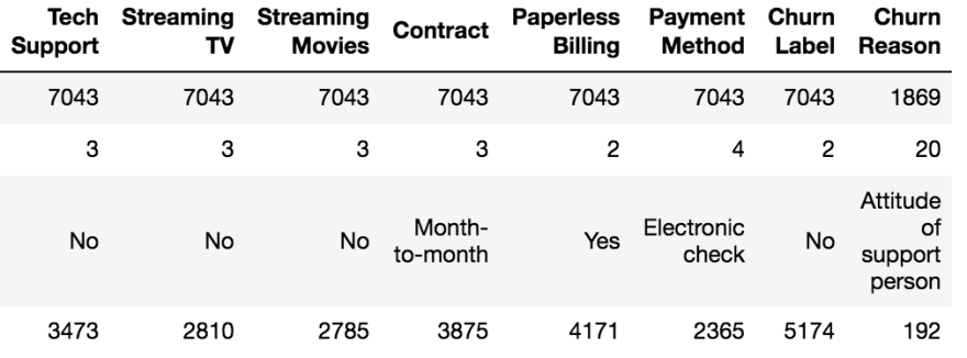
Let’s use the describe(exclude=[‘int64’,’float64’]) function to display the summary statistics of the features. This function displays the count, unique, top, and most frequent values of categorical features.
- count displays the number of non-null records/rows. This value will be the same as the number of records/rows in the dataset if there are no null values.
- unique displays the total number of unique values, i.e., number of categories in a feature.
- top displays the first record/row in the feature.
- freq displays the mode.


 Summary statistics of categorical features
For example, let’s understand the summary statistics of the “Churn Label” column.
- There are no null values.
- There are 2 categories in the “Churn Label” column.
- The first record has the label “No”.
- One category appears 5174 times, indicating that 5174 records belong to 1 category and the remaining records (7043–5174 = 1869) to the other.
- All customers are from the state of California.
- There are 2 types of phone services and 3 types of internet services.
- All customers have the option to have up to 3 multiple lines.
- There are 3 types of contracts and we may be able to identify a customer who is more likely to churn based on the contract type.
- The categories in the “Churn Label” column are not evenly distributed, so we say that the data in this column is imbalanced. Try analyzing the columns and see if you can get more interesting insights from the data.
Conclusion
Consider a scenario where your client has given you a large dataset and has asked you to immediately provide some information based on the given data.
In such circumstances, descriptive statistical analysis can be performed quickly, and a brief overview of the data can be provided to the client.
That’s it for this blog. In the next part, we’ll see how to explore and analyze the data using the descriptive graphical analysis method and see what interesting insights we can gain through the graphs.
Thanks for reading!!
This content originally appeared on DEV Community and was authored by Mage
Mage | Sciencx (2022-01-07T23:46:00+00:00) Guide to Churn Prediction: Part 3 — Descriptive statistical analysis. Retrieved from https://www.scien.cx/2022/01/07/guide-to-churn-prediction-part-3-descriptive-statistical-analysis/
Please log in to upload a file.
There are no updates yet.
Click the Upload button above to add an update.


