This content originally appeared on DEV Community and was authored by Rajesh Joshi
Dark and Light theme in any Web-App make it even more attractive. To build a theme enabled web-app in ReactJS with the help of Material-UI v5 and Redux follow this article.
Directory Structure
src
│   App.js
│   index.css
│   index.js
│
└───theme
│   │   theme.js
│
└───redux
│   │   store.js
│   │
│   └───theme
│       │   themeSlice.js
Create a React Project
Using npx create a new react project.
$ npx create-react-app my-site
Add dependencies
Add the following libraries
$ yarn add @reduxjs/toolkit react-redux @mui/material @emotion/react @emotion/styled
your package.json should look like this
{
  "name": "my-site",
  "version": "0.1.0",
  "private": true,
  "dependencies": {
    "@emotion/react": "^11.7.1",
    "@emotion/styled": "^11.6.0",
    "@mui/material": "^5.2.7",
    "@reduxjs/toolkit": "^1.7.1",
    "@testing-library/jest-dom": "^5.16.1",
    "@testing-library/react": "^12.1.2",
    "@testing-library/user-event": "^13.5.0",
    "react": "^17.0.2",
    "react-dom": "^17.0.2",
    "react-redux": "^7.2.6",
    "react-scripts": "5.0.0",
    "web-vitals": "^2.1.3"
  },
  "scripts": {
    "start": "react-scripts start",
    "build": "react-scripts build",
    "test": "react-scripts test",
    "eject": "react-scripts eject"
  },
  "eslintConfig": {
    "extends": ["react-app", "react-app/jest"]
  },
  "browserslist": {
    "production": [">0.2%", "not dead", "not op_mini all"],
    "development": [
      "last 1 chrome version",
      "last 1 firefox version",
      "last 1 safari version"
    ]
  }
}
Let's Write Code 🚀
Start with Writing Store / Redux
To learn the basics of the new Redux using a simple Counter App, you may have a look at my recent article New Redux 😱 is just 🔥.
Create themeSlice.js
import { createSlice } from "@reduxjs/toolkit";

export const themeSlice = createSlice({
  name: "theme",
  initialState: {
    darkTheme: false,
  },
  reducers: {
    toggleTheme: (state) => {
      state.darkTheme = !state.darkTheme;
    },
  },
});

export const { toggleTheme } = themeSlice.actions;

export default themeSlice.reducer;
In initialState the default value of darkTheme is false, i.e. by default the theme will be light.
Register the
themeSlicein store. So, yourstore.jsshould look like this.
import { configureStore } from "@reduxjs/toolkit";
import theme from "./theme/themeSlice";

export default configureStore({
  reducer: {
    theme,
  },
});
Don't forget to provide the store to the App in
index.js
import React from "react";
import ReactDOM from "react-dom";
import App from "./App";
import "./index.css";

// redux
import store from "./redux/store";
import { Provider } from "react-redux";

ReactDOM.render(
  <Provider store={store}>
    <App />
  </Provider>,
  document.getElementById("root")
);
Let's write
theme/theme.js
Define both light and dark themes in theme.js
import { createTheme } from "@mui/material";

export const lightTheme = createTheme({
  palette: {
    mode: "light",
    background: {
      paper: "#f2f2f2",
    },
    text: {
      primary: "#11111",
    },
  },
});

export const darkTheme = createTheme({
  palette: {
    mode: "dark",
    background: {
      paper: "#222",
    },
    text: {
      primary: "#fff",
    },
  },
});
Write
App.js
Based on the Global state variable darkTheme, provide theme to ThemeProvider HOC.
import { useSelector, useDispatch } from "react-redux";
import { ThemeProvider } from "@mui/material/styles";
import {
  Paper,
  FormGroup,
  FormControlLabel,
  Switch,
  Typography,
} from "@mui/material";

import { darkTheme, lightTheme } from "./theme/theme";
import { toggleTheme } from "./redux/theme/themeSlice";

export default function App() {
  // get theme from store
  const theme = useSelector((state) => state.theme);

  // initialize dispatch variable
  const dispatch = useDispatch();

  // ToggleSwitch component
  const ToggleSwitch = () => {
    return (
      <div
        style={{
          position: "absolute",
          top: "10px",
          right: "10px",
        }}
      >
        <FormGroup>
          <FormControlLabel
            control={
              <Switch
                checked={theme.darkTheme}
                onChange={() => dispatch(toggleTheme())}
              />
            }
            label="Toggle Theme"
          />
        </FormGroup>
      </div>
    );
  };

  return (
    <ThemeProvider theme={theme.darkTheme ? darkTheme : lightTheme}>
      <Paper
        style={{
          minHeight: "100vh",
          borderRadius: "0",
          display: "flex",
          flexDirection: "column",
          alignItems: "center",
          justifyContent: "center",
        }}
      >
        <ToggleSwitch />
        <Typography variant="h1">Hello</Typography>
      </Paper>
    </ThemeProvider>
  );
}
Run the Development Server 🚀
$ yarn start
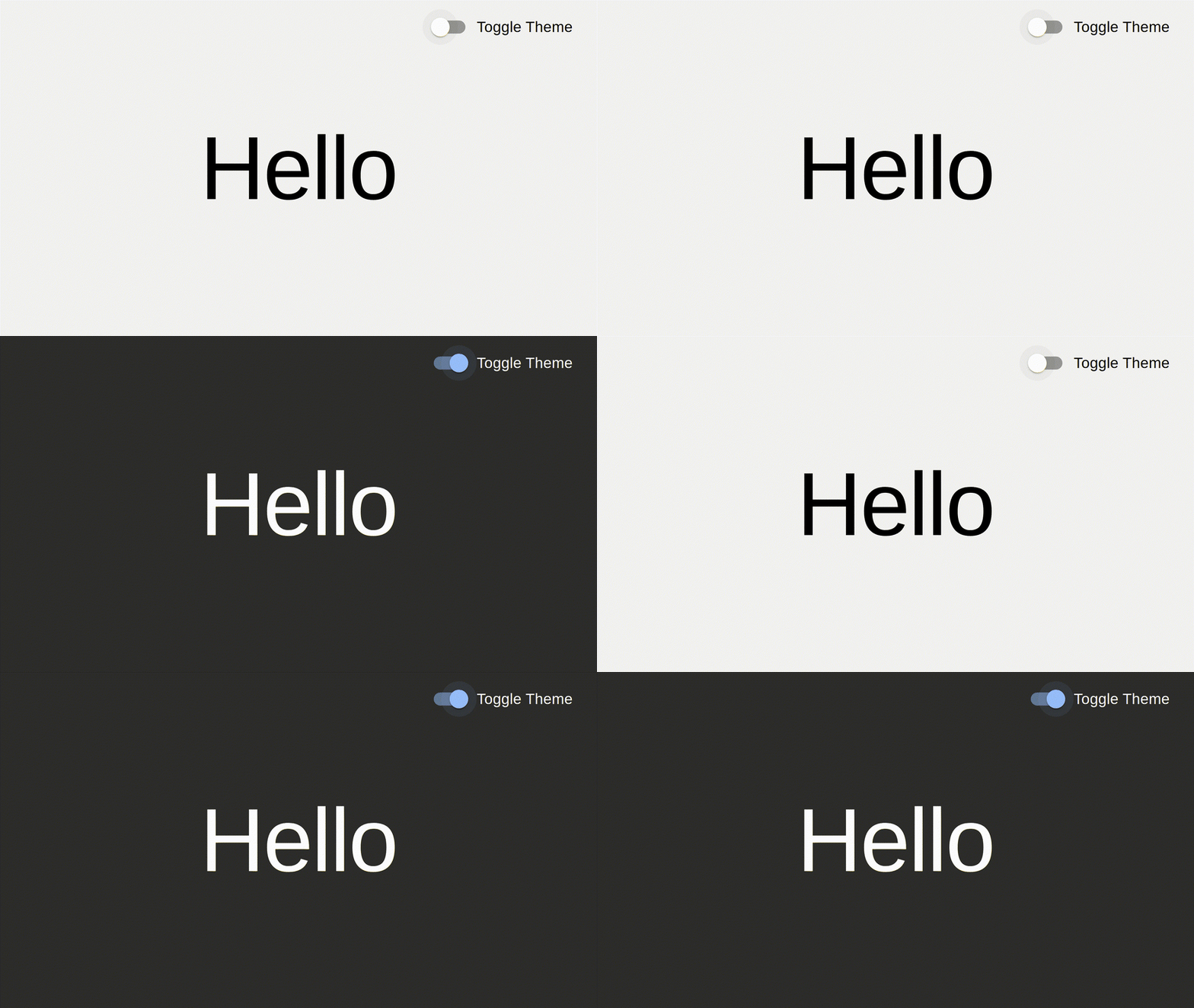
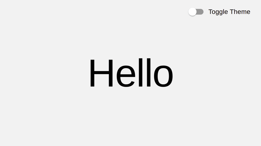
Light Theme
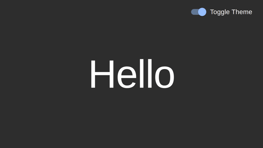
Dark Theme
Hurray! You just learned 🌞 Toggle theme 🌑 in React with MUI v5 and Redux 🚀
I hope, you guys liked this quick tutorial. If so, then please don't forget to drop a Like ❤️
And also, help me reach 1k Subscribers 🤩, on my YouTube channel.
Happy Coding! 😃💻
This content originally appeared on DEV Community and was authored by Rajesh Joshi
Rajesh Joshi | Sciencx (2022-01-09T08:03:19+00:00) 🌞 Toggle theme 🌑 in React with MUI v5 and Redux 🚀. Retrieved from https://www.scien.cx/2022/01/09/%f0%9f%8c%9e-toggle-theme-%f0%9f%8c%91-in-react-with-mui-v5-and-redux-%f0%9f%9a%80/
Please log in to upload a file.
There are no updates yet.
Click the Upload button above to add an update.


