This content originally appeared on DEV Community and was authored by Tapajyoti Bose
Do you have what it takes to be an outstanding UX Developer in 2022? Add these tricks to your arsenal and witness your Development skills break new grounds that you didn't know even existed!
Three Click Rule
What is the Three Click Rule you ask? A quick Google Search will reveal:
The three-click rule or three click rule is an unofficial web design rule concerning the design of website navigation. It suggests that a user of a website should be able to find any information with no more than three mouse clicks.
Er... Why is this relevant? The decline in attention span of the people lately has led to the origin of the Three Click Rule. A click is an interaction that results in the highest cognitive load, because the click works only in a small surface area.
An alternative to reduce the taxation on the brain, you can use gesture inputs like swipes, pinch or double taps (eg: Instagram & LinkedIn). The general rule of thumb is, for double taps, the surface area should be large, else you fall in the same trap as the click issue.
Appropriate use of White Space
This is one of the most crucial pillars of Modern UX. As you can see here, the one with more spaced-out content looks way professional.
As you gain more experience designing UX, you slowly develop an eye for it by default. It is also crucial to maintain consistent spacing (the padding/margin in the left & right sides should be equal, same is the case for the padding/margin in the top & bottom)
You also need to maintain adequate spacing across sections, a highly spaced out section should be followed by a section with low spacing:
To avoid lopsided spacing, one hack is to use alternate positioning:
Scroll Interaction
The use of Scroll Interactions such as Scroll Storytelling, Parallax, and more are on a constant rise and can lead to truly immersive websites. Even the Mac Pro uses Scroll Interaction on the product page!
These immersive scrolling experiences are generally implemented using a technique known as Scroll Hijacking, where the scroll behavior is altered as per the requirement of the developer. Even though it has enormous upsides, it comes with a major catch: if not implemented properly, it can lead to severe accessibility issues.
Masonry Grid
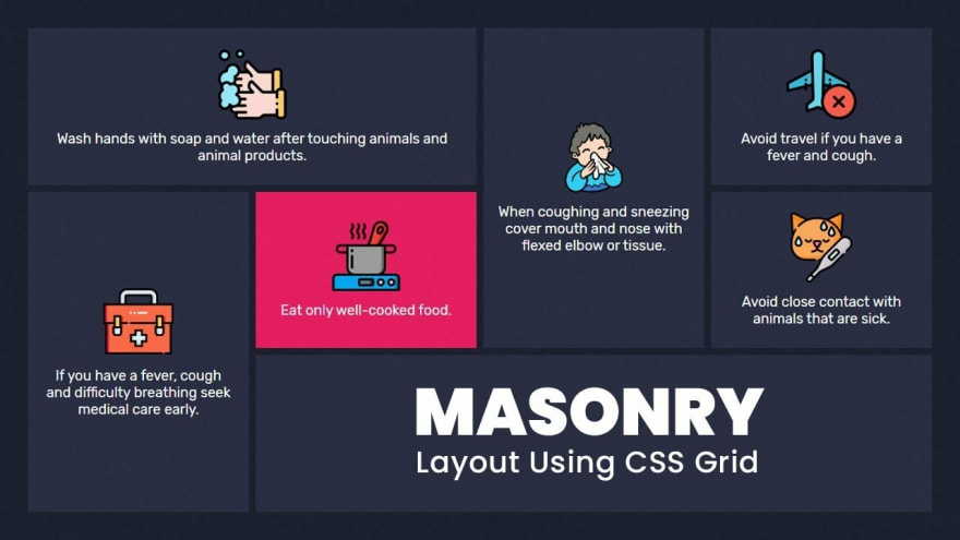
Masonry Grid had been around for a long time but saw a rapid increase in popularity after the introduction of Windows 8. It involves a grid of elements with different sizes and provides a fresh feel over traditional grid items.
Unlike most other items in this list, this one is possibly the easiest to implement as it only requires CSS knowledge.
Cursor Interactions
Cursor Interactions is the perfect way to keep a user engaged in your website in this age of dwindling attention spans. You have a buffet of options to choose from ranging from Custom Cursors:
to highly dynamic cursor interactions
NOTE: The target audience for the Cursor Interactions are the desktop users, so if your audience demographic is mainly the phone users, you could opt out of using these interactions.
Wrapping Up
In this article, we went through some cool UX tricks that you can use in your applications to give them a modern feel. Hope this helps you in your journey!
Fun Fact: This was my 50th article, I have been writing consistently for the past 50 weeks! When I started I had a lot of doubt about who will read the articles, now I have a lot of people supporting me. Thanks a lot to everyone who had been on this journey with me!
Happy Developing!
Thanks for reading
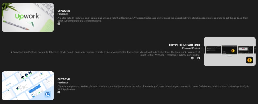
Need a Top Rated Front-End Development Freelancer to chop away your development woes? Contact me on Upwork
Want to see what I am working on? Check out my Personal Website and GitHub
Want to connect? Reach out to me on LinkedIn
I am a freelancer who will start off as a Digital Nomad in mid-2022. Want to catch the journey? Follow me on Instagram
Follow my blogs for Weekly new Tidbits on Dev
FAQ
These are a few commonly asked questions I get. So, I hope this FAQ section solves your issues.
-
I am a beginner, how should I learn Front-End Web Dev?
Look into the following articles: Would you mentor me?
Sorry, I am already under a lot of workload and would not have the time to mentor anyone.Would you like to collaborate on our site?
As mentioned in the previous question, I am in a time crunch, so I would have to pass on such opportunities.
This content originally appeared on DEV Community and was authored by Tapajyoti Bose
Tapajyoti Bose | Sciencx (2022-01-09T06:15:11+00:00) 5 UX Tricks You Must Know in 2022. Retrieved from https://www.scien.cx/2022/01/09/5-ux-tricks-you-must-know-in-2022/
Please log in to upload a file.
There are no updates yet.
Click the Upload button above to add an update.


