This content originally appeared on Telerik Blogs and was authored by Suzanne Scacca
On average, people are spending over 3.5 hours in mobile apps every day. If you want to keep inaccessibility from becoming a reason your app can’t retain users, follow these suggestions.
There are many factors to consider when designing an app to be accessible: age, vision, hearing, mobility, location and so on. Because of this, mobile app accessibility can feel pretty daunting.
However, there are a number of common accessibility issues in mobile app design that can easily be fixed. Below, we’ll look at four examples of those issues and their fixes. It might not get your app 100% of the way there, but it’ll get it pretty darn close.
Common Mobile App Accessibility Fixes
eMarketer estimates that U.S. adults will spend a total of 4 hours and 6 minutes, on average, on their mobile devices each day in 2021.
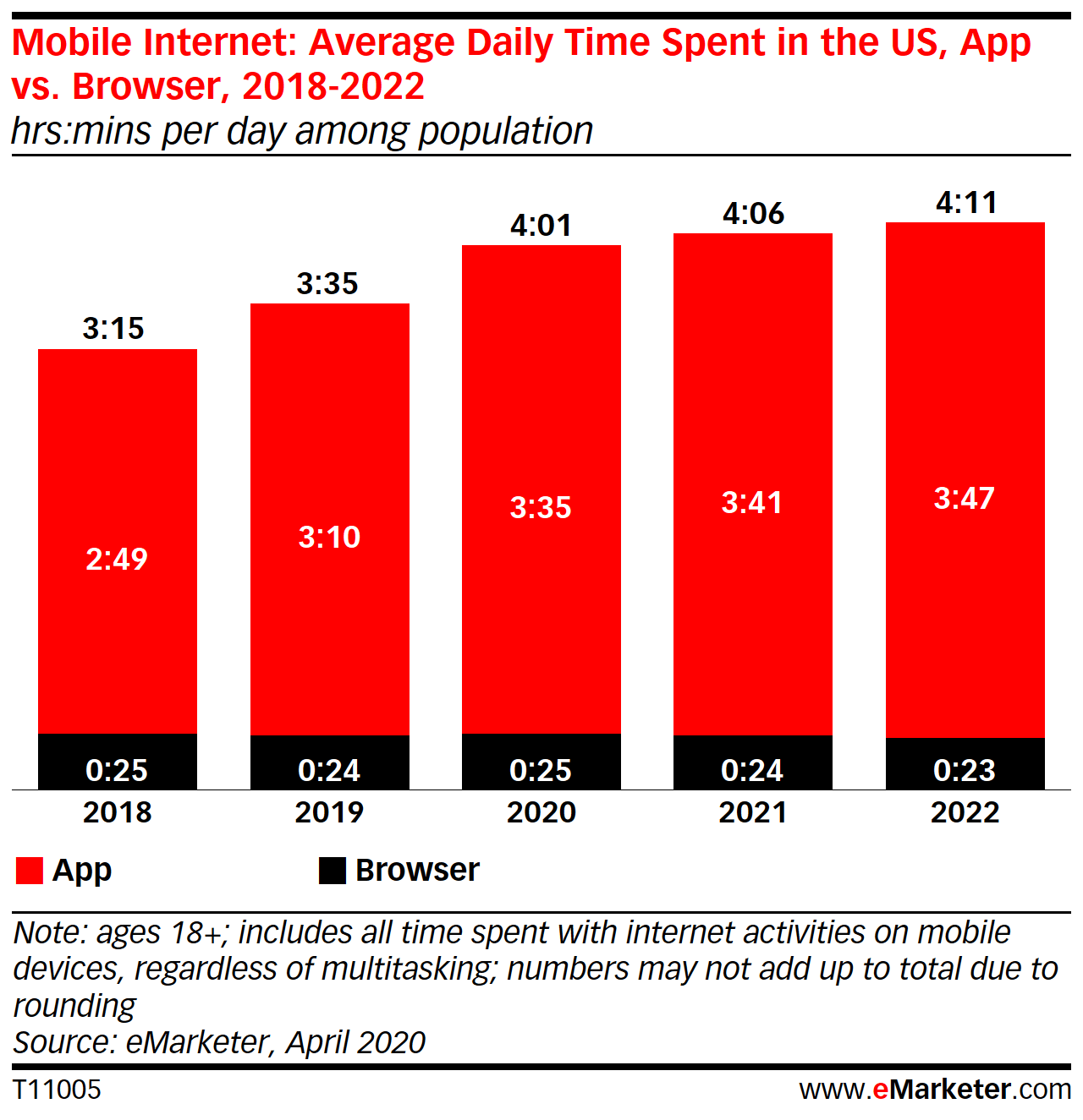
3 hours and 41 minutes of that time will be in mobile apps.
Now, just because people are spending more time in mobile apps than ever before, that doesn’t mean they’ll want to spend more time in your app. If the app isn’t accessible, you’re likely to see the app go unopened for long stretches or, worse, get uninstalled.
So, here’s what you can do to remove inaccessibility from the equation:
1. Design the Navigation for Mobile App Users
The navigation is a critical element in mobile app design. However, simply including a navigation isn’t enough.
Let’s look at the example of the Kohl’s mobile app:
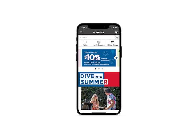
The first thing you’ll notice is that the navigation is in the gray header of the app. While this is expected and acceptable on a website, it’s not ideal for mobile apps—especially if those are the only navigational elements available.
One of the main reasons is that it’s not a user-friendly design for single-handed users. This is why most apps have the main navigation aligned along the bottom and the most important clickable elements in the center of the page. This is also known as the “thumb zone.”
There are some other issues with the way this navigation is designed. Let’s look at a walk-through of it:

Under the hamburger menu is a “Shop by Category” mega menu. Users have to go three levels deep before they see any search results. For a store of this size, it’s to be expected.
However, it’s the next layer of navigation that gets tricky.
When users scroll down the search results, the hamburger menu disappears, so all they’re left with is the name of the subcategory they’re looking at and a “Filter & Sort” button.
The subcategory is problematic as it serves more as a label for the search results than as a breadcrumb that helps users backtrack through the levels of navigation.
The filter and sort options are also not very well designed. The font becomes very difficult to read in this section and the thumb zone is ignored once again, with the “Apply” button sitting in the top-right corner of the header.
A more accessible way of designing the navigation can be found in Target’s mobile app:
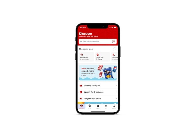
Target’s navigation sticks to the bottom of the app UI at all times.
What’s especially nice is that this menu is designed for the omnichannel experience by including “To Go” as one of the options. This way, Target users buying stuff through the app to either pick up in the store or get via curbside pickup don’t have to sift through a bunch of extra settings to find this feature.
Another noteworthy feature is that most of the clickable elements on the pages remain in the thumb zone:
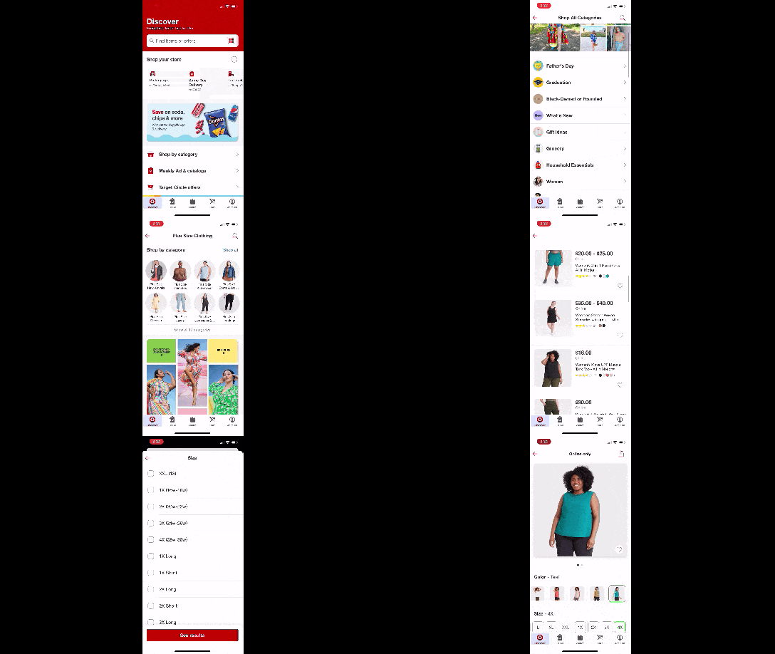
While you can’t see what I’m clicking on in the GIF above, what you can see is how the space has been used. The main header has three elements in it once a user starts navigating through the categories:
- “Back” button
- Category label
- Search icon
That leaves the main action to take place within the thumb zone below the top header.
Consider this as you design your apps. Even if you have two-handed users who can more easily reach there, accessible app design has taught users to expect the navigation to be at the bottom and the main activity in the center of the app. If you don’t have to deviate from the norm, don’t.
2. Spell Out Your Icons
Icons can be a great space-saver in app design. But perhaps a more important thing to consider when adding icons to your UI is whether or not they actually improve the user experience.
If you think about it, there are maybe only a dozen icons that are (mostly) universally recognizable. For example:
- Mobile menu (hamburger)
- Search (magnifying glass)
- Home (house)
- Edit (pencil)
- Favorite/like (heart)
- User/account (profile)
- Notification (bell)
For others, you can’t assume that users will be able to figure out what they are.
Instead, every icon used in your interface—from the navigation to the content in your tabs—should be paired with a label that’s concise enough to understand and large enough to read. It’s the only way to ensure that every user knows what exactly they’re going to find on the app and what they can do when they click on it.
Here’s an example from Chirp Access:
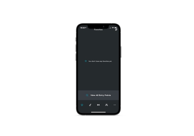
There are five tabs in this navigation. I’m guessing that people can figure out what two of them are for:
- The star is where you save “Favorite” or most commonly used entry points.
- The ellipsis is where you find settings and other extras.
But what about the other three?
- The key icon includes a list of entry point options all around the property.
- If bluetooth is enabled, the network icon will display available entry point options.
- The users icon allows users to invite other people to access the property.
While I’m sure muscle memory will help many users get around this app since it gets used on a daily basis, the lack of labels will be problematic for others who might not be tech savvy or have the best recall.
If you’re concerned that labels will take up too much space, don’t be. Here’s what they look like in the OfferUp app:
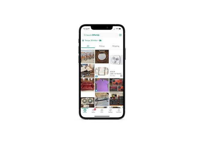
This is the perfect example of how well-recognized symbols aren’t always universal in application. For instance, the Inbox icon is what we’d normally see for texting or chat. And the Post icon is what we’d see associated with in-app camera functionality.
They’re both relevant in this case. However, without the extra label attached to each, the icons alone could be confusing.
3. Provide Click Alternatives to Gestures
Mobile apps have enabled us to build special gestures into the experience, like double-tapping, swiping and tilting. That said, although gestures may speed up some actions and make apps feel more engaging, they’re not always user-friendly.
For starters, there’s the dexterity factor. If the user can’t easily execute the gesture with their hands, then that could realistically render the app unusable for them.
This is an issue with the Bumble dating app:
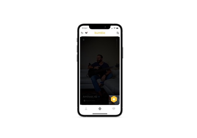
In order to move onto the next card, the user must swipe left for “No” or right for “Yes.”
The yellow star button in the bottom-right corner is for Super Swipes. However, if the user isn’t paying for this feature, this button becomes a liability as it’s all too easy to click it by accident and disrupt the entire experience in the process.
And in terms of looking through someone’s profile, the user needs to swipe down to view it.
Tinder has this issue partially solved:
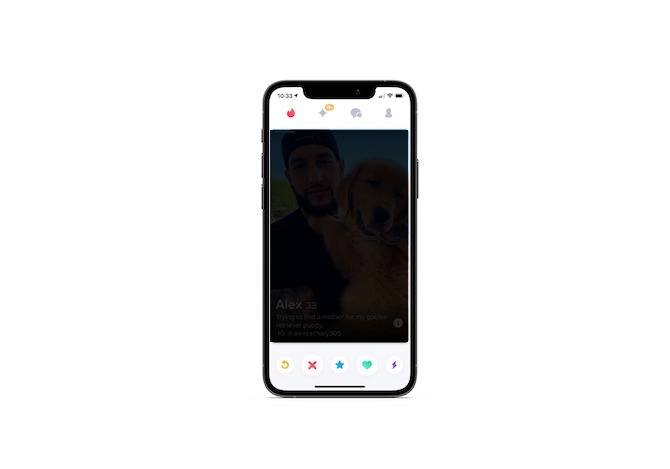
Tinder gives its users the option to use swipe gestures—left for “No,” right for “Yes,” and up for “Super Like.” Or they can use the button panel below the cards.
There are five buttons here. The X and Heart icons are the largest because they’re the most commonly used (for “No” and “Yes,” respectively). The Star in the center works similarly to Bumble’s star in that users click it for Super Likes. The other two icons are for extra features. The Back arrow allows users to undo the last action, while the lightning bolt pushes them to the front of the queue.
As for looking through someone’s profile, the user can either click on the left or right side of the image to scroll through the photos or in the center to read the description.
Obviously, the lack of labels is problematic for accessibility. But we have another issue here. It’s the inconsistency in how the same click features work across nearly identical apps.
I get that every dating app has its own schtick. That’s fine. But that shtick should only apply to the app’s identity and not to its features.
When you deviate from a very familiar design or functionality, you’re going to increase the number of errors your users make and, consequently, their level of frustration. That could very well be the last straw for users who are already unhappy with the app’s inaccessibility.
4. Place Accessibility Features into the Settings
Accessibility isn’t just about text size or color contrast, though they’re definitely important factors for visually impaired individuals.
Take, for instance, older users. Things like dexterity, hearing and cognition may determine how accessible an app is for them.
Obviously, if you try to design an app for every possible type of impairment or restriction, you’re going to have to compromise on a lot of what you envisioned for it. There’s no need to do that though. Just as websites now often come with built-in accessibility panels, you can do the same for apps.
Unlike websites, though, I’d recommend including only the accessibility features that make sense for your users and that are relevant to your app.
For example, this is the Settings panel for Plants vs. Zombies 2:
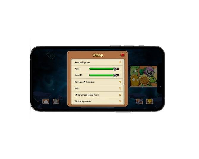
There are two accessibility controls, and both pertain to the sounds coming from the app: Music and Sound FX. Ideally, the app wouldn’t autoplay music when the user enters it. However, considering this is a mobile game, it’s something that I think most users expect upon opening a newly installed app.
What’s important is that these volume and sound controls are located in the Settings and easy to find.
Next, let’s take a look at how the Two Dots mobile game enables users to customize their accessible experience:
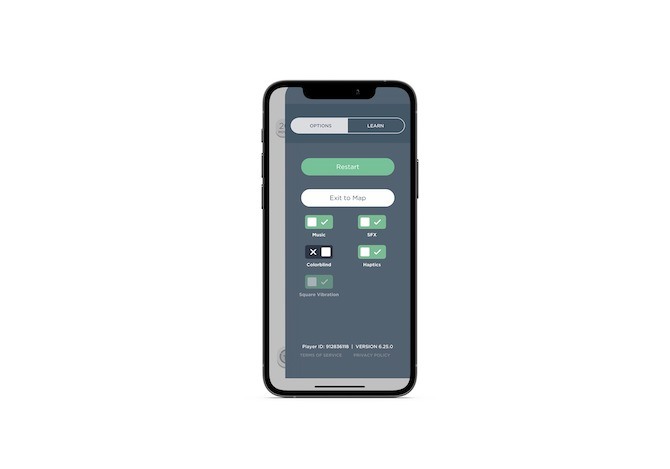
Users can toggle on/off:
- Music
- Special effects
- Colorblind mode
- Haptic feedback
- Vibration
These settings account for impairments/restrictions other than those related to hearing:
- Disabling special effects can help those with cognitive issues like epilepsy.
- Activating colorblind mode helps those with visual impairments.
- Turning on haptic feedback and vibrations can serve as a supplement for users with other sensory impairments.
While you want to make sure your mobile app is accessible to as many people as possible, be careful with going overboard with how many settings you include. The more options there are, the more time users will have to spend considering each as well as activating or deactivating them.
Wrap-up
While Google has officially made accessibility part of its algorithm in the new Core Web Vitals update, the app stores haven’t gone so far as to do that for mobile apps (or so we know). But just because the app stores don’t mandate accessibility, that doesn’t mean it can be ignored.
Start with the four tips above. You can then use this accessibility checklist to make sure you’ve dotted your i’s and crossed your t’s in getting everything else in order.
This content originally appeared on Telerik Blogs and was authored by Suzanne Scacca
Suzanne Scacca | Sciencx (2022-01-12T14:35:01+00:00) 4 Ways to Make Mobile Apps More Accessible. Retrieved from https://www.scien.cx/2022/01/12/4-ways-to-make-mobile-apps-more-accessible/
Please log in to upload a file.
There are no updates yet.
Click the Upload button above to add an update.
