This content originally appeared on Telerik Blogs and was authored by Maria Veledinova
Telerik UI for Blazor R1 2022 brings 90+ native components: Map, FileSelect, Dialog, Heatmap, QR Code, ColorPicker, REPL code runner, theming options and more!
Hey, developer folks! It’s Telerik R1 2022 release time and we’re excited to start 2022 with the introduction of multiple new UI components such as Map, FileSelect and ColorPicker; more Data Grid, TabStrip and Editor features; theme and style improvements; REPL code runner; .NET 6 and Visual Studio 2022 support; Visual Studio Code extension updates; and more! The Telerik UI for Blazor component suite continues to expand and has reached a new milestone of 90+ truly native components!
TL;DR Telerik UI for Blazor R1 2022
Below is a summary of the R1 2022 Telerik UI for Blazor release content shipped between October 2021 and January 2022 (includes Telerik UI for Blazor 2.28, 2.29, 2.30 and the current 3.0.0 releases):
- New UI components: Map, Heatmap, QR Code, Color Picker, Color Gradient, Flat Color Picker, Dialog, File Select
- Theme improvements: New Theme settings in Button, DropDown, Input, and DatePicker components make building design languages easy
- Telerik & Kendo UI Kits for Figma v1.7
- Data Grid enhancements: Excel export customizations; include all pages in Excel export with OnRead, enhanced validation and editing; API methods for auto-sizing columns to their content width; include SearchBox filter criteria in state and ability to clear it through X-icon and Esc key
- New Tree List enhancements: Enhanced validation and editing, API methods for auto-sizing columns to their content width, include SearchBox filter criteria in state and ability to clear it through X-icon and Esc key, include all pages in Excel export with OnRead
- Chart enhancements: Area background color & opacity, line width and dash type
- Tab Strip enhancements: Visible & PersistTabContent parameters
- Upload enhancements: Methods for managing selected & uploaded files
- All Input components: ValidateOn parameter (validate on change, blur or while typing)
- Date Pickers enhancement: Placeholders
- All Select components: Introducing Popup settings
- Add media to Editor Component
- Product source code is now available for active license holders
- Support for .NET 6 and Visual Studio 2022
- New Telerik REPL for Blazor playground
- Document Processing Libraries enhancements: Support for conditional formatting and export notes with a specific author in SpreadProcessing; nested MailMerge in WordsProcessing
- Visual Studio and Visual Studio Code Extensions enhancements: Revamped Visual Studio Code extension, with Themes & Swatches selection and new Admin Dashboard template in both Visual Studio and Visual Studio Code extensions
Deep Dive into 3.0.0 Release of UI for Blazor
Let’s take a closer look at the current 3.0.0 release content and then review the new components and features from Telerik UI for Blazor 2.30, 2.29 and 2.28 releases shipped in October, November and December 2021 as part of the R1 2022 release.
New Blazor Map UI Component
Overview
We are happy to announce the first release of the Telerik UI for Blazor Map component! The map allows you to display geographical information organized in layers, and can be integrated with open map providers in your Blazor apps. The component includes tile, bubble, shape and marker layers, and support for the GeoJSON data format. It is compatible with a wide range of tile map providers, enabling you to easily integrate advanced location and mobility capabilities into your maps, touch support, multiple customization options and more!
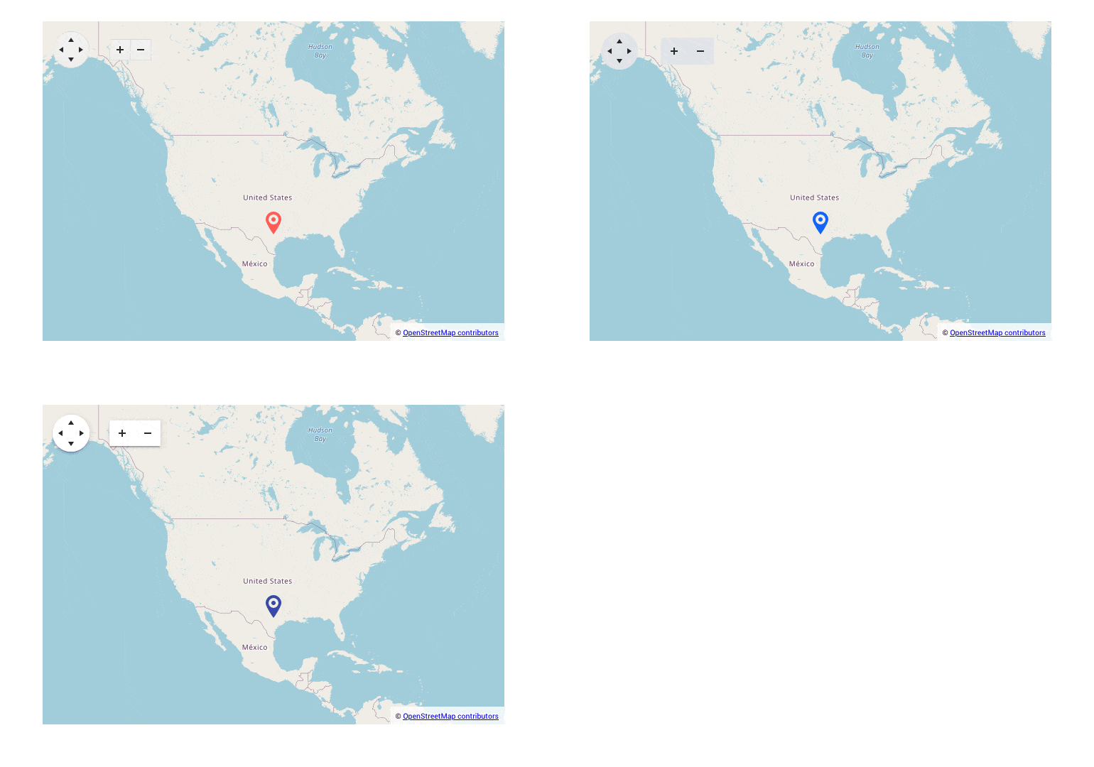
Map Layers
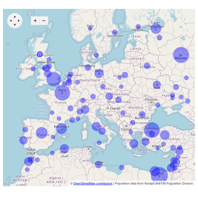
Depending on the different map providers and use case, you can take advantage of the following layers:
- Tile – Renders elements and can be bound to OpenStreetMap & Azure Maps providers
- Bubble – A vector layer that displays bubbles over another layer to mark regions
- Shape – Bindingto GeoJSON data
- Marker – Used for displaying markers on the map and a tooltip when the marker is hovered.
See the demos of the Map component bubble layer implementation.
Map Configuration Options
The Map for Blazor includes multiple configuration options related to the map itself, the map controls (zoom, attribution, navigator) and its tiles (type, size, min & max zoom, multiple styles fill properties, marker shape and more).
Map Events
With the initial release of the Map component, there are several events exposed that let you define logic when a marker, shape or the map is clicked: OnMarkerClick, OnShapeClick and OnClick.
New Blazor FileSelect UI Component
Overview
The UI for Blazor FileSelect component allows users to select single or multiple files from their local file systems and store them on a server. The component is especially handy when you want complete control over the management of selected files and the way they are uploaded. It has built-in keyboard navigation support and accessibility, just like the rest of the Blazor UI components in the Telerik portfolio.

Disabled FileSelect
For cases when you need to restrict users from selecting files, the FileSelect can be disabled with a single configuration option.

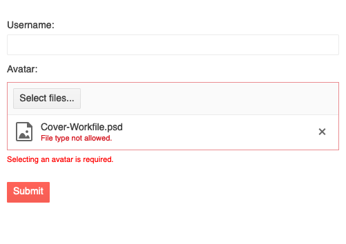
FileSelect Validation
The component allows you to define rules about the accepted minimum and maximum file size, file types and extensions.
See the Blazor FileSelect component validation demo.
FileSelect Events
The File Select component exposes OnSelect and OnRemove events, giving programmatic control over the selected and removed files:
- OnSelect – fired when a file or files have been selected through the Select files button
- OnRemove – fired when a file has been removed from the list of selected files (by clicking the X icon or pressing the Del key)
Theme Improvements
Based on your feedback related to themes customizations and design language trends, we are going to address various aspects of our themes in an ongoing effort to make Kendo UI themes more flexible, extensible and customizable to help our users cover more design and UX requirements. (Note: Kendo UI’s common set of themes can be shared across all Telerik and Kendo UI products: UI for Blazor, ASP.NET Core and MVC, as well as Kendo UI for jQuery, React, Vue and Angular).
We have revisited all Telerik UI components across the Default, Bootstrap and Material themes and introduced common options that can be set on a component level that can help with defining the main theme colors, the size and shape of the individual components, and more.
With R1 2022 we have updated the Button, Input, DateInput, and DropDown component categories to offer the following theme rendering options:
- ThemeColor
- Size
- Shape
- Rounded
- FillMode

These options have rolled out with the v5 release of the Kendo UI Sass-based themes, which is the latest version of the theme packages as of today. These updates contain breaking changes for anyone that has customized the Telerik UI for Blazor components, so we highly recommend adding some time for addressing breaking changes as a part of any update process you may have planned.
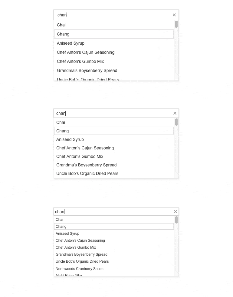
Additional components will be tackled with future releases in 2022. Here’s a rough roadmap around what components will be covered next: AppBar, BottomNavigation, Badge, Notification, Tooltip, Loader, Toolbar, Window, Dialog, TabStrip, PanelBar, ExpansionPanel, Upload, Editor, Scheduler and more!
Keep in mind that things may change here as our roadmap does adjust based on customer feedback, but this should still serve as a rough plan for when certain components will be targeted. To provide more information about these changes, and our general plan around the Kendo UI themes, we recently posted a blog post about the future of Themes in Telerik and Kendo UI.
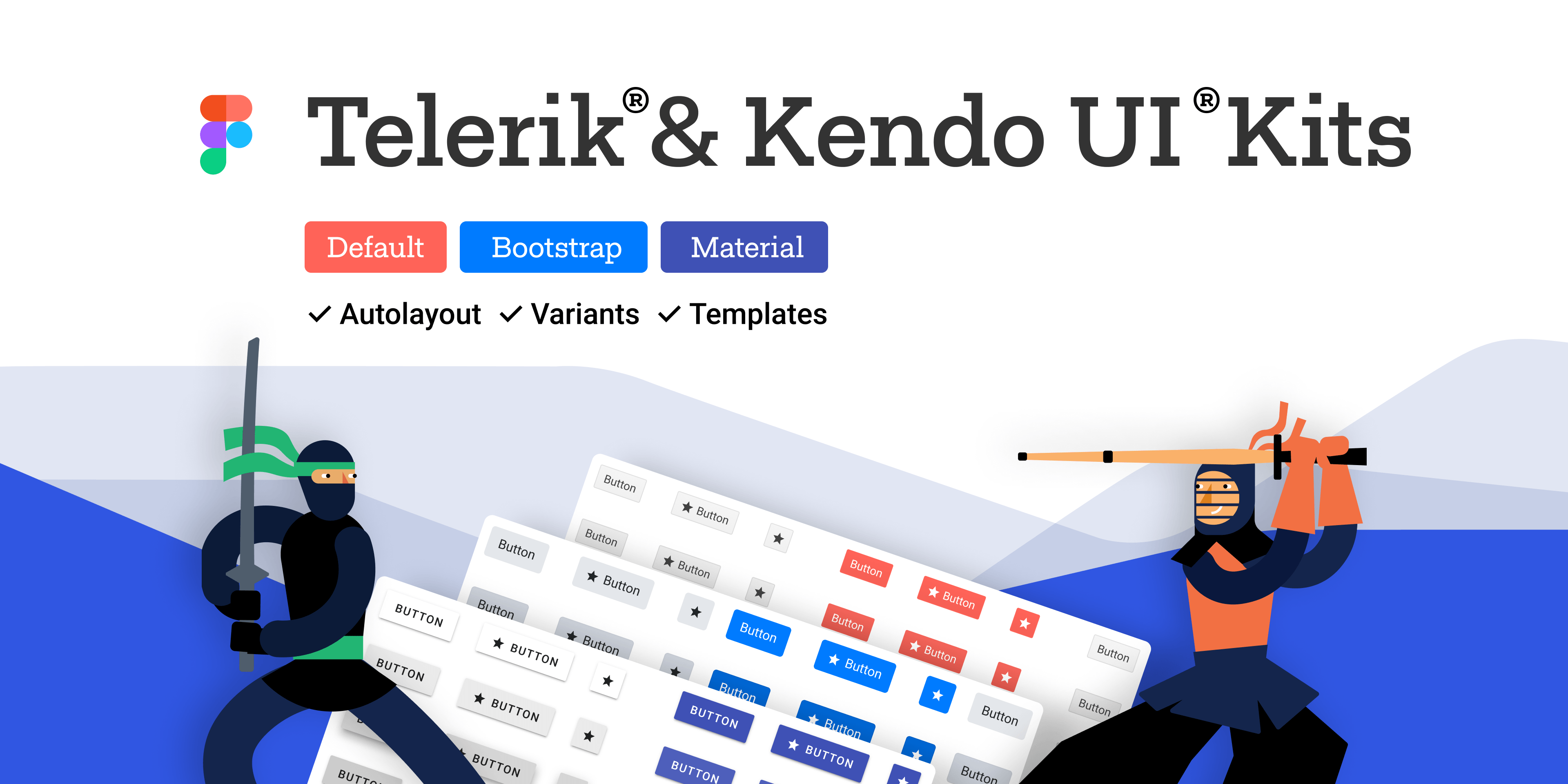
Telerik & Kendo UI Kits for Figma v1.7
We officially introduced the Telerik and Kendo UI Kits for Figma a few months back with the goal to help improve the collaboration between designers and developers using Telerik and Kendo UI components. We expanded the initial set of UI components, and I am happy to share that with R1 2022 we have introduced Figma assets for all Telerik and Kendo UI components with only one exception: the charts.
Introducing Popup Settings in All Select Components
You can now easily customize popups within a single dedicated tag for Telerik select components: Dropdownlist, Combobox, Autocomplete and MultiSelect. The popup settings allow you to configure minimum and maximum dimensions along with the already existing width, height and class parameters.
Include All Pages in Excel Export with OnRead
A popular Feedback Portal request has been implemented as a feature in both the Data Grid and TreeList components.
Blazor Editor UI Component Enhancements
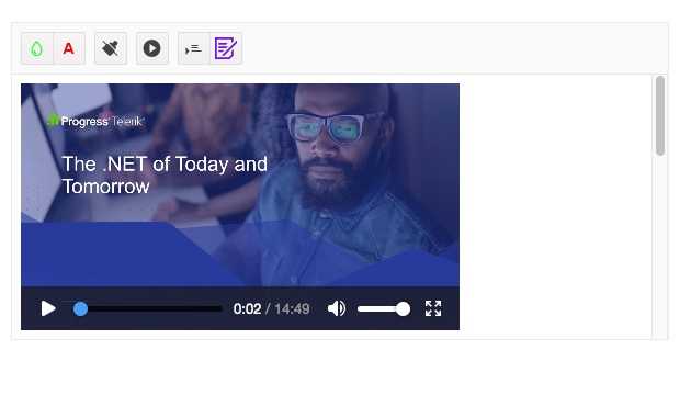
The Editor component now allows you to add media tags such as video, audio and iframe.
See how to insert a video in the Telerik Blazor Editor component.
New Methods in Upload Component
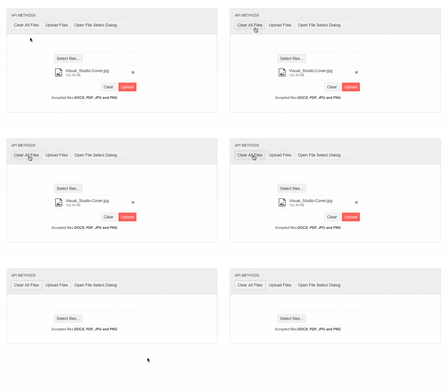
With this release, we exposed new methods in the Upload component API for triggering upload, file select dialog, and the ability to clear successfully uploaded files.
New Features in Telerik Document Processing
In the R1 2022 release, we have something new for those of you who are using Telerik Document Processing within Blazor apps! In the latest distribution package, you will find several of the most-wanted items from our Feedback Portal, such as:
- Conditional Formatting for SpreadProcessing: Allows adding rules used during cells visualization and applies formatting depending on their values.
- Notes for RadSpreadProcessing: The user will be able to add and export notes with a specific author.
- Nested MailMerge for WordsProcessing: Each merge field can contain a list of elements that should be displayed in the merged document.
Breaking Changes in 3.0.0
While we aimed to ensure undisturbed releases for two+ years, as the product and the framework evolved, we introduced several breaking changes in the current 3.0.0 release ensuring improvements in the API, rending and theming and some related to unifying parameter naming.
We highly recommend reviewing the documentation article describing in detail the breaking changes in 3.0.0 release, and adding time for addressing them as a part of any update process you may have planned.
Overview of Telerik UI for Blazor 2.30, 2.29 and 2.28 Releases
As we covered the new goodies from the Telerik UI for Blazor 3.0.0 release, let’s review the rest of the items that are part of R1 2022 and were shipped earlier.
Telerik REPL for Blazor
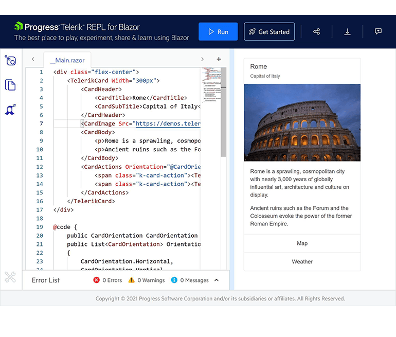
The Telerik REPL for Blazor was launched in October and represents an interactive online environment that reads, compiles and immediately runs your Blazor code in the browser. The run-ready environment requires no installation, account or special tooling—just jump in and start coding. Additional features include:
- Saving your Blazor code snippets
- Sharing examples with a simple URL
- Embedding into blog posts or articles with an interactive iframe
- Sharing from your IDE with the help of our Visual Studio extension and Visual Studio Code extension
- Installing your favorite NuGet packages
- Referencing static files
- Seamless access to Telerik UI for Blazor with 90+ truly native, easy-to-customize UI components
Telerik REPL for Blazor always integrates with the latest version of Telerik UI for Blazor, so any snippet created before the current 3.0.0 that uses the Telerik Components might need an update due to the breaking changes in the release.
New Blazor Dialog UI Component
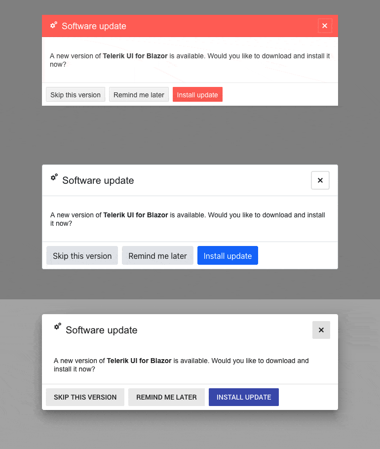
We added a standalone Telerik Blazor Dialog UI component so you have an out-of-the-box solution for building UI popups. The component comes in handy for displaying information to users and provides multiple options for customization such as width, height, title, visibility, content and action button templates, close on overlay click, and more.
New Blazor Heatmap Chart UI Component
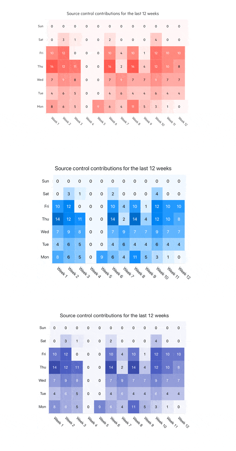
The Heatmap Chart UI component allows you to visualize two-dimensional data in a magnitude of colors. Some of the features of the new Heatmap component include: visualizing data values in different shapes; various color scales; tooltips that allow you to display additional information; built-in and custom themes and swatches.
New Blazor QR Code UI Component
The new Telerik UI for Blazor QR Code component is a machine-readable label that carries data for a locator, identifier or tracker, directing users to a website or application when scanned with any smart device. You can encode several data formats such as URLs, phone numbers, email addresses, contact information and geolocations. The QR Code can be customized in various ways: rendering your own custom logos and pictures in it, configuring its size, width, padding, borders, error correction levels, colors and overlay settings of the QR Code. The component also supports Swiss QR Code generation.

New Blazor Color Picker UI Components
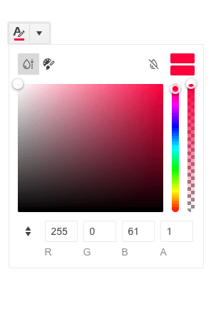
In addition to the ColorPalette component, we introduced three new flavors ensuring simplified reference for different scenarios. You can plug the ColorGradient component in case you need to show just a gradient view, and for more advanced scenarios you can use the FlatColorPicker or the ColorPicker with a popup.
Enhancements in DataGrid & TreeList Components
- Enhanced Validation – two added features: disabling the built-in validation and exposing the option to developers to build a custom one
- Enhanced Editing – improved editing UX in data virtualization scenarios
- Fit Column Width to Content – three new methods that let you resize column width to fit content
- SearchBox Enhancements – the search box input and filter criteria can now be easily cleared up by using the X-icon in the box, Esc key or programmatically
- Trigger OnEdit, OnUpdate, OnCancel on every cell in Incell EditMode – you can decide on your own whether you would like to update the model conditionally or for every field
- Grid Export to Excel ustomization Options – define which data items or columns are included in the exported file (via the OnBeforeExcelExport event), control the exported columns’ width, have seamless support for exporting enum values, and trigger Excel and CSV export programmatically
DateInputs Enhancements
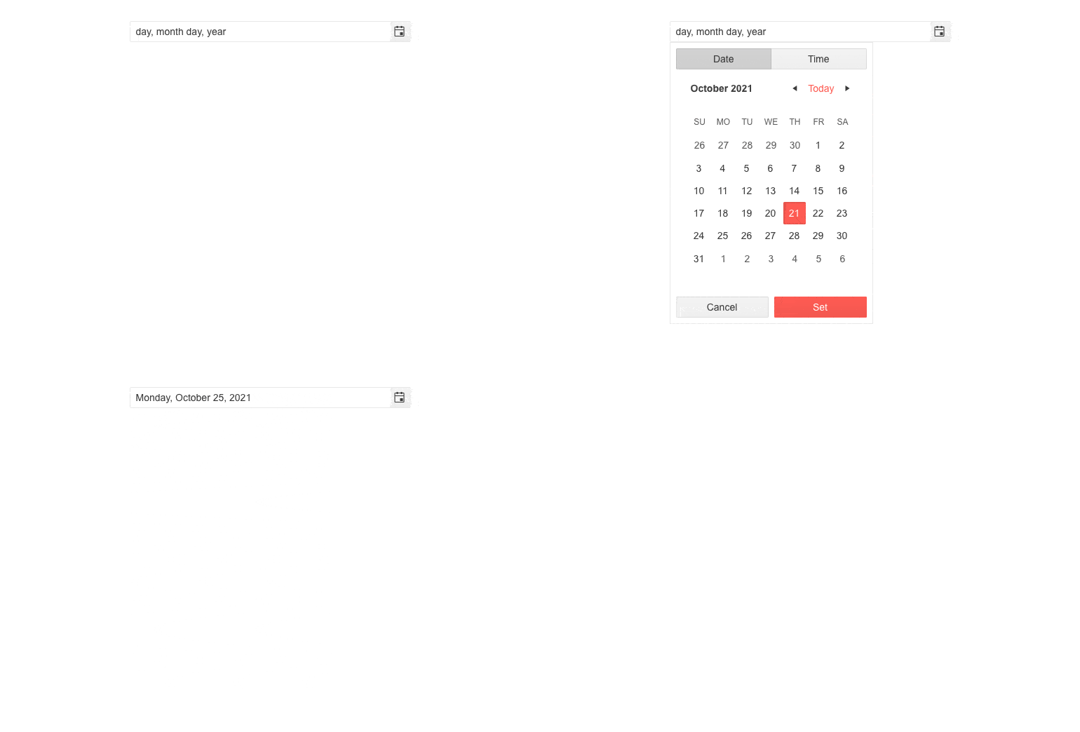
You can now render a text suggestion for each input field and provide descriptions for the format parts for multiple DateInputs components. The format placeholders are supported for the DateTimePicker, DatePicker, TimePicker, DateRangePicker and DateInput components.
TabStrip UI Component Enhancements
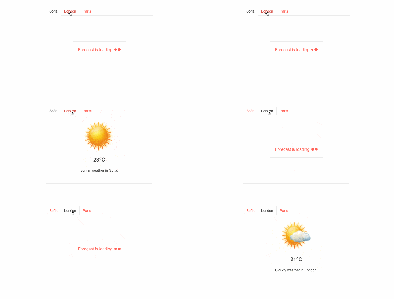
The TabStrip now exposes two new parameters: PersistTabContent, which determines whether the content of tabs is persisted when changing tabs, and Visible, which allows you to easily control the visibility of each of the tabs.
Validation Mode in Input Components
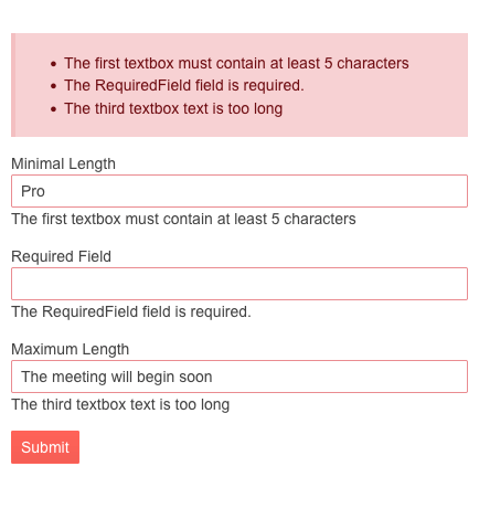
A new enum parameter ValidateOn was introduced in all Telerik Blazor input components, such as Date & Time Pickers, TextBox, Numeric TextBox, MaskedTextBox and TextArea. The ValidateOn parameter allows you to configure whether to trigger validation on change, blur or while typing.
New Features in Charts
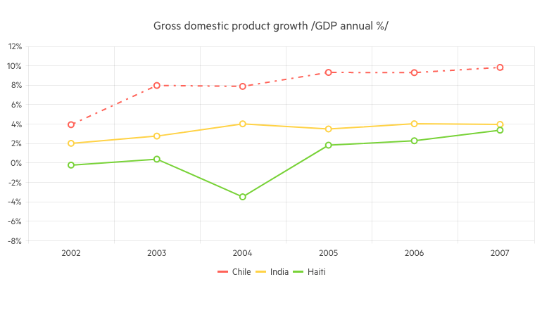
We exposed several chart properties requested via the dedicated Feedback Portal, which will allow you to easily customize the area background color and opacity, line width and dash type.
Product Source Code Available to License Holders
Starting with Telerik UI for Blazor 2.29 release, we now ship the product source code for our active license holders (available in Your Account -> Downloads section).
.NET 6 and Visual Studio 2022 Compatibility
Telerik UI for Blazor library is compatible with .NET 6 and Visual Studio 2022 since November 2021, shortly after the release by Microsoft. You can dive into seamless development with our web components and create new projects using our VS and VS Code project templates and built-in layouts.
Visual Studio & Visual Studio Code Extensions
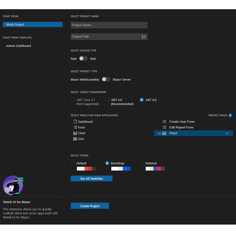
The Create New Project Wizards for Visual Studio and Visual Studio Code now provide the option for theme and swatches configuration, plus a brand new Admin Dashboard project template. You can now style your project at the time of its creation and configure both the theme and the specific swatches in the wizard with a click of a button. Using the Admin Dashboard project template, you can easily jump-start a Blazor project with the pre-built layout and functionality—rearrange the layout as it fits your needs, and simply plug in your data and bind it to the components—including Grid, Tile Layout, Drawer, Calendar, Form, various Chart types, Card and more.
Download Telerik UI for Blazor 3.0.0
Head over to the Telerik UI for Blazor page and download a free trial of Telerik UI for Blazor 3.0.0. Or, if you are an active license holder, you can grab the latest and greatest from the “Your Account” page, or update your NuGet Telerik.UI.for.Blazor package reference to version 3.0.0. Make sure to review and assess the announced breaking changes before updating to the latest version in your Blazor solutions.
Download Telerik UI for Blazor 3.0.0
Webinar & Dedicated Twitch Sessions
Be sure to sign up for the Telerik R1 2022 release webinar and live Twitch sessions to see the newly released components and features in action:
Twitch Sessions:
Mon, January 24 I 10:00 am ET – noon I Desktop & Mobile
Tue, January 25 I 10:00 am ET – noon I .NET Web
Webinar:
Wed, February 2 I 11:00 am – 1:00 pm ET
Thank you for the continuous support!
This content originally appeared on Telerik Blogs and was authored by Maria Veledinova
Maria Veledinova | Sciencx (2022-01-19T16:41:35+00:00) What’s New in Telerik UI for Blazor With R1 2022. Retrieved from https://www.scien.cx/2022/01/19/whats-new-in-telerik-ui-for-blazor-with-r1-2022/
Please log in to upload a file.
There are no updates yet.
Click the Upload button above to add an update.
