This content originally appeared on Brad Frost and was authored by Brad Frost
I had the honor to be the first guest on Storybook‘s new Storytime show with the great Michael Chan (aka @chantastic). We talked about the history of atomic design and the rise of the modern JS landscape, how directly-consumable UI components are a game changer for front-end development, the importance of front-end workshop environments like Storybook, and our web-component powered future. Give it a watch!
We covered a lot of ground, and I’d like to take a bit more time to unpack how exactly we use Storybook when co-creating design systems with our clients.
How we use Storybook
Even with the competent teams I work with, it can be difficult to understand what exactly Storybook is. Is it a component playground? A component visualizer? A documentation hub? A prototyping environment? A testing platform? A design review tool? The answer is: yes! It’s all of those things and more.
The biggest mistake I see teams make with Storybook is the same mistake I see organizations make with design systems in general: they treat it as this off-to-the-side thing that requires doing chores to keep up to date. Of course, chores suck and we have bigger fish to fry, so the teams eventually stop updating Storybook (and/or the UI library and/or the reference website documentation). Once the documentation ceases to reflect the reality of the product, the effort is dead in the water.
How to avoid that terrible fate? By making the design system the cornerstone of your design and front-of-the-front-end development workflow. For front-of-the-front-end developers, that means that Storybook becomes the workshop environment where all UI code gets built. That work then gets bundled up and published as a component library, which applications can pull in a product dependency.
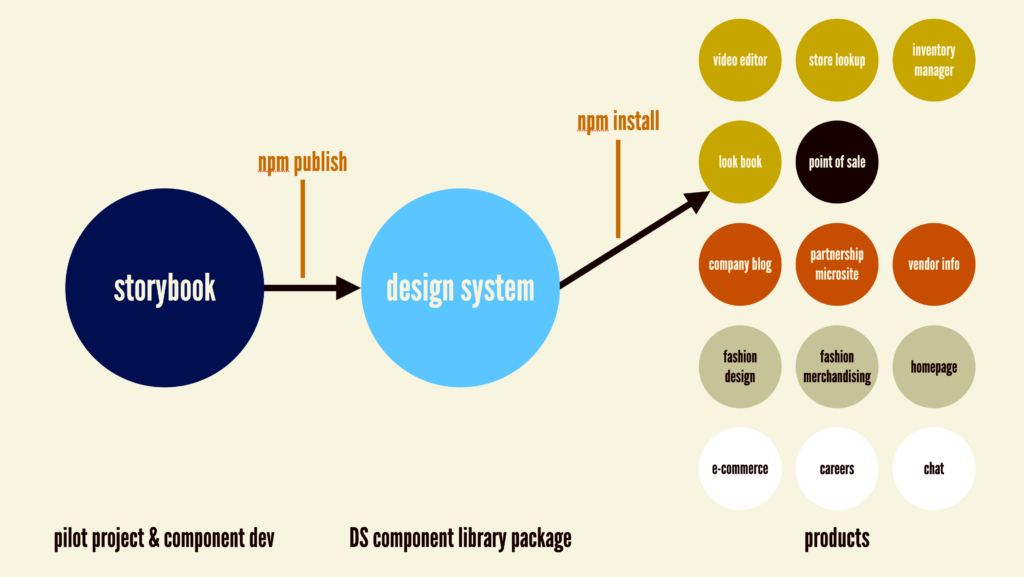
Practicing atomic design in Storybook
Atomic design is a mental model for thinking of user interfaces as an interconnected, hierarchical system of components. The atomic design methodology is comprised of 5 discrete levels: atoms, molecules, organisms, templates, and pages.
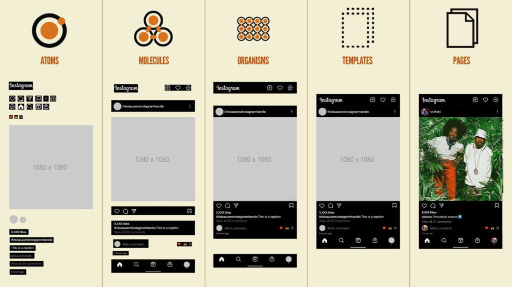
This mental model works hand-in-glove with how Storybook works. Storybook allows you to organize stories however you want, and we find it valuable to bucket our components based on the atomic design vernacular. Of course you don’t have to do this and can cluster components using other labels or categories. That said, we’ve found it helpful to chunk things out based on level of complexity.
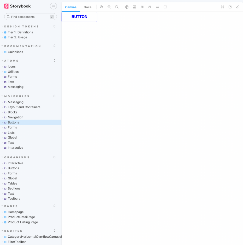
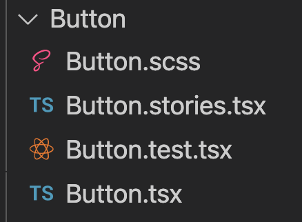
Each of our components has a .stories file colocated with the source files:
And inside of that .stories file we are able to organize the component like so:
export default {
  title: 'Molecules/Messaging/Alert',
  component: Alert,
} as Meta;
From there, we’re able to write our stories for the component so that we can do our dev work. I’ll stress that this work is the first thing we do, rather than some documentation step at the very end of the process. In order to make an accordion we need to see that accordion, so it makes sense to create a story for the component so that we can see what we’re doing.
Templates and pages in Storybook
One thing that is apparently fairly unique to our workflow is that we build our pilot projects‘ templates and pages inside of Storybook. Nearly every client I’ve consulted with has a Storybook that represents components (with varying degrees of organization and comprehension), and zero of them actually articulate product screens and states. That’s why demonstrating how to work with templates and pages in Storybook continues to be one of my favorite magic tricks.
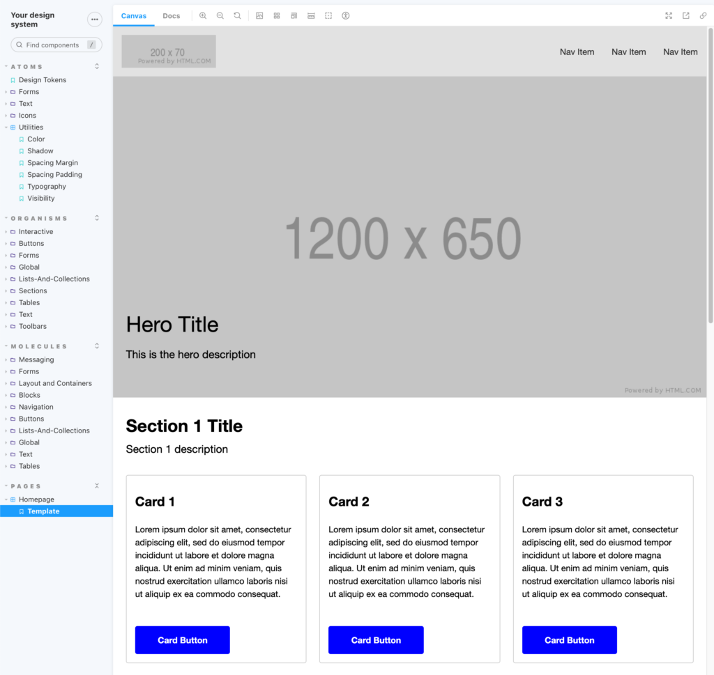
This one really throws teams for a loop sometimes. Why represent templates and pages in Storybook? Isn’t that just wasted time and effort? We have to build these screens in the product; why are we duplicating our efforts?
While I sorta understand those concerns, there are myriad ways this approach increases product quality and saves a ton of time and effort in the process. Building product templates and pages in Storybook:
- Connects the dots between the design system and the products it serves. By having low-level components and pages under one roof, we’re able to connect the dots (Truly! Actually!) between the design system’s components and the products those components serve.
- Reduces the UI feedback loop – Colocating components and pages drastically reduces the feedback loop to validate the design system’s components. The alternative is having to change a component, publish a new version, pull that new version into the app, view those changes in the application, and then address any bugs or deficiencies back in the component library. By representing pages in Storybook, we’re able to instantly answer the question “if I make a change to this component, how does that affect the product screens?” This in my opinion continues to be why atomic design is still so important all these years later.
- Demonstrates the view layer of an application as an “interactive comp”. Historically, developers were shoved static comps and were tasked with building the whole thing out, often having to infer what components and conventions were in use. With pages represented in Storybook, front-of-the-front-end developers can hand off to back-of-the-front-end developers the actual view layer of the code, albeit without it being wired up to any back-end code, APIs, and services. The job for back-of-the-front-end developers then becomes replacing hard-coded demonstration code from Storybook (e.g.
<PageHeader title="Women's Clothing">) with the dynamic version wired up to the application tooling/CMS (e.g.<PageHeader title={post.frontmatter.title}>). - Allows teams to quickly demonstrate product states – “What does this page look like in German? Arabic?” “What happens if our product grid shows 24 products instead of 12?” “What if we had two promo touts instead of three here?” The ability to quickly demonstrate different product states without having to trip over back-end code is a powerful concept and creates an important delineation between UI code and application code.
- Unlocks new levels of design/stakeholder review – Historically a dev staging environment was the only place where stakeholders and design partners could see the living, breathing interface. This of course meant that all the back-end work needed to happen in order to render a product screen, which resulted in a very long runway just to validate the design in code. By using a front-end workshop environment, stakeholders and designers can review the UI code, provide feedback, and even collaborate real-time with front-of-the-front-end developers to design and tweak the UI.
- Unlocks new levels of prototyping – Unlike prototyping features in tools like Figma, InVision, and others, we’re able to prototype whole flows and new features using the honest-to-goodness coded UI components that the application will eventually use. This is materially honest (unlike pictures with hot spots) since it’s using real components, and the level of fidelity allows teams to put these in front of stakeholders and users with confidence things can actually ship.
- Unlocks new levels of user testing – We’re able to use Storybook to validate our product screens and prototypes with real users, without having to build all the application logic. We’re able to do A/B tests simply by creating different stories with different product states or content.
- Unlocks new levels of unit testing – We’re able to use Storybook’s many testing integrations to validate that things behave accordingly. We’re also able to use Storybook’s new play functions to test page-level interactions to test things like “the user should be able to click on the ‘delete account’ button, which should trigger the confirmation modal, and then when they click ‘i’m sure’ it should redirect them to the ‘account successfully deleted’ page.”
As you can see, there’s just so much great stuff that building pages in Storybook unlocks.
Because pages don’t get packaged up and shipped with the component library, we found it helpful to tuck our pages directory inside of the .storybook directory:
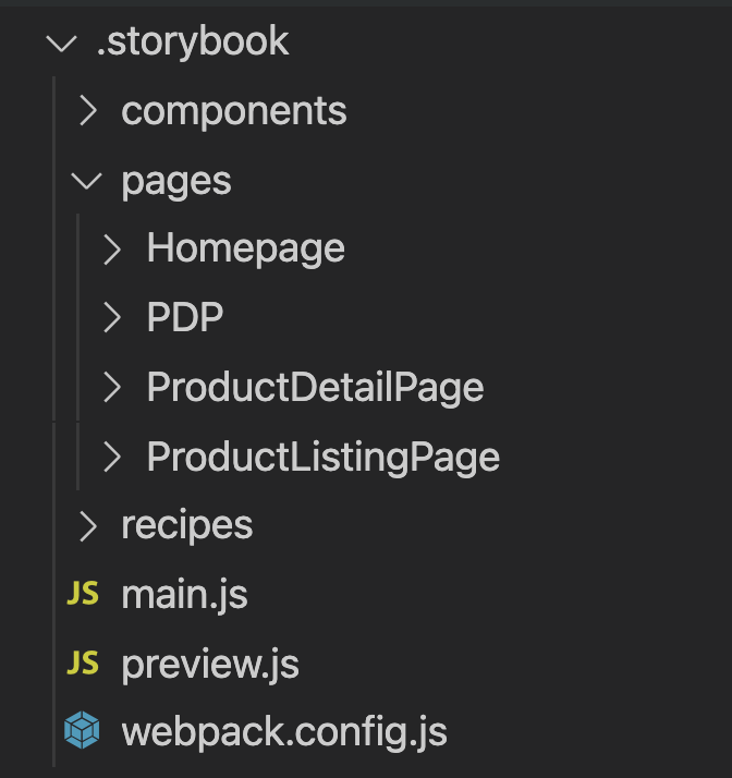
In fact, we’ve found it super helpful to tuck all things that are helpful for demonstration purposes (icon grids, design token swatch components, et al) inside the .storybook directory and away from our src directory.
Tried and true
We’ve been building atomic design systems in front-end workshop environments since 2013, starting with a tool I helped create called Pattern Lab. The technology landscape shifted and the JS ecosystem blew up, making Storybook a natural successor to the work we started in Pattern Lab. While the specific frameworks changed (and continue to change!), the concepts and architecture I’ve covered here continue to be incredibly sturdy.
So go forth and Storybook! And if your team ever needs help architecting and building your design system and Storybook environment, feel free to get in touch!
This content originally appeared on Brad Frost and was authored by Brad Frost
Brad Frost | Sciencx (2022-01-21T17:32:43+00:00) Atomic Design and Storybook. Retrieved from https://www.scien.cx/2022/01/21/atomic-design-and-storybook/
Please log in to upload a file.
There are no updates yet.
Click the Upload button above to add an update.
