This content originally appeared on DEV Community and was authored by DEV Community
Howwwwwwwwwdy! I'm back with another CSS tutorial and more fun stuff that you can sink your (proverbial) teeth into!
What are waveforms?
Waveforms are a visual representation of any kind of wave, as described here. For our example, we won't be tying our waveforms to any kind of real data, but, if you're adventurous enough, you can use a bit of JavaScript to do just that!
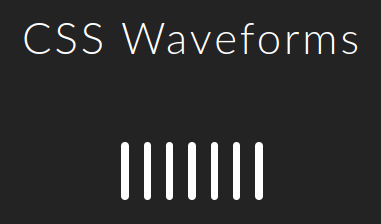
Screenshot of our eventual results:

Note: I will share the full source code for this project at the bottom of the document, but this article will only cover what's absolutely necessary.
Building the basics
Our HTML code:
First, we need seven divs, wrapped up in a section, each with a unique class:
<section>
    <div class="wave0">
    </div>
    <div class="wave1">
    </div>
    <div class="wave2">
    </div>
    <div class="wave3">
    </div>
    <div class="wave4">
    </div>
    <div class="wave5">
    </div>
    <div class="wave6">
    </div>
</section>
You can call your classes anything you like, but I've gone with "wave0" to "wave6", to keep things straightforward.
Our CSS code:
We'll let flexbox handle the layout, and we'll use a "wildcard" selector to style all those classes without having to write duplicate selectors or rulesets.
The section:
section {
  display: flex;
  gap: 15px;
  margin-top: 5vw;
}
The divs:
[class*='wave'] {
  aspect-ratio: .125/1;
  background-color: white;
  border-radius: 15px;
  width: .5vw;
}
This should give you a result like this (minus the heading, of course):
Animating it all
Creating the keyframes:
We'll create an animation description using @keyframes, named waveform.
@keyframes waveform {
  0% {
    transform: scaleY(.5);
  }
  50% {
    transform: scaleY(1.5);
  }
  100% {
    transform: scaleY(.5);
  }
}
When applied to any element, this animation will cause it to shrink on the Y axis:
- At 0%, to half its vertical size (height),
- At 50%, to 1.5x its vertical size,
- At 100%, back to half its vertical size again.
Note: If we were to apply a rotation of 90 degrees, the Y axis would now correspond to the element's horizontal size. This is important to remember when doing more complex animations.
Applying the animation:
To actually apply our animation, we will modify the [class*='wave'] ruleset, to include an animation declaration.
[class*='wave'] {
  aspect-ratio: .125/1;
  /*This can all be written on one line:*/
  animation: waveform var(--wavefreq)
             ease-in-out infinite
             forwards;
  background-color: white;
  border-radius: 15px;
  width: .5vw;
}
This consists of the property animation:, and a number of values, which correspond to other properties such as animation-name:, animation-duration:, animation-timing-function:, etc.
For the sake of brevity, I won't cover all of these in this article, but you can read the docs on MDN.
What's with the var()?
If you've paid attention to the code, you'll notice that I included a custom property (often called "CSS variables") in the animation: declaration's values. This is critical, because it will allow us to change the value of our animation speed (animation-duration:) without having to re-declare the animation for every class we've written above.
Declare the variable:
Include this snippet of code at the top of your CSS file:
:root {
  --m: 17.5;
  --wavefreq: calc(100ms * var(--m));
}
This tells the browser to create two custom properties, --m, which acts as a constant, and --wavefreq, which calculates the timing of our animation, using the calc() function.
Finally, timing each class separately
This part calls for some repetition, so if you're using a text editor that supports duplication, you may want put it to good use. Or, you may just copy and paste this snippet.
.wave1 {
  --wavefreq: calc(200ms * var(--m));
}

.wave2 {
  --wavefreq: calc(300ms * var(--m));
}

.wave3 {
  --wavefreq: calc(400ms * var(--m));
}

.wave4 {
  --wavefreq: calc(500ms * var(--m));
}

.wave5 {
  --wavefreq: calc(600ms * var(--m));
}

.wave6 {
  --wavefreq: calc(700ms * var(--m));
}
The result + Taking Things Further:
With this code in place, you should get something like this:
If you play with your values a bit, such as the "constant", --m, or the number of milliseconds in each wave's calc() function, you can get some rather interesting results.
Source code + Example
I've done exactly this in the full project, which you can grab from my gumroad page for free. It includes a slider and relevant JS code to allow for changing the animation speed, which is listed below the waveform in an <output> element.
If you try this out and build something more with it, I'd love to see your results, so feel free to share them with me in the comments, or tag me on Twitter!
This content originally appeared on DEV Community and was authored by DEV Community
DEV Community | Sciencx (2022-01-26T16:18:20+00:00) CSS Funstuff: Animated Waveforms. Retrieved from https://www.scien.cx/2022/01/26/css-funstuff-animated-waveforms/
Please log in to upload a file.
There are no updates yet.
Click the Upload button above to add an update.

