This content originally appeared on DEV Community and was authored by Anthony Dellavecchia
TLDR: Developers, the fonts that you use matter! They help you find bugs and lessen eye strain.
Why do Fonts Matter?
Did you know that there's a whole industry revolved around fonts? Typeface and typography are some terms used in this space, and their goals are to design fonts/letters to improve experiences or give products identity. As developers, we look at code all day long. Shouldn't we try to improve that experience, so that we can be more productive? Well, there are many fonts out there that do just that! Some popular ones include Fira Code, Source Code Pro, Jetbrains Mono, and Ubuntu Mono. But these are just a few, there are tons more.
Here are some reasons why picking the right font will help you, as a developer:
- Easily find typos.
- Quickly find variables and functions.
- Identify programming-specific characters.
- Reduce eye strain.
Plus, they just look cool, and who doesn't like that? 🤣
Differences Between Normal Fonts
Fonts for programmers are designed with programmers in mind. The philosophy behind these ideas differ amongst typefaces, but they aim to do the same thing: improve the developer experience.
Let me go into some details about the font: Jetbrains Mono, my current font of choice.
Jetbrains Mono has the following features:
1. Increased font height, so code is easier to read.
How does this help? Well, a more readable font will help you find typos because you can easily identify each character you type. And no more squinting! You're eye's will be much less strained since you don't need to squint anymore.
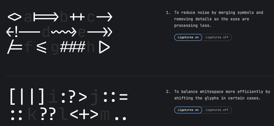
2. Ligatures which help you identify special characters used in programming.
Take a look at what I mean from the images below. Notice how arrow functions go from => to an actual arrow. This makes special characters stand out and look how they should.
OFF
ON
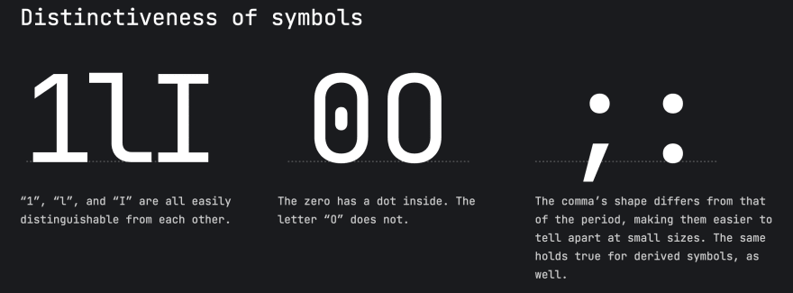
3. Each character is distinct.
I'm sure you've experienced something like this. You look at a character and wonder if its a capital I or a lowercase l. They look the same with a lot of standard fonts (like this one that I'm using for my blog!).
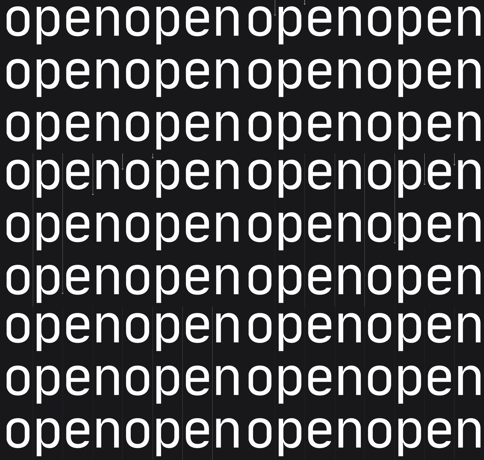
4. Letters flow vertically.
When we code, we do a lot of vertical scrolling and, in tern, a lot of vertical reading. Jetbrains Mono is designed to be super legible and flow vertically.
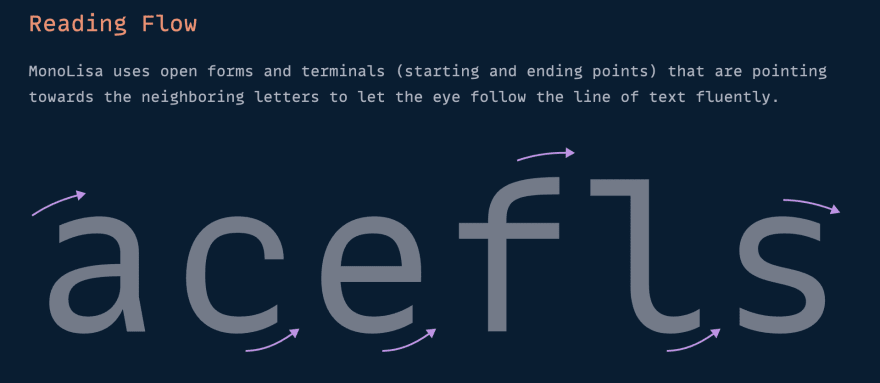
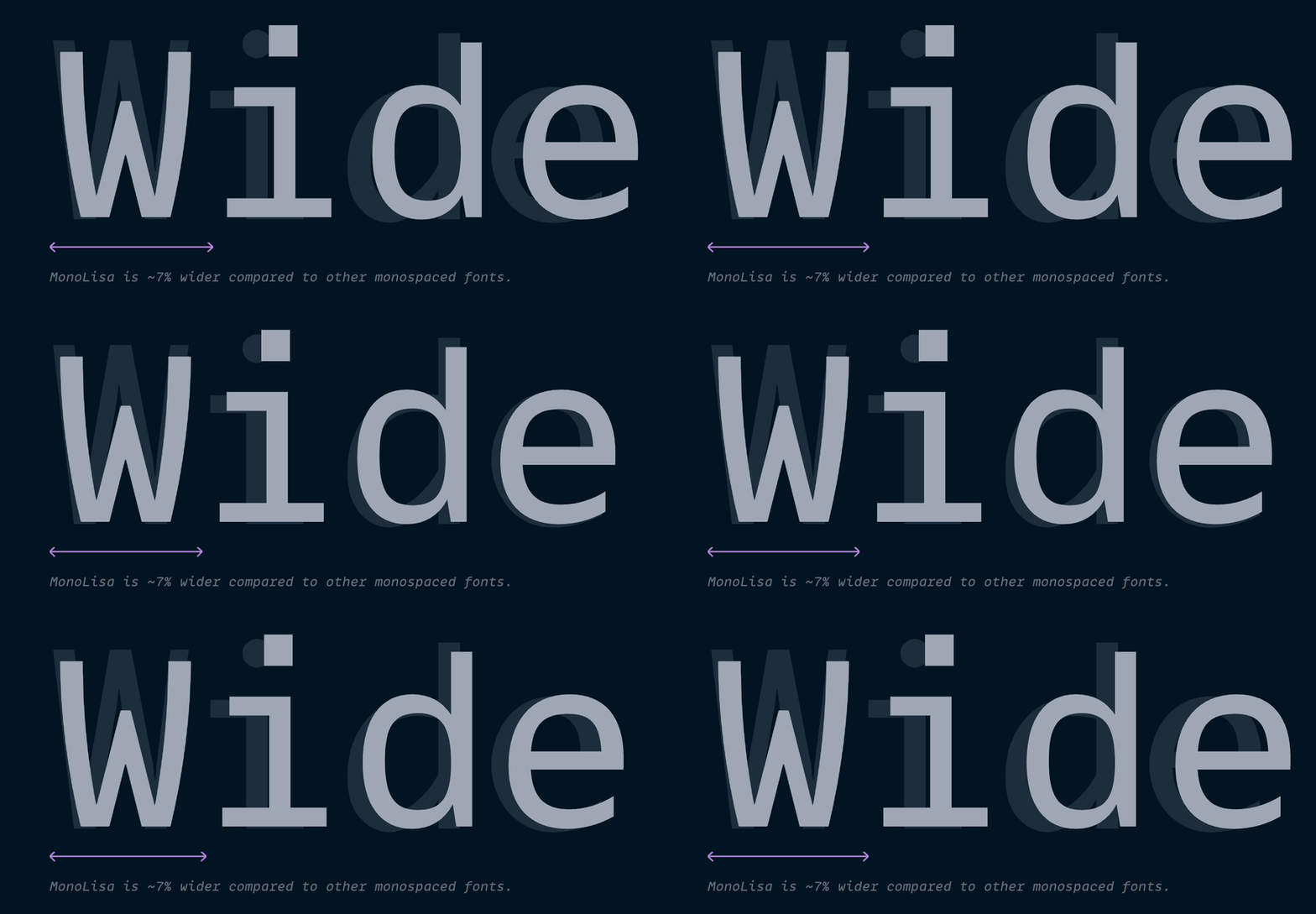
MonoLisa is another popular dev font. Part of their design philosophy includes horizontal flow, so each character flows to the right, making horizontal reading much smoother.
MonoLisa also has a wider font, which makes your code less condensed and easier to read.
Test Them Out Yourself!
If you're not sure which font will work best for you, check out this font playground. You'll be able to select from a bunch of different fonts to try out.
Summary
If you're a developer, I highly recommend downloading some programming fonts and see what works best for you. They can improve your workflow by reading code more easily. And you'll have less eye strain since everything's more legible.
For more information:
Thanks for reading!
Consider following me for more!
My Blog
Twitter
Dev Community
HashNode
Medium
This content originally appeared on DEV Community and was authored by Anthony Dellavecchia
Anthony Dellavecchia | Sciencx (2022-01-28T06:54:46+00:00) Why you should use a developer font. Retrieved from https://www.scien.cx/2022/01/28/why-you-should-use-a-developer-font/
Please log in to upload a file.
There are no updates yet.
Click the Upload button above to add an update.


