This content originally appeared on Articles on Smashing Magazine — For Web Designers And Developers and was authored by Steven Frieson
Amid the KPIs and e-commerce and seemingly endless analytics, there are still plenty of sites embracing frivolity. Doesn’t it take the edge off to just have a little fun?
The web can feel like a very businesslike place nowadays. Most places you go there seem to be legions of glossy products and unnervingly personalized ads competing for our attention. There’s a lot of money to be made, and at times it can all feel a little inhuman.
Kick back, relax and enjoy. Maybe even think about a pointless project of your own. Lest we forget, the only limit to what’s possible on the World Wide Web is our imaginations.

There are few bigger, blanket canvases for artists than the World Wide Web. With so much onus on selling products and building brands, one can lose sight of creation for creation’s sake.
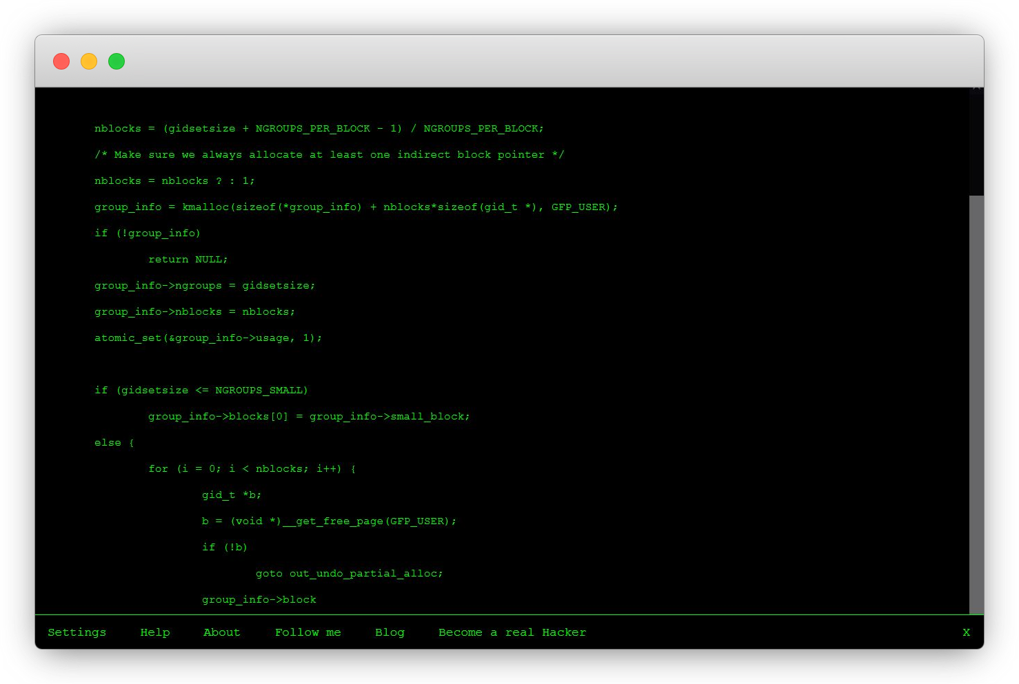
‘Short Trip’, an experimental page by Alexander Perrin, shows what’s possible online. The idea of ‘sketches’ still feels very hands-on — something you need a pen and paper for. Not so. Graphite illustrations and trams are front and center in this ‘interactive illustration’. Why? Why not?

This was built with Three.js and JavaScript WebGL and works both on desktop and mobile. Having become so accustomed to the engagement-ridden design of the modern web there’s something incredibly peaceful about watching a digital world drift by.
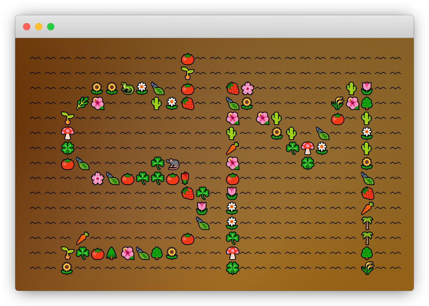
drawing.garden“Gardening, but with emojis and less time.” That’s how Minneapolis artist Ben Moren describes the thoroughly lovely drawing.garden. That about covers it. Drag your cursor across the screen and watch as an empty field becomes resplendent with strawberries, sunflowers, and (figuratively) magic mushrooms. Be sure to have the sound on, too.

This isn’t quite what people mean when they talk about tending one’s ‘digital garden’, but it’s a terribly pleasant alternative. For those interested in what’s going on among the roots, the project was made using p5.js and the code can be viewed in full on GitHub.
FlopstarterThe execution on this one is just perfect. Crowdfunding and supporter schemes have been game-changers for much of the web (do consider becoming a Smashing member, by the way), but they’ve also had a few misfires in their time (not us, we’re really good). Flopstarter is a not-so-subtle piece of satiric gold, assembling all sorts of absurd ideas that need your hard-earned dollars to become reality.

Flat bowls, potato skin jackets, tissue paper pillowcases to cry right into — it’s a mighty fine array of silly ideas. The site’s so professionally done that you almost want to support the products. Almost.
Release Your Inner PollockWho needs an easel to be an artist? This Jackson Pollock site lets you create your own manic masterpiece, giving the cool, calculating web a lovely organic feel. It’s a joy to ‘paint’ with and even manages to convince you you’re somewhat artistic. (If Pollock isn’t your style why not try Mondrian and Me instead?)

Built more than ten years ago by Greek artist Miltos Manetas, this site still holds up as a wonderful showcase of what can be done by leaning into the interactivity of the web. It can be a canvas if only we treat it like one.
ArpeggiosThis Chrome Experiment that loops through scales at the user’s whim has a playful, pure feel to it. Being able to jump between different keys and instruments isn’t strictly useful for anything, but it sure is pleasant.

The no-frills presentation and interface work in the page’s favor here. It’s built around its core elements — musical notes. Sound is easily (and often) applied clumsily on the web, but pages like these are a reminder of how rich an experience it can be.
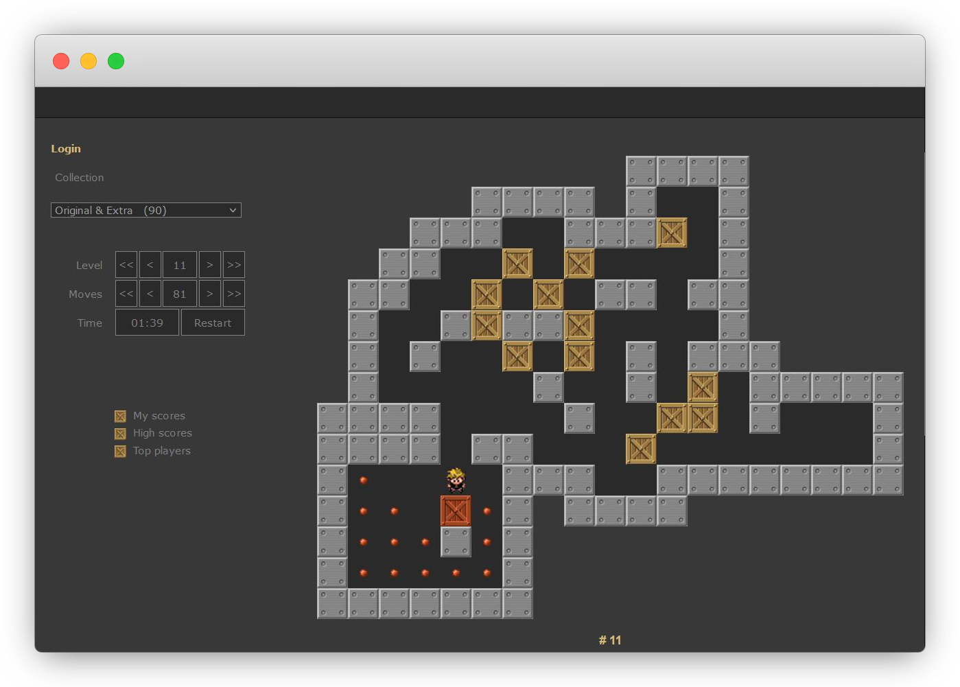
SokobanFirst written by Hiroyuki Imabayashi in the 1980s, Sokoban is a puzzle game genre in which you, the player, push crates around a warehouse until each one is in a designated storage location. Think that’s a dry premise? Think again. It’s a stone-cold classic, more than a little addictive, and free to play over at sokoban.info.

With more than 7,500 levels to work through, this is an essential bookmark for all the serial procrastinators out there. The added challenge of completing each one in as few moves as possible practically makes this a game for life.
Make Everything OKThe button we all wish we had. Make Everything OK keeps things simple. I won’t pretend to know what goes on under the hood for it to deliver on its offering, but it sounds like a good deal to me.

There is beauty in an idea — however daft — being executed so simply. It’s a nice little example of skeuomorphic web design, too. One button, one result. Don’t pretend you won’t try it. We both know you will. Go ahead, make everything ok.
Disclaimer: This may not make everything ok.
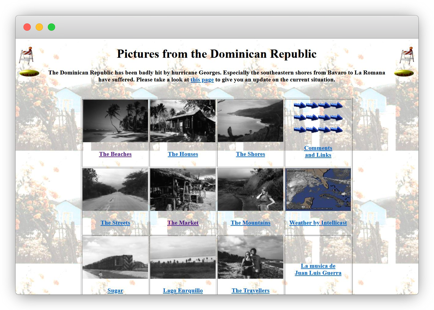
GeoCitiesThis is the OG pointless site — or rather, these are the OGs. Founded in 1994, GeoCities was a service that allowed users to code websites for free and group them in ‘cities’ with like-minded pages. By the time it ended in 2009, around 38 million user-written pages had been created. Thankfully, many of those pages live on in the Geocities Gallery archive project by restorativland.

Browsing the archives makes for a surreal, even moving glimpse of what the internet could have been and still might become. The closest contemporary community that comes to mind is the IndieWeb. Or GeoCities’ spiritual successor Neocities, of course. Sites that are offbeat and messy, but expressive and beautiful. As Edward Snowden put it in his memoir, Permanent Record, “all these quirks and tics of amateur production merely indicated that the guiding intelligence behind the site was human and unique.”
Ain’t No Project Bizarre EnoughThe sites shared above are a tiny fraction of the art pieces, experimental pages, and downright absurd projects on the web. They are there if only you look for them — or even make a few yourself.
If you want to see more where these came, Pointless Sites and The Useless Web are good ports of call. Elsewhere sites like CodePen are bursting with terrific tinkerers. For the digital history buffs I again gently nudge you towards the GeoCities archives and its spiritual successor Neocities. Pointless passion projects are alive and well, thank goodness.
- “Playfulness In Code: Supercharge Your Learning By Having Fun” by Jhey Tompkins
- “Unexpected Learnings From Coding Artwork Every Day For Five Years” by Saskia Freeke
And if you’re feeling bold, why not cobble together that idea you wrote down a while back? Try out that framework, or that library, or that app. There is no such thing as being too silly or lacking value. If you enjoy making it, that's valuable enough.
Go forth and be pointless. Keep some god honest innocence in your online life.
This content originally appeared on Articles on Smashing Magazine — For Web Designers And Developers and was authored by Steven Frieson
Steven Frieson | Sciencx (2022-02-11T12:00:00+00:00) Web Design Done Well: Perfectly Pointless. Retrieved from https://www.scien.cx/2022/02/11/web-design-done-well-perfectly-pointless/
Please log in to upload a file.
There are no updates yet.
Click the Upload button above to add an update.
