This content originally appeared on Level Up Coding - Medium and was authored by George Argyrousis

Popularised by Apple’s iOS, Switches (or Toggles) have become an essential UI element for any web component library. Unlike checkboxes which require an explicit form submission, switches have an immediate effect when alternating between opposite states.
During our process we will consider key challenges towards an effectively designed architecture. Our primary responsibilities ultimately lie towards accessibility and re-usability. However, we shouldn’t compromise on simplicity. Thus, enabling an effective yet seamless adoption within an external system.
Engineering considerations

Semantic HTML unfortunately does not support native switch elements. We can opt for a simple<input type="checkbox" role="switch" />, remove all default browser styles using the CSS declaration appearance: none; and apply our own custom styles.
Plain HTML structure
<label for="id_input">
    <input id="id_input" type="checkbox"></input>
    <div class="switch-labels">
        <span>Label</span>
        <p>Description</p>
    </div>
</label>
We should use a <label /> as our switch container for its directional coupling with HTML <input /> tag. Labels have a unique attribute for allowing them to become aliased click targets for their matching input id as long as it is currently present in the document object model (DOM).
In addition, our container will house a <span /> acting as our primary labelling text with an optional <p> description.
Accessibility features

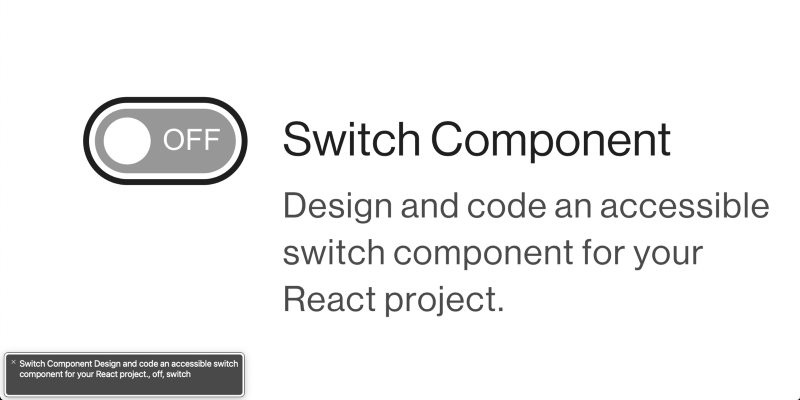
The role="switch" enables screen readers to express “On” and “Off” states according to the boolean selection inherent to a checkbox input. The input element is focusable by default. We will further enhance the focused state with our own custom css styles.
The text and descriptive labels must have a uniquely assigned id attribute corresponding to their parent container. We will utilise these attributes with aria-labelledby for correct announcements by assistive technologies.
Custom SCSS styling

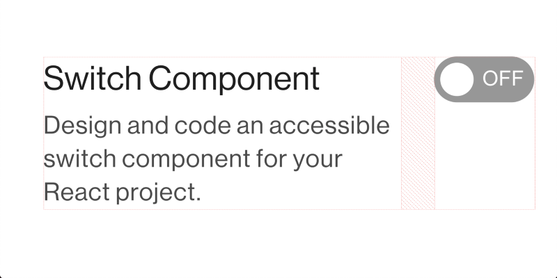
Our layout will be constructed using display: flex; and align-items: flex-start; -thus vertically aligning elements towards the top. Consequently, we can easily customise our layout with just a few lines of CSS. Some horizontal spacing will be needed gap: 4px; to prevent intersection between the text and switch when available space is scarce.
With CSS, we can easily identify when an <input type="switch" /> has a selected state using the pseudo class selector :checked. We will also use the ::before pseudo selector to create a position: absolute; circle knob. Animating to the right can be handled by the ::before:checked selector when applicable.
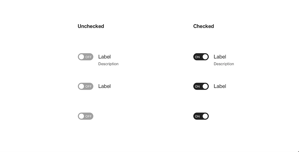
In the implementation you will observe “ON” and “OFF” text opposite to the switch’s knob circle. We are utilising the content: attr(); declaration to parse HTML attributes into CSS.
It is highly recommended to use CSS custom properties or SCSS variables for consistency across your design system.
React & TypeScript implementation
In the following implementation we have made a conscious decision to have a controlled component. We are overloading the onChange event handler and pass an explicit boolean prop for determining the checked or unchecked state.
Final thoughts
We have fully analysed dual state Switch toggles and designed a flexible component. Most of the principles used have very little bias and enable easy adoption towards a foreign host system.
You can always remove TypeScript related declarations for a pure JavaScript implementation. Remember to use design tokens in your CSS utilising REM units.
References & further reading
- WAI-ARIA Authoring Practices 1.1
- ARIA: switch role - Accessibility | MDN
- aria-labelledby - Accessibility | MDN
- :checked - CSS: Cascading Style Sheets | MDN
- content - CSS: Cascading Style Sheets | MDN
If you found this post useful, please share it with others. Some claps 👏🏻 below help a lot!
By clapping, you help others discover this content and motivate the writing of more articles about accessibility, design, React and JavaScript!
Build an accessible Switch Component with React and Typescript. was originally published in Level Up Coding on Medium, where people are continuing the conversation by highlighting and responding to this story.
This content originally appeared on Level Up Coding - Medium and was authored by George Argyrousis
George Argyrousis | Sciencx (2022-02-14T16:38:24+00:00) Build an accessible Switch Component with React and Typescript.. Retrieved from https://www.scien.cx/2022/02/14/build-an-accessible-switch-component-with-react-and-typescript/
Please log in to upload a file.
There are no updates yet.
Click the Upload button above to add an update.
